How Does Design Contribute to Human Catastrophes? Gonzalez Haase AAS
|CLAIRE KORON ELAT
Killing is a matter of aesthetics. Architects Pierre Jorge Gonzalez and Judith Haase, who designed our Seoul store, talk about radical retail spaces and the relationship between design and catastrophes.
In his 1963 film How to Kill People, industrial designer George Nelson suggests that killing is a matter of design. Arguing that design is used to improve the functionality and form of weapons, he ultimately concludes that aesthetics ameliorates lethal technologies. The relationship between aesthetics and calamities is a complicated one—not only when it comes to the construction of actual weapons but also when looking in a more mundane context. Catastrophes are being aestheticized. Instead of showing actual images of wars, we create digestible AI images that fit our feeds.
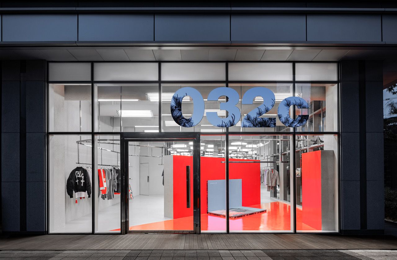
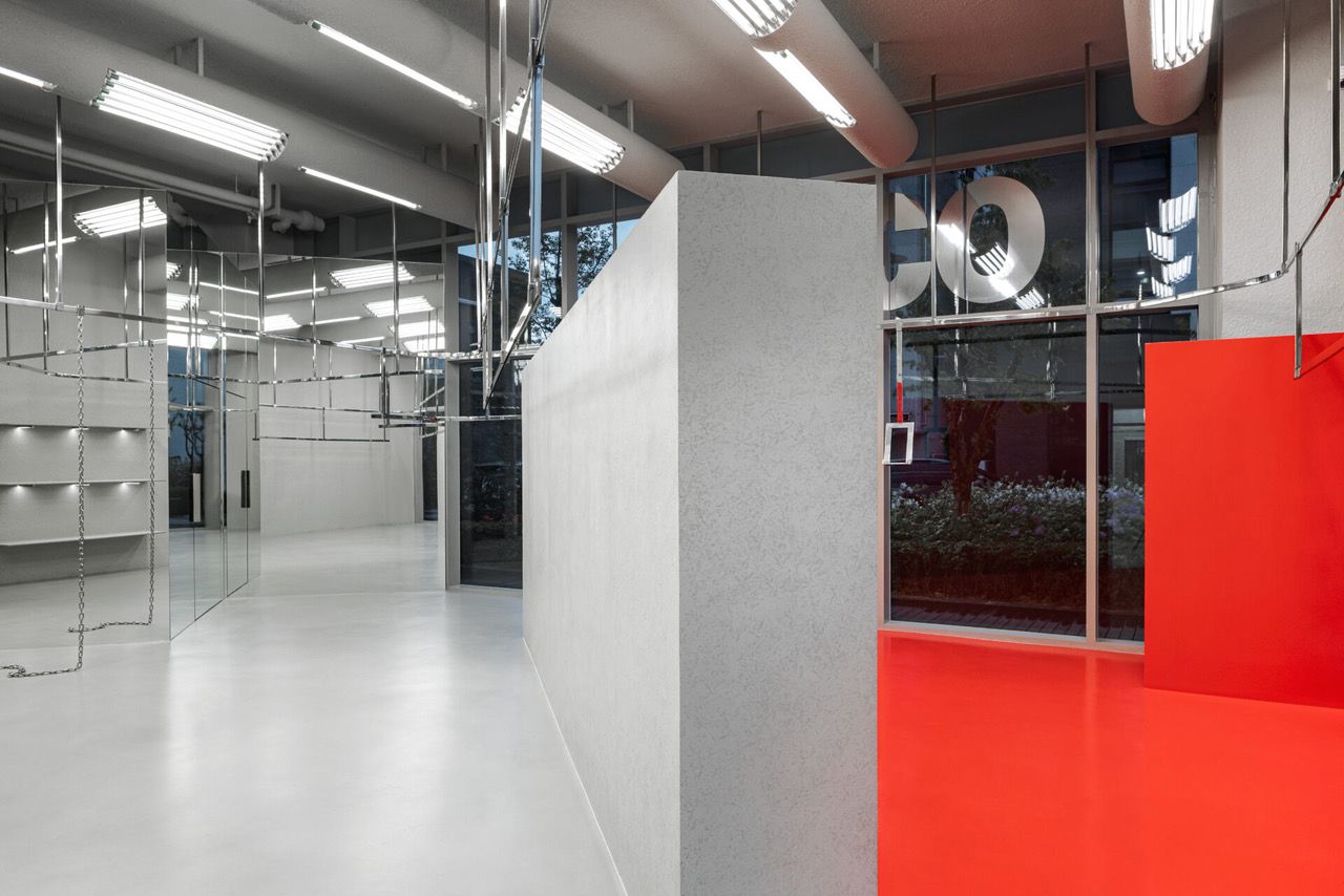
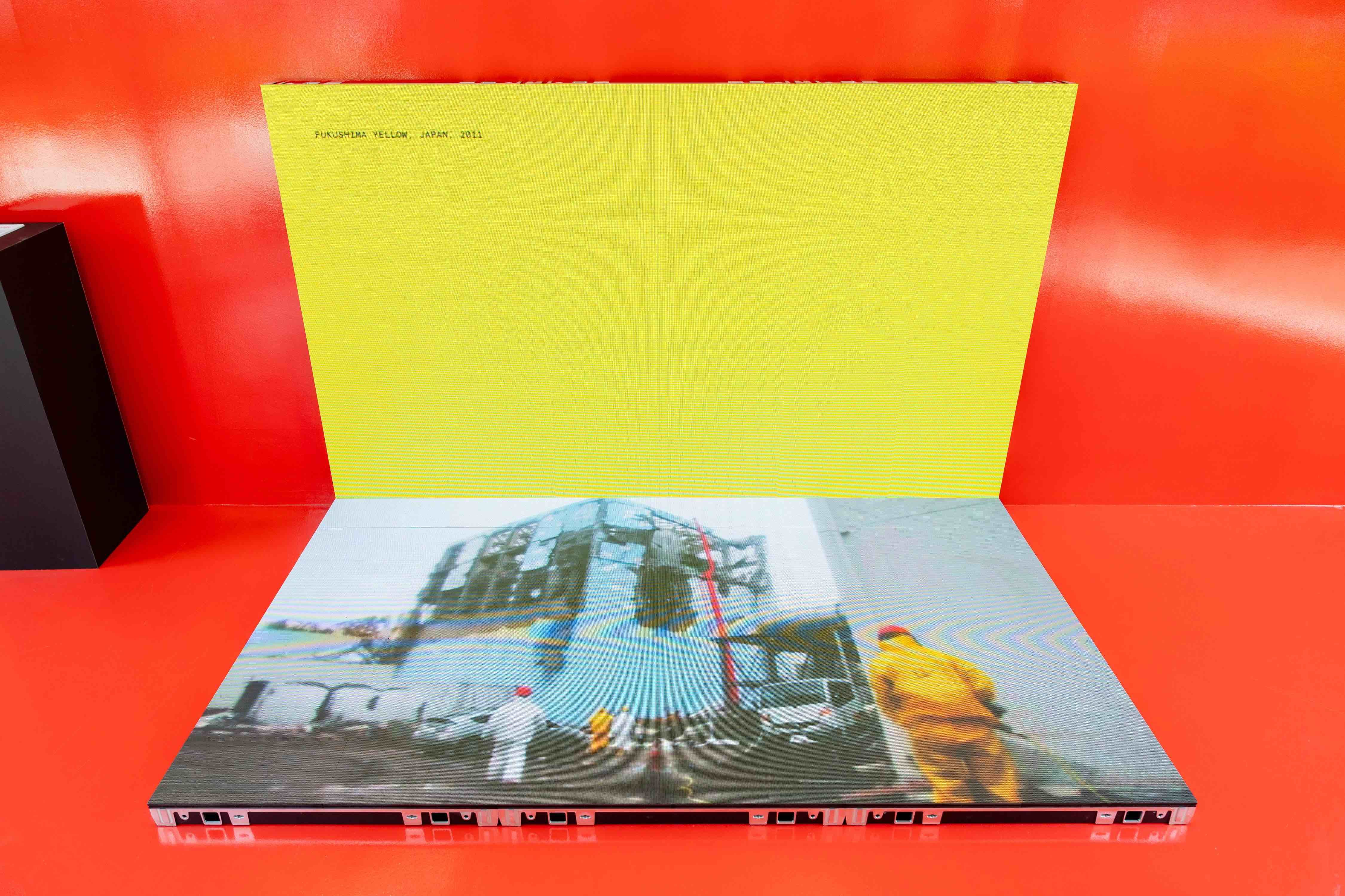
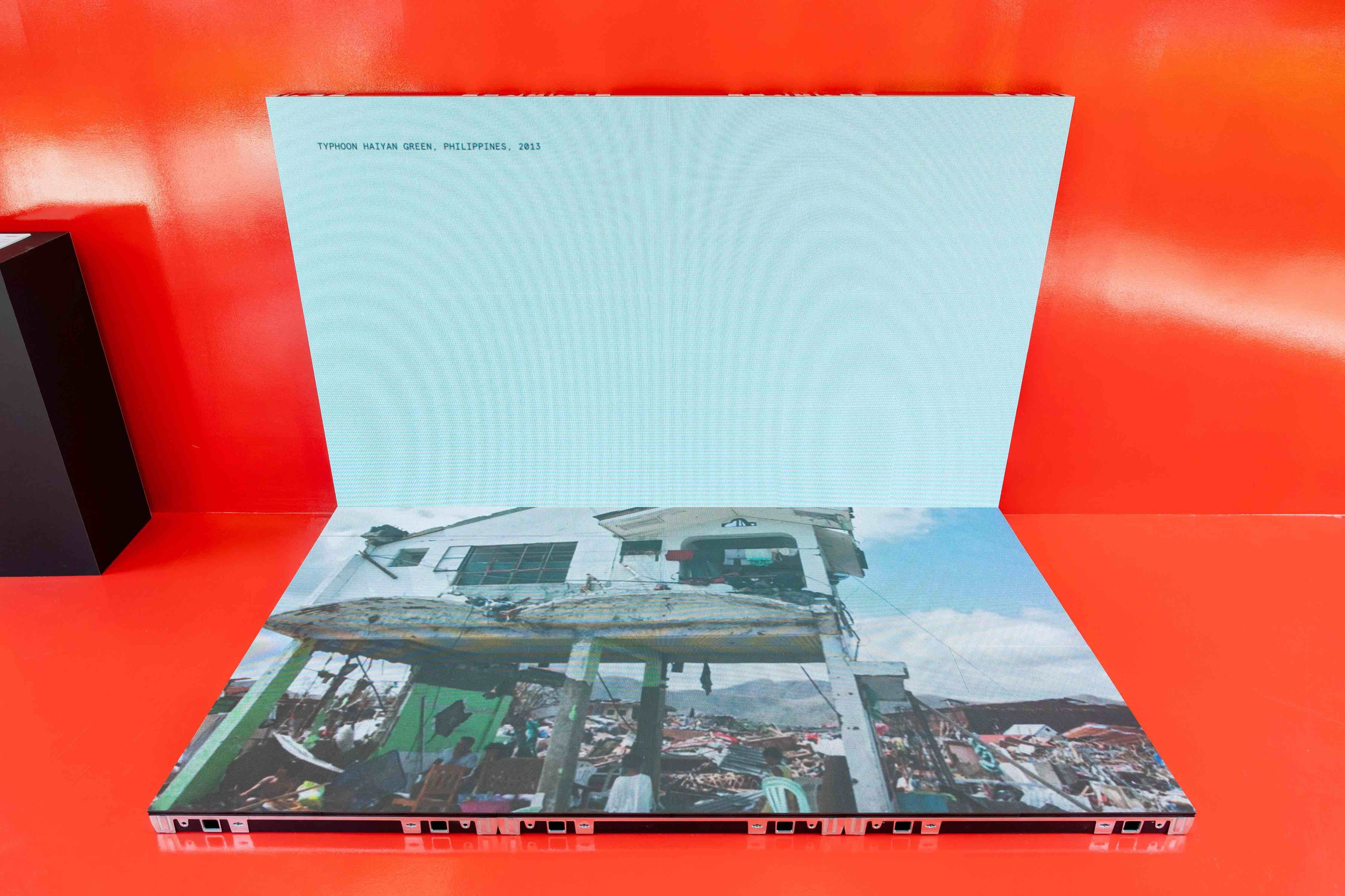
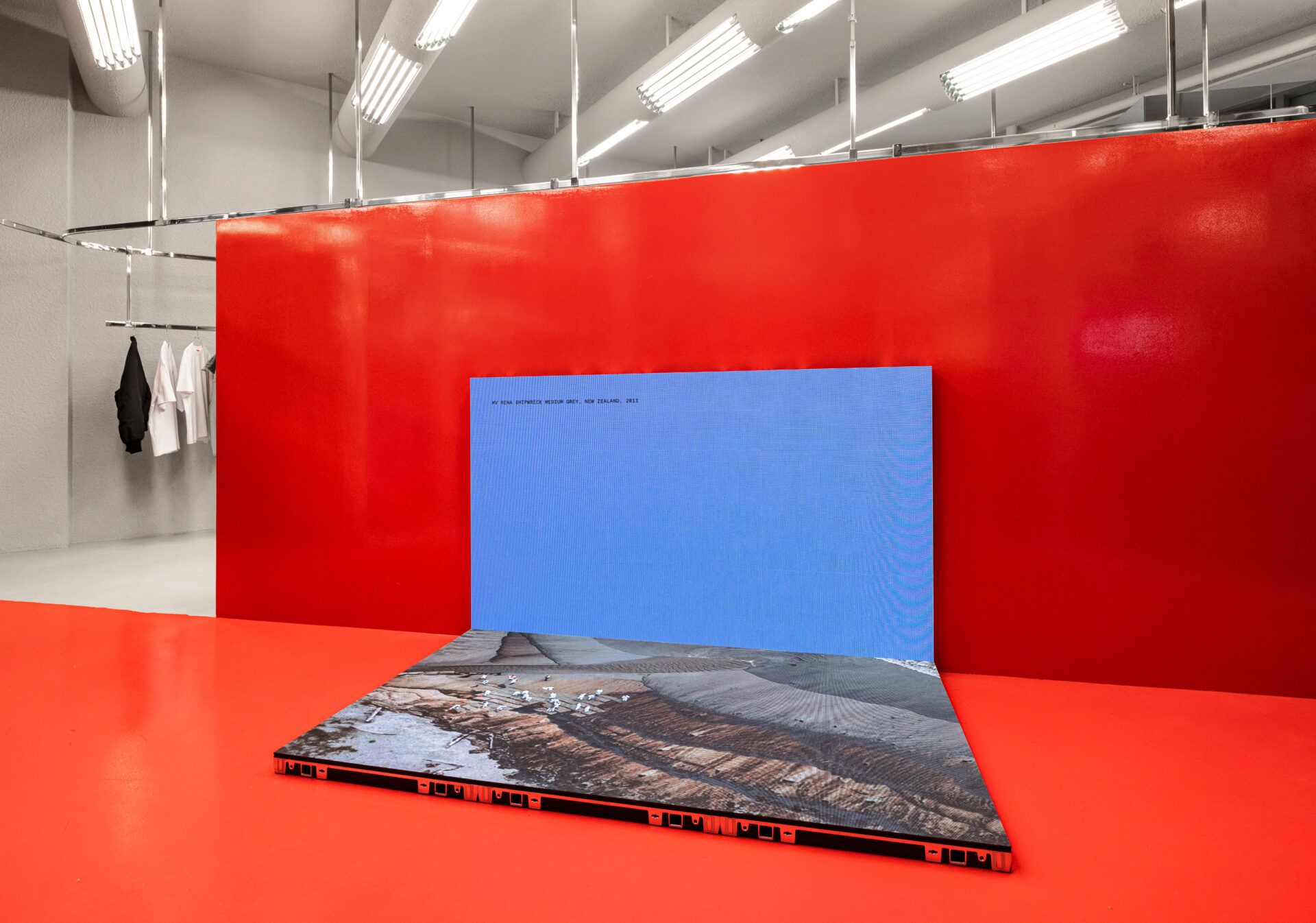
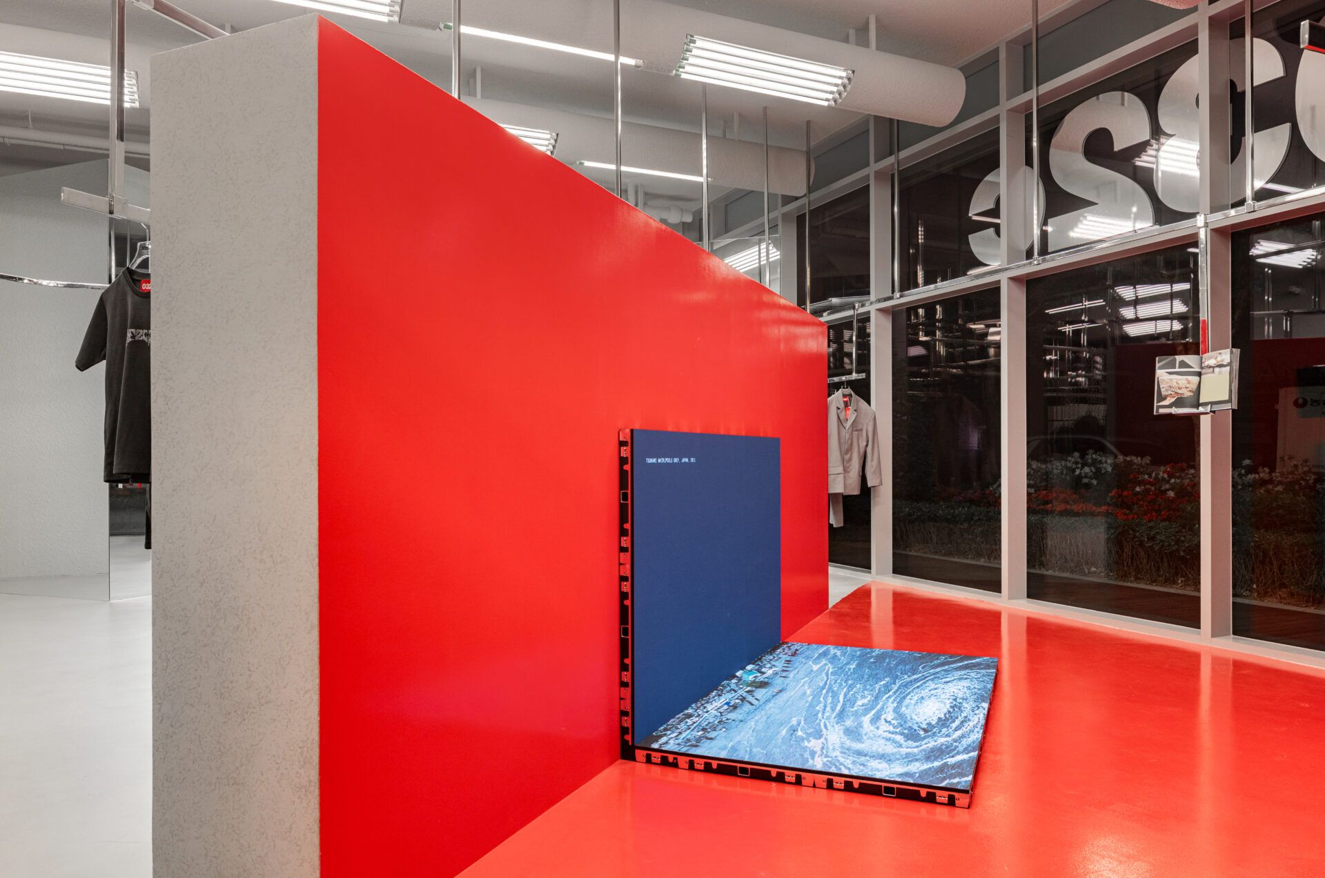
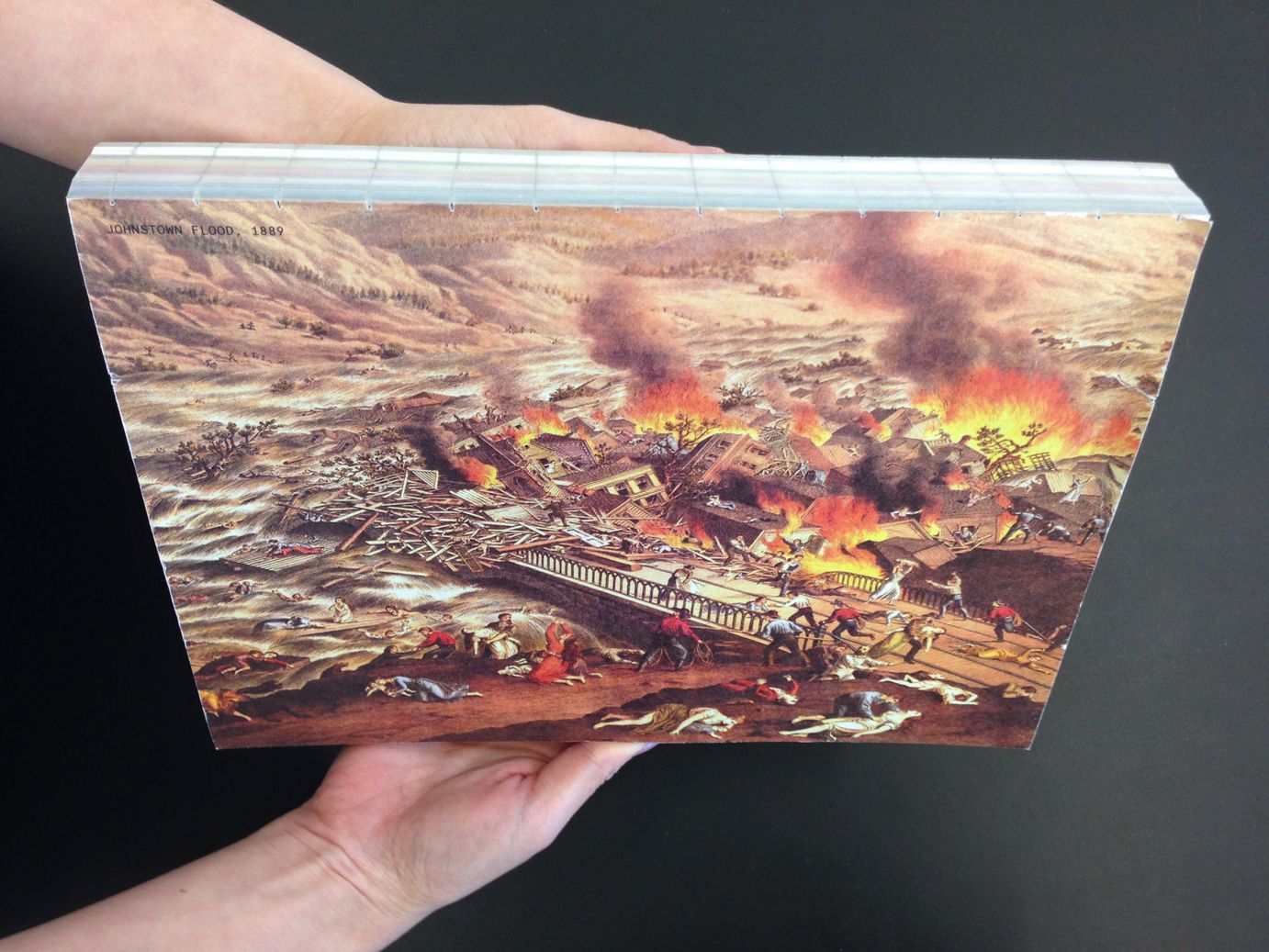
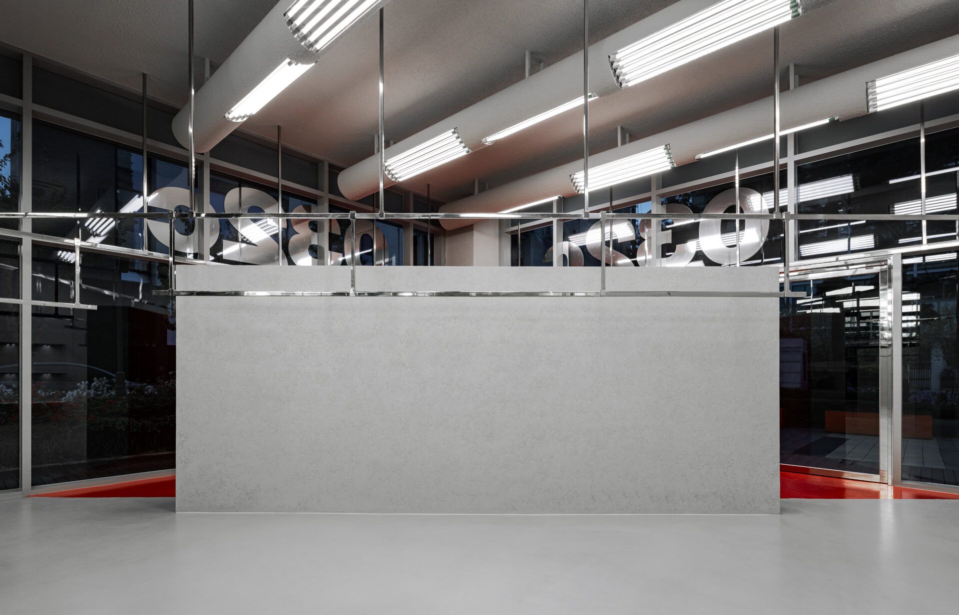
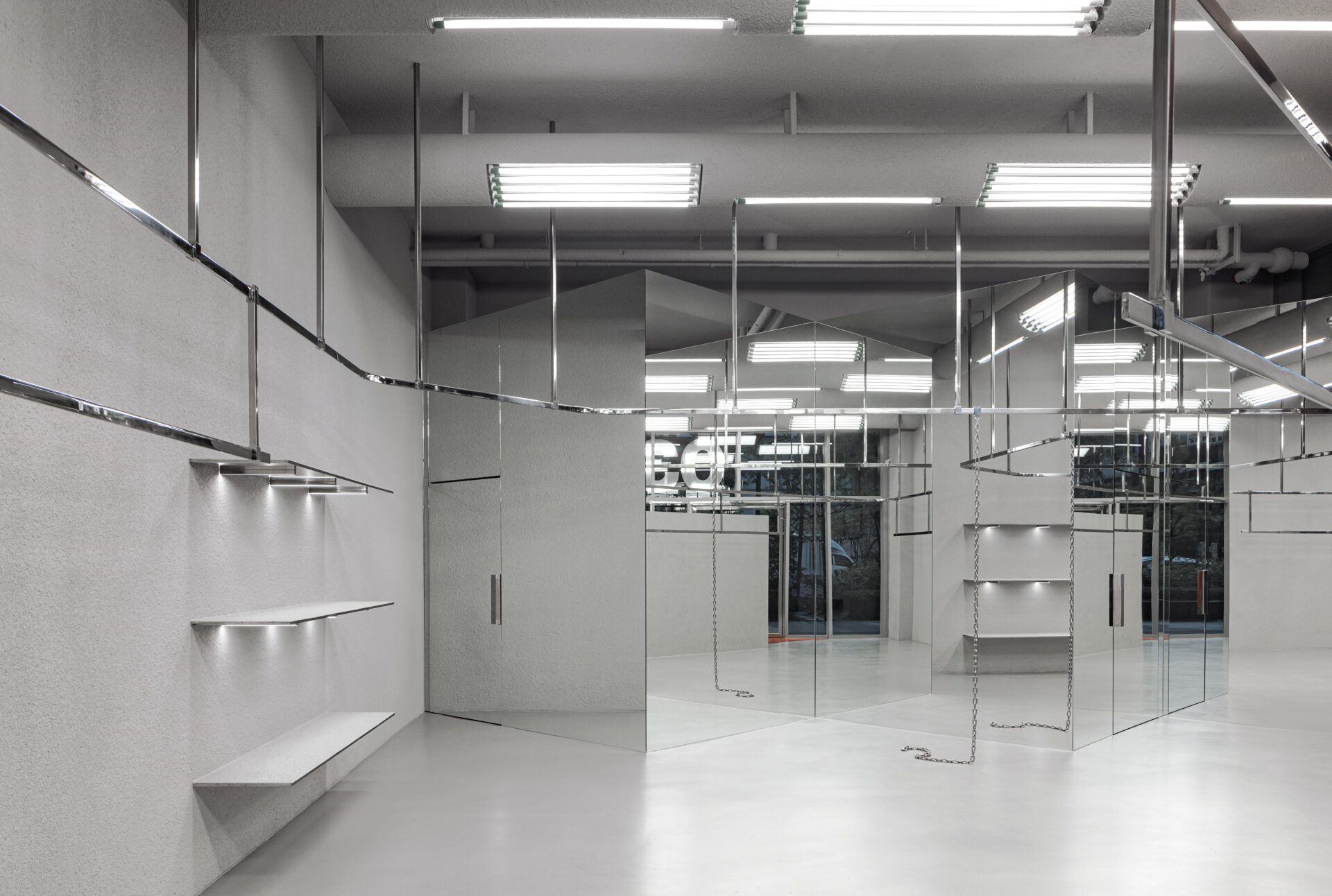
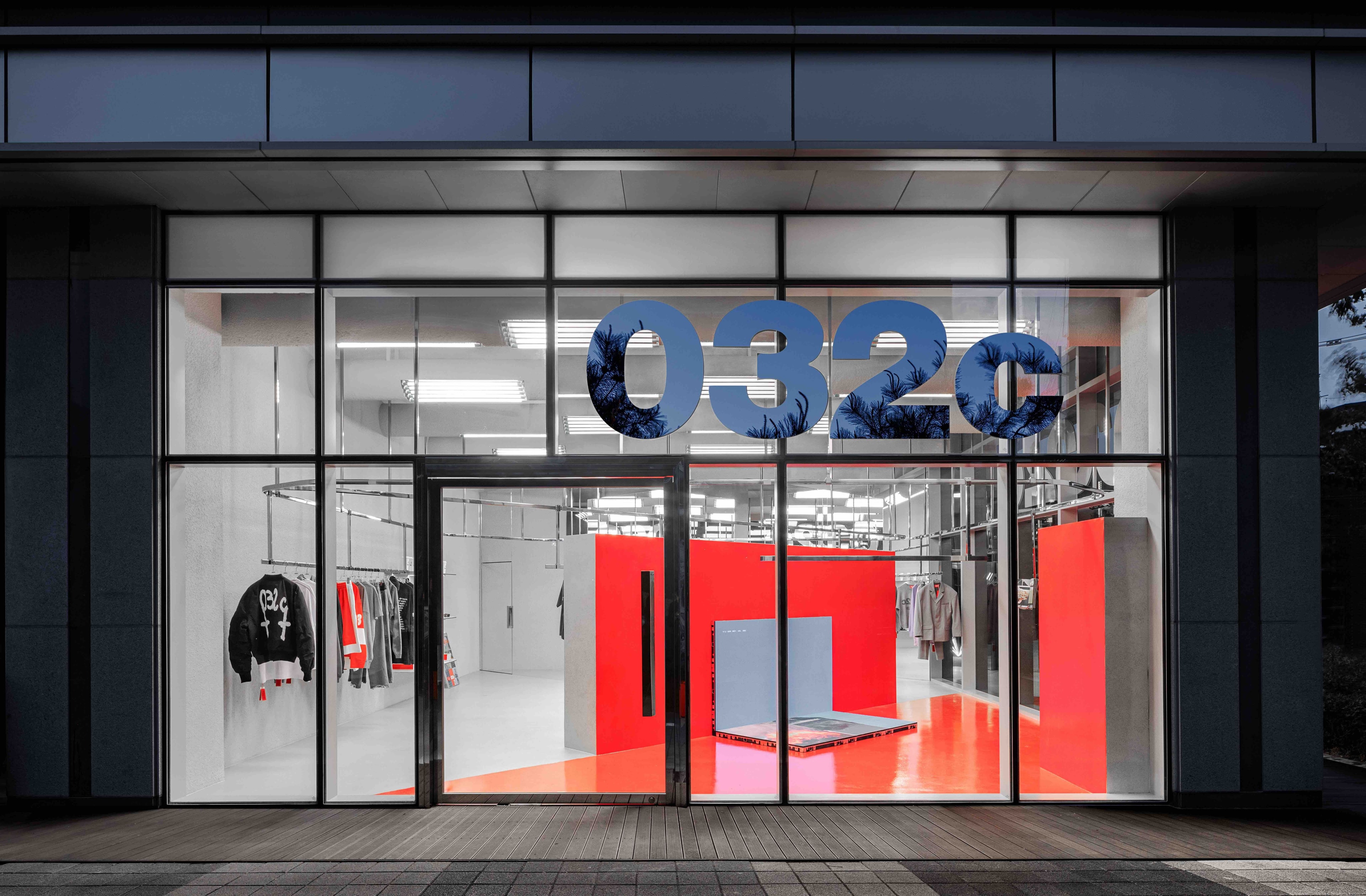
In 2014, architects Pierre Jorge Gonzalez and Judith Haase published the book Catastrophe Colors. By associating colors to human disasters, the aim was to challenge our consumption of colors, consequently making the selection of colors a conscious act. Founded in 1999, their Berlin-based studio Gonzalez Haase AAS has worked on numerous projects, including our recently opened 032c store in Seoul, where an installation of Catastrophe Colors is currently on view. With a red exhibition area mirroring our store in Berlin and a minimalist product section separated by a dividing wall, the store was designed by the architect duo to reflect Seoul’s “energy and curiosity about what’s new,” according to Koch. I talked to the duo about design and disasters, making utopian architecture, and unexpected retail spaces.
CLAIRE KORON ELAT: While reading about your project Catastrophe Colors, I was thinking of George Nelson’s film How to Kill People. Your project is also interested in the relationship between catastrophes and design, or particularly colors.
PIERRE JORGE GONZALEZ: It also reminds me of a quote by Karlheinz Stockhausen, who said that 9/11 is the greatest work of art imaginable. Of course, that was very shocking. And it showed that you can aestheticize a crime.
What we tried to do with Catastrophe Colors is take a more critical approach to how we think about existing colors. Every culture has a definition of their colors, and many times they are related to something very poetic. When the paint industry was born, it was very interesting to see drawings in advertisings of women, the wife who stays home and is proudly buying colors to decorate the house, waiting for the husband to come home in the evening and discover the colors she picked. When you look at how this industry chose these pretty names of the colors, it was, of course, following a marketing strategy. It removed any kind of historical charge and emotion that was connotated to the color before. It flattened everything. You make it pretty, and it becomes a product.
So, we tried to do the reverse. Instead of associating colors with something pretty, we associated them with disasters that were made by humans. If you think about COVID-19, for example, there are maybe two colors that you associate it with—the light blue of the mask or the green from images of the virus.
CKE: The relationship between aesthetics or design and catastrophes also seems to be ambiguous. We’re constantly confronted with images, and often very horrible, cruel ones that depict human made catastrophes. At the same time, you can observe an aestheticization of these cruelties, it has become chic to emulate brutality.
PJG: What is interesting is that the last few generations have been living from disaster to disaster. Before the 80s, there were still dreams in society, utopias. It was possible to dream and then create everything around that—art, literature, etc. For me, utopias started to be impossible with when it was not possible to ensure full employment to everyone. That was one of the first utopias that proved to be totally false. Everybody was expecting that our society, with the new technology, would be able to give jobs and consequently happiness to everyone—because if you have money, then you're happy. And another disaster was the wars in Iraq. So, utopias are going out, which means that the focus in design can’t be on utopias. When we design, we try to not be naive and just do something pretty. We try to connect everything to a form of reality.
CKE: Do you think it’s dated when some architects today still design utopian?
PJG: I think so. I think when you try to create a utopia, or you have a new idea—and there are not really many new ideas today—you fall into the utopia of yesterday, and it gets kind of vintage. When people try to do something they call futurist, it usually looks old fashioned. What is contemporary today does not have to do with futurist forms but has to do with clothes, such as 032c or Balenciaga, which catch something from today but twist it in a way that also relates to society’s fears.
CKE: I was also thinking about the relationship between aesthetics and catastrophes in the past days because of the “All Eyes on Rafah” AI image circulating on Instagram. It’s highly aestheticized and not showing the actual human disaster that's happening there.
PJG: That’s the thing. When you see pictures that are generated by AI, they are so kitsch. They are so based on the past. Because AI is just reading the past, right? It doesn't invent anything. It needs a human being to reinvent something. The only advantage such machines have is that they can put together all the knowledge of the world and come up with something that no human being has the capacity for—and AI doesn’t get tired like a human being. I remember when Kasparov played chess against the IBM Deep Blue. He won the first match. The second time—it was the second version of the machine—he lost. After, he explained why he thought he lost. He thought he lost because he got tired, and the machine never gets tired. It can always go on, and on, and on.
To come back to this picture from Rafah, the beauty of it is that everybody wants to come together. You see the number of people supporting this idea or image. But it’s a shame that such a picture has nothing to do with the city, the country—and it’s a poorly generated picture. So, again, it’s something where you can’t connect to the painful reality like a documentary will give you. That's a feature of our society.
CKE: As architects, how do you consume images? How does the consumption of images through different media, and especially social media, influence your practice?
JUDITH HAASE: I wouldn’t say we’re influenced by pictures from social media, but we are very much influenced by art. Our approach is about the existing architecture we find. If we go into a space, into the space of the proportion, we know where the light comes from or how the structure of the building is. This is how we start a project. It's not about having an image in mind, and then trying to get from two dimensions to three dimensions. The starting point is always what is already there.
PJG: What I consume much more than Instagram is X. X is such garbage. It’s such a gamble because you now have to buy a professional account that is quite expensive every month, where you can clean up all these bots. Maybe five percent of the content is interesting. But I consume it because I try to read the news or more specifically the thoughts on news and understand things that I'm interested in, and I find it more enriching to go through X than to consume too many pictures through Instagram.
CKE: This also leads me to a question about the relationship between the interior, or, the private, and the exterior, politics and history. In the context of retail space, I imagine that when you design a store you have to consider both—interior spheres that then correlate with exterior, less visible ones, for example, how the brand's identity is reflected in the space’s architecture.
PJG: The basis is a bit like talking about a program. The program can be something very pragmatic, in terms of the usage of the space. If you're sensible as a designer or an architect, you will also catch what the brand is or, maybe even better, what the brand wants to be. We sometimes have to fight with people a little. Not because they don't want what we want but because they don't have the culture of the space or the same understanding—and because they think they understand the consumer perfectly, that they can predict the consumer. What we try to do is create something that will surprise a consumer and create new habits. That's an atypical approach, but this is how we like to think, trying to be one step forward of what is expected.
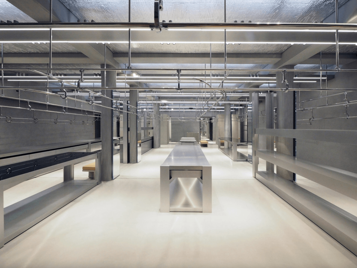
JH: When we designed the Seoul store, the 032c program was defining for us in the design process. They wanted to create a transitional space, where you enter and first see an art installation. So, what we did was very simple. We treated it almost as a square. We divided it diagonally, and you come through the art installation space, which gives a more private feeling to the fashion area. The transition is through the art—that’s the first thing you see—then you enter into the fashion world.
PJG: In the Berlin-Charlottenburg store, you have a distinction between the front space and the back. But in Seoul, it was this big square. How do you divide the square? In pure geometry, you pose this divider and create two rectangles longitudinally, and then everything becomes too small and too long. The best proportion you can get is just cutting it diagonally. What was perfect with the idea of 032c is that you have two facades that are open and two walls that are framing the rest of the space.
JH: It's not good to have a lot of ideas, it's good to focus on one. And this is what it does—to understand immediately, by cutting that and creating this diagonal shape and creating two spaces in one. It's a very strong concept.
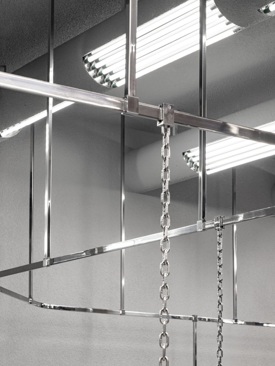
The work is to do that and to play with the language, or the same aesthetic, until the end. So, every element is reacting to this. The hanging chain is the same form you find here on the carpet. Everything is reacting to the first idea, and the more you go into it, the stronger and stronger it becomes.
CKE: And when you design other retail spaces are there certain clients you particularly enjoy working with?
PJG: With Joerg and Maria, it was very straightforward. It was a very quick understanding of what was needed. I think they got it immediately. We did one proposal and that was it.
Sometimes, you get clients who want you, but they don't really want you, you know? We get a lot of those clients because they expect something radical, but as soon as they approach some form of radicality, they start to push back. They realize that what they understood from our work was very visual, but they didn't understand the deeper implications conceptually—and what that means in terms of clients.
JH: The best client is the one who is confident in what we do. The best works are when the client has confidence in us and says, “I’ll follow you.”
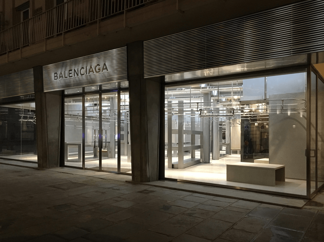
PJG: People such as Andreas Murkudis have always given us carte blanche. Then, when we did the first Balenciaga store, it was also very open, and Demna was trusting.
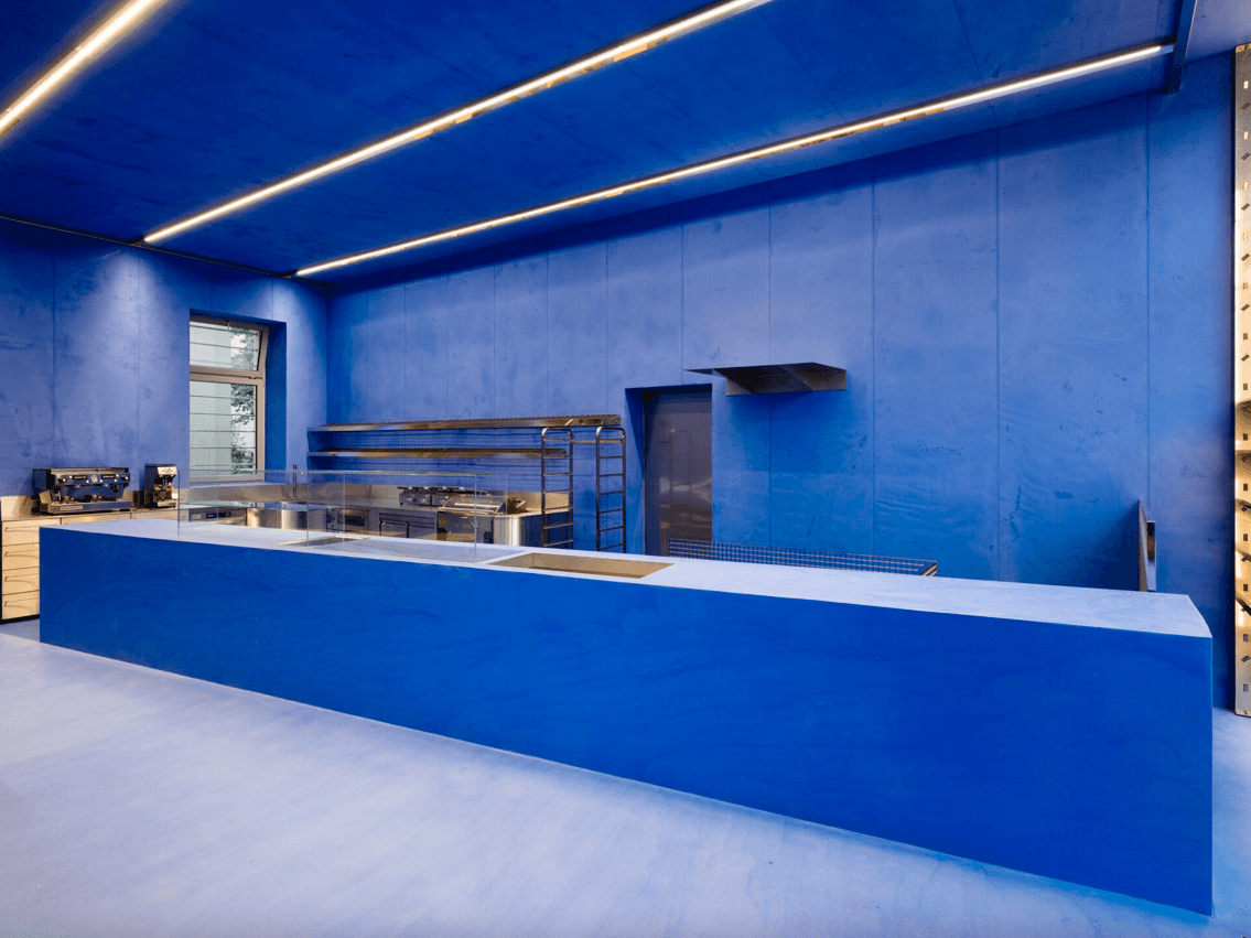
CKE: I was also thinking of a specific space you designed, the AERA bakery in Berlin. When I first saw the space, it seemed really exceptional to me because this is not the design that you would expect for a bakery. It doesn’t really feel like a bakery, it’s more like a gallery space or a luxury retail space. What was the process of designing the space?
PJG: We wanted to do what no one does. That was very simple because if you open Google Images and type in “bakery,” “cafe,” and “bread,” you get millions of pictures that are all beige, cream, a cafe color, stone, or wood. Everything is exactly the same, all over the world. But if you reverse that color, you get to blue.
JH: We were looking into how bread was depicted in art history. Jan Vermeer’s The Milkmaid depicts a woman making bread, and her dress is lapis lazuli blue. It’s a very special pigment, which was super expensive when he used it. She carries the bread, and the bread becomes like a golden nugget in contrast to the blue.
The owners of AERA were a little bit afraid when we first had a conversation about why blue makes the bread more golden. Normally, you would never eat something blue. So, you're in a space where it perhaps becomes totally artificial. But, having seen this image from Jan Vermeer and seen the bread, how it looks aesthetically, we transferred this philosophy into a whole monochrome blue space. They have it on the floor, on the walls, on the desk.
PJG: And the aesthetic is not just from the color blue, but from the materiality of the blue.
JH: It's not paint, it's pigmented. It's inside the material.
PJG: The concrete is pigmented. When you feel that, you feel the depth of the material.
JH: As a material, the color also changes through the light. In the morning or evening light, it's totally different. You really see its materiality, it's not just a blue paint. And this is why we will always work with materials and not just paint.
PJG: The idea here is the immersion of monochrome. We believe that any monochrome becomes a neutral color or surface. This is something that we have been doing since forever. We started to do this even with the first store for Andreas Murkudis, where we did everything blue.
If you think of the usual white gallery cube, for example, the white is quite technical and practical. It’s something that arose out of hygienic reasons, and it also catches the lighting. But, if you really think about it, you could have done the same with black—without natural light, but with artificial light. The opposite of the gallery is the theater, which is totally closed, never has any natural light and where everything's totally black inside. The film or play creates the magic inside there.
Credits
- Text: CLAIRE KORON ELAT
Related Content
032c Gallery opens in Seoul

Do We Want Anarchy Or Guerilla Warfare? Julian Klincewicz & RASSVET

The story of NICOLAS GHESQUIÈRE and how BALENCIAGA became 21st Century Fashion
Iceberg's Visual Soundscapes
A Film’s Sonic Architecture: DOUG AITKEN

Anime Architecture: How GHOST IN THE SHELL was Built
Gross AI Spam with Cory Arcangel
Tor Studio Evades Synthetic Claustrophobia