Anime Architecture: How GHOST IN THE SHELL was Built
|Thom Bettridge
Just because your art never leaves a screen, it doesn’t mean it’s not real.
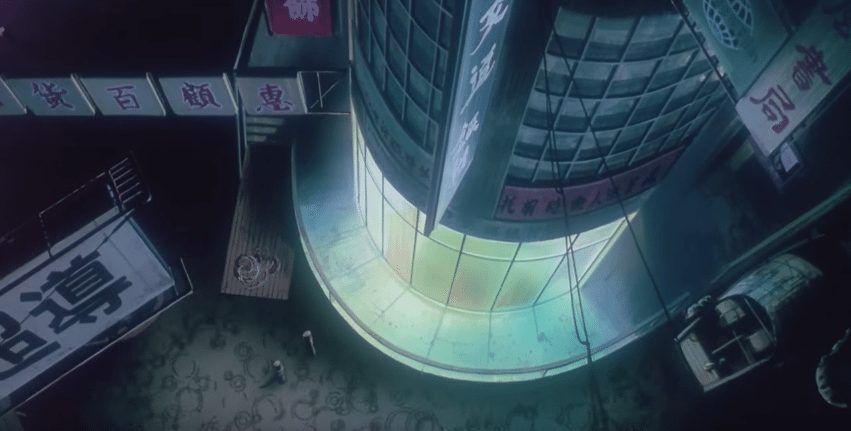
The Japanese cyberpunk classic Ghost In The Shell takes place in the year 2025, in a world at war between mind-hackers and the authorities. At the time, it was the most expensive anime movie ever made, with a budget of $10 million. Its intricate plot and high-cyberpunk philosophy are mixed with some of the most sumptuous, no-expenses-spared visuals ever produced. Through the work of location scouts and production designers, the space of the film is not a simple backdrop: it is a fully realized, tangible world, at once achingly beautiful and claustrophobic, oppressive and liberating, dreamlike and absolutely concrete. This futuristic urban sprawl was perhaps the least fictional aspect of the film. The future is, after all, already here: it’s just not very evenly distributed.
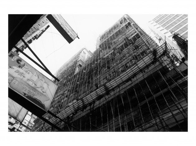
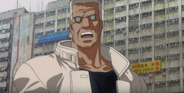
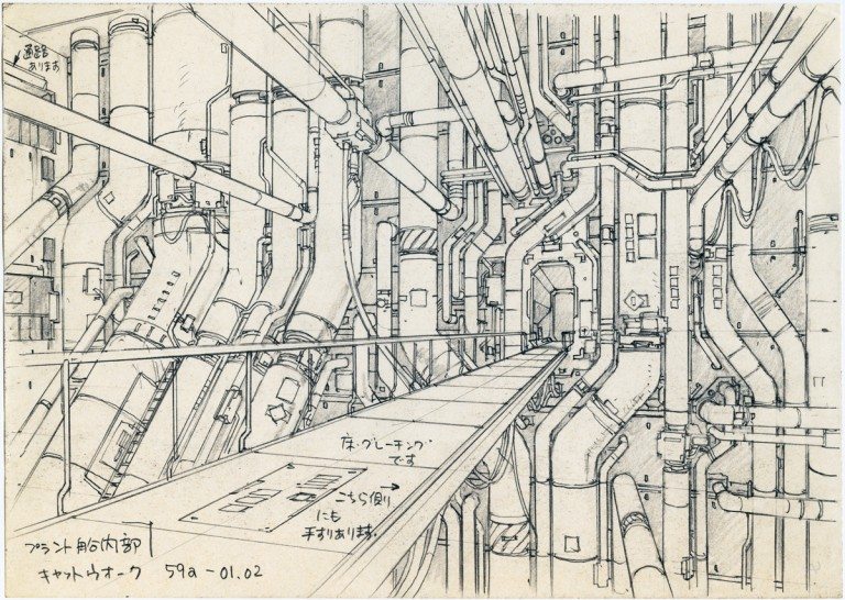
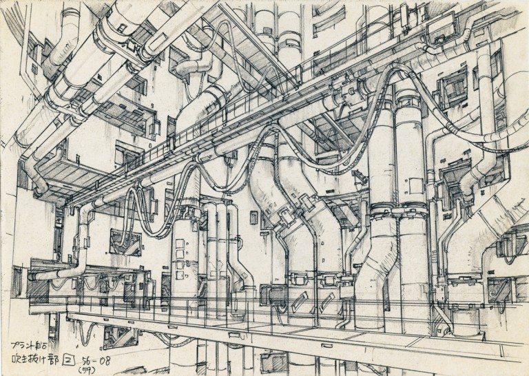
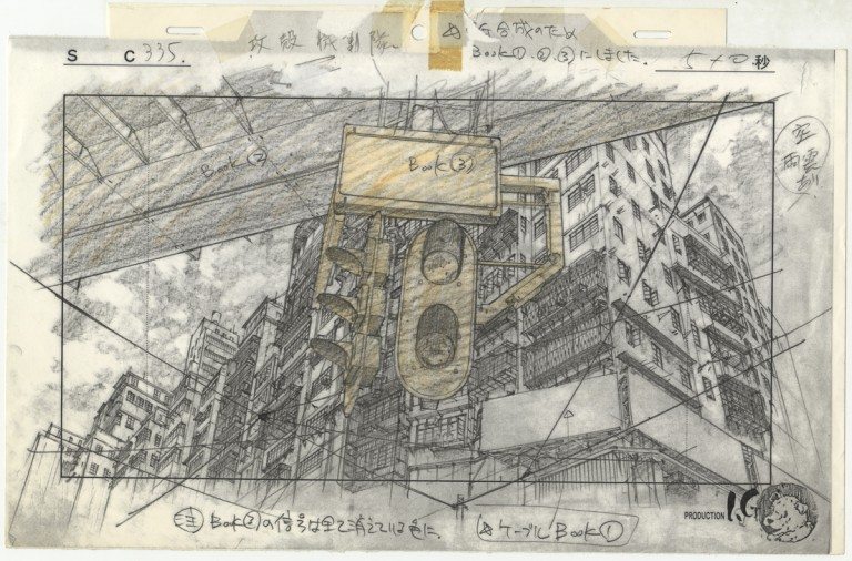
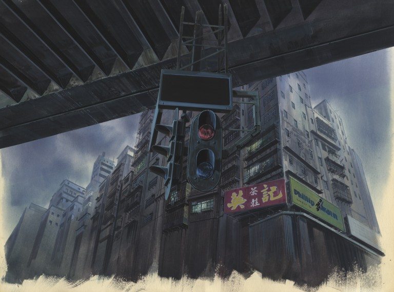
The film’s architecture – a mix of dusty, steroid-pumped brutalism by day, and rain-drenched neon by night – was inspired by the real-life spaces in Tokyo and Hong Kong, including the Kowloon Walled City. Once a Japanese fort, it was the most densely populated area of one of the world’s most densely populated cities: a lawless interzone in a historic free port that served as a byword for an open-air blackmarket in both drugs and electronics. Ghost In The Shell‘s location scout Higami Haruhiku meticulously photographed the area before it was demolished and dissolved into the rest of Kowloon in 1993. These drawings were then realized by Hiromasa Ogura and the rest of the art team in a process of detailed sketching and – finally – producing of animated film.
These shots, drawings, and stills are part of a new exhibition “Anime Architecture,” now on view at Berlin’s Museum for Architectural Drawing. 032c’s Thom Bettridge spoke with curator Stefan Riekeles about building the future, and the extraordinary story behind an extraordinary film.
I’m curious about how you became interested in this project. In what ways does this fictional architecture inform our concepts of real architecture?
STEFAN RIEKELES: the exhibition “Anime Architecture” is an outcome of a longer research in the realm of Japanese animation. With my colleague David d’Heilly I started this endeavour in 2007 when we began visiting the animation artists in their studios in Tokyo. First I was impressed by the amount of work that is necessary to produce a few seconds of animated films. In the studios we saw piles of boxes filled with drawings. Then I was astonished by the quality of the drawings: thousands and thousands of great drawings in cardboard boxes! We were sure that other people wanted to see these, too. And so we decided that we have to show at least a few of them in an exhibition. Which lead us to the major task of finding criteria for the selection.
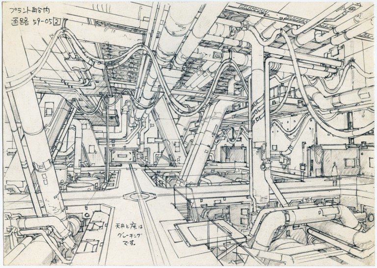
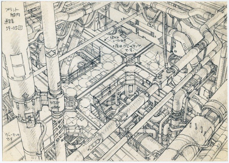
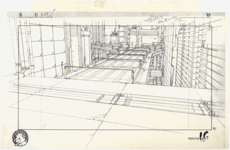
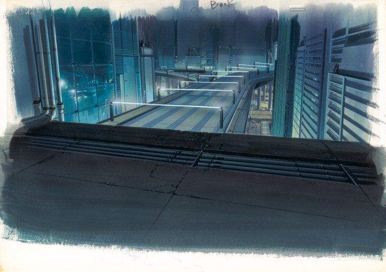
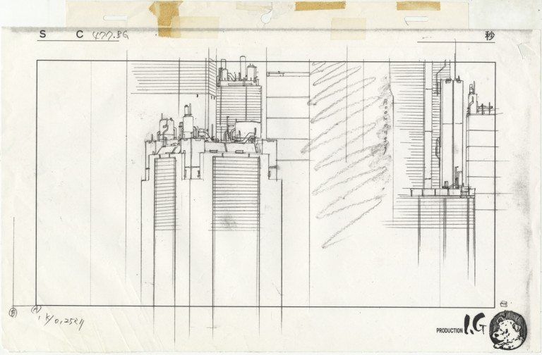
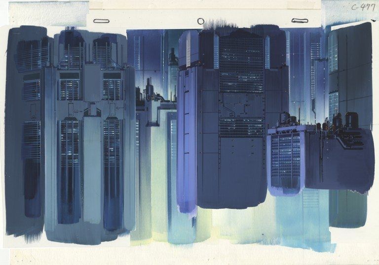
From the beginning I was fascinated by the background illustrations. These works present large parts of the worldview of the film. Some are worked out in great detail yet each one is only visible for a few seconds. The ambivalent status of these drawings: on the one hand these are paintings, on the other they are set decoration, made for the animation camera, is the most interesting point for me. The background illustrations depict urban environments in a way that appeals to the eye of the camera first. The artists have to consider the optical characteristics of the camera lens. Therefore you can often see distorted angles, for example fish-eye perspectives, on paper. Another fascinating feature of my backgrounds is that the image is layered. You have actually background, middleground and foreground, sometimes even more layers. By moving the layers independently in front of the camera it is possible to generate effects of depth. It looks as if the camera is panning or moving into the background. So the illustrations possess a physical structure of their own. I call this the architecture of the image. You can read the title of the exhibition in both ways: “architecture in anime” or “architecture of anime.”
From an architectural point of view, what stands out to you about Ghost in the Shell? What type of world is it set in?
The world of Ghost in the Shell, based on the manga by Masamune Shirow is “exotic.” That is a strange word and I’m only referring to it here because Mamoru Oshii, the director of the film, is using it to describe the worldview of Ghost in the Shell.
In the 1990s Asia, especially the growth of China, stimulated a large discourse about the future of large cities. In the visual arts it was the exhibition “Cities on the move” by Hou Hanru and Hans-Ulrich Obrist, in which David d’Heilly actually took part, which captured these ideas best. Ghost in the Shell reflects this mood in its story and visual language.
The idea was to evoke a feeling of submerging into the deep levels of the city, where a flood of information overflows the human senses and a lot of noise surrounds the people. The artists were looking for an expression of a crowded space. They found a blueprint for such a place in Hong Kong, which is exotic enough for a Japanese audience to evoke a feeling of alienation and strangeness but familiar enough to relate their daily life to.
The film is set partially in Hong Kong of the 90s and partially in a fictional so called “new city.” The new city represents the future while the real Hong Kong figures as the past.
How did you discover Higami Haruhiku’s location scouting photographs for Ghost in the Shell? In what way did they change you view on the drawn environments in the film?
He is one of very few locations photographers for animated films. When we were talking to [art director] Hiromasa Ogura he explained the process of building the world of Ghost in the Shell. The “old city” is based on location shots by Higami. These are done in black and white because they should only show the build architecture for the scenes.
Based on these photographs, the layout designer produced line drawings which served as blueprints for the coloured illustrations of the backgrounds. Colour is the job of the art director. Ogura took his own photographs in colour to develop the colour palette of the backgrounds.

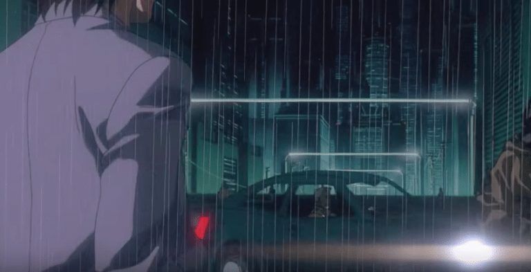
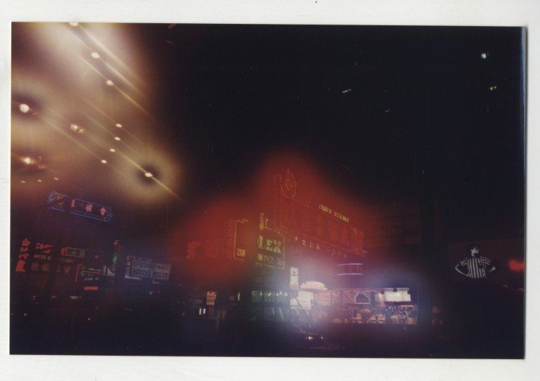
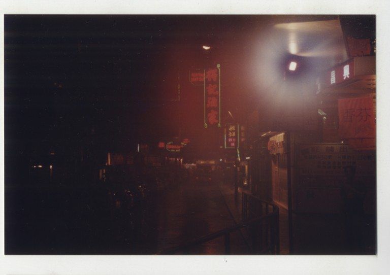
While shooting, he went into an air-conditioned shop, and when he returned to the humid night air, his camera misted up, inspiring the hazy design of the film's billboards and backgrounds.
For the “new city” the process was different because there were no real locations to start from. The job of the layout and concept designer, mostly that of Takashi Watabe, was to invent, to construct that urban environment. Watabe is the architect of the set. He designed most buildings and scenes which could not be photographed.
The art director then blended both parts into a coherent world with immanent contrasts of old and new. That is a very exciting process to follow.
It’s interesting to think that these fantasy spaces are based on concrete locations in reality. How do these environments in the film reflect on the architecture of Tokyo at this time? Was it a particularly dystopian mood that existed in the country’s landscapes? Or perhaps something imagined that was then projected onto these real environments?
This film, released 1995, was the continuation of Oshii’s reflection of the Asian megacity, which he started with Patlabor in 1989 and continued after Ghost in the Shell with [its sequel] Innocence in 2004. Patlabor is set in a realistic urban depiction of Tokyo. Innocence is located in a purely fictional Asian world. The world of Ghost in the Shell is a hybrid of these poles.
Haruhiko Higami photographed city views as concept photography for the development of storyboards and backgrounds of the film Patlabor: The Movie. Tokyo was once a lagoon city with many canals surrounding the Imperial Palace. Most of the channels, dating back to the Edo period (1603–1867), were filled in the 1960s. As local research, Oshii and his team criss-crossed Tokyo by boat through remaining old channels to find new, unusual perspectives and hidden views. This rarely seen other face of Tokyo was used in the backgrounds through the whole film.
The setting of Innocence is, in comparison with Ghost in the Shell, further abstracted from a real city. In order to present a world living 30 years in the future and remain believable, Oshii decided to use a production design strongly featuring the ornamentation and formal language of the pre-industrial Asian mainland. In contrast to the high-tech vehicles and mechanical bodies stands an East Asian vision of a future metropolis.
In 2004 the film Tokyo Scanner was produced for the “Cities of the World” exhibition at the opening of Roppongi Hills, one of the largest urban development projects in Tokyo at the turn of the millennium.
Produced by the Mori Building Corporation in cooperation with Mamoru Oshii, the movie blends the cinematic vision of the director with real estate projects of the company. It thus highlights the close connection between technology, urban visions and the fantasy world of Anime.
Built by the Mori Building Corporation, the mega-complex houses offices, apartments, restaurants, cafes, cinemas, a museum, a hotel, a large TV studio, an outdoor theater and parks. The central element is the 54-story Mori Tower. Seventeen years after the earliest designs, the complex was opened on the 23rd of April 2003. Roppongi Hills cost over 4 billion Euros and was built on a 109,000 mm² site. The construction site was bought over a period of fourteen years from more than 400 landowners, some of who had lived in traditional wooden houses.
Credits
- Interview: Thom Bettridge
