All Networks Lead Through Kansas: The Text Image
|PHILLIP PYLE
In his column ALL NETWORKS LEAD THROUGH KANSAS, Phillip Pyle investigates the trends he sees, hears, and senses online. ALL NETWORKS proposes that online life is, for the most part, still physically and socially contingent, no matter how invisible, untouchable, or ineffable the internet and its decentralized future Web 3.0 may seem to be. Moving between what he encounters through “digging,” algorithmic feeds, and his experiences in the places he’s staying—starting with Kansas, the place where the internet first touched him—Pyle plots currents across culture, seeing where IRL and URL worlds fit (or don’t fit), forecasting where things might be going.
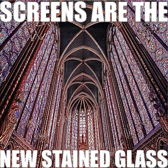
The image is on the decline.
Or, like the author, maybe the image has already died—at least its aura. 15 years ago, Boris Groys attributed this to the digital industrialization of images, writing that, “mechanical reproduction may be understood as the lifeless repetition of the dead image.”
Art critics and postmodernists have long expounded the metaphorical demise of the vitality of images, at the least as entities born from a single maker and charged with inherent meaning. However, that doesn’t change the fact that the image, as a reproducible, malleable, and shareable entity, has more or less been in a state of ascendance since the invention of early printing technologies.
However, now surrounded by too many images that hold too many truths and untruths, too many references and too little context, the image has entered a novel era of precarity. This is not to say the image is going away as a mainstream support to claims of truth, authenticity, and communication, but rather that the image, as a trusted mode of communication and mode of creation within digital subcultures, arts communities, and networks, is slowly fading into obsolescence as text moves to the fore.
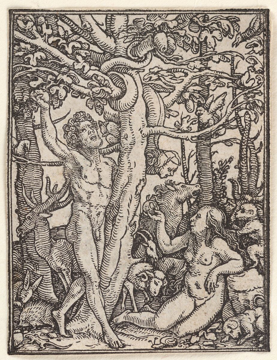
This comes at the tail end of years of image speed. Owing much to the accelerationist thought and cultural curation to come out of the Cybernetic Culture Research Unit in the 1990s, a few key aesthetic paradigms have dominated perceptions of coolness and validity amongst niche internet communities. One such aesthetic is “schizoposting,” which was defined by Günseli Yalcinkaya as “an unfiltered approach to sharing information via unintelligible text walls, memes, and videos”—and exemplified by the excessively cryptic lockdown era TikToks of Dimes Square associated writer Honor Levy and the vaguely cultish thought propounded by the anonymous internet critic, Substack, and persona Angelicism01 (and its many imitators).
“Nu-spiritualism” is another aesthetic direction, which, Yalcinkaya continues, is similarly opaque in expression and meaning, collapsing new age spiritualism, pagan and gnostic motifs, and an unshakeable faith in the algorithm as a holder of higher meaning. Evident in philosophy-bent meme accounts including @vitruviangrimace and @avocado_ibuprofen and the mystical lore and messaging of the Swedish collective Drain Gang, nu-spiritualism constitutes a kind of meme-ified leap of faith. The aesthetic can read as an attempt to find religious meaning in the coming Singularity (the hypothetical where AI reaches a point of constant development beyond human command) at the same time that the conditions of real life are worsening every day.
The third strand of visual communication that acts as a trace of memetic velocity is Hito Steyerl’s “poor image.” Deemed “bastards” of the original image by Steyerl nearly 15 years ago, poor images originally harbored a potential for critique, insofar as they reflected the global, late capitalist conditions of dissemination, displacement, decontextualization, and degradation that led to their lo-res quality. Originally associated with pirated videos, lo-res JPEGs, and pixelated image files, poor images have functioned as the visual schema for everything from Dean Blunt's underground label World Music to the aesthetics of contemporary meme culture. However, as artist Ana Viktoria Dzinic aptly pointed out in her 032c interview, poor images—once an opportunity for cultural gatekeeping and preservation—are now just another “aesthetic form that has been co-opted by capital.”
Speed runs through it all—the “schizo-images,” the “nu-spiritual” ones, and the “poor” ones—effectively transforming the image, a once trusted mode of communication, expression, and knowledge, into a pure memetic gesture of performance. The image no longer holds sacred meaning. What Barthes said about the word has occurred to the image, “The unity of a text is not in its origin, it is in its destination.” And while this doesn’t seem to be an issue for most, within pockets of underground internet and IRL cultures, a new current of aesthetic communication has recently arisen that seems to deal precisely with the image’s death as we once knew it.
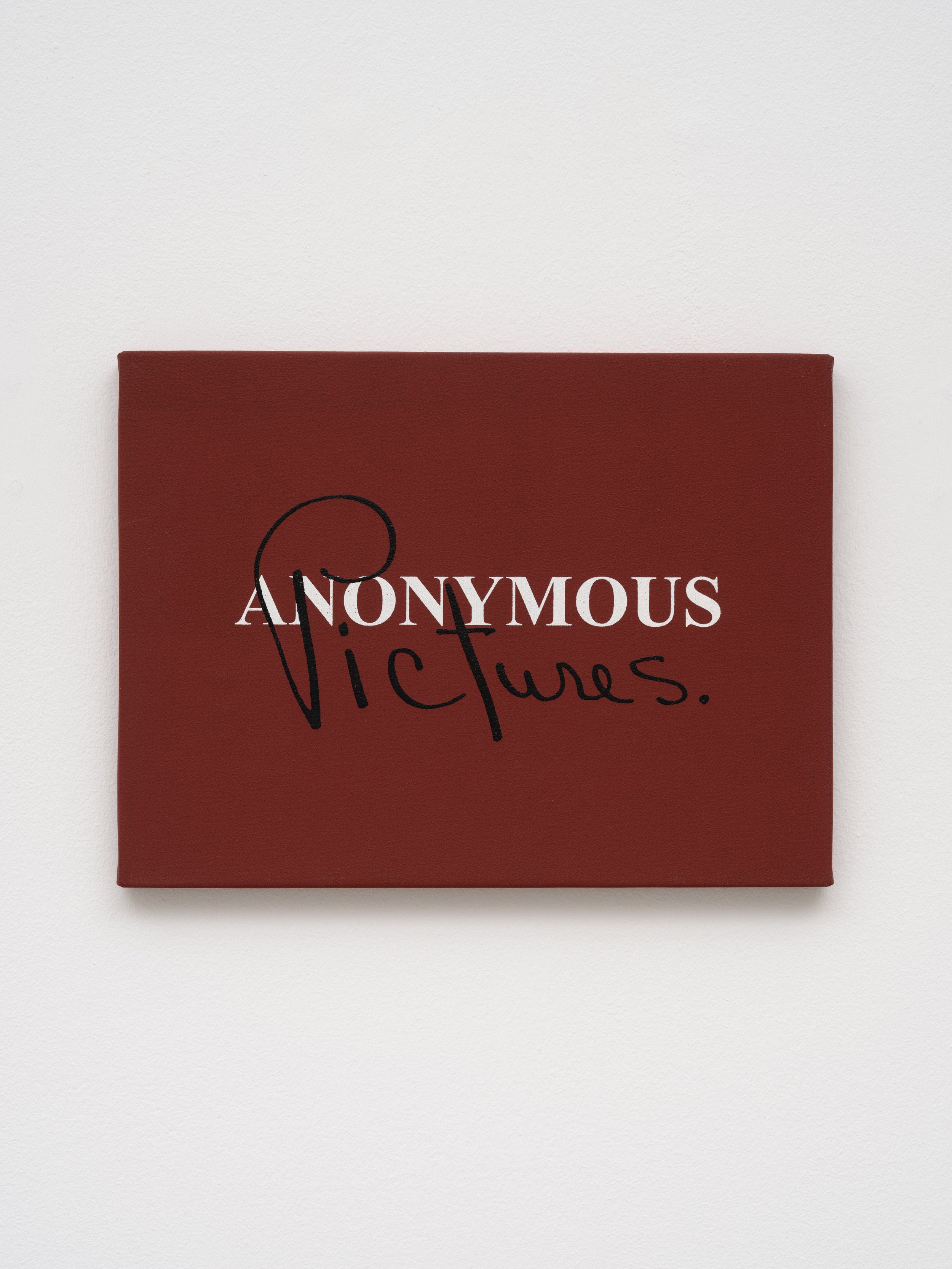
The Text Image
The text image is an image that returns text as a primary marker of meaning. Itself minimal in text, the text image neither fully subscribes to word nor image. Constituting something akin to a “secret third thing,” the text image is the offspring of contemporary art historical theories, including Tina M. Campt’s model of “listening to images,” that propose diagonal, almost synesthetic engagement with once stable channels for representing meaning.
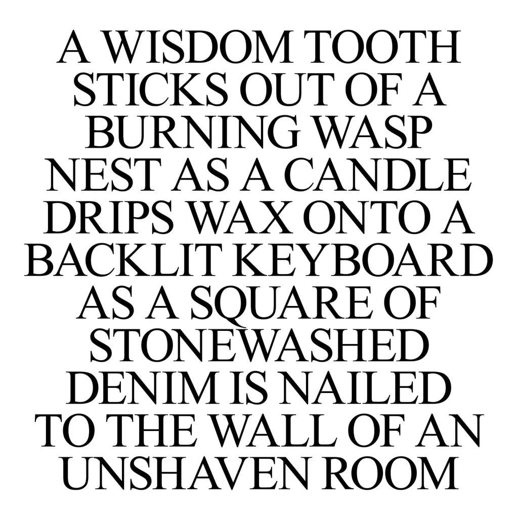
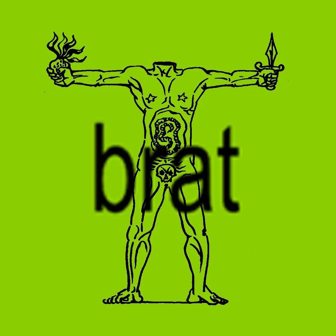
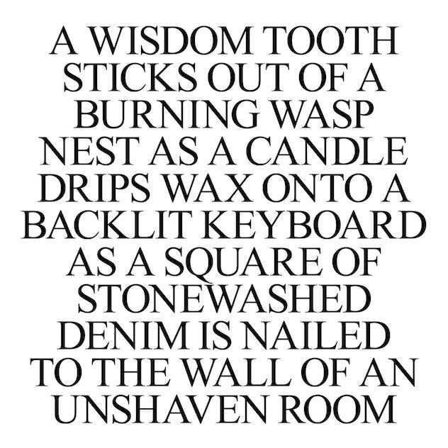
In some instances, the text image is merely text over a colored backdrop. The album cover for Amnesia Scanner and Freeka Tet’s 2023 STROBE.RIP is an example of this form, as the Jaakko Pallasvuo poem resists the “overabundance of imagery today” without submitting to a didactic function of text either. When images do appear in the text image, they are always in subordination to words. These images, used as everything from album covers and party flyers to exhibition posters and close friends story manifestos, began as memes but have recently entered the halls of institutional usage with the release of Charli XCX's Brat—something I’ll touch more on later.
Adjacent to “create mode,” the text over colored backdrop functionality that was added to Instagram in 2018, and the explosion of text over randomly generated image memes made popular through the app Whisper, text images have often taken a minimal or anti-design approach to graphic design and can easily be mistaken for poor images. However, unlike poor images, which at their core are born from outside interference and technologies of replication and dissemination, text images are fundamentally an act of creation. That creation, though, occurs more on the side of text, the seemingly unrelated background images, notes app backdrops, and randomly chosen background colors both pulling the importance of the text into relief and minimizing the margins for misinterpretation.
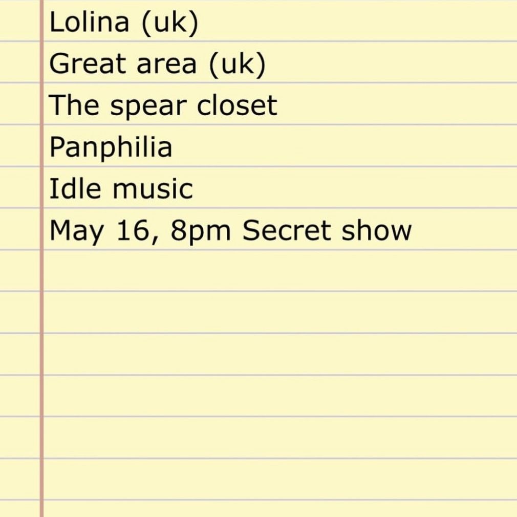

I first noticed text images as a mode of aesthetic communication for underground music and arts communities a couple of years ago in the flyers of the now defunct Kansas City ambient music label and mix platform C minus (known for their releases with artists including Huerco S., Umfang, Ian Kim Judd, Nick Léon, Eera, CCL, and Lolina). The flyer for their farewell show at Public Records in Brooklyn last fall, for instance, was simply a list of artist names hastily photoshopped onto a snapshot of a hotel bedside table. If it was unclear what was going on, that was because of just how clear it was. It simply showed that Lolina, 7038634357, Sydney Spann, fall river music project, Lilic, Kaho Matsui, sleepdial, and Ian Kim Judd were to play on November 9 at Public Records in Brooklyn. However, coming on the tail end of years of conditioning by post-COVID maximalist rave and event flyers and custom typefaces more concerned with their own aesthetic flourish than communicating information, the flyer immediately struck me as somehow novel.
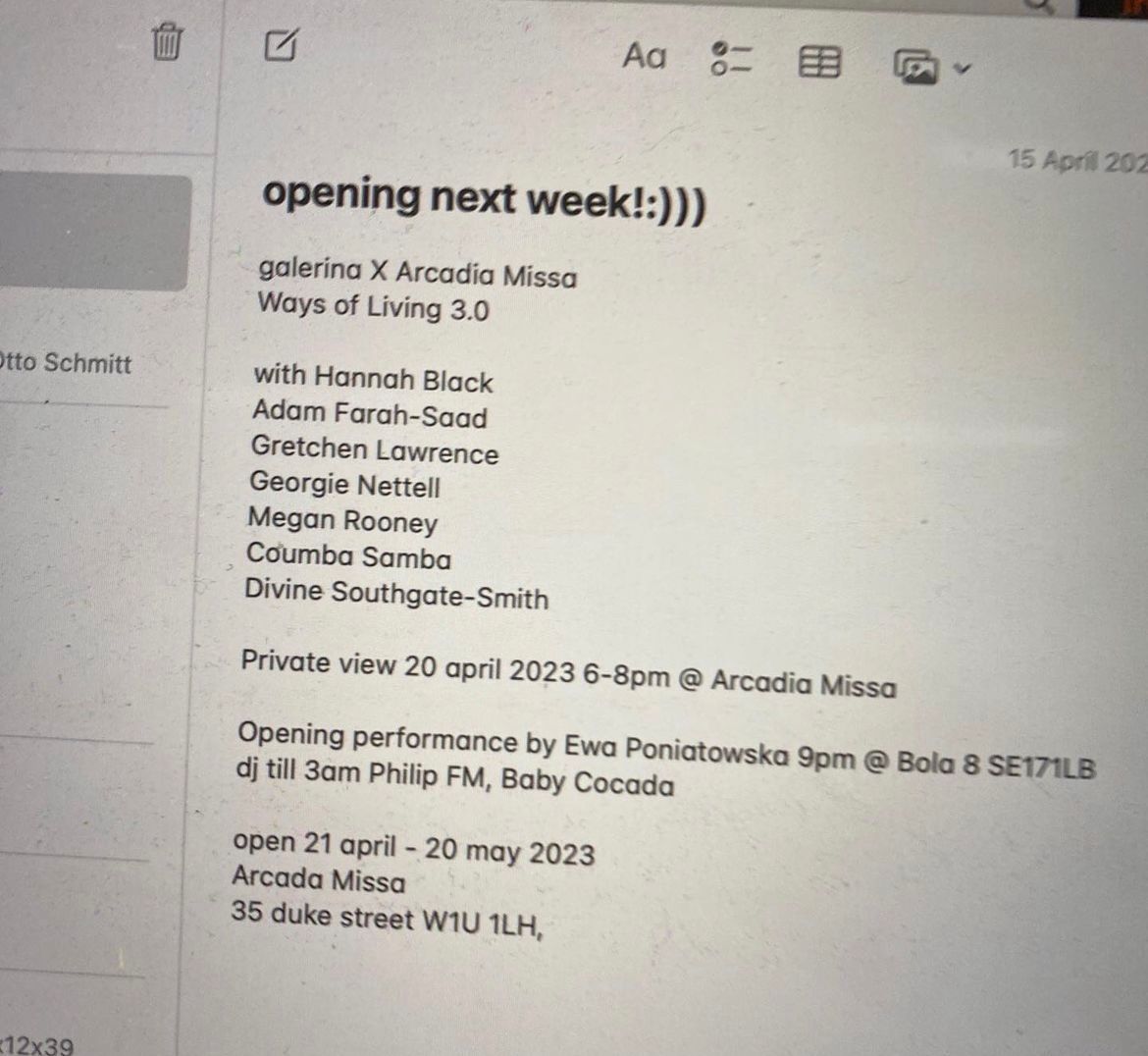
Though I had seen that style before, earlier that summer in England. Then, I came across an Instagram exhibition post for a show by the London curatorial project Galerina at Arcadia Missa, “Ways of Living 3.0.” The post (poster? press release?) was simply an image of an iMac note listing the artists, opening details, and address for the show—a refreshingly simple approach in the midst of seeing too many heavily-designed gallery promotional materials with far too much didact press release writing.
It wasn’t until this winter that I began to link the text image with the falling stock of the image, generally. On my close friends story in early February, I half-jokingly posted “One day—not today—I will say goodbye to the image.” Around the same time, I noticed various other online (and much more astute thinkers) posting thought-out reflections on the image’s fate. Later in February, Paul Skallas tweeted, “Video and the ‘image’ are entering its Faustian stage and will burn out.” Dean Kissick quoted it, replying, “I agree that images are in trouble, and that it’s time to abandon images…,” before qualifying that “spoken word” and “text” are alternatively on the rise. As always, the discourse had lagged behind creation—but the debate had nevertheless entered the chat.
“All the images will disappear.” Annie Ernaux, The Years
The Brat Image
If the text image had been ascending slowly through local underground arts and music scenes and, belatedly, through the discourse of internet thinkers, then it broke out in a rather extreme way—and into the mainstream—with the release of Charli XCX’s sixth studio album Brat. With Charli’s “Party Girl” Bushwick Boiler Room set attended by the likes of Julia Fox and Addison Rae, random club appearances, and “360” music video starring everyone’s favorite internet “it” girls (Chloë Sevigny, Gabbriette, Alex Consani, Hari Nef, Emma Chamberlain, Quenlin Blackwell, etc.), it became clear that a moment of well-orchestrated virality was in the works. Moreover, through specifically focusing on a physical hub of the chronically online (Bushwick) and the esteemed icons of her primarily queer Gen Z and Millennial audience, Charli’s Brat rollout flexed the pop star’s knowledge that the marketing of cultural products has switched from a physical effort to a “hybrid offline-to-online effort,” as has been suggested by Grace Gordon, the former Senior Director of Brand Marketing at CashApp.
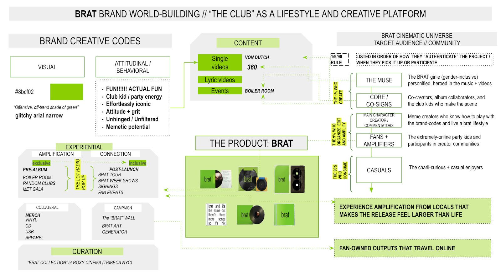
Recognizing that real life experience and validation is a necessary component to sustainable online success, the album launch was supported with a live stream of a changing lime green wall in Brooklyn, a curated “Party Girl” film series at the Roxy Cinema, a Brat-style album art online generator, and fan events across major cities. The idea behind it all being that club kids could expand the Brat universe in their own local communities and across global digital channels—and on their own terms.
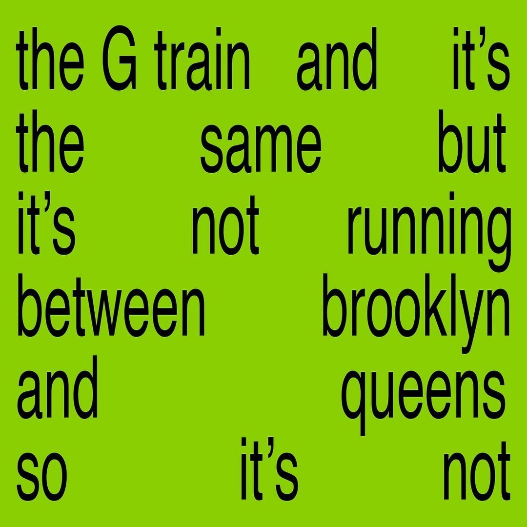
The zero point in Brat’s “bottoms-up” marketing approach lies in its album cover. Designed by the NYC creative firm SPECIAL OFFER, Inc., the stretched, lowercase, low-res arial text over lime green album art has become an unmistakable and endlessly repeated template both online and offline. And although SPECIAL OFFER, Inc. describe themselves as “focused on the growth of subculture through digital experience,” Brat has expanded beyond both subculture and digitality, marking a transitional point for the text image.
The once emergent aesthetic language of hybrid online-offline subcultures now occupies centers of cultural production and even national politics. In the weeks since the album's release, the Brat version of the text image has been used by The Whitney, the MTA in an announcement of the G train’s suspension, and, most recently, as the official header for the Kamala Harris campaign HQ page on X. With Harris already being named the “meme candidate,” the text image has entered the popular space where memes supersede politics and the flattened signs of subculture replace the material conditions of their circulation.
At first, the text image offered us a shot at communicating reality. Unlike many of the other subcultural communication strategies popularized over the past few years, the text image reorients real, physical experiences as the main goal of a party flyer, an album cover, or an exhibition poster. Supported by an implicit philosophy somewhere between “Squad Wealth”—a widely circulated 2020 manifesto advocating that squads are now “at the center of social, cultural, and economic life”—and “The Host Manifesto”—Angel Prost’s PDF guide on which archetypes to invite to host your party and, more importantly, to include on the flyer—the text image both communicates the key names, communities, or even ideas of a particular cultural event or product at the same time that it resists collapsing its messaging to the insularity of a squad or the digital clout bombing of a host-focused party.
The text image ultimately represents its fundamental IRL-URL interaction in intentionally minimal, easy-to-interpret, and reproducible terms. Unsurprisingly, Grace Gordon attributes the success of Brat to a sense of realness, too. She suggests that “people need to feel that your product and brand is real.” However, now that the text image has entered a mainstream visual economy that values flatness above all else, the reality that it promises might just dissipate as soon as we grasp it.
The Reality Principle
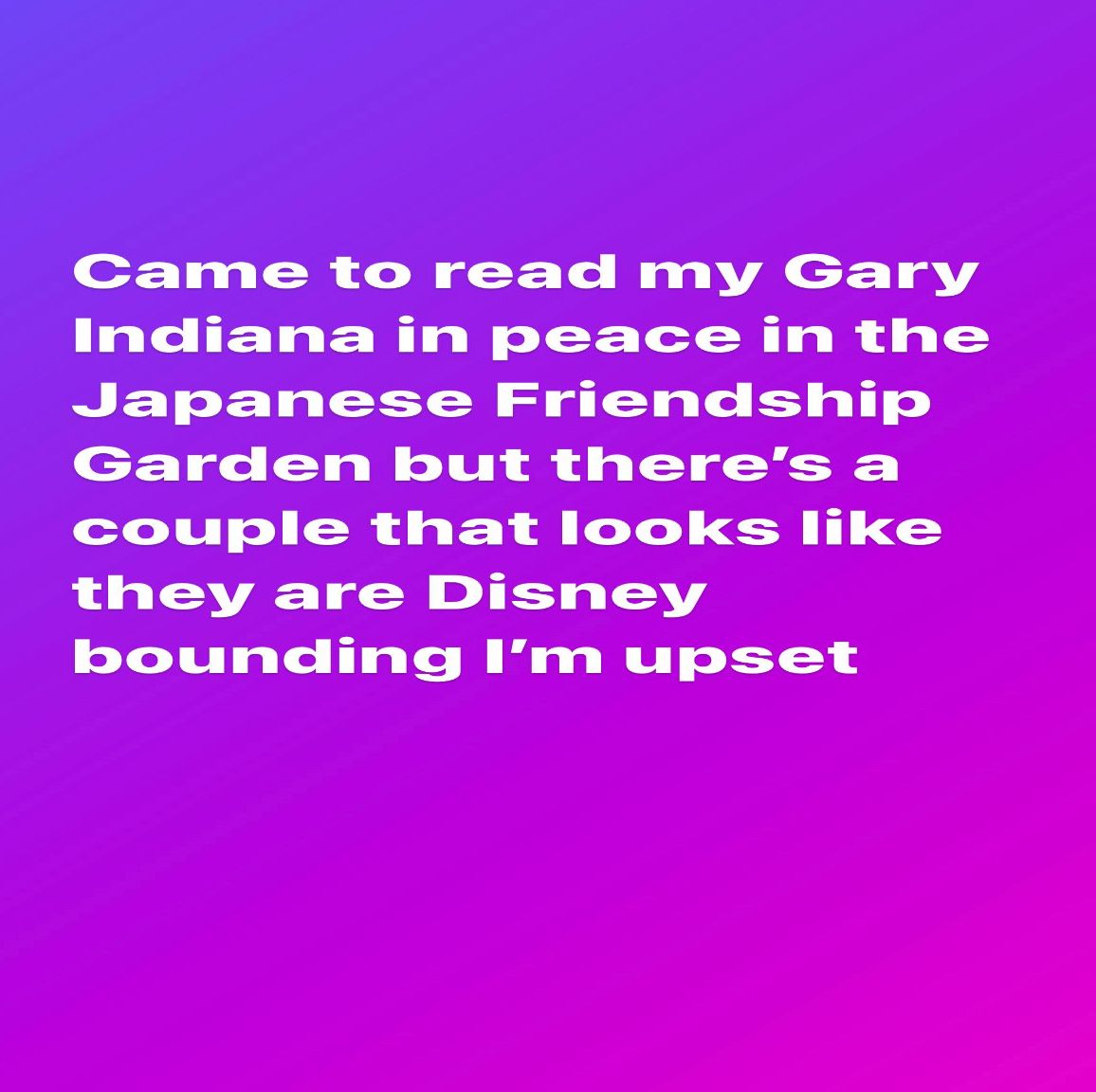
My reflections on the text image came into sharper focus when I returned home to Kansas City this past May. I posted a close friends story of white text over a purple background. The note was inconsequential, a passing reflection on seeing a couple “Disney bounding” (an online trend and meme where adults dress as Disney characters; at times, to go to Disney World, at others merely out of recreation) in real life. The story appeared on my sister’s main public story minutes later. I reloaded Instagram and it was suddenly on nearly every account on my feed’s Instagram stories and grids, including 032c’s. I panicked and convinced myself that I, or someone with access to my account, somehow broke Instagram. The first-hand experience I hoped to convey only to intimate friends had (at least in my initial estimation) spread like a virus throughout my entire feed.
That same weekend, a friend of mine wore a fitted Anna Bolina dress that reads “Drama Power Greed Waste Money” out to a new club in Kansas City—and as made clear by the many Anna Bolina imitators on Depop, Etsy, eBay, and fast fashion brands, it seems that the text image is clearly becoming more popular in fashion, too. My friend Ryan, who ran the aforementioned label C minus, gifted me a physical CD of an EP that he released through his new label, Linoleum Records, one which I had been streaming obsessively for months. The cover for the electro-folk project, Pumpkin by Fall River Music Project, is a text image: A rectangle with “fall river music project” in lowercase stamped on a piece of cardboard. The digital cover is an image of the physical CD stamped with the text. The physical gift only confirmed the sort of IRL-URL mutualism inherent to the text image. Around that time, I also attended a club night DJed by one of the former C minus associated artists, Mister Water Wet. The flyer advertising it? Lo-fi arial against a lime green Brat background.
As true to its original intent, the text image had reached me on the level of reality—one that is neither exclusively online nor offline in the same way that contemporary life cannot adequately be described by either terms alone. Often beginning from personal interest in a particular cultural phenomenon, artwork, or product, the text image slowly and deliberately transforms subjective experiences into collective ones. In this, it is similar to algorithms, generating communities around particular tastes or aesthetics. However, now that the text image is at the center of the feed, it seems the venomous speed has reached it, too, treating it just like every other image that it originally opposed and estranging it from the IRL side of its makeup. Images may never leave us on their own accord, but for those privy to the cycles of politicized usurpation and debilitation that accompany the image’s conventional usage, abandonment may just be the next course of action.
Credits
- Text: PHILLIP PYLE
Related Content

The New American Dream Is Sponsored by Meta: ANA VIKTORIA DZINIC
An Album is a Tragedy: AMNESIA SCANNER & FREEKA TET
Post-Music: Apocalypse Soundcheck

An Analysis of The Backrooms—Also Known as the Internet's Horror Rooms
Disco Isn’t Dead. It Has Gone to War
Image Stacks With ISABELLE GRAW

Love in the Time of Prompting: SHUMON BASAR and Y7’s CORE+LORE
Runway Music: Electro-Indie-It-Girls
Image Spamming with Paul Hameline
ARIA DEAN Life World
The Erotics of the Nerd
An Internet the Size of a Room: Berlin Review