JESSI REAVES Leaves it dirty
|Octavia Bürgel
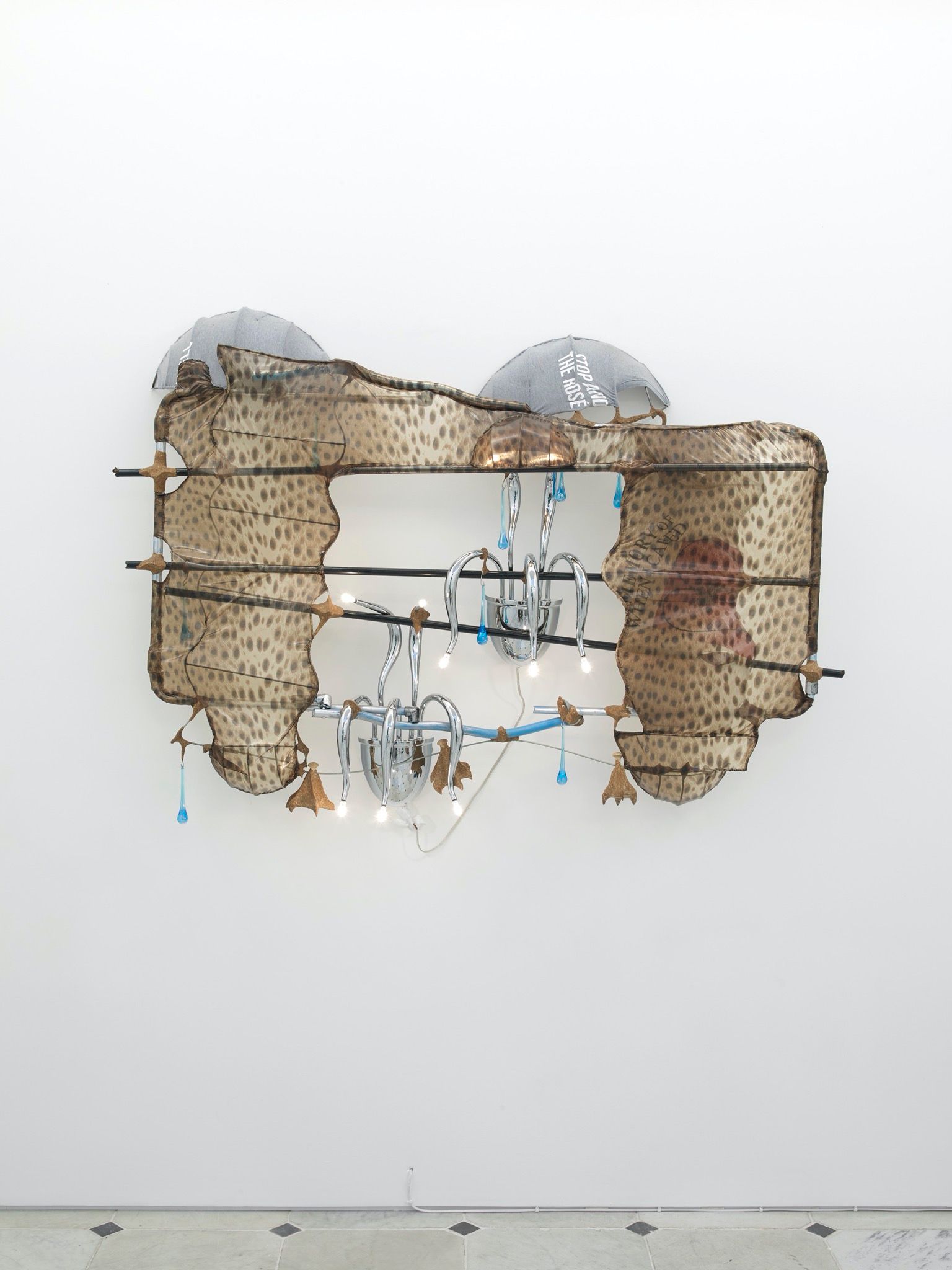
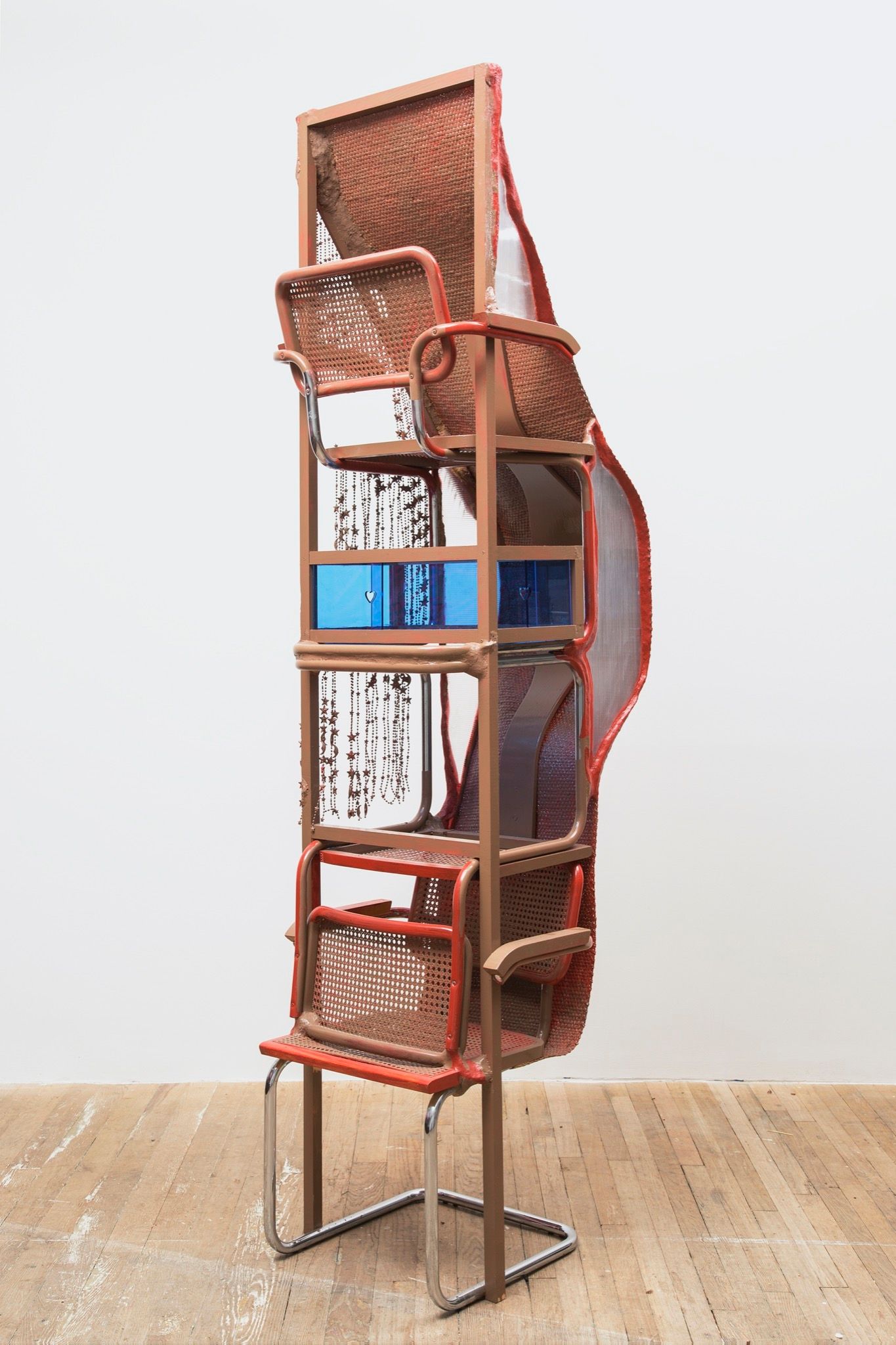
“Good design shouldn’t be noticed,” goes the cliché. Charles and Ray Eames’ aim with their designs, for example, was famously to shape how users act – without them being aware of it. In her early sculptures, artist Jessi Reaves took such modernist design icons as her raw materials. By reworking Eames and Isamu Noguchi “masterpieces,” she was challenging their design ethos – resulting in perfection besmirched, functionalism unusable, beauty (sometimes literally) turned inside out. The work left an impression less of destruction than of playfulness. Anti-functionalism veered into absurdism.
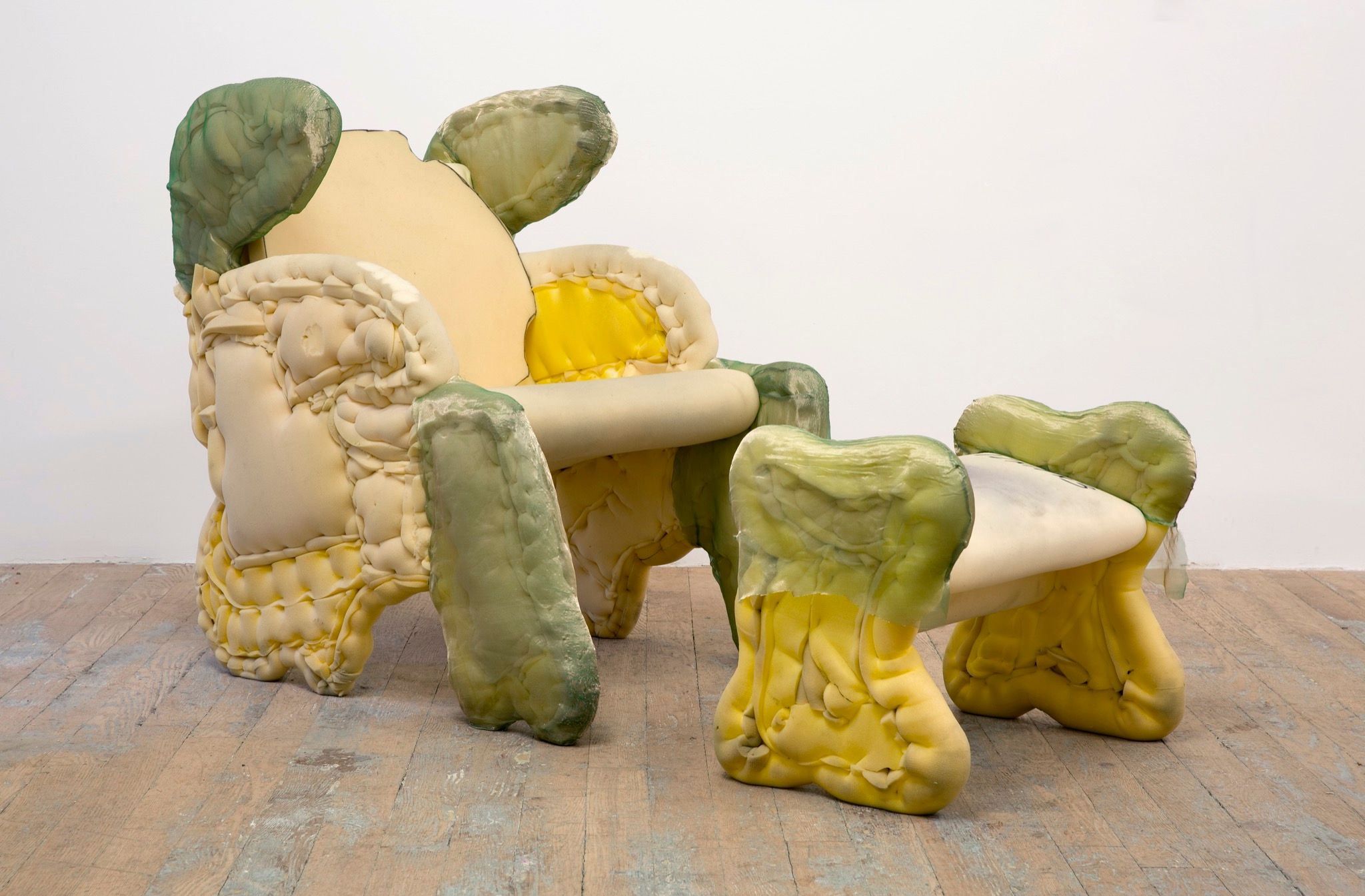
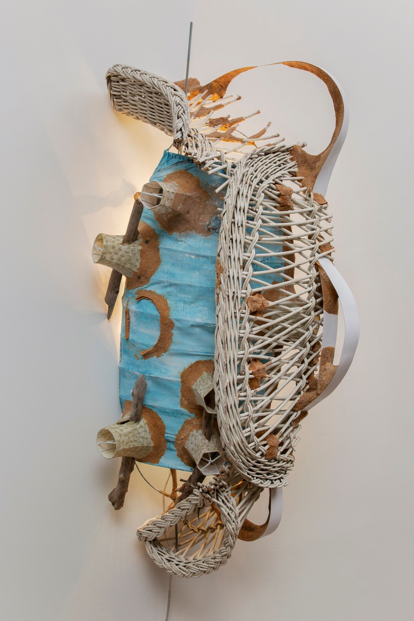
Reaves’ more recent work leaves her design ancestors behind, but finds the surreal in the quotidian in headboards without beds and “waterproof” shelves. Reaves refuses the distinction between art and craft, but doesn’t rely on visible mastery or technical prowess. Instead, she pursues the unrefined innocence and playful sensuality that craftwork can attain. Amid the mischief, there is an honesty to the materials used: almost everything is made of plywood, sawdust, and foam – supplies that, these days, are normally concealed within the furnishings that surround us. Peeling back the surface of the everyday, in other words, Reaves reveals the beauty of bare bones.
Octavia Bürgel: I’ve been thinking a lot about arts education and what it should look like. In general, institutions are interesting to discuss right now, because I think the experience of Covid has lifted the veil off of the systems we play into.
Jessi Reaves: It certainly has. I’m still digesting what it has been to teach during Covid. I was teaching at Cornell University for the first time, and I didn’t even get to go there. It was all through Zoom. It was a tough year to try to instill confidence in people about making art, but the pandemic also brought really cool parameters with it. The undergrad students have limited resources to begin with – money and other things that restrict what you’re able to make. It was cool to see how much the students were into drawing and making digital work. Because of the format, I ended up showing them a bunch of video art. I feel like a reference is one of the best things you can share. When I was in college, everybody was obsessed with Neo Rauch, and then the reference went away and for the next 10 years nobody was thinking about or referencing him. I was terrified to show them this video art, thinking, “They’ve probably seen it all.” It’s out there on the internet – I’ve watched these things probably 10–15 times – but it was cool that a lot of them hadn’t seen them before. You take for granted what you already know, and teaching forces you to get past that and reiterate things that, over time, have become second nature.
You studied at the Rhode Island School of Design (RISD) around the same time as Mike Eckhaus and Zoe Latta of Eckhaus Latta. I see strong material resonances with the fashion brand in your sculptural work, even though you’re engaging really different functions.
Mike and Zoe are my really close friends – and part of my origin story. I wouldn’t have moved to New York if it hadn’t been for them. They got this big loft space near the Navy Yard – there were six bedrooms and they encouraged me to move in. I’d visited New York a bunch while I was in Rhode Island, but it’s such a different experience visiting than it is making the decision to live here. I’ve been here 10 years now – shocking! – and I’m completely indebted to New York in every way, in terms of what I’m doing now.
When I moved in with them, Mike and Zoe hadn’t started Eckhaus Latta yet. We were all doing dumb freelance stuff. I’m going to embarrass them, but their big break as a collaborative team was when they got to design this dress for Lady Gaga. They were so excited. They stayed up all night designing this thing and it obviously never happened. It was a lot of shit like that – weird antics, living with six people in this very messy place. When they did start the brand, it was motivating to me on another level. We had just been partying a lot, being low lives. There’s this thing that happens when people around you start to get their shit together. You’re like, “Wait – what am I going to do?” It was motivating and sad, in a way, because I wish there was some deeper drive that I could blame it on. But it was really just a late twenties panic. My other friend started this record label, White Material, and Mike and Zoe started Eckhaus Latta, and I just remember this existential dread of not doing anything. It all helped build towards my being more diligent.
Did you have jobs that allowed you to work in sculpture or in any tactile capacity during that time?
I always had physical jobs – doing window displays, working install for private events, installing custom sculptures for the Syfy Channel. The Syfy Channel job in particular was crazy. I made friends with the building manager, who was this hippie artist. For whatever reason he liked me, and he would have me make things for this crazy mansion in Soho that was owned by the guy who produced The Texas Chainsaw Massacre. The house had these huge windows and I spent so much time there making six-story curtains. I made things for that house for almost a whole year. Anytime anything would break, I would just go work on it. But I also had dumb day jobs. The low point, really, was working at an architecture office.
It’s fascinating that you were basically an on-call repairman. I feel like there’s a way in which your work is almost mimicking the distinction between brokenness and repair. I remember experiencing your installation at the 57th Carnegie International. The room it was presented in was very dim, almost cavernous, and included this large, ottoman-like seating structure that dominated the center of the room. There was a comfort to the environment, but it was an uncanny familiarity. It felt like being a child again, asking, “How do I interact with this?”
I got put in the weirdest part of the museum – what they call the Heinz Hall of Architecture. The Heinz Ketchup family paid all this money to build an architecture wing on the museum in the late 1980s-early 1990s. It sits in that period of time: the walls are yellow stucco and dark wood. There’s a funky decorativeness to it. The museum bought Frank Lloyd Wright’s last office, which was in San Francisco, and piece by piece they had it installed in the room that my work was in. The dimensions of the room are custom to that office. At some point they sold the office to a museum in Buffalo and turned that room into a gallery where they display architectural renderings. It has linen walls where they pin up old blueprints, but they have to keep it dim because the blueprint paper is sensitive to light. Where I grew up, Starbucks was high design. Everybody aspired to have their kitchen look like Starbucks with those glass blown pendant lamps. I made an offhanded comment to the curator when we were walking through the space, like, “This is very Java House.” Somewhere between corporate and artsy, this weird Seattle synthesis. For a while, I regretted saying that, because she was like, “You have to be in the Java room.”
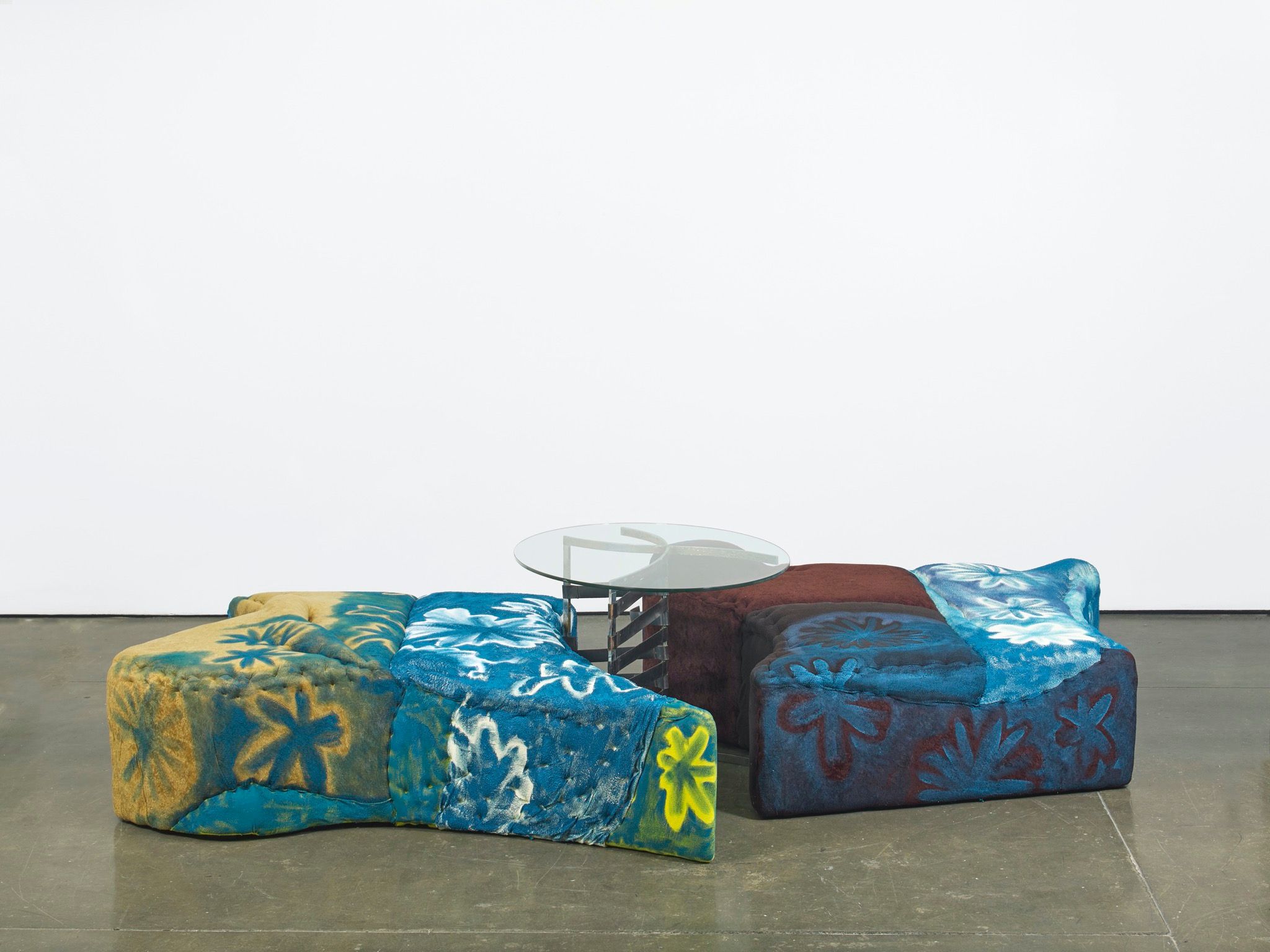
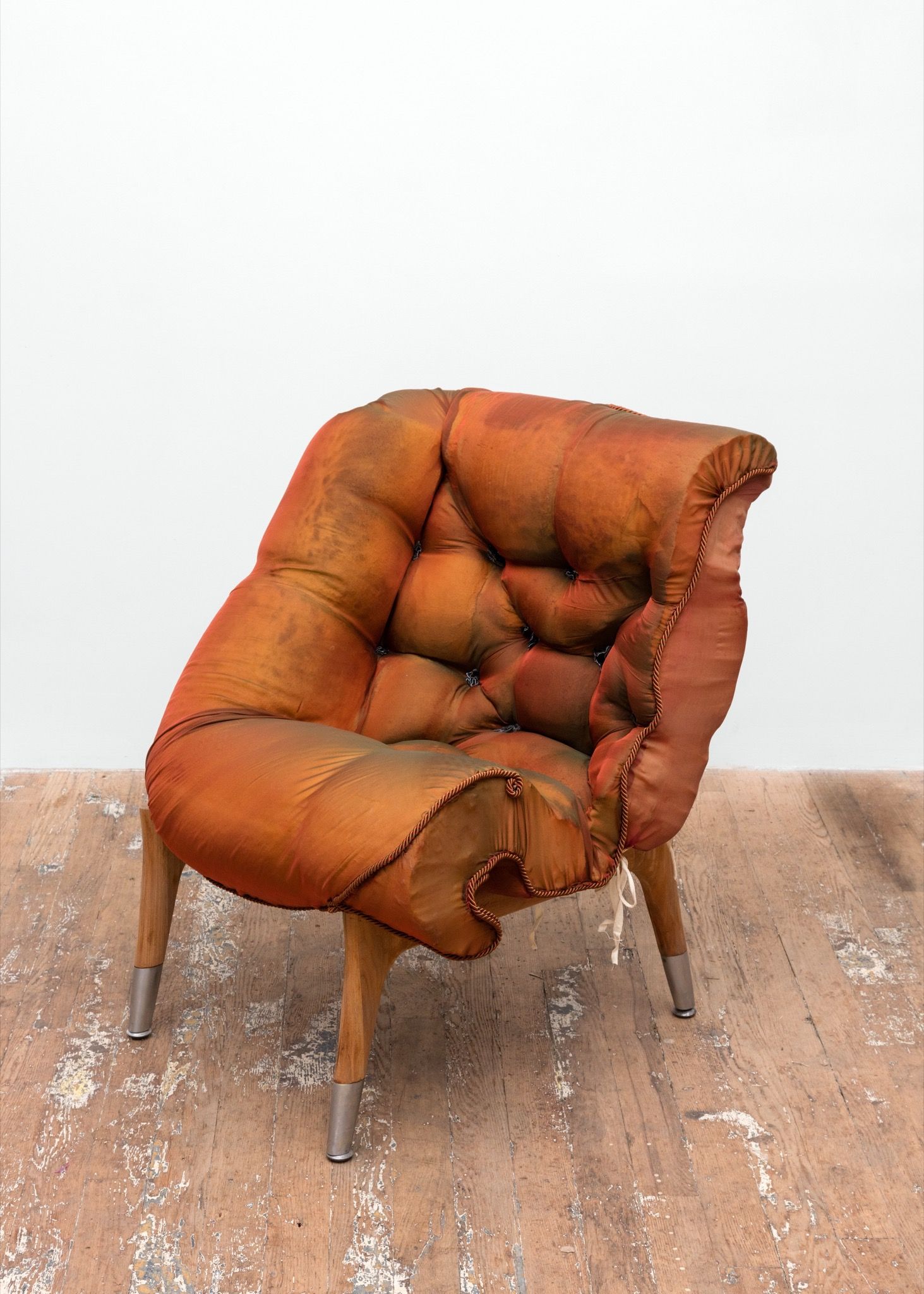
Museums are interesting because you need somewhere for people to sit. It’s part of the design of any museum. If you can do that in a way that’s interesting, you’re controlling where people linger, or what they linger on. I wanted to make that piece such that it sat perfectly between being repulsive – the surface is painted and crusty – but also looking so soft that you can tell you’re supposed to sit there. The more challenging part is how to explain that interaction to people. I don’t want the work to be instructive. I don’t want there to be signage that says, “Please sit.” It’s more about the encounter with the thing – about wondering if you can sit. There’s a certain person who’s willing to test that boundary.
I went to see the Bruce Nauman retrospective at PS1 a couple of years ago, and they showed that work called Body Pressure. It’s a pink poster that doubles as an instructional performance. I was there with a friend who was into modern dance, so this piece was right up her alley. She began following the instructions, and immediately the guard came over and was like, “Sorry, there’s a scheduled performance of the piece at these intervals.” It was a total interruption of a very pure interaction.
I’m surprised by that. It almost works better when you encounter that poster in somebody’s house or something. You’re waiting for them to make coffee and you just have a moment with it. I mean, I hate the idea of performing. How do I even say this? It’s the same way I feel about a music festival, where I’m so aware of the expectation to have fun. You’re looking left and right; you’re reassuring everyone around you that this is fun. I hate the idea of that in my work, but I’ve had the same moment where I’ve gone back to my own show when it’s open to the public and just sat down. Like, “Here I am, reassuring you that you can do this,” demonstrating the casualness, or the potential casualness of the object.
I don’t really think the institution is the best venue for my work for that reason. I much prefer the commercial gallery because you can do what you want. You still own the work most of the time, so you can be a bit more risky with it. One of the weirdest things about the recent show at the Contemporary Arts Museum Houston is that I don’t own most of that work. They hardly let me touch it or move it around. That’s an experience I haven’t had before. I’m lucky to know that way of working with your own work, where it’s almost gone through a phase change. It’s not mine anymore. I would love for people to be able to sit on everything at that show, but I don’t get to make that decision. Hopefully the work of the sculpture, when it was in my hands, was done in a way that you still feel that you could sit. Hopefully it holds on to that. One of the chairs in the Texas show had come straight from this home in LA and was covered with hair. The museum was like, “We’re going to do a quick broom down.” I was like, “Just leave it dirty.”
“I don’t want someone to have to tell you to sit, because it’s more about the encounter with the thing – wondering if you can sit. There’s a certain person who’s willing to test that boundary.”
I actually wanted to ask you about preciousness. I think there’s a transformation that occurs when the art object actualizes as a commodity. But there’s also a preciousness to the curatorial ideal of art. Whereas artists – at least in the conversations I’ve had – are like, “This is some shit that fell out of my brain.”
Truly. It can be hard to take that stuff seriously, because I just see whatever I was trying to figure out at the time. I’m really into momentum in terms of working through ideas. I think the beauty of continuing to make art is that you can travel really far. You wind up somewhere completely different. Something you made three years ago almost looks foreign to you. Sometimes I’ve had regrets that maybe I should never have shown certain artworks. What if I hadn’t shown them? What if I just threw them away? I just try to focus on whatever I’m working on next. Which is awkward about having a show with things from the past.
Is there a dissonance that happens in the meantime?
Yeah. And it’s not that I can’t stand to look at my old work, I just see something different in it now. I have a lot of friends with skeptical attitudes towards what it is to be an artist now. I don’t want to do a virtual walkthrough of the show. I don’t feel that I should have to do that, and it doesn’t feel like it serves the art. I’m like, I did my work and now I’ll back off. But you start to understand, through talking to people, that there are artists who maybe have regrets about not squeezing every opportunity for everything it’s worth. I enjoy the kind of range of advice and experience you can get from people, because no two artists’ careers are the same.
I’ve been into this artist Colette Lumiere. She was really good friends with Jeff Koons and Richard Prince and they made some collaborative work together, but her career went in a very different direction from theirs. It’s so special to discover someone’s work when it’s not completely known, her website is an incredible archive.
“I’m not interested in mastery at all. I’m really interested in the opposite – in what comes out of figuring out how to do something the wrong way, and feeling emboldened to take on building something without the right tool or maybe without even planning ahead of time, just cutting the thing in half.”
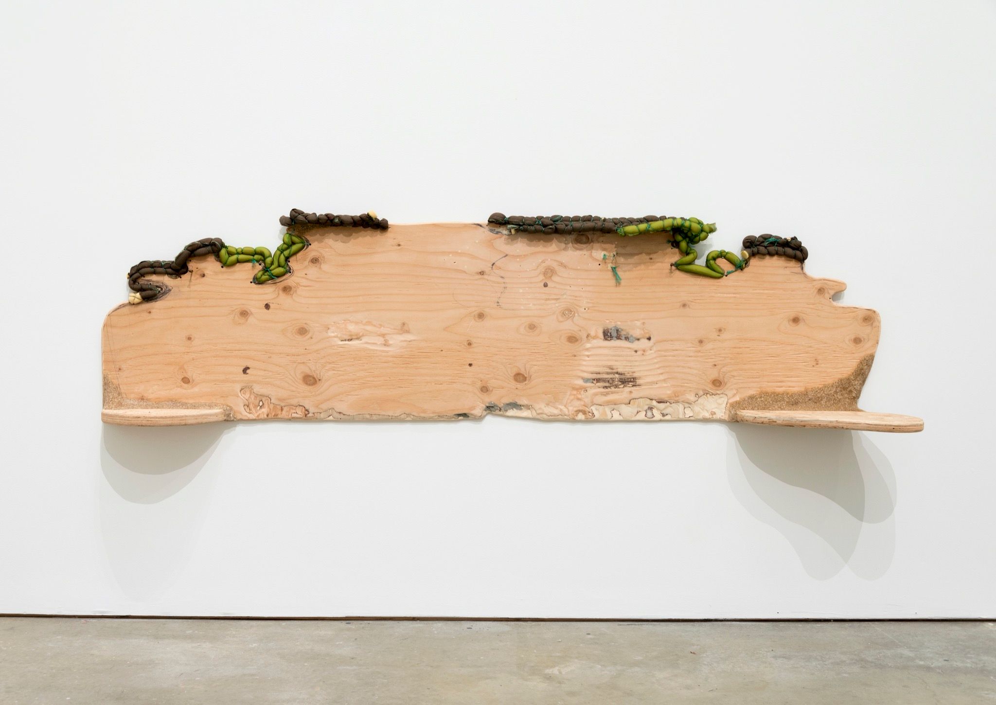
I want to quickly return to what you were saying about getting away with more in a gallery setting. I was looking at an image of one of your headboards. It has this forward motion, jutting out of the gallery wall. It registered as a repellent gesture. There’s a playfulness to the way it keeps the viewer at an arm’s length. Can you speak to that?
Broadly, I’m into object hierarchies and how they inform how design and art interact. There are a lot of sculptures that deal with chairs, and it’s easy to put a certain psychology onto a chair. You can draw the connections effortlessly: an empty chair has a certain sort of psychological weight. When I was working on my last show at Bridget Donahue, the idea of the bed was pestering me. I knew I didn’t want to make a bed; it’s too loaded. I already feel like there is a paradoxical sexual component to some of my work, where it’s both crude and delicate at the same time. So I knew that I didn’t want to make a bed, but I liked the idea of a headboard. It becomes a different type of object without the bed in front of it; it becomes a weird painting, and people were really confused by that. That was the one piece in the show where people asked, “What is it?” It wound up being my favorite for that reason. There is more territory, more tension to push into when there can be a more roundabout way of coming to understand what the object is. That piece also showed me that there is a potential interplay between whatever the headboard is associated with as a functional object, and how I can use the titling to talk about it. I think that was titled Headboard for One, or something that. I liked the idea that the headboard is always symmetrical, and can imply two people. So I made one side of it really small and ungenerous, and then the other side had all these little scooped out places where you could put things. I liked that it was an imbalanced object. My friends have it now, so I get to see it at their house.
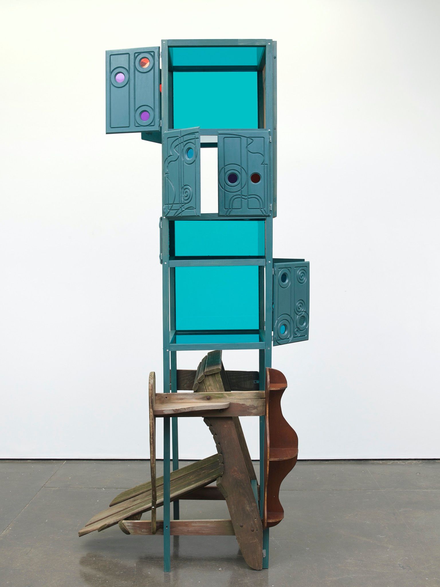
How does it feel to visit your work in a domestic context? I feel like a lot of the time you are also are playing off of ideas of domesticity, or kind of fucking with it.
I really like my friends having my artwork, because I get to see this thing over time. It’s never fully thrilling to me to get a photo from a stranger of the thing in their house. When I was struggling to make stuff during quarantine, I caught up on trades and made a bunch of stuff for friends, which felt better than doing nothing.
I feel the term “craft” is sometimes used as a pejorative, but I also think that there’s a lot of technical knowledge – which is valuable – assumed in the term. I also think “craft” is frequently associated with the activity of women, and I don’t necessarily see a direct link to femininity in your work. The way that I see it expressed is in its juxtaposition with these more coded-masculine things, like woodworking or the language of construction. That’s where I see a tension.
I like that. I’m from Oregon, where the arts are really intertwined with craft. We didn’t have a contemporary art museum, but there was a lot of craft to see. It’s omnipresent. The ideas of mastery and craft are really tied together, but I’m not interested in mastery at all. I’m really interested in the opposite – in what comes out of figuring out how to do something the wrong way, and feeling emboldened to take on building something without the right tool or maybe without even planning ahead of time, just cutting the thing in half. I incorporate a lot of ready-made objects into my sculptures, and I am drawn to a kind of craft sensibility in those things. There’s a detail, a sense of time that comes with a crafted object. You were talking about contrast, or two things coming up against each other. When I take these crafted objects, they collide with my more crude way of putting things together or cutting things apart. They become the detail within the work, where you’ll see this object that’s very sensitively made within something else.
I find there’s often an overgrowth to your handling of material.
I try really hard not to be precious, even if I find something I’m excited about. I’ll let things sit in the studio for a while so that they get dusty and become like everything else. Earlier, if I found something like a couch, I was way more interested in taking it apart – in stripping the leather off until you just have the foam, the leather, the little wooden connections, the frame, these disparate but component parts. Maybe there’s a cool curvature to the back of the couch that you wouldn’t necessarily arrive at without taking it apart. That process was really thrilling to me because I felt like those smaller pieces still held onto some of the information about the source object. When they are redistributed into various artworks, it becomes, like, “This has the back of a Thonet chair.” If you know about that chair – whether you know it to be an important piece in design history, or you just know it as a catering chair – there’s some kind of association there. Inevitably, I still take things apart, and there’s a material revision of these objects, but right now I’m more interested in leaving things whole, in creating a sense of accumulation.
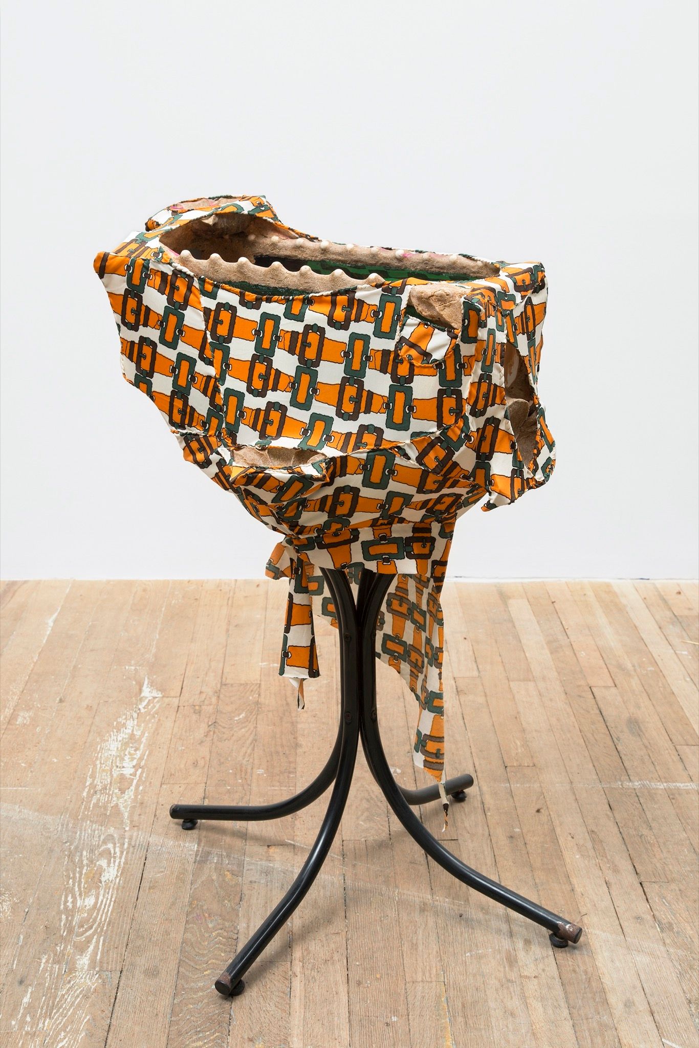
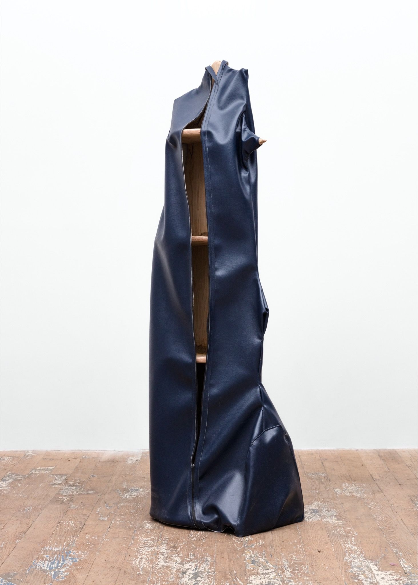
There’s also a dark sense of humor in a lot of the work. Waterproof Shelf comes to mind. I find it really delightful and also quite unsettling – like, under what circumstances does it make sense? That question triggers a whole train of thought about floods or natural disasters. But I mention it also in terms of its wholeness – rather than some of your other sculptures, it really retains the recognizability of the source object. And the slip cover over it becomes this humorous thing, like a banana peel.
I’m so glad that made you laugh. There is an absurdity to the idea of a waterproof shelf. The idea of a slip cover is so funny: it reduces a very complex object, like a car or a boat or a chair, into a very simple form. There is something sad about it. It’s like putting a dog in a little outfit. And then there’s a cool tension – the slip cover is meant to protect the object, but it also makes it more fragile because you can’t see what’s underneath. I think that narrative – even if it doesn’t translate to the finished artwork in a straightforward way – is something that a lot of artists create about their work as they’re working. It might even just be how you refer to something, like a studio shorthand. I’ll be like, “Ugh, the crusty one.” And then that becomes its own story. I could go on like that forever.
I’m also really into the sawdust and glue fixative that shows up in a lot of your work. It’s kind of its own performance. If all you were looking for was a way to glue two pieces together, you could do it fairly discreetly. But instead you’ll opt to use this material that functions as adhesive but also as ornament.
I’m weirdly addicted to that material. It’s so easy to make. I haven’t focused on the performative aspect of it, but you’re right. It’s a play on joinery. You can see that it’s put on. You can feel that it’s like a wood clay or something. It’s similar to what you get from ceramics sometimes, where you really feel the additive process. It’s a free material that I get from the woodshop up the street, and it has limitless potential. It can be a solid cast, it can be how I connect two pieces of metal or wood, or it can be how I cover something like a screw hole or an attachment. It functions so well for me. I love the color of it – it’s putrid. My friend, Thomas Barger, who worked with me for years, got really good at sanding it to a smooth level. At that point I wanted you to be able to reach out and touch it and for it to feel soft. Now, I don’t even worry about that. Half the time, I’ll paint over it. I want it to feel more urgently applied than beautiful.
There are a lot of sketches hanging on the wall behind you. Is that usually how you develop form, or is drawing its own process, separate from sculpture?
It’s very separate. I tape the drawings up so that I don’t spill coffee or water on them, but I also think it’s cute. This is always where I Zoom. It’s nicer than a blank wall. For me, it comes down to timing: logically, the drawing would come first. It would tell you all this information that would be helpful to know going into making something. But there’s an inversion of that as well. There are also pieces of an object that I could never draw – those have to be built in real-time. There’s some weird interaction, and the drawing is a pause in the process. Like, are you going to finish one before the other? I’m also messing with framing – making a frame for the drawing before the drawing. How would you then do the drawings? I have a thing about artists’ frames: I sometimes think they’re overcompensating, like you make the funky frame for the thing because the thing can’t hold up on its own.
A frame also acts as a repellent. It’s a boundary, literally.
I hadn’t considered that. It is a deterrent, like a slipcover, in a way.
I want to quickly return to the show at CAM Houston. There’s a significant generational divide between yourself and Elizabeth Murray. Did the cultural situation of her work, and its juxtaposition with yours, create any new tensions or realizations?
To be honest, they didn’t dwell much on Elizabeth Murray in my art historical education. It was something that I found through friends who were into painting and knew about her. One characteristic of her work, which I really admire, is the fact that it takes up so much space psychically. If you think about the economy of a painting, there’s a logic to it. It’s easy to store. It’s easy to slide a bunch of paintings onto a rack. There’s an obedience to painting that Murray really messes with. Even the flat paintings are a combination of multiple canvases. They’re so hard to install because of how they correspond to one another and the negative space between them. It’s not difficult to admire what she took on, just in terms of the ambition of the objects and their construction. Quite a few of them are actually paintings of furniture – views of tables from the top-down, where the legs spiral out in these weird ways. You do spend part of your life just staring down at the table. She explodes that sad, contemplative moment in a 15-foot, extremely bizarre painting. I think there’s something deep in her work, in these quiet moments that are animated by it. I see the gesture in that, in the staring down at the table, in staring at a cup.
Sometimes I sit here and draw whatever is in the studio. It’ll often be things that are halfway or somewhere in the process of being worked on. It’s really just to do something different, or if I’m too lazy to work, I’ll draw. I like that the association with drawing is that it’s schematic or preparatory. But for me, it’s nothing. It’s a version of the sculpture that doesn’t end up existing.
Credits
- Text: Octavia Bürgel
