Cornered: Berlin Review
|SHANE ANDERSON
In our print edition, the "Berlin Review" section showcases books that resonate with the prevailing spirit of the present. The Review presented here is an archived article from our issue #43.
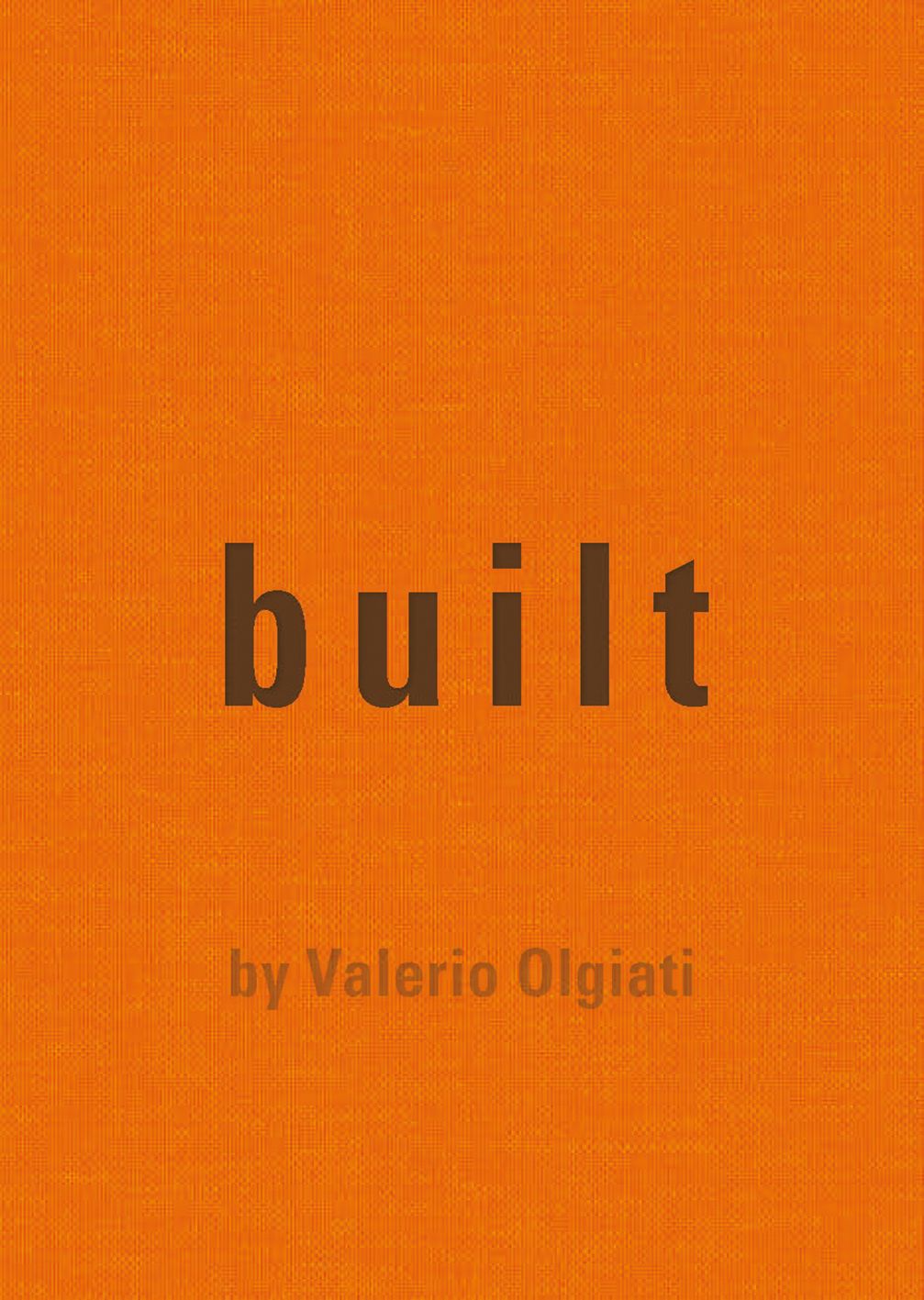
Valerio Olgiati’s Built begins with a simple statement: “In this book are my built projects. Photos are at the front and plans at the back.” The 79 photos and 16 plans that follow are of the 16 structures the 64-year-old Swiss architect built 1998–2019, which display his unique blend of asceticism, boldness, and grandeur. Having been described by The New York Times as “a cult figure” for his “idea-driven purity and shocking forms,” Olgiati adds to the opening statement of Built with a note on the photographs: “I have only selected the few photos from our archive that clearly document my intentions. The specific order of the photos explains the nature of my work.”
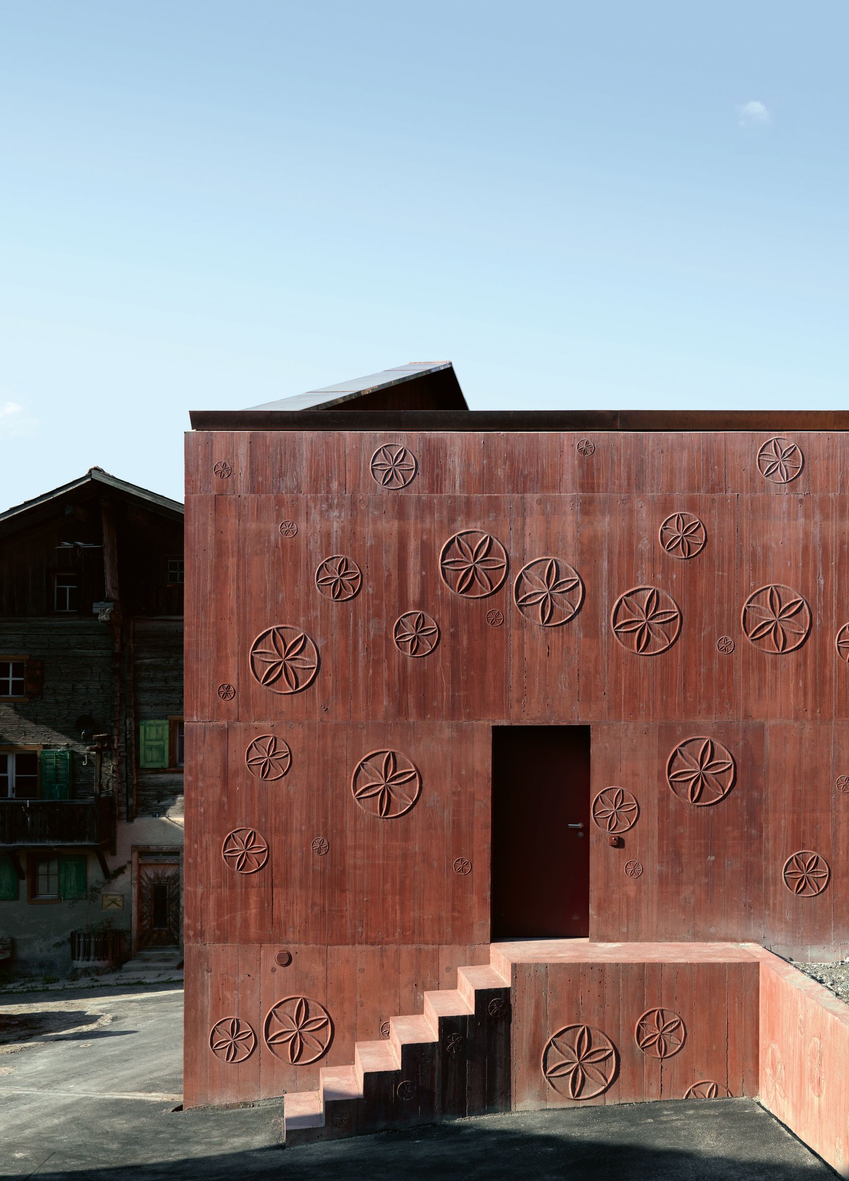
What immediately follows is a number of angles. A facade of ornamentally decorated red sandstone, pencil-shaped columns, a windowed alcove, a rusty-looking stairwell, and monolithic concrete pillars, all centered on their corners. For dozens of pages, various structural details, such as marble entryways, are shown aslant. The repetition of vantage point and subject matter suggests both the obsessiveness and the breadth of Olgiati’s intentions in addressing a simple and yet fundamental aspect of architecture—namely, that which unifies space on the inside and divides it on the outside, the corner. By doing so, the buildings, which are identified only in an index at the back of the book, blend into a singular vision of grace and austere splendor, even as they remain distinct in their materials and specific architectural forms.
It’s striking that Built initially displays all these details on the recto page only. This choice focuses our attention on a single aspect instead of overwhelming us with information and alternate views on two pages. Only after we have gained an understanding of the smaller, crucial features that occur in nearly half of the book’s images, do we then become privy to the larger picture, the structures in full view, as double spreads.
But before that, there’s a singular break. The first page that constitutes part of the double spread shows a man (who might be Olgiati) standing near a tree on a hill, looking at a building in the valley in the distance. The placement of this image would suggest that, after the details, the setting is secondary in importance; where the building is matters. This interpretation is substantiated in the red sandstone studio, Atelier Bardill (2008), that Olgiatibuilt for the composer Linard Bardill in Scharans, Switzerland, which is pictured with two typical Swiss chalets flanking it and some mountains in the background. Because of the way the building has been photographed, the roof seems to be in communication with the mountains. If you swap out the soft curves of the rocks with the angular lines of the building, it’s as if the structure is echoing the mountains’ shape. Similarly, there’s the School in Paspels(1998), a rectangular bunker-like structure jutting from a steep hillside in rural Switzerland, which also plays with the mountains in the distance, bridging two peaks with its sloping roof.These two photos suggest that the contexts provide inspiration for the forms, or that they’re at least in dialogue with each other. Remember: “I have only selected the few photos from our archive that clearly document my intentions.”
This interpretation, however, might be apocryphal and go against Olgiati’s intentions. In the aforementioned New York Times piece, he disparagingly calls Machu Picchu derivative for its abstract reinterpretation of the surrounding mountains (he also calls it fantastic). A proponent of “non-referential architecture,” Olgiati believes that buildings should be meaningful and meaning-making in and of themselves, and that structures should not be subservient to something “greater” in an age without any prevailing religion, political stance, or social movement. So, it might be safe to assume that non-referential buildings shouldn’t take thecontext or climate or geographical location into account, as these things exist beyond the building. Built gives no definitive answer to this conundrum—the man standing on the hill might just be at the ideal place to see the architect’s intended shape. It’s only in other writings—where Olgiati states that the unrealized Lake Cauma Project (1996–2002) “revolves around the relationship of the building to the water,” or that the schoolhouse in Paspels “fits in” with the surrounding settlements—that we can assume the setting must mean something to him.
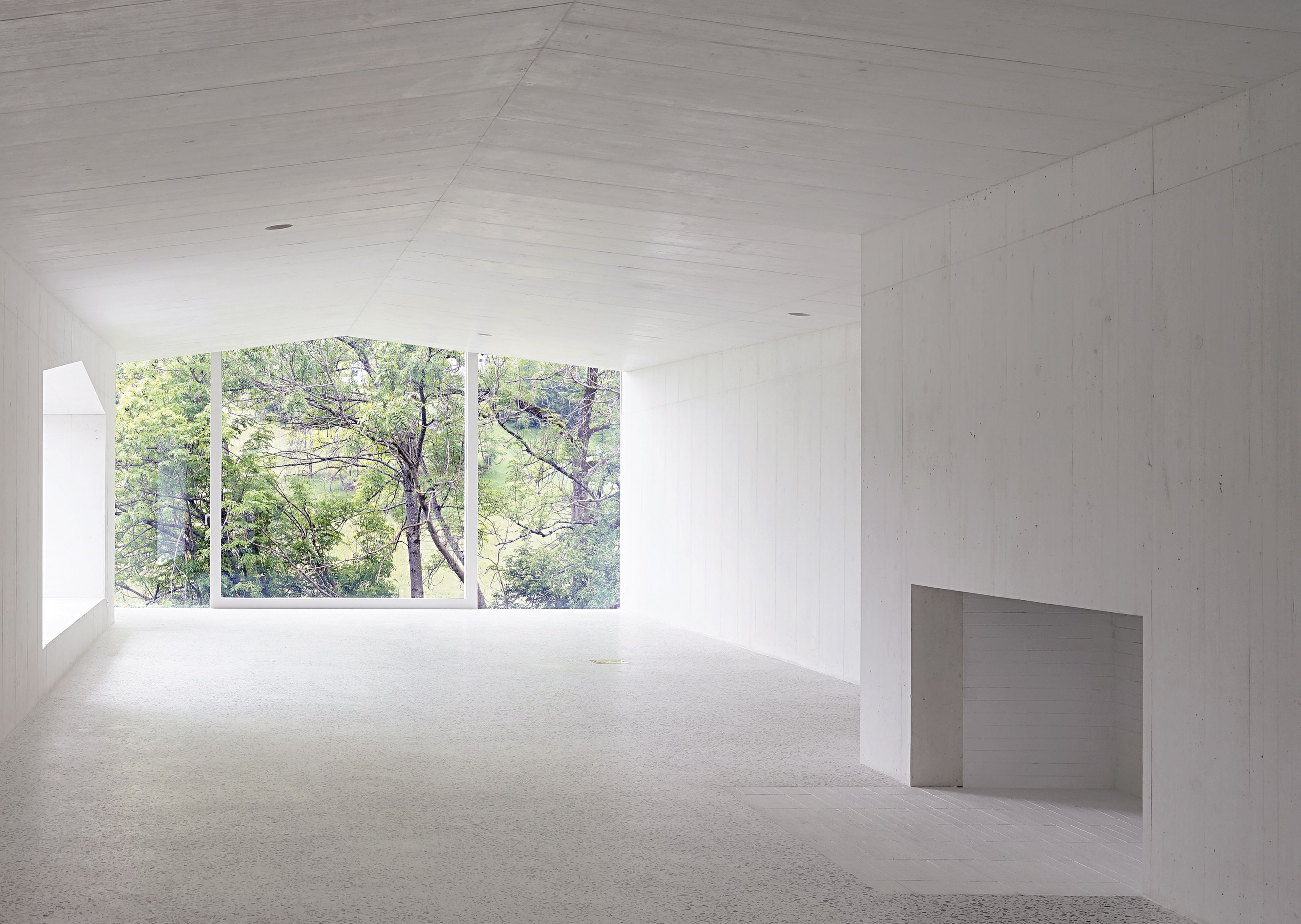
With this contradiction put to rest, we encounter others in Olgiati’s interiors, which are welcoming and foreboding and dark and light all at once. Take, for instance, the concrete bunker room inside the Pearling Path visitor center and museum at the UNESCO site in Muharraq, Bahrain (2019), which in one room is furnished like a living room but doesn’t feel lived-in enough to be called a home. This “open-air” room is predominantly filled with darkness, excepting the three skylights with different shapes (a tall pentagon; a short one; and a rectangular, almost rounded one). There’s something mysterious, if not ominous, about the huge room, but intimate spaces are created by the way the light from the ceiling falls near the sofa. Contradictions abound in the rest of the museum, which features other, much larger “urban rooms,” ones akin to public parks in terms of dimensions and the fact that the space is open, despite the roof and the simulacrum of surrounding walls. What’s amazing is that,despite the contradictions, everything here feels like it’s in its right place.
Credits
- Text: SHANE ANDERSON
Related Content
The Art of Collecting Chairs

VITALI GELWICH’s Boring Book
The Book of Gucci According to Alessandro Michele
PHYLUM-H: “Medicine, Metaphor, and Architecture”
From NOAM CHOMSKY to ICE-T: GLEN E. FRIEDMAN’s Book “My Rules” is a Survey in Being Hardcore
H.R. GIGER’s Private Life Was Just as Dark, Sexy, and Pop as His Art

032c Issue #43 “CULTURE CRISIS. Therapies for the confused” Summer 2023
Architecture of Resistance: The Barricades of Kiev