SANAA: Our Future Could Live Here
|NIKLAS MAAK

Just before winning the Pritzker Prize, the Japanese architecture firm SANAA unveiled a sensational enclosure for the École Polytechnique in Lausanne.
It was foggy when we exited the Route Cantonale. You couldn’t see the lake; you couldn’t see the mountains, which normally appear at dawn on the other side – the French side – of lake Geneva. Strictly speaking, you couldn’t see anything that would let you know you were near Lausanne. The administrative building, the strange tower, and the dilapidated concrete bars on the Chemin des machines made it seem more as if you were in a North Korean fungicide testing laboratory complex.
You have to know this in order to understand what this building, which was designed by the Japanese architecture firm SANAA for the École Polytechnique, is all about. Baptized in honor of the main sponsor as the “Rolex Learning Center,” the building is not only the new pride and joy of the Swiss University, which is home to 4,000 researchers and 7,000 students, but also offers a new center and public space to the senseless landscape formed by the aggregation of old administrative buildings. What SANAA – famous for the New Museum in New York and the Management School in Essen – has designed here also intends to be a comment on the question of what “public” could mean in the future.

A university campus is often organized like a city. There are cafeteria buildings, academic buildings, and libraries, all with parks in between. But the first surprise in Lausanne is that all these functions blend together into one form. The 20,000-square-meter Learning Center is a constructed landscape, in which everything flows together in a giant, open-space continuum. From the outside, it looks like gravity has been turned off, which is why the building seems to float above the ground. The structure undulates, creating shaded spaces underneath it, while from the inside, an oscillating, vaulted course accrues.
You step in and wander around, as if on a mountain meadow, always up and down through a single open room, whose individual functions – a library with 500,000 books, a cafeteria, and classrooms – are arranged like islands. It’s more than a stupid joke about Swiss delicacies if you point out that the design is reminiscent of two slices of porous cheese that artfully swell on top of one another. The building forms sometimes small, sometimes large bubbles, which become courtyards that then merge with other courtyards, creating an external landscape. Inside, you float around as if driven by the currents in an aquarium. Sometimes the building’s glass façades recall a never-ending film: people wander away, then resurface again on the other side, behind the winding glass panel, as if they had transgressed into the realm of fiction.

The Constructed Brain
The constant restlessness is the strength, and perhaps also the weakness, of the building. Whether you can really concentrate on work without walls surrounding you, or on islands in the open space, has yet to be seen. Whatever the verdict, this learning landscape is definitely an innovation in architectural communication. As if in Raphael’s The School of Athens, small groups can rest on the artificial slopes and ubiquitous beanbags that punctuate the swell of the open room. The beanbags, as well as the concrete waves, also recall the attempts in the 1950s and 60s to make space more dynamic: Oscar Niemeyer’s samba-modernism; French architect Claude Parent’s wavy-landscaped interior; Eero Saarinen’s TWA terminal, which embodies the pleasures of takeoff and departure. You’ll be similarly pleased with the metaphoric chargeability of the learning Center – at the building’s opening, everyone was talking about its open nodal-points system. The projection of dim images of neuron-like fireworks enhanced the feeling that the building was a constructed brain and that we were its wild, shooting neurons. But you don’t even need to buy this metaphor in order to be astounded by the spatial effect. On the one hand, the building’s seating islands affect a living room; on the other, it’s as public as a park – only you’re protected from the weather by a thin layer of glass.
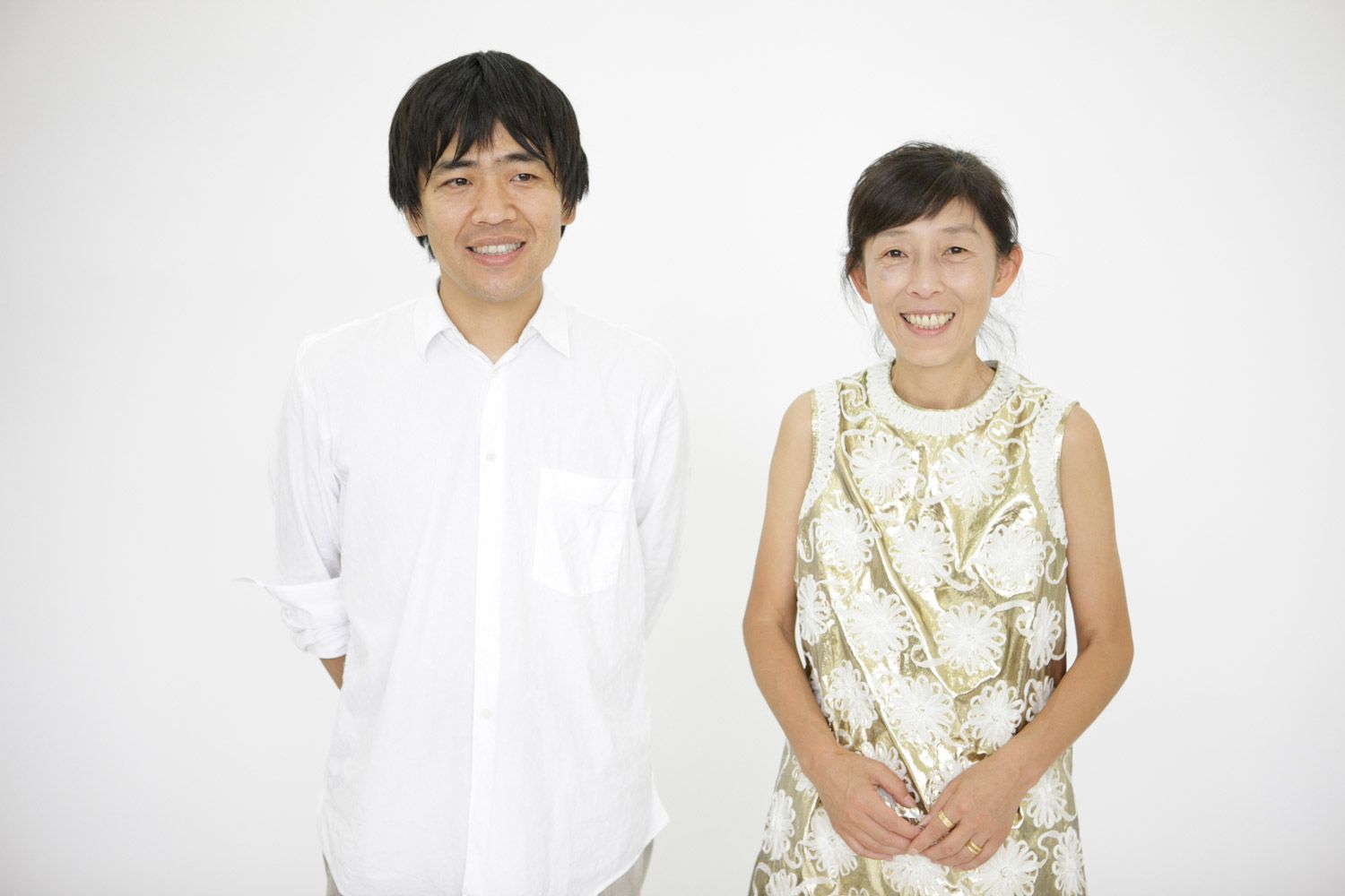
One of the most exciting issues in architecture today is imagining how the public domain of a society altered by new collective rituals could look. Could a new form of the collective develop in these hybrid spaces – public spaces, which aren’t merely defined by a commercial succession of cafés, cinemas, and stores, but rather offer freedom to interact in different ways? Even if Western architects like Rem Koolhaas or Ben van Berkel have already dissolved rooms, staircases, and floors into a continual sequence of ramps and levels, the center of this discourse is currently in Japan. SANAA is part of this architectural movement – as is Sou Fujimoto, who arranges rooms into interior landscapes, and designs houses that do away with stairs, walls, and furniture; or Yoshiharu Tsukamoto, who just built a retreat for the artist Miranda July. Kazuyo Sejima, who founded SANAA in 1995 together with Ryue Nishizawa, was trusted to lead the Venice Architecture Biennale this year in the hope that her intellectual impetus will also activate Europeans.
Born in 1966, Nishizawa first baffled the architecture world a few years ago with a curious building-for-thought, which took the question of private versus public to the extreme. He deconstructed his Moriyama House into new, white cubes. Each room was its own structure; the halls in between were public space. In these attempts to break down spatial conventions, this crude white, which has become the trademark of new Japanese architecture, is important – blurring, as it does, boundaries like the whiteout effect of a snowscape. If Tanizaki Junichiro celebrated the darkness of traditional Japanese houses in his 1933 book In Praise of Shadows – emphasizing that Japanese things first show their true beauty in a “vague half-light” – then the opposite is true today: Architecture lives off of overexposure, which lets spatial borders become blurred.

The University Without Condition
The Learning Center, open daily until midnight, also bears spatial cross-fading. The beanbag landscape is meant to form thinking islands, which network and flow through the waves of the structure like intellectual plankton, so to speak. To remind you that all of this costs something, the presence of the sponsor is somewhat intrusive (Rolex clocks hang in every corner). Nevertheless, you can sit here, lie there, work in small and large groups; lectures can spontaneously pop up on the ramps. This all begs a few questions of practicality (noise, concentration); but it also ties into the idea of a “university without condition,” which Jacques Derrida once proposed – a place that forges the “resistance against all forms of economic, political, judicial, or ethical constraints,” and in doing so, becomes a symbol of a different, more open society. Cultural structures provide alternative public spaces, in which a society envisions itself differently. For that reason, they are essential in times of crisis.
What these places could look like isn’t discussed anywhere as intensively as it is in Japan. This is why it’s no wonder that the biggest upcoming cultural structures in Europe are being designed in Japan – a branch of the Centre Pompidou in France’s Metz, which opens in May, by Shigeru Ban; a branch of the louvre in lens by SANAA.
Credits
- Text: NIKLAS MAAK
- Photography: TAKASHI OKAMOTO


