“Architectural, Not Decorative”: WILSON on MAPPLETHORPE
|Irina Baconsky

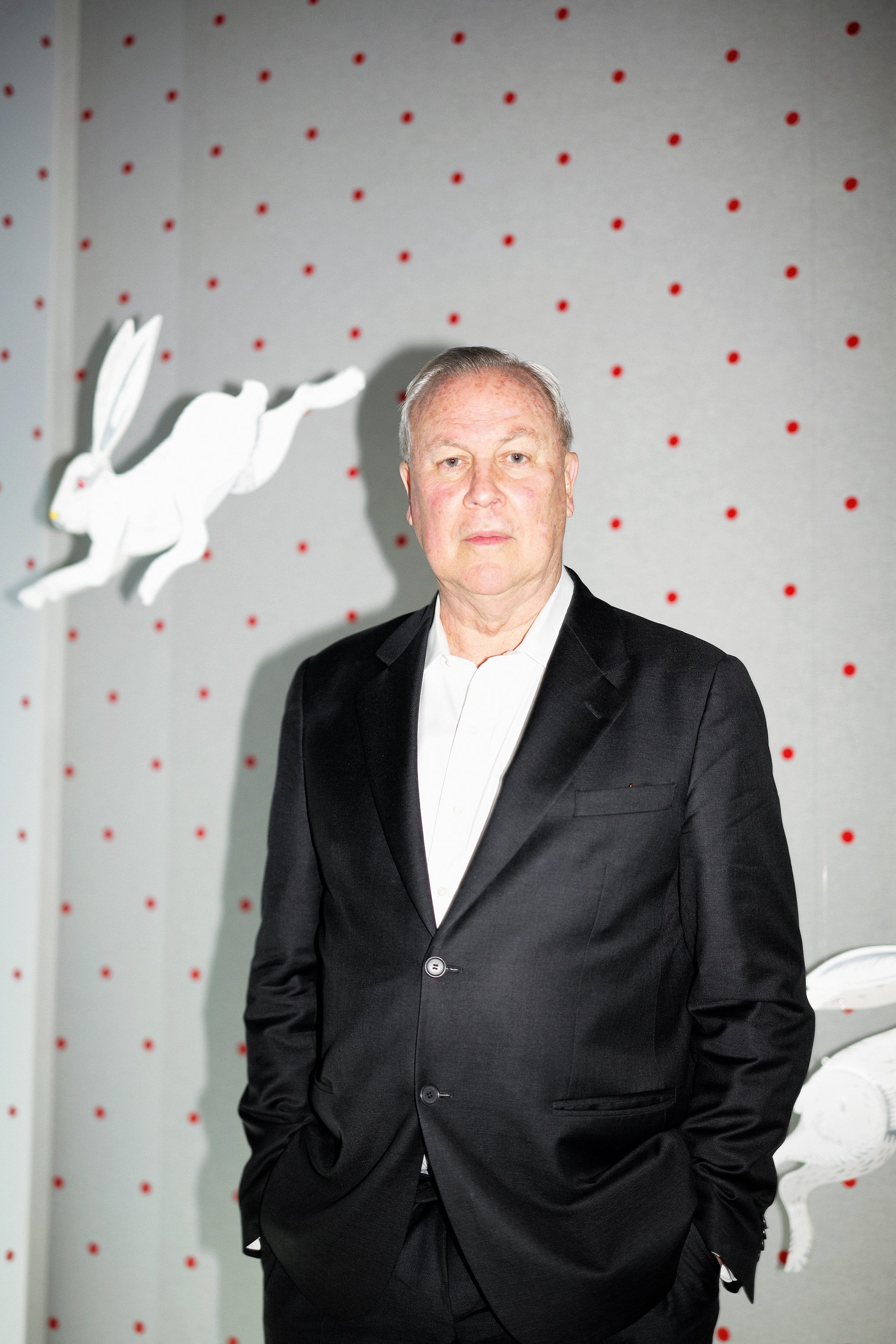
Recent discourse around the surge of multi-hyphenates in the creative field – of the Virgil Abloh or Kanye West professional hybrid – position the trend as the fruit of a flattened modernity. But we all know multi-hyphenates have been around for a while. Theater and visual artist Robert Wilson has consistently done it all for more than 40 years: he’s made visual art, directed and written plays and operas, convened happenings, created sculpture and lighting design, and founded and helmed the Watermill Center artistic residency program in Southampton, NY. While experimental, Wilson’s work is coherent: good theater, he believes, like good visual art, is mathematical at its core.
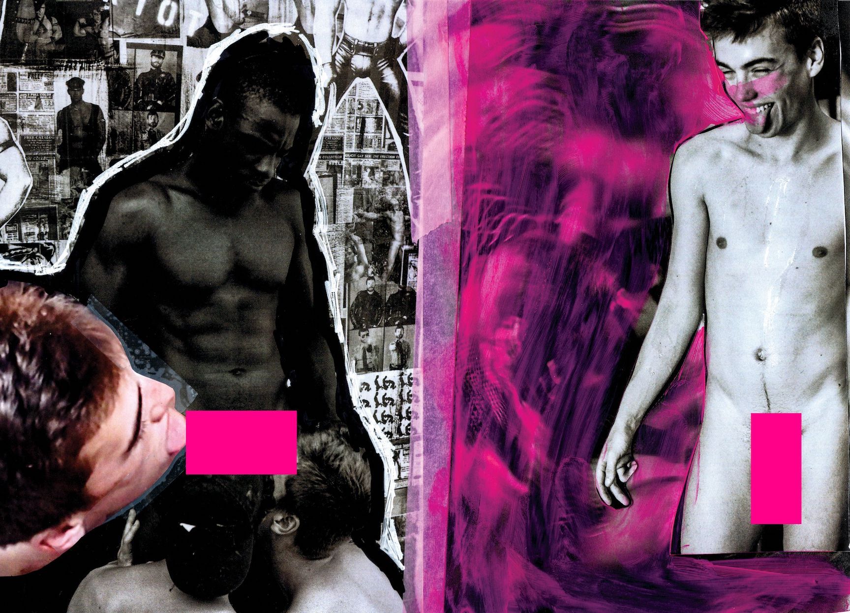
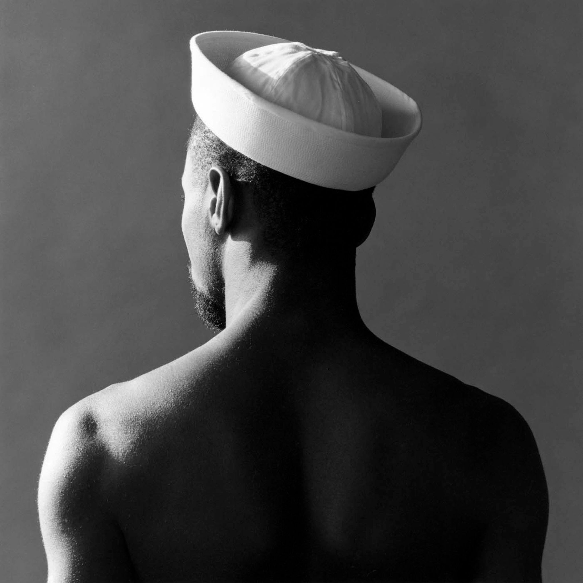
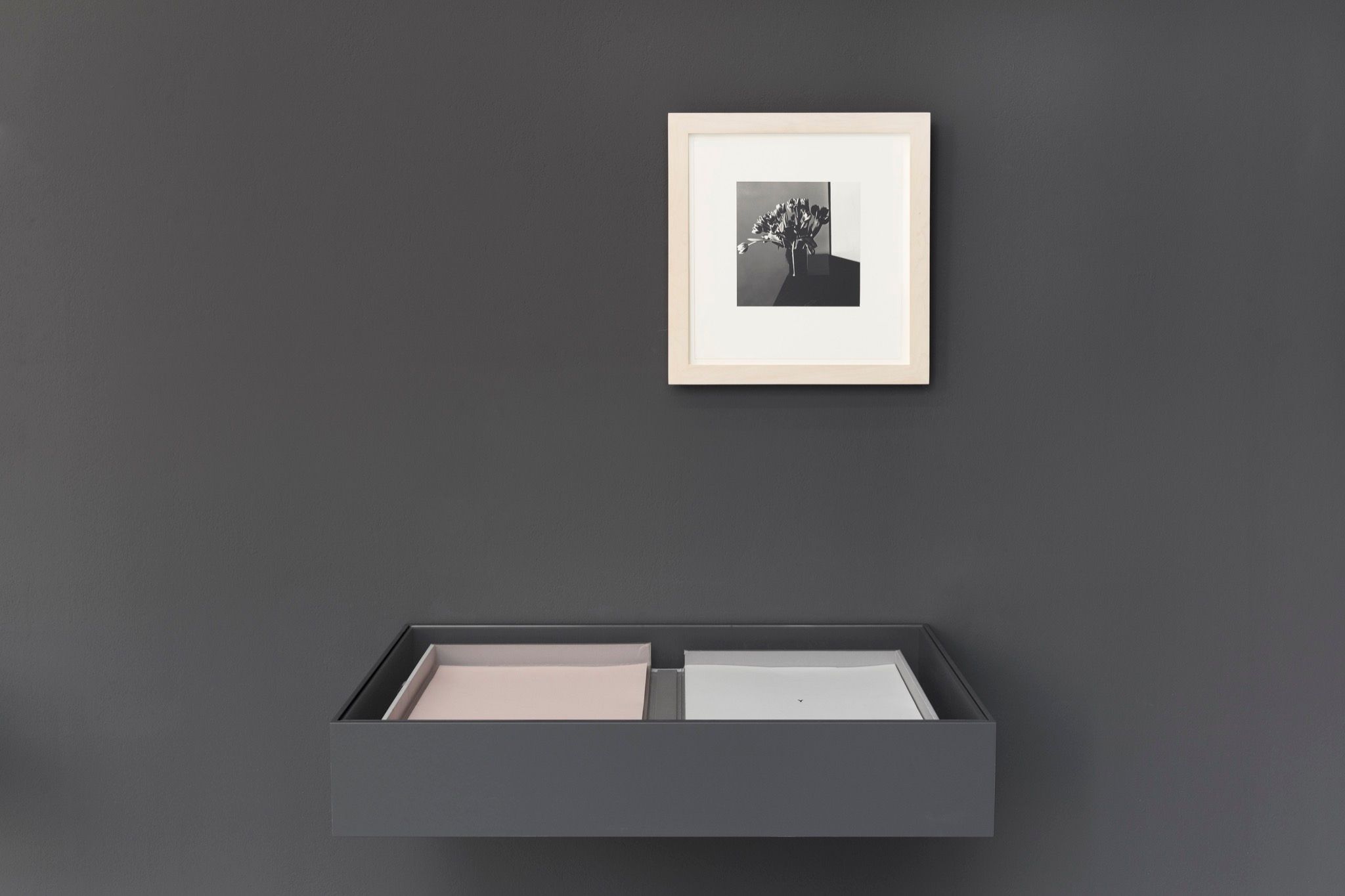
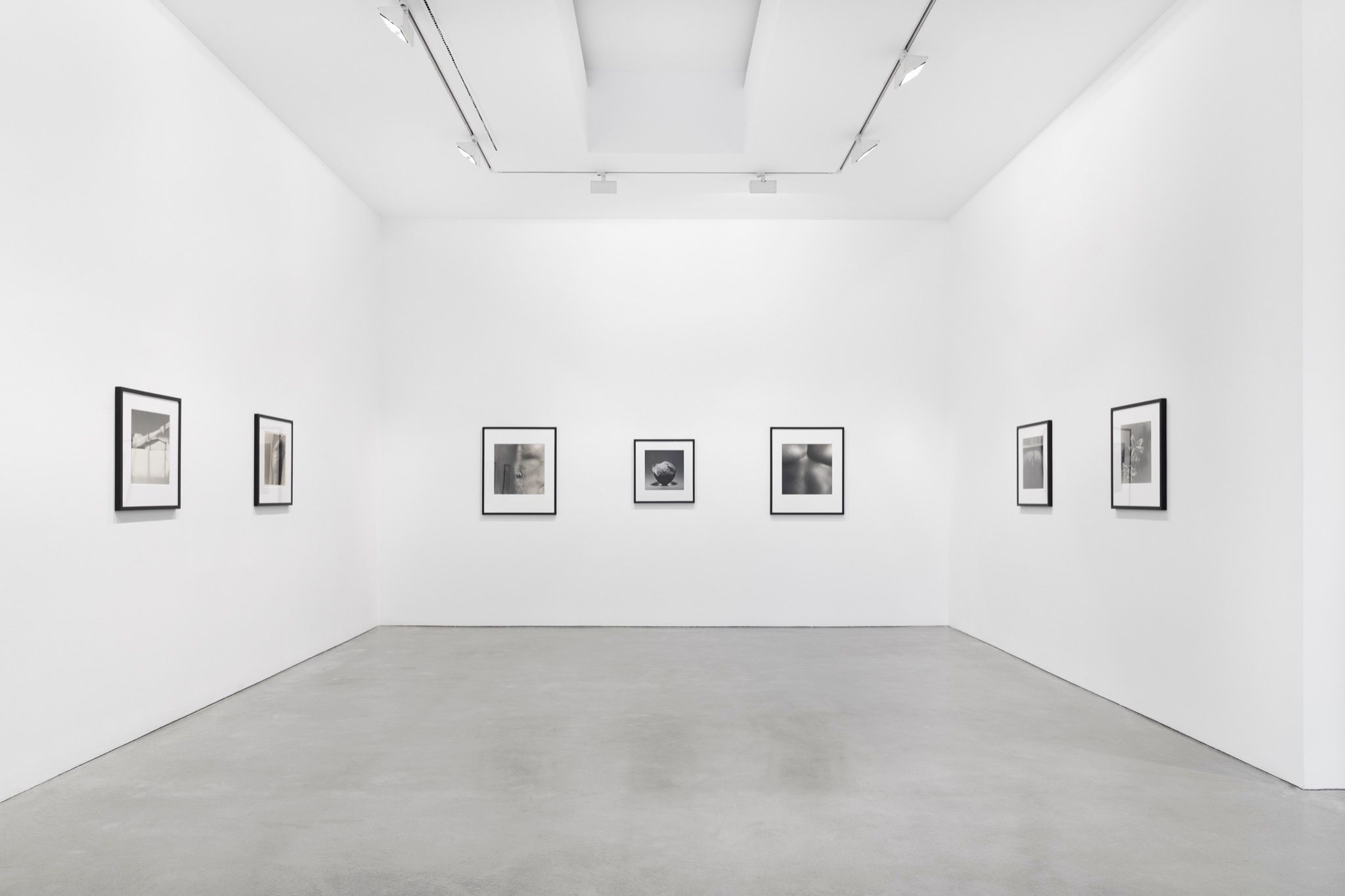
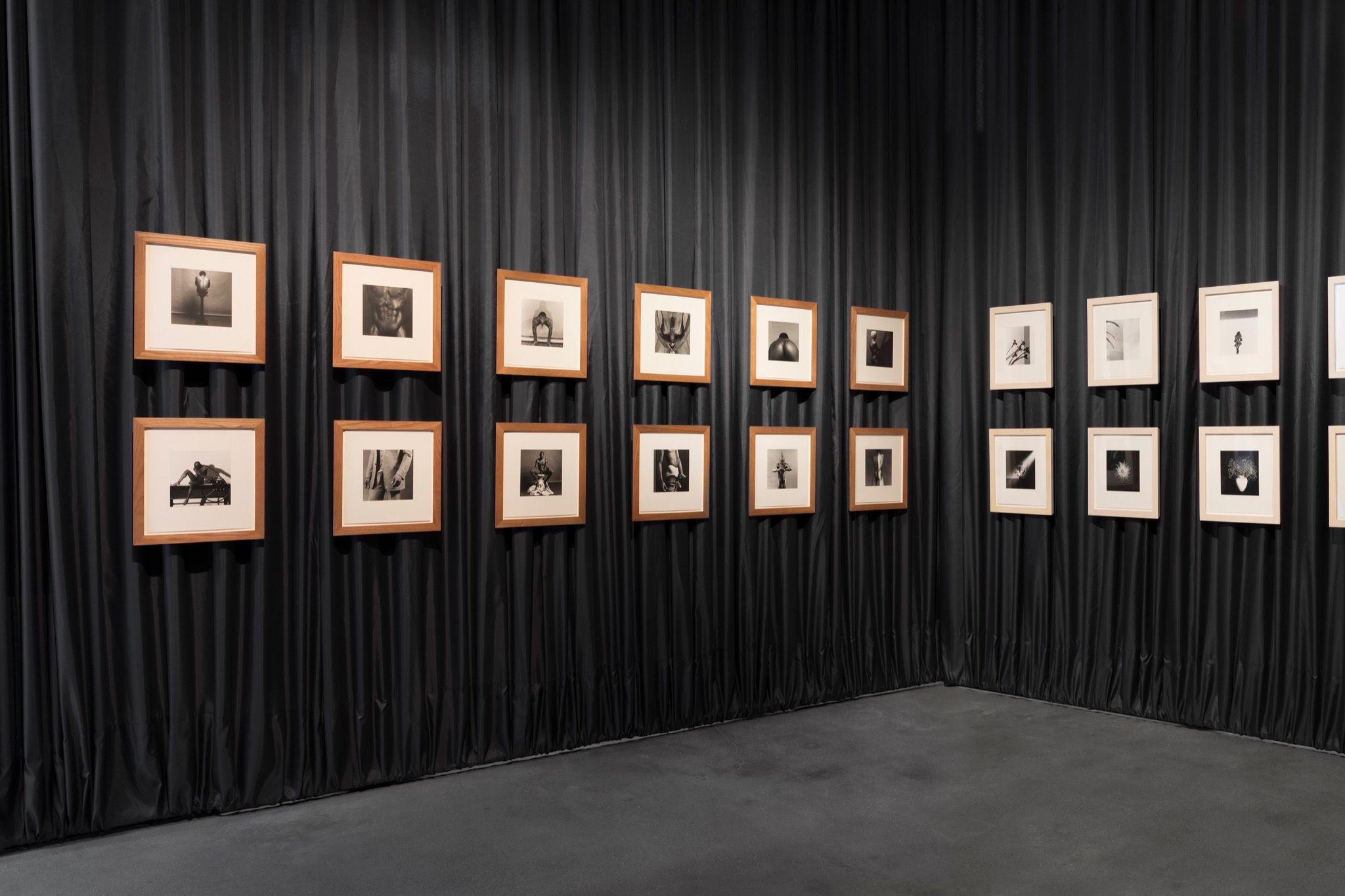
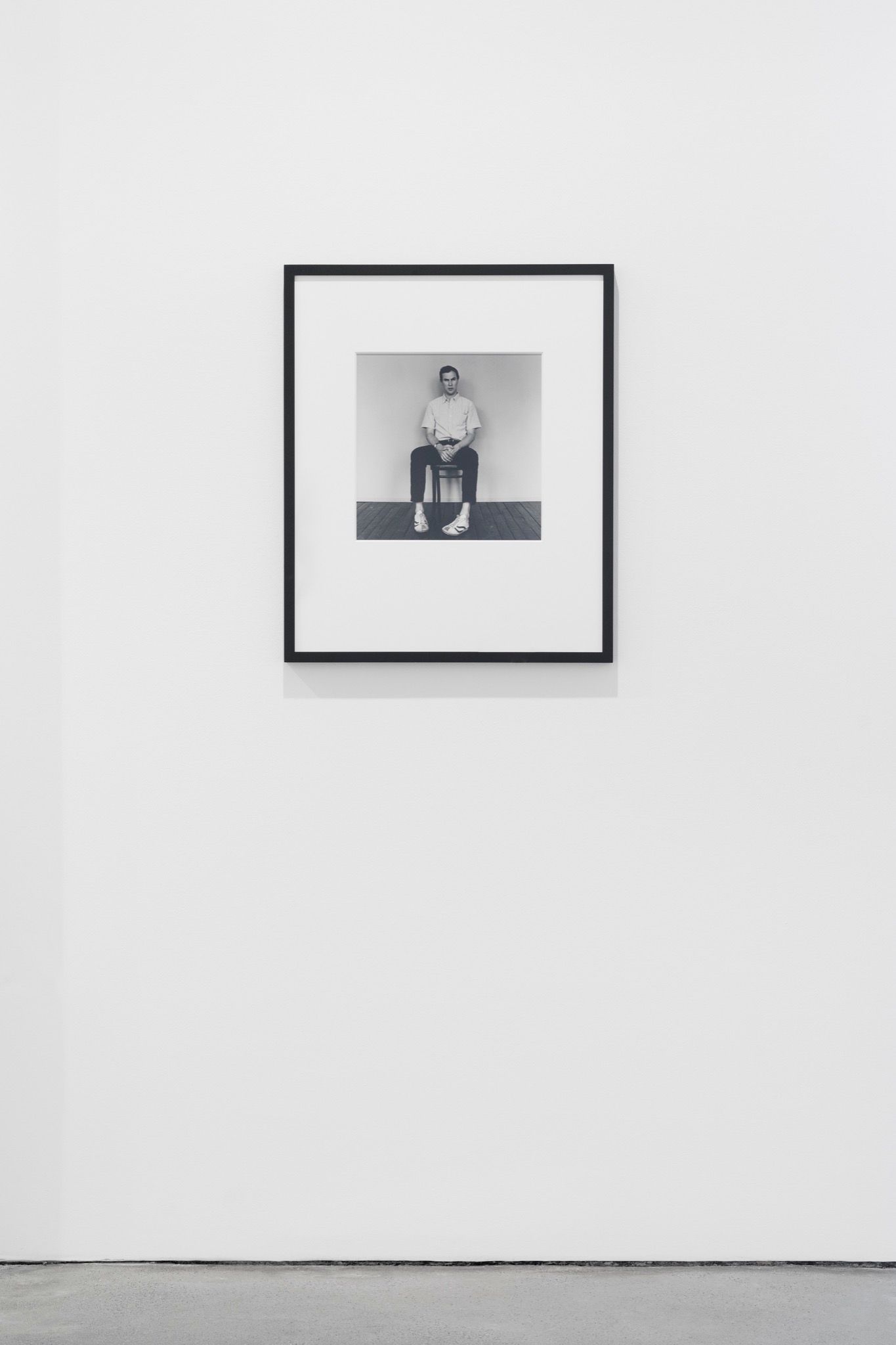
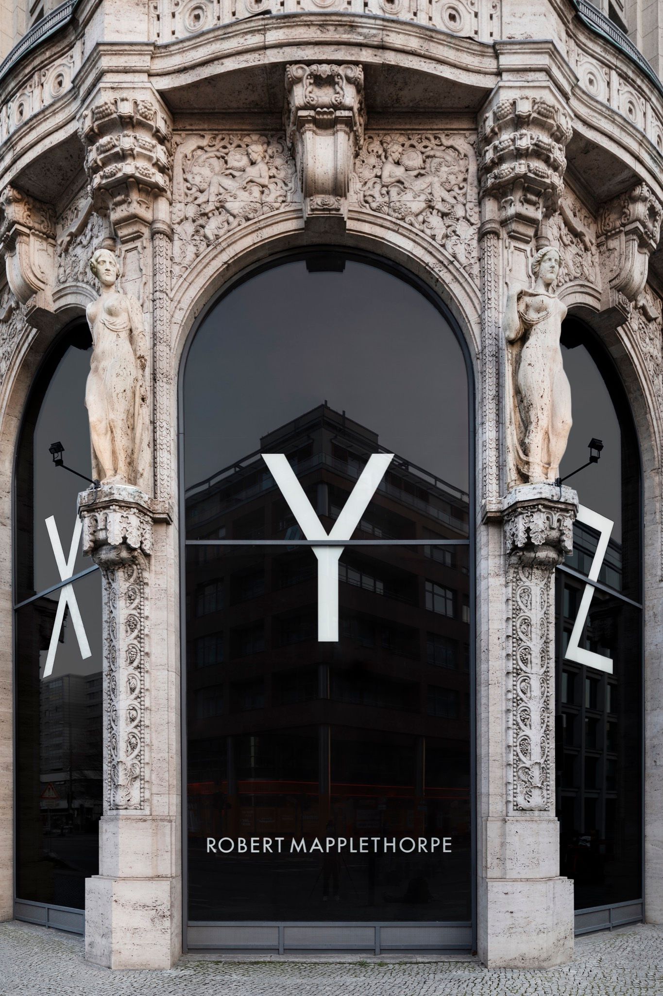
Wilson’s most recent project, however, is curatorial, revisiting the photographic oeuvre of the late Robert Mapplethorpe (1946–89). One of the most influential, exhibited, and controversial portrait photographers of the late 20th century – and a First Amendment cause célèbre – was also Wilson’s friend and collaborator. Recently opened at Galerie Thomas Schulte in Berlin-Mitte – then swiftly closed, along with other exhibitions in the city – “Robert Mapplethorpe: Selected by Robert Wilson,” proposes a similarly structural view of the New York icon’s photographic thinking. Now, the exhibition is viewable in 3D, digitally and the show, up through May 9th, can still be visited by individuals on appointment. Fortunately, we spoke to Wilson IRL, just before mass isolation, to discuss a collaboration that remains intimate, long after Mapplethorpe’s death.
Irina Baconsky: How did you and Robert Mapplethorpe meet?
Robert Wilson: We went to the Pratt Institute together, in Brooklyn during the 1960s. Bob was a few years younger than me. At the time, he had no idea he was going to be a photographer, and I had no idea I was going to be working in theater.
I think we met in a supermarket. I was preparing to stage a happening in an old movie house on Myrtle Avenue in Brooklyn, and asked him if he wanted to be part of this theater activity. He said yes, so we got to know each other after that, and we kept in touch through the years.
He is probably one of the most referenced and exhibited artists of recent decades – it must be a challenge to find a new angle for his work. How did you approach curating this exhibition?
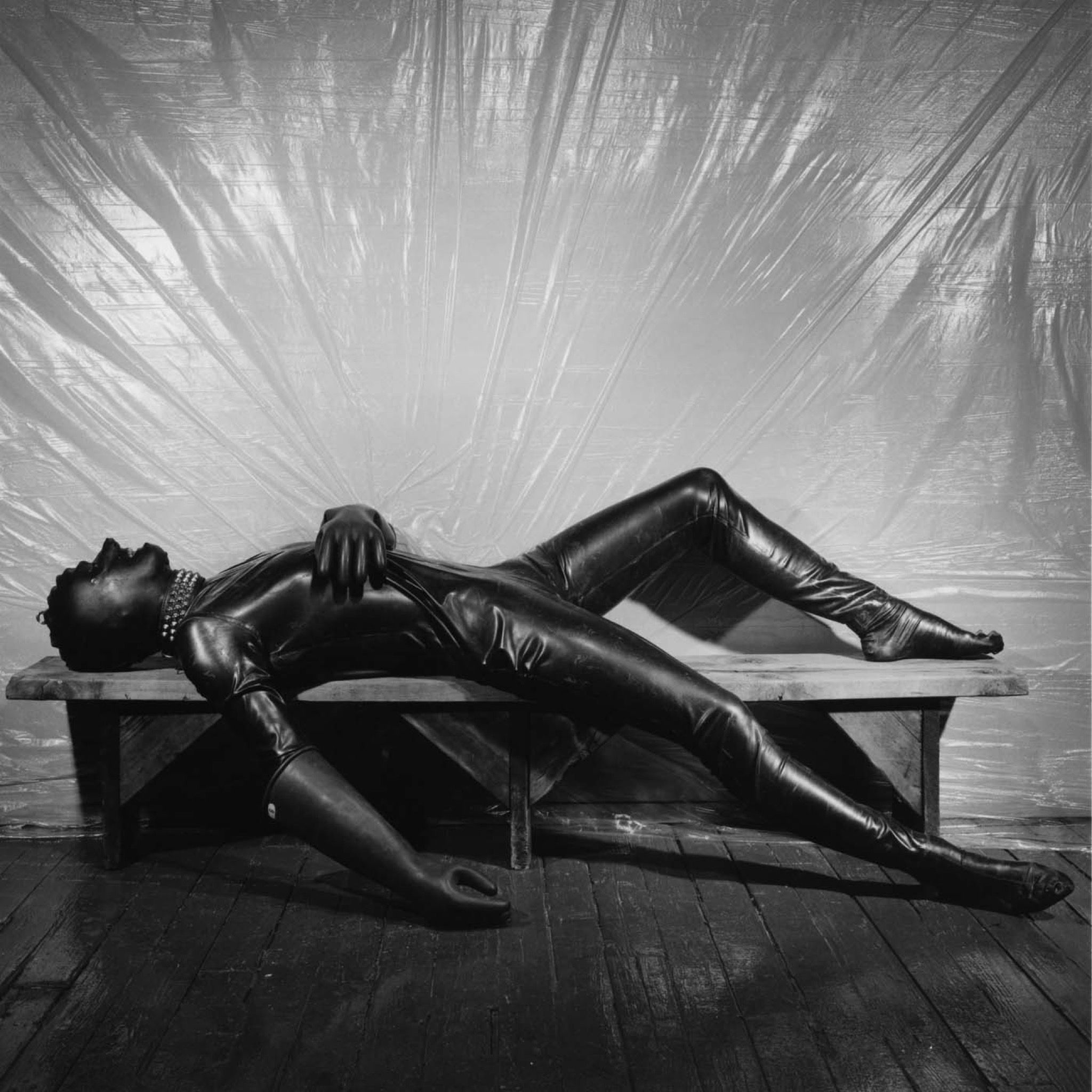
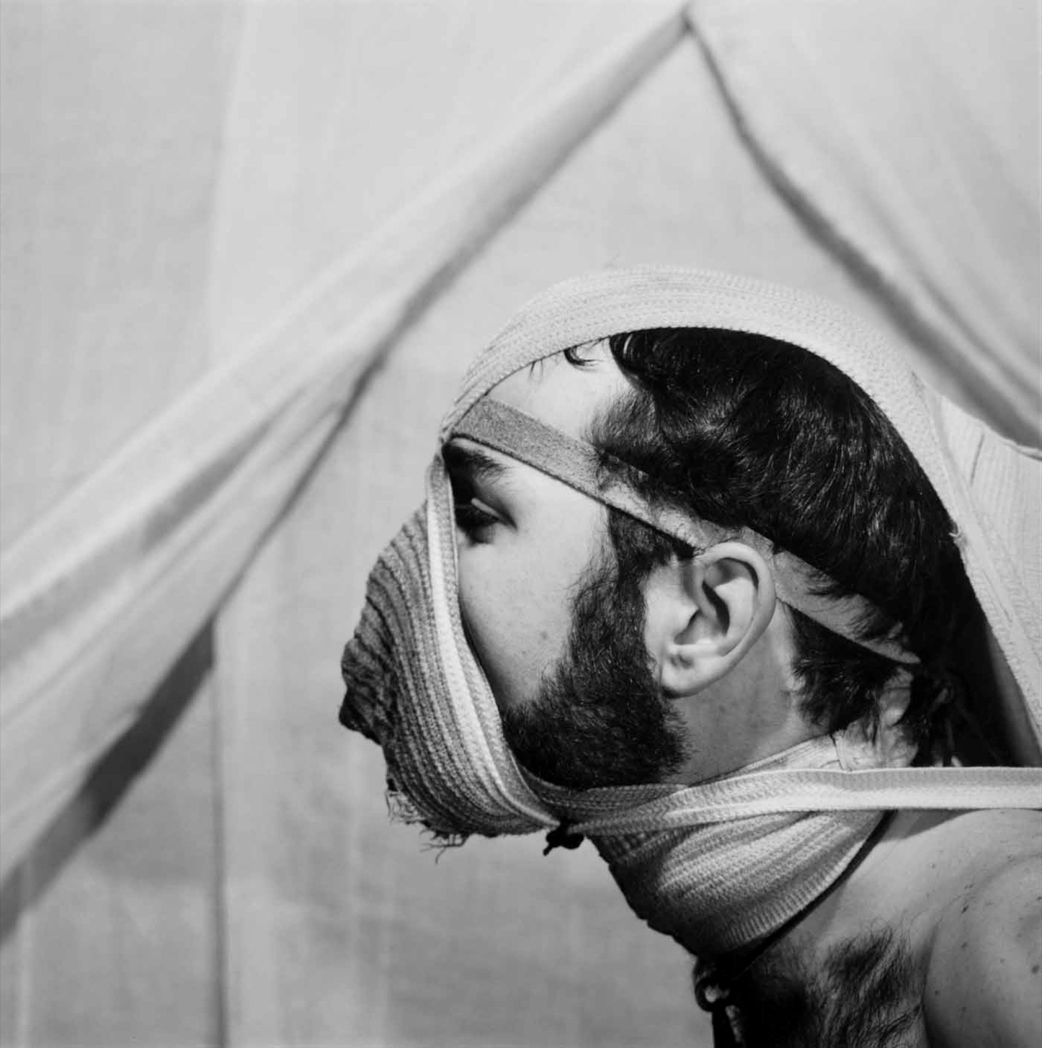
I tried to show how his mind worked. I think most exhibitions are too focused on the surface of the material and not the methods or the structure that underlie it. Bob was thinking structurally.
In retrospect, what aspects of his life and work resonated with you the most?
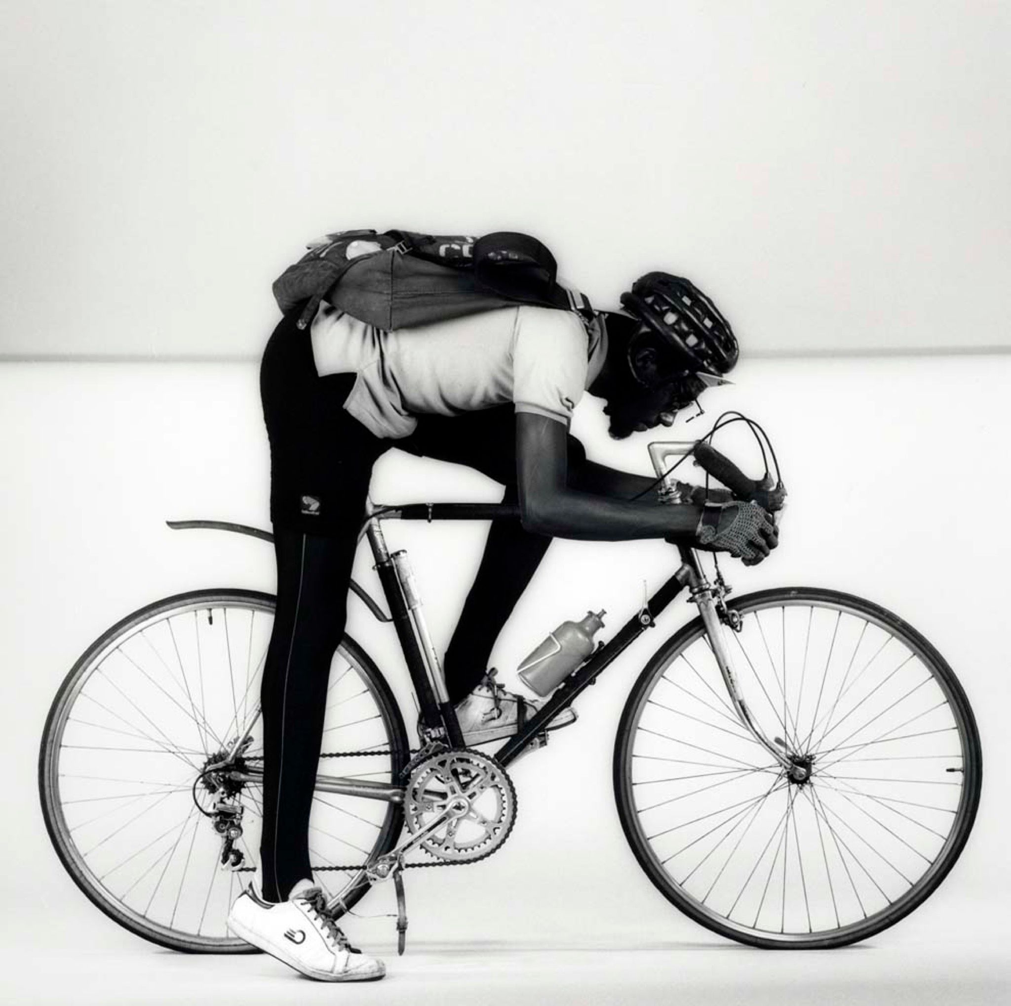
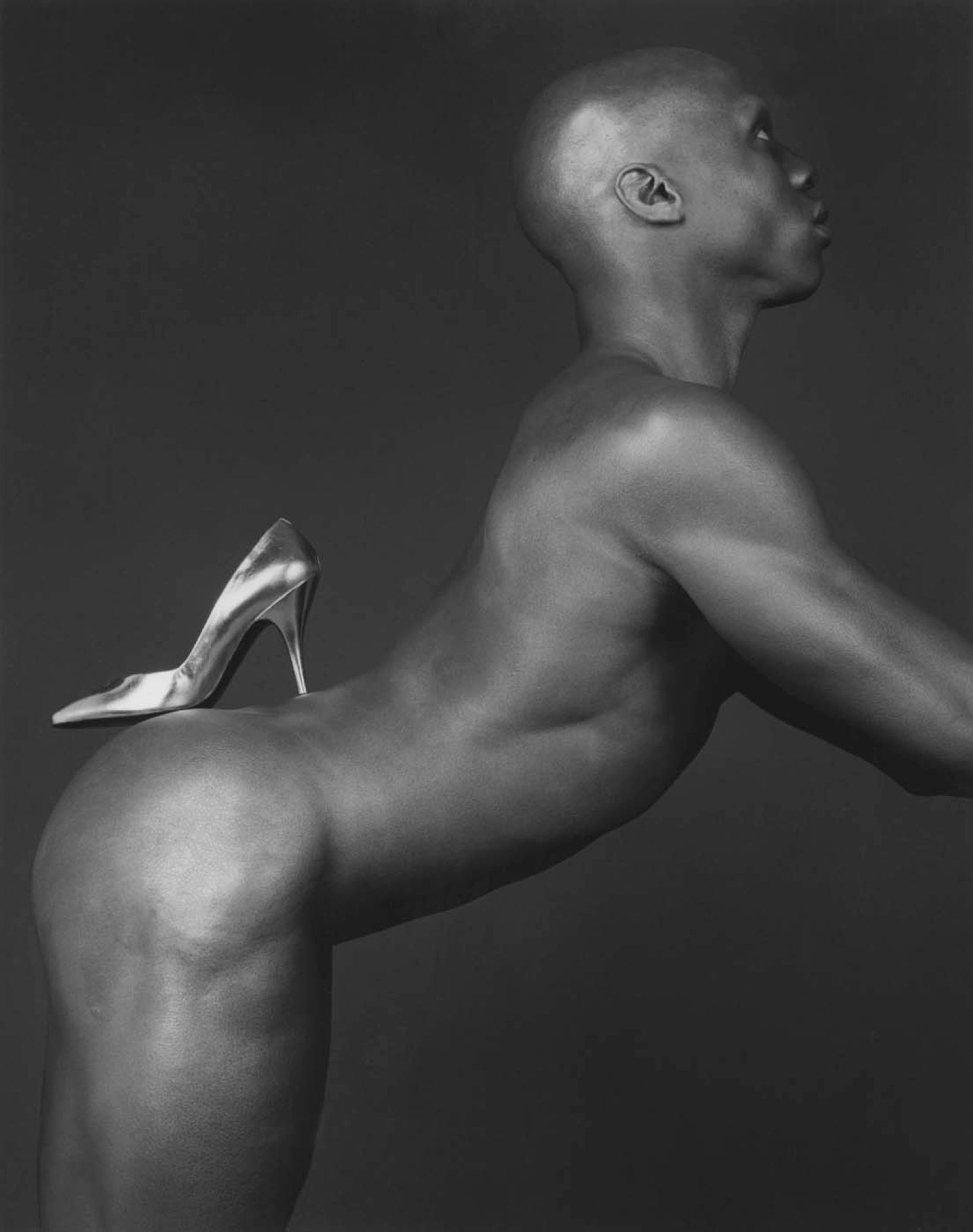
Bob and I think alike. He thinks and sees classically; if you look at his compositions, they are very much centered around diagonal and horizontal lines. The compositions are very simple but based on classical techniques. My work in theater has always been very mathematical and classically constructed. People didn’t always see it that way, but the skeleton of my work was always classical.
Another overlap, I would say, is our attachment to light. Bob was a great portrait artist, but also a great light artist. As far as I’m concerned, the lighting is often a signature in my work. I spend more time lighting a work on stage than anyone. Einstein said that light is the measure of all things. Without light, there is no space. We both created work that orbited around this notion.
Does this like-mindedness also translate into your lives, or is it limited to your work?
Well, Bob and I were in touch for a long time, and we shared some common friends, but never got to be particularly close. Mostly, I think what connects us is the instinct and immediacy of our responses to the world around. In German theater, for instance, people will sit around a table for months and read books. I don’t work like that. I don’t need a reason to do what I’m doing. I just do it. I don’t want to know why it is that I’m doing it. Bob worked in a very similar way— he was very quick and always knew what he wanted.
You’re known for your collaborative work. Did you approach this exhibition as a dialogue with Mapplethorpe?
I just tried to look at his work, but inevitably a dialogue arises. For instance, the methods of structuring I used for the curation – again, classical methods used by painters, such as counterpoint and sequencing – are methods I rely on a lot in my theater work, too.
The exhibition space includes a quote from a Rimbaud poem. Why Rimbaud?
As a student at the University of Texas, I had a professor named Paul Schmitt – a brilliant, scholarly man who spoke 11 languages and was known for his translations of Rimbaud. At some point in the 1970s I introduced Schmitt to Bob Mapplethorpe. I thought they should collaborate. Paul did a translation of Rimbaud, Bob took some photos, and they published a book together. Bob loved poetry, and resonated with this text in particular.
Some artists from this era, including yourself, worked at the intersection of disciplines. Today, the “multi-hyphenate” is the most prevalent professional archetype – or perhaps stereotype. What do you make of this cultural trend?
I’ve always felt drawn to the Renaissance mind. I couldn’t imagine just directing a play. A play is also something very visual, and something you hear, it’s a choreography. All theater for me is a kind of dance. It’s an opera, in the latin sense of the word opus, meaning something where everything is included. And in this sense, an artwork is everything— it’s light, it’s architecture, it’s literature. I was never able to think in terms of departments.
Does this all-encompassing approach make your practice more, or less complex?
A great artist is someone who thinks on many different levels. Part of the problem is that schools are departmentalized. A young girl came up to me a few years ago and she had spent years at university studying theater decoration. I think we should burn schools that teach theater decoration. They’re not necessary. Theater should be architectural, not decorative. I hate decoration.
Bob’s work is architectural too. There are only two lines. There is a straight line, and there is a curved line. So make up your mind, Frank Gehry.
Did Mapplethorpe inspire your practice in any way?
I think we both matured as artists roughly at the same time. When I first met Bob, he was doing these little fuzzy collages. When we both began to evolve and mature, and he became one of the great portrait artists of our time – that’s when he began to see things in a very classical way. We had this in common and understood each other because we thought the same way.
What makes Mapplethorpe’s work relevant today?
His signature is now complete. You see a Mapplethorpe photograph and you instantly recognize it. In the same way that you see a Warhol, or read a text by Gertrude Stein – the signature is complete. Mostly, his work will remain valid even 100 years from now, because it’s classical in its construction. The sonnets of Shakespeare are classical constructions. The pyramids are classical forms, and that will exist forever. This, on the other hand [Wilson gestures to a caricature sketch of a Frank Gehry building] will be a footnote in history. The Romantics never make it. It’s the Chinese and the Mayans we go back to. Gaudi is a pretty footnote, but it’s not Palladio.
The opening of the exhibition coincides with Berlin Fetish Week. Do you see any cultural overlaps between Berlin and Mapplethorpe – beyond the penchant for leather?
Berlin could have been one of the great capitals of the world. When the wall came down; an opportunity was missed to have a masterplan for building the city. It's a pity no one came in with a masterplan. For better or for worse, Schinkel and those guys were thinking about the city in a much larger scope in terms of a plan for a city. Paris is a beautiful city because it has a beautiful plan. The megastructure is very clear. And without that you have chaos, which is okay too.
Credits
- Interview: Irina Baconsky
