The Metaphysics of SUPREME: Decoding Branded Objects with Philosopher Graham Harman
|Jonathan Olivares

Since opening as a New York skate shop in 1994, Supreme has slowly transformed into a globally ubiquitous brand. Last fall, the Carlyle Group announced that it would be acquiring one half of the company at an unprecedented valuation of one billion dollars. Supreme’s success is driven by its hyper-collectible products, which have become known for inspiring hordes of young fans to camp out in front of its stores in New York, Los Angeles, London, Paris, and Japan.
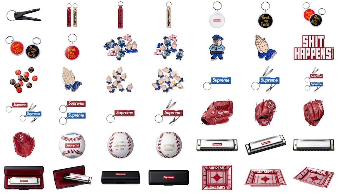
After starting out with the typical skate shop fare – such as skateboard decks, t-shirts, and 5-panel hats – the company’s product line has sprawled into an outcropping of uncannily branded everyday objects. Spawned concurrently with the rise of mobile-based social networking, this web of products reads like a set of Newtonian laws on branding in the digital age. Supreme’s objects are memes in the form of product design, created to smash together unexpected references. And the degree to which they have surfed the internet’s appetite for absurdity has only grown over the years. In 2015, Supreme released a crowbar and a set of Chinese Baoding balls bearing its name. For its mania-inducing collaboration with Louis Vuitton, it released a record player, a cushion, and a Boite Skateboard Trunk. And – in perhaps its most bizarre and defiant move to date – in 2016, it released a brick with its logo baked into it.
The glue that holds this network of objects together is Supreme’s distinctive logo, which features its name set in Futura Heavy Oblique, a font originally made famous by artist Barbara Kruger. The simplicity and loudness of this marking seems purpose-built for the small screens and short attention spans of digital media, a context that continues to pour gasoline on the brand’s worldwide conflagration. As the fashion industry continues to get folded around streetwear’s penchant for merchandising and flipping logos, Supreme’s output takes on a sense of calculated purity.
At a time when brand insignias have been mobilized to freely collide in both the digital and physical worlds, the effect a logo has on an object has become a massive site of confusion. Philosopher Graham Harman’s theory of object-oriented ontology is uniquely equipped to take on this phenomenon. Through the triple Os, Harman eschews thinking of objects in terms of their utility or history and instead encourages us to consider objects in and of themselves. His work takes on objects as entities that have an almost human quality: as things that can grow, peak, and even die. In his most recent book, Immaterialism: Objects and Social Theory, Harman uses the historical example of the Dutch East India Company to discuss how corporations themselves can become super-objects, a concept that has only gotten more palpable with the emergence of a fashion empire like Supreme.
After reading Immaterialism, industrial designer Jonathan Olivares said that the book exploded all prior methods of conducting design history. He and Harman met in Los Angeles to consider the hybrid lives of branded objects.
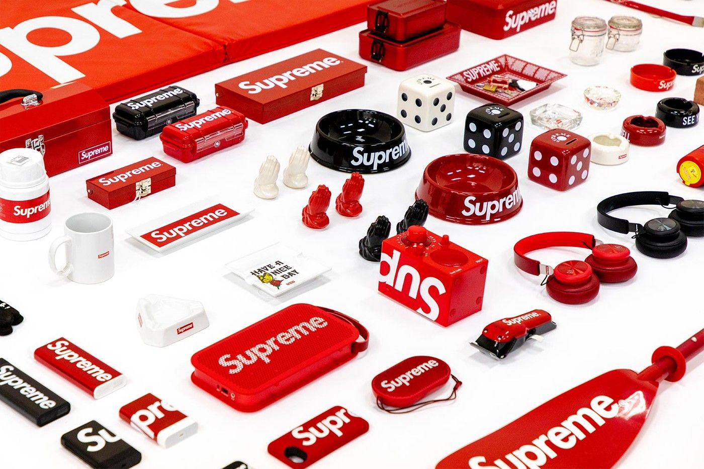
Jonathan Olivares: It is evident that putting a brand name on an object does something to that object. For example, putting a Supreme logo on an object like an axe can radicalize something that was originally banal.
Graham Harman: When an object merges with a brand name, a hybrid object is created. Giving an object a proper name gives a stability it might not have had otherwise. In the case of Supreme and the axe, the axe in isolation has a different feel from the axe with a Supreme logo, which is a more hip, expensive object, more part of the culture. A logo is an interesting thing because it’s a surface property that nonetheless points to the essential – it points to a style that’s beneath the surface. Even though some brands might not plaster their logo on everything, it’s still visible in a subtle way that comes from a certain style.
Supreme started before social media, but it caught fire with Instagram. In a way, it was accidentally built for that because its logo is so recognizable in photos. Could you say the entirety of Instagram is Supreme because the Supreme logo is all over it?
What do we associate with social media? What is its brand? Probably internationalism – which was already a capitalist idea, but social media does it better. Interestingly, the military and the porn industry are two of the early adopters of the network. It took everyday life a little while to catch up with it.
How can we use philosophy to find out what a branded object actually is?
In philosophy, you usually get two kinds of takes on design culture. You will either get Heidegger saying, “This is all American capitalism and it’s turning everything into stockpiles of usability.” Or you get the Left, which just sees capitalism in every consumer product as a means of alienation or domination. I don’t see it in either of those ways. I see brands as charismatic objects. They captivate you with an allure. And you can have that with an object from the brand, or you can just have that with the brand itself. There are certain brands I love no matter what they make. For example, there’s a certain charisma to Apple products that you don’t find with PCs or Samsung phones. But “brand,” for me, is not about the instrumentality of making money. It’s about announcing, “Here’s what we are,” in a way that’s hard to put in literal terms. The brand is like a soul of the product.
Can a design itself be a logo? For example, Supreme makes things “Supreme” through the logo, but a Zippo lighter’s shape is in itself a logo that exists without typography.
It has to be more than a shape. I was thinking of Volkswagen, where the new Beetle doesn’t look like the old Beetle, but it’s suggested effectively somehow. By some means, it’s a translation of the Volkswagen look we all knew from the 1970s and before, but it hinges on something deeper than this old Volkswagen Beetle shape. The actual shape of the current Beetle, which is new, points at something deeper than both. It suggests that both of them are translations of a deeper thing.
I remember Slavoj Žižek saying that even when you are drinking a warm, flat Coke in a slum, you’re somehow still drinking Coke.
Even if it tastes bad, you’re drinking the brand, so it’s something more than what you’re actually getting. Žižek thinks that’s the structure of a commodity in general – it is always something more than what you get. He thinks this is the real reason why those Kinder Eggs you get in Europe are illegal in the US. Supposedly, they are illegal because of the choking hazards, but Žižek claims the real reason is that Kinder Eggs expose the lie of capitalism. You see the chocolate, but now there’s something more, there’s a prize. It always says, “You get this, this, this, and more!” And capitalism always needs “and more,” because there’s no product that can satisfy us. He thinks Kinder Eggs somehow unmask this, showing capitalism to be the fraud that it is. That has some relevance to what we are talking about with branding. A brand is an object over and above the object you are getting.

In your book, you look at the Dutch East India Company and argue that a corporation itself – not just the objects it produces – can be an object. Is the same true in our time? Is the brand Supreme an object itself?
You can look at it in all kinds of different scales – the brand as an object, each individual object as an object, the design specifications as an object. There is an argument that with all knowledge, you can either reduce it down to the pieces of its history, or you can reduce it upward to its effects. Both of those miss the object. Most philosophies do one or the other, or they do both at once. And I call this undermining, overmining, and duomining. They are always erasing the object and replacing it – either with its process, its history, or its outward impact.
Within object-oriented ontology, an object is more than its history because there are many different pasts that can lead to the same object. And also, the object always has plenty of other possible uses that it’s not having right now. But the object is not equivalent to the sum total of possible uses, because then you are just reducing it to future effects rather than present effects. In other words, if you make a list of everything that a Supreme product can possibly do – even if you had an exhaustive list of all of the things it could do – that would still not be the product, because there’s always a surplus to the product. Another key feature of object-oriented ontology is that objects can interact with each other. An object has an internal, independent life that we can never get at directly, but only indirectly or elusively. That’s why descriptions of things are no longer privileged where they usually are. There has to be a certain aesthetic way of getting at things. And designers know this – designers make implicit decisions about how to signal to people that a thing is useable in this way and not in other ways. They encourage and discourage certain uses.
For example, a handle gives something the function of being handled, but it also tells you as a design that something can be “handled.”
Speaking of handles, the design that repeatedly frustrates me are hotel shower handles. It seems that shower handle designers are into this abstract, high analytic cubism where they are trying to be too cute. Usually, I leave every hotel not knowing how I got that shower handle to work. So I think that’s a fail, over and over again.
You have talked about objects as things that can live and decay and change and fail. If you take Supreme itself as an example, you have a brand that started in 1994 as a skate shop that is now a super-brand, selling all kinds of things. Is everything Supreme has ever produced still part of the same thing?
The brand itself has a reality that goes beyond its individual product. Even if the brand starts out selling only t-shirts, it could potentially translate itself into other products. Amazon is now translating into Whole Foods. Earlier, they had translated into the Washington Post. If the Amazon brand is behind it, you expect certain things – you expect them to lower the prices, offer door-to-door delivery of groceries from Whole Foods, you expect them to try turning into a giant monopoly at some point, undercutting all of the competition. Basically, the brand is like a style in that it can take on many incarnations in many different products. There are all kinds of products like that – things that started out first as something they no longer do. How would you describe Supreme’s customers now?
Whenever I go to their stores, I would say 85 percent of the customers there are male. And a lot of these objects seem to be designed to capture the animal spirits of adolescent men.
You know, young males are a more interesting demographic group than people give them credit for. Understandably, there has been so much attention paid in progressive cultures to the way male power exceeds that of women or minorities. And what has been obscured is the differences between male demographic groups. Obviously, young males are responsible for most crimes in most societies. But in the greatest numbers, they are also sent to fight in wars that they didn’t choose. They tend to be anti-authority. They shoot their mouths off about religions and bosses and capitalism and everything under the sun. What’s the role of the young male in our society? It’s not always so good. And not all of them grow up to be alpha males. Most of them turn out to be wage slaves, eventually. It’s a group that has its own unique challenges. So, it’s interesting to look at row after row of products designed to appeal to that group. Of course, there’s a lot of “Fuck you,” “Fuck,” a naked woman on a coffee mug, possibly a semi-ironic Crucifix, tools that might be used to break into places.
But then you see something like a Braun calculator that has nothing to do with that.
Every object can have atypical events in which it’s involved. By standing out, they show you where the real boundaries of the object are. So you almost need those failures to show that there’s something there that’s real – that doesn’t quite fit into its surroundings. Real objects can generally be recognized through their exceptions or failures.
There are also moments when an object’s characteristics are established. At what point does this symbiosis occur?
Symbiosis will happen fairly early in the object’s history, because the youth of an object is when it’s most flexible and most open to attachments. Usually, when an object reaches the point of irreversibility, that’s a good signal that it has reached a symbiosis. Two people can be married for 20 years and get divorced. Fine, but they are still different from who they were before the marriage. It’s not reversible. Same with the Supreme brick. Its symbiosis occurs probably at the point when it’s fired in a kiln. There are about five or six slots in the object’s life for it to change. And once the object reaches the point of irreversibility, it will ripen and then decay. Across a wide range of objects – humans or nonhumans – we are going to see things like this.
How does this idea of decay relate to objects coming in and out of fashion? You have claimed, for instance, that the 1960s really crystallized in the 1970s, that an object becomes more of itself later on.
Marshall McLuhan’s From Cliché to Archetype is how to approach this. He claims that a medium’s features are not generally known in their initial phase. And then, they vanish and come back in nostalgic form as deliberate arts. In order for an object to be art, it has to somehow outwardly manifest as an aesthetic form. There was a very funny article in The Onion at one point about how lava lamps are hard to pin down because they constantly go from “nouveau-retro-camp” to “passé-retro-kitsch.” Lava lamps have changed their status 17 times in the last decade. You never really know when they are in or out of fashion. Same with the 1990s – I don’t know if the 90s were ever out. There are some things that never go out.
Credits
- Text: Jonathan Olivares
