The Color Cult
|KEITH RECKER
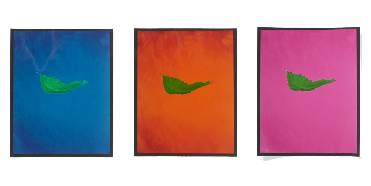
Futurist Cher Potter probes the tea-reading cabals of chromo- sapiens with KEITH RECKER, co-author of Pantone: The 20th Century in Color. Together, they open the closed door to the world of color forecasting, and the effects it has on global fashion.
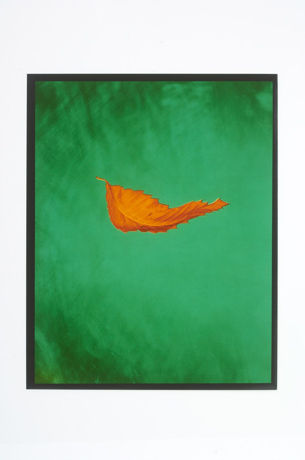
Twenty-seven women and a man debate over three different shades of chartreuse. As the world’s ultimate authorities on color, these are the heads that select the shades we choose to wear each season, and they do it two years before we even walk into the store. The agenda at the biannual meeting is to decipher how the vibrational changes in today’s society will affect our relationship toward color, and in turn, how this will influence the tone of socks and trousers fashioned for 2014. The fact that the spaces we live in and the garments we wear in the near future present themselves in similar and distinct color combinations is no coincidence.
KEITH RECKER: Next season’s color just isn’t a case of the fully formed Athena bursting forth from Zeus. The shuddering juxtaposition of red, ruddy amber and fuchsia, the bewitching combination of chartreuse, navy and tangerine or the lazy lyricism of melon, ochre and oyster are not acts of glorious impulse. There is a color system behind every inspiration.
CHER POTTER: But how does this committee with its seemingly godly powers to control the hues of the universe make the “right” decisions? Are these color experts prophets, scientists or global negotiators? As color forecasters establish their palettes two years in advance, talk of prediction and prophecy surround the field. However, most of the hype behind this brand of future speculation can be neatly explained through commercial logistics and time; for example, to develop new fabrics takes up to eight months. Only once the fabrics are developed can the collections be designed and the garments manufactured. In this sense, thinking in the future is less about a color message bestowed by the divine and more about industry preparation needs. Yet, when it comes to forecasters choosing the colors themselves, there is something of a sixth sense at play. Laurie Pressman, Vice President of Pantone reveals: “There is a surprising level of coincidence in these international color meetings. Certain hues will dominate a particular season; the same hues are picked out again and again by different color committee members from across the world.” But, if color experts around the world are intuitively predicting similar colors, there must be an inherent color-coded zeitgeist that can be accessed through special powers of observation.
The symbol of a certain shade bubbles up because of a psychological need. The color forecaster’s job is to find colors that satisfy the psycho-spiritual wants of people in future contexts – that is the key. This winter, off-kilter green emerges amidst a revival of late 70s decadence. It’s a sickly shade and gives us access to the inherent not-quite-right-ness in the current flow of culture and economy.
The not-quite-right-ness of this leaden green is an ambiguous progression from the devastating dominance of achromatics after the 2008 economic collapse. Now, according to the Spring/Summer 2011 catwalks, we find ourselves caught between these ashen tones and an injection of histrionic brights in vermillion, cobalt and battery yolk yellow. It appears there is an emotional link between neutrals and social gloom; between off-kilter green and a sense of the awkward-but-not-entirely-forlorn; between saturated brights and defiance. World renowned historian Eric Hobsbawm, in his lectures titled Looking Forward noted: “Why fashion and color, whose instruments are not words, often manage to predict change before professional forecasters is a fundamental and obscure question for me.” This psychological link may account for the fact that sometimes colors in fashion seem to reflect a social temperament before it is realized.
Is there or is there not an underlying pattern to the periodical changes in the coloring of our cultural landscape?
Nothing is completely predictable. But in the broad flow of culture and economy and current events, it’s interesting to see how often complete opposites balance each other out. At the depth of the Great Depression you had Jean Patou and Edward Molyneux offering very reserved palettes of pearlescent and smoky hues. At the same time you had Technicolor movies come into play, with their great blasts of exaggerated color – a perfect distraction from distress. From the opposing points of view, you can argue that both palettes accomplish similar things psychologically for different people. I think this is something you see in most periods of great flux and change.
The rules of practice in this field remain shrouded in mystery. Some color forecasters wander through events and spaces and simply feel, using the self as an emotional litmus test, reacting to what’s new or relevant for the times. Others take a more cogent approach and analyze their regions by breaking down the emerging psychology of their countries into a series of expressive color palettes – a kind of psychoanalytic chromology. Most independent color forecasters refer to the process of gathering palettes for the near future as an intuitive science, both rational and emotional. There are indeed resonances with the scientific method in that predictions are set up based on intuition and observation and then tested in the market. But exactly how the rationality and intuition is employed is impossible to translate into written methodology; set theories are avoided in the belief that they may compromise instinct.
I am not bound by a particular theory. I’ve found that theoretical systems can usually explain why something works or doesn’t work. But these same systems do not predict what new combinations will delight, surprise, challenge, revolutionize and give birth to something original. By definition, something original will break a few rules. And delight and surprise are notorious for their ability to elude the structures of systems.
And so there is an inexplicable system underlying independent color forecasting, whose results are both collectively succinct and deeply subjective. It’s at this point that color committees become an integral point of reference for the industry. Committees like The Color Marketing Group and Intercolor act as worldwide color management systems coordinating and refining international color messages. For independents working around the world, national color committees are the first point of submission. From these national committees, a single representative is invited to the international council, the final stage of the global editing process.
The process of color selection at this meeting begins with each member revealing their regional color stories – a series of palettes that connect to the coming zeitgeist from the per- spectives of North America, South America, Asia, Europe, the Middle East and so forth. From more than 600 hues presented, 42 are chosen to represent the season, covering pales, pastels, mid-tones, brights and darks. And within this seasonal matrix, one or two key colors will emerge as the defining tones of the autumn/winter period in 2014. This negotiated final palette acts as a universal color message for a particular season and is sent out to designers and companies across the world.
Each season we set out to define the next alphabet, metaphor or sentence of color and its combinations. The process is every bit as complex as a poem.
The philosopher Vilem Flusser, in his contemplation on the potential of color as a universal language, asked the question: “Is it possible to establish a color code that could become a sort of clear and distinct universal language like Esperanto?” If color is an information carrier of cultural codes, then developing a universal palette does generate a quasi currency of visceral communication – if the codes themselves are systematized. It may be that these covert color committees are unknowingly at the forefront of the endeavor.
I’m fascinated by cultural coding, which is essential to forecasting. There is a cultural matrix around each color. Red centers around passion, fertility and violence; this code can extend into celebration but not into mourning. Green means growth, but certain shades also connote impurity and sickness; growth and sickness meet in contagion, so the matrices are connected. It’s not quite universal, but it is interconnected and comprehensible. The diverse resonances do not quite submit to a universal meaning, unless of course there is a prolonged and concerted attempt to construct one.
“If it is [possible],” Flusser continues, “it would be an aesthetic revolution.”
Credits
- Interview: KEITH RECKER
