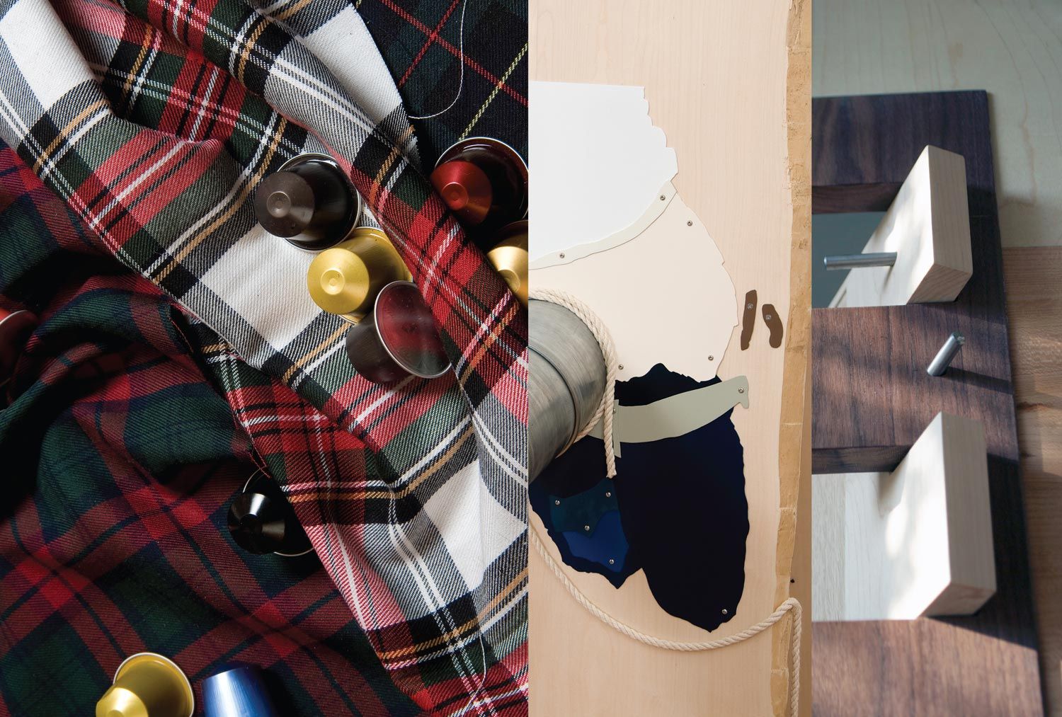
Special Commission for 032c by HELEN MARTEN
|VICTORIA CAMBLIN

Gallery biographies tend to state that Helen Marten “lives/works” in London, but at the time of this contribution she was living and working in Macclesfield, the Cheshire market town in which she was born in 1985. Macclesfield was where one half of Joy Division was from and used to be something of a booming silk center. Marten says it is now “almost charmingly off-kilter,” and that she uses the industry there because it is smaller and more focused than London’s. For Marten, it is simply a place of production, but something of Macclesfield and its Northern English history nevertheless seems to haunt her work, which consistently presents a festishistic, medieval tactility. The “medieval tactile” is a made up typology, of course, but part of what that means is that the material objects are persistently erotic – they are “touched”; the welding and the wood possess an analogue sexiness, obsessional and prodding and binding.


Marten is interested in how you can use materials to specifically brand or locate something in a fixed narrative – that is, within a kind of textbook history, a primary school diorama of Tudor lifestyle. Basic building materials assume a digital arrangement, where flat squares of wooden color register as pixels, and straightforward constructions resemble 2D foam board cutouts of themselves. Elsewhere, wooden panels made from solid and veneered timbers – yew, lemonwood, jarrah, holly, black walnut, maple, speckled mahogany – intersect at wide angles through knurled finger joints, weighty and exposed like overwrought ornamental quoins, awkwardly patched together in misalignment like architectural Comme des Garçons.
Marten highlights the grotesque in these materials. There is what she calls a “kitschy disgustingness” to the pattern of wood swatches as they butt up against one another, but also a “butch” carnality, alluring and hairy and flannel-clad. Some of her most recent works function, she says, as “ludicrous display centers for ironmongery.” Shelving brackets, handles, panic hardware, taps and keys protrude from panels pornographically – it is a fixings fetishist’s dream, a sadomasochistic fantasy in metallic curves. Marten’s homemaker is out of control, a prolific handyperson whose work about the house is the gratuitous antithesis of “good design,” yet flirts with the grid of 1960s minimalism. It subverts the axiomatic, yet presents its own spatial logic. It mocks itself and finds itself ridiculous but also beautiful – in its abjectness, in the pathos of its brushed steel and metal-pressed shelving brackets, and in the semi-apologetic tackiness of an Ikea laminate.
There are fabrics involved as well – historically weighty ones like gabardine and tartan, rubbery vinyl wallpaper (which is smelly, apparently, like a volatile solvent) and digital prints of wicker, pebbles and wood grain. And these, too, are pieced together with all the wrongness of the aforementioned fashion house, or of a Robert Venturi Chippendale chair – a postmodern pastiche that flattens the fastidious dimensions of the original, “perfect” object into a paper doll. “I like the deliberateness of error,” Marten says – you can integrate the mistake into the totality of the final product. No unwanted “crumbs” dwell in the shadows of the exhibition space because Marten has moved them into the glorious excess of its fixtures.
These fabrics find their way into the architecture of the exhibition space. Her adaptation of Tudor manor beams integrates black sleeping bags (rolled, stuffed, splayed flat) and puffer jackets crammed against stark white walls and steel “window boxes”– slickly welded and strewn about as they would be on so many suburban patios. The sleeping bags-as-Tudor-beams modernize the imago of the medieval urchin; the metal boxes function as ashtrays in public parks. Yet despite this density of signs, everything manages to be dumbly “there,” analogue aliens in an otherwise digital world. Next to drawings – of hands and fists, tools and dirt – that look like sexed-up Hergés, symbols of industrial revolution become cartoons, “cutout” versions of progress, as a blurred steam engine, for instance, rendered in post-apocalyptic gradient grey.
Runic and Roman insignia cover the panels and tubing of Marten’s newer works, objects cantilevered against one another like bundles of sticks. We are, again, within a realm of commercial signifiers that lies somewhere between Robin Hood’s Sherwood Forest and Charles Dickens’ lamp-lit London: chic, bleak, and quiet under a powder-coat of coal. These objects are never humorless, though. They are mysterious. They are static, but not really, because they are mischievous, and they are smug, because they have been designed that way. Part of that can be located in Marten’s manner of suggesting things rather than simply building them: the form of the ramp will be indicated in lieu of a ramp’s actually being there by a structural prop approximating it. This is art-practical Neo-Platonism: contained ideas are conveyed in ersatz but exist elsewhere, off-site, in their essential, universal form.
The universal, however, is not what is at issue here; the imperfect particular is. Marten’s system of signs is more slapstick than truth-hungry, and the situation is such that a ramp can be indicated by the same impulse as that which governs the Nike swoosh – the idea of an idea takes the form of an athletic curve, an affirmative “yes,” a “here,” a confirmation, a caricatural light bulb appearing over a head. To walk into Marten’s space of exhibition, then, is to cross a threshold into an arena in which meaning is encrypted, conveyed in cultural codes. Modern iconographies, logos like those of YSL or Ralph Lauren flag up some archetypes while going head to head with others – those conveyed by acrylic nails, lead piping, clip art or airbrush – here against an Yves (or is it Calvin?) Klein blue. Marten rather suggestively calls this “horizontal conversation,” a side-to-side movement in a context (that of the gallery) typically devoted to the vertical, to looking upwards at a wall or a standing work. This contribution is the result of precisely such a conversation – the pillow talk of three-dimensional material objects gathered amidst the sensual horizontality of the printed page.
Credits
- Text: VICTORIA CAMBLIN

