Must What Went Up, Come Down? An Interview with SITE’s JAMES WINES
|Patrick McGraw
Architects are often sadists, though maybe not intentionally. By having to design for masses of people over long periods of time, their work is often rendered in the image of a delusionally pristine future. But as the future of a given block or city can’t be decided by how one firm and a gaggle of patrons sees it, pain and disruption inevitably follow. An idea of humanity’s linear progress – the silver lining of capitalism – is the story that architects tell themselves in order to survive.
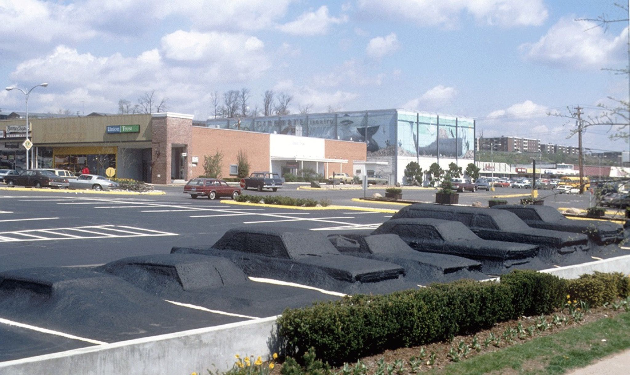
James Wines and his firm SITE, established in 1970, have always taken a different approach. Avoiding the totalizing visions of his discipline, Wines plugs the realities of development and destruction directly into his buildings. For his Frankfurt Museum of Modern Art proposal, he incorporated leftover elements of the original building’s war-torn shell, while an early sculptural work from 1972 featured a row of cars drenched in asphalt, lined up in a strip mall parking lot for the public to interact with. Recently, he designed an Off-White storefront in a mall in Gwanggyo, South Korea, out of nearly transparent materials, making the retail installation almost vanish into anti-Instagramability. For Wines, ruin and collapse are ornaments in a body of work that seems increasingly prescient.
PATRICK MCGRAW: Are you a misanthrope?
JAMES WINES: I don’t think I’m misanthropic, though I may be pessimistic. I just like things that are overgrown and unfinished because you never know which way it’s going to go, so I thought it’d be interesting to build things somewhere between construction and demolition. “Nature’s revenge” is how I like to describe the work.
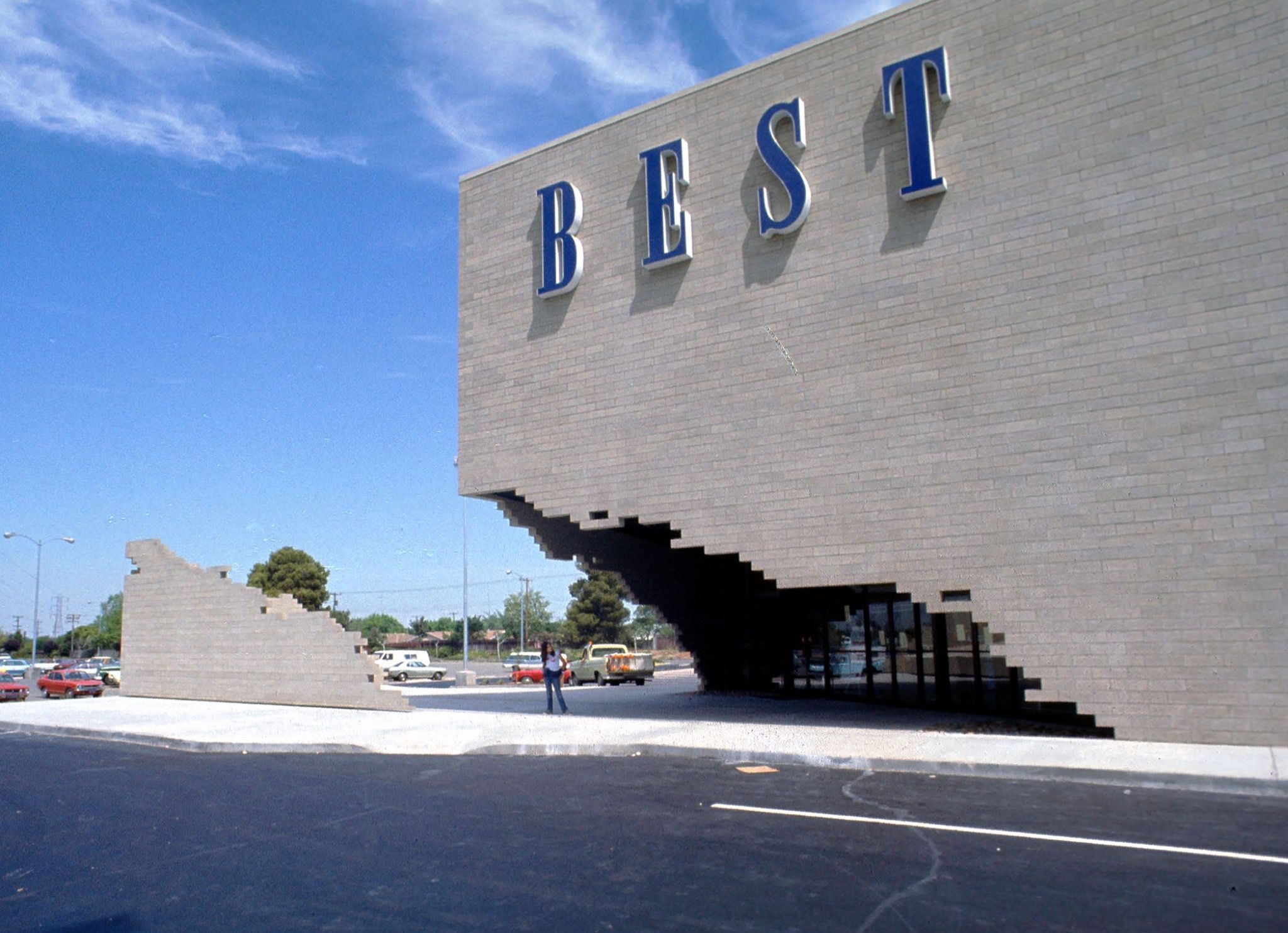
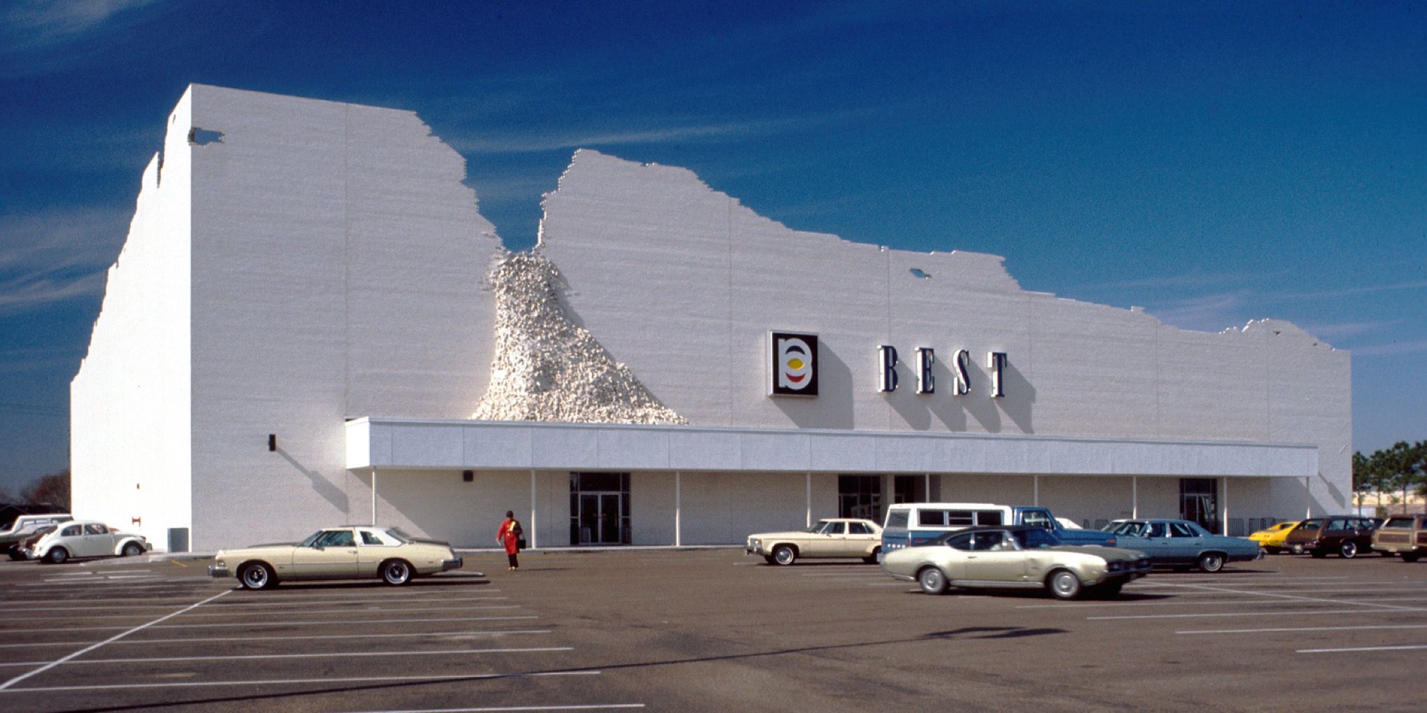
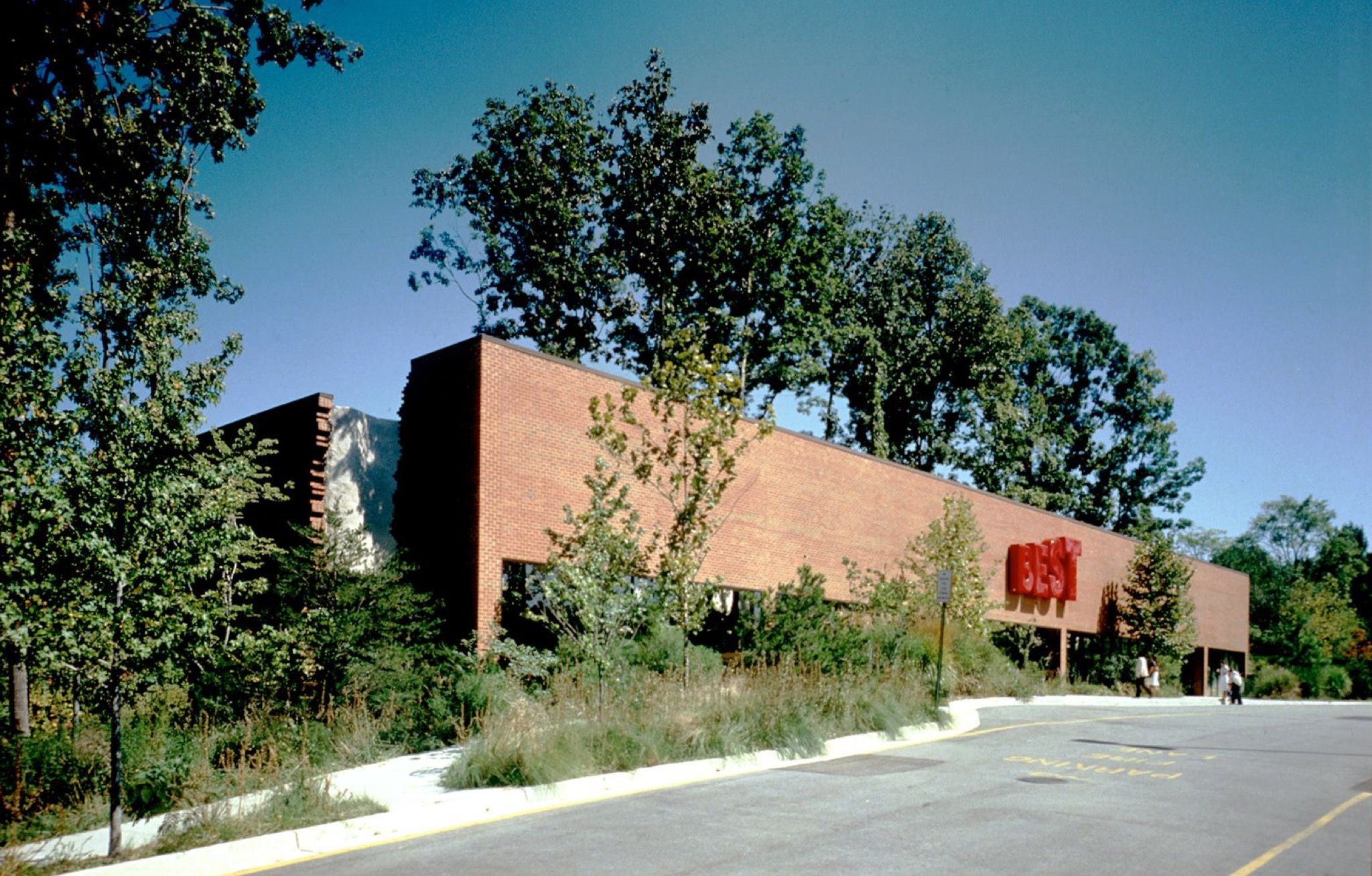
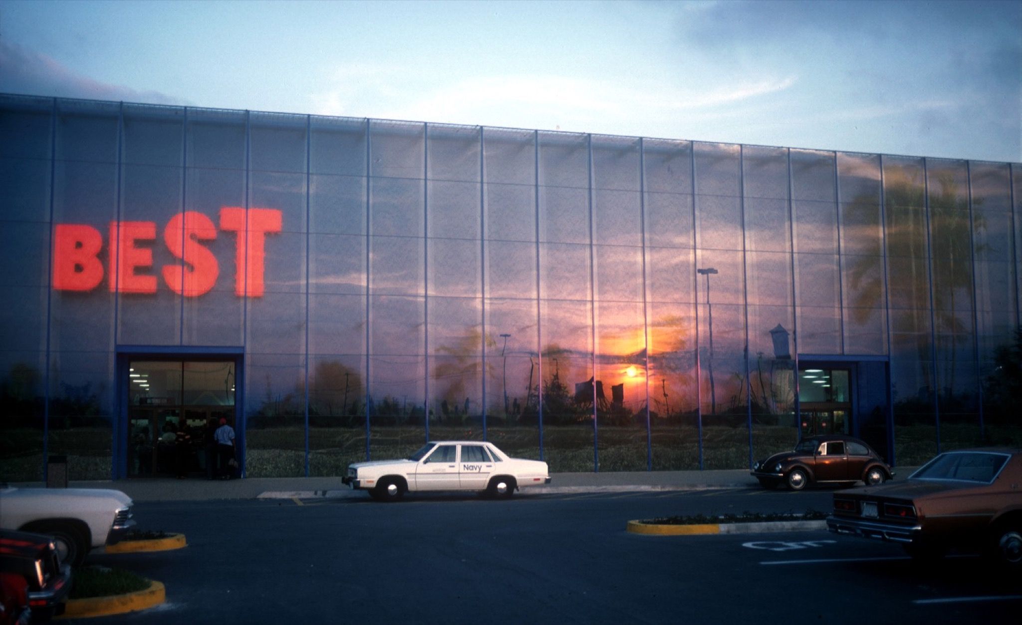
In 1972 Wines and SITE began a twelve-year collaboration with the BEST Products Company, a Virginia based big-box outlet store. In one of his most well-known designs from the series, the facade is made of partially destroyed walls, one of them with a hole blown into it as if by some imaginary force, and a waterfall of bricks trickling down from the roof. Inside the store, which functioned as a showroom for BEST, Wines had products cast in concrete and placed on the shelf next to the actual items for sale.
WINES: With the BEST buildings there was always the idea of putting art where you least expect to find it. And in those situations, there was no art. Customers just came, bought products, and went home. At the time, if you had talked about those types of buildings with Harvard Architecture students, they would’ve shuddered. We wanted to embrace roadway architecture so we designed the building as a billboard, one that you can walk into.
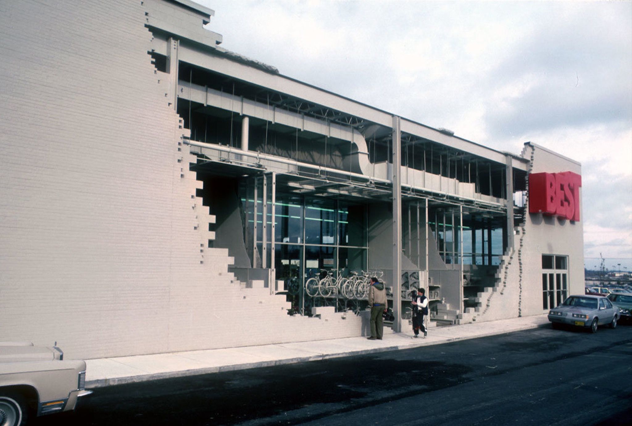
It’s possible to see these buildings, as many have, through the lens of postmodernism – which among other things used enlarged, at times cartoonish forms, and invented narratives to stylize America’s expanding consumerist base. But unlike Michael Graves and The Memphis Group, Wines was designing for reality as he saw it on the ground, using elements of American industrial and suburban decay in the same way he used fragments of war for his bombed-out museum in Frankfurt. Yet Wines also offers an antidote to the breakdown that he saw around him: nature. In a 1978 building for BEST, SITE’s partially deconstructed store was built around an existing patch of trees and shrubs, offering shoppers a post-apocalyptic greenhouse experience – a window onto what Wines calls “nature’s revenge.”
By incorporating greenery into his designs, he would inadvertently predict the most popular and perhaps most overused architectural reference of the past 20 years: “green architecture,” a term that has developed in tandem with the widespread corporate adoption of environmental signaling. Ironically, at this late point in our climate dilemma, it seems that our future cities will be covered in green, no matter what route we choose: either we will design cities with greenery, or nature will overtake them post-doom. In 2019, New York mayor Bill de Blasio proposed a ban on glass and steel architecture – a ban on modernism. Meanwhile, the city’s new energy code leaves few options for some buildings but demolition itself, a prospect that will make our future look increasingly like a Hollywood depiction of our own destruction.
WINES: Architecture, especially these days, is so anti-ecological it’s absurd. Even buildings called “green” are rarely so. I mean, the fact that in this age of environmental disaster, people build buildings with titanium and aluminum and things like that is just literally insane. Recently it’s been getting harder and harder to get people to respond to environmental issues, or to consider them at all when they’re working on a project.
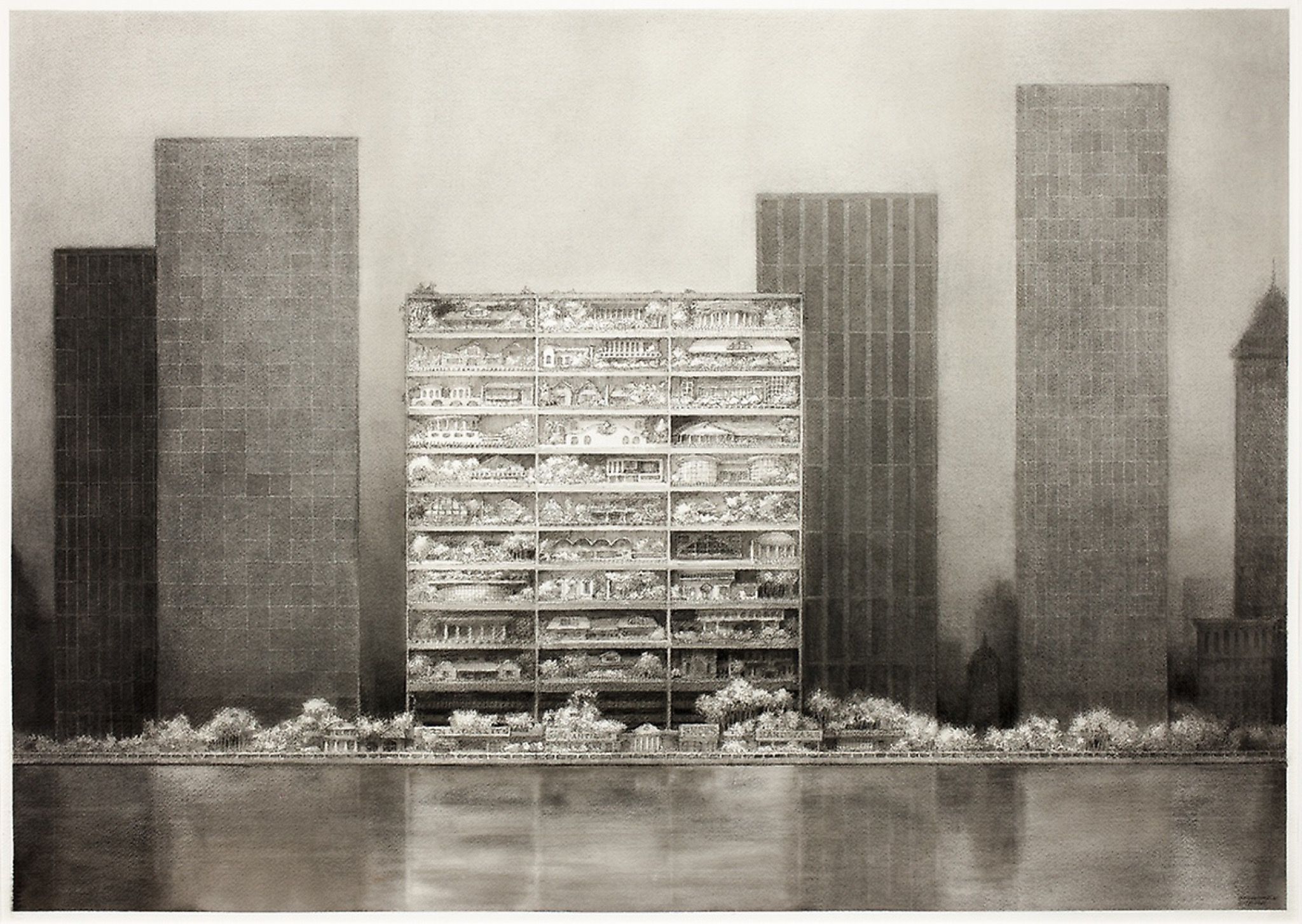
In 1980 Wines designed his “Highrise of Homes,” an unrealized proposal for a tower that holds dozens of separate, foliage drenched houses in a multi-story frame. In a drawing, the Highrise looks like a vertical parking lot of architectural styles, pictured against the backdrop of a vacant, monolithic New York. In a postcard created for Earth Day in 1991, Wines shows the southern tip of Manhattan overrun with greenery to the point that the city appears to be melting. It’s in these environments, rotted to the point of picturesque postcard perfection, that Wines is his most intentional, and his designs closest to abjection.
WINES: One of the major issues of living in a city of high-rise structures is that individuals have no identity. Basically, the Highrise of Homes was like a Sears catalogue, from which people could pick their designs and facades and gardens.
Did you ever try to get the Highrise built?
WINES: It started out as a theoretical project, though there was a Japanese developer who wanted to build it. But he went bankrupt in the 1980s real estate bubble. Over time the idea became more realistic. Now I’m actually thinking, what would it be like to build one? I wish there was an adventuresome developer who would try it.
Of course, in America, dilapidation has happened outside the realm of design for a long time. In abandoned housing projects and deindustrialized cities, some areas have become so rundown that they’ve unintentionally become green. In midtown Manhattan, a theme park for architecture-cum-foreign-assets, billion-dollar towers built by the likes of Jean Nouvel and Robert Stern now have vacancy rates upwards of 40%, turning the buildings into active ruins. Downtown, a new age of trendy tourists flock to The Highline to stroll along a former railroad spur converted into a park, while a few miles away former housing projects are eaten back into the earth. Between the inadvertent and the intentional, expanding inequality manifests in built space.
Wines is not a radical environmentalist, but in responding to the question, what is to be done with what’s left?, his projects play on the same apocalyptic aesthetic that accompanies ecological nightmare. Long before Covid-19, high-paying jobs and wealthy suburbanite emigres returning to the city – and the policy and development that serve them – systematically priced out lower-income earners. In the last year, the affluent have once again fled for the country, citing a variety of reasons including “safety” and space, deeming the need to inhabit densely populated urban centers behind-the-times as “distance” replaces proximity in their professional and lifestyle priorities. In this version of the future, in which the city skyline is formed by depopulated corporate towers, what must be done with the massively energy inefficient architectural leftovers?
WINES: I don’t have the solution, but a solution is going to have to present itself. I mean you’ve got high rise buildings that are almost empty. What’re you gonna do about that? Those buildings are ruins in themselves. And among developers, there’s denial. I think one thing people don’t realize today is that we can’t go back.
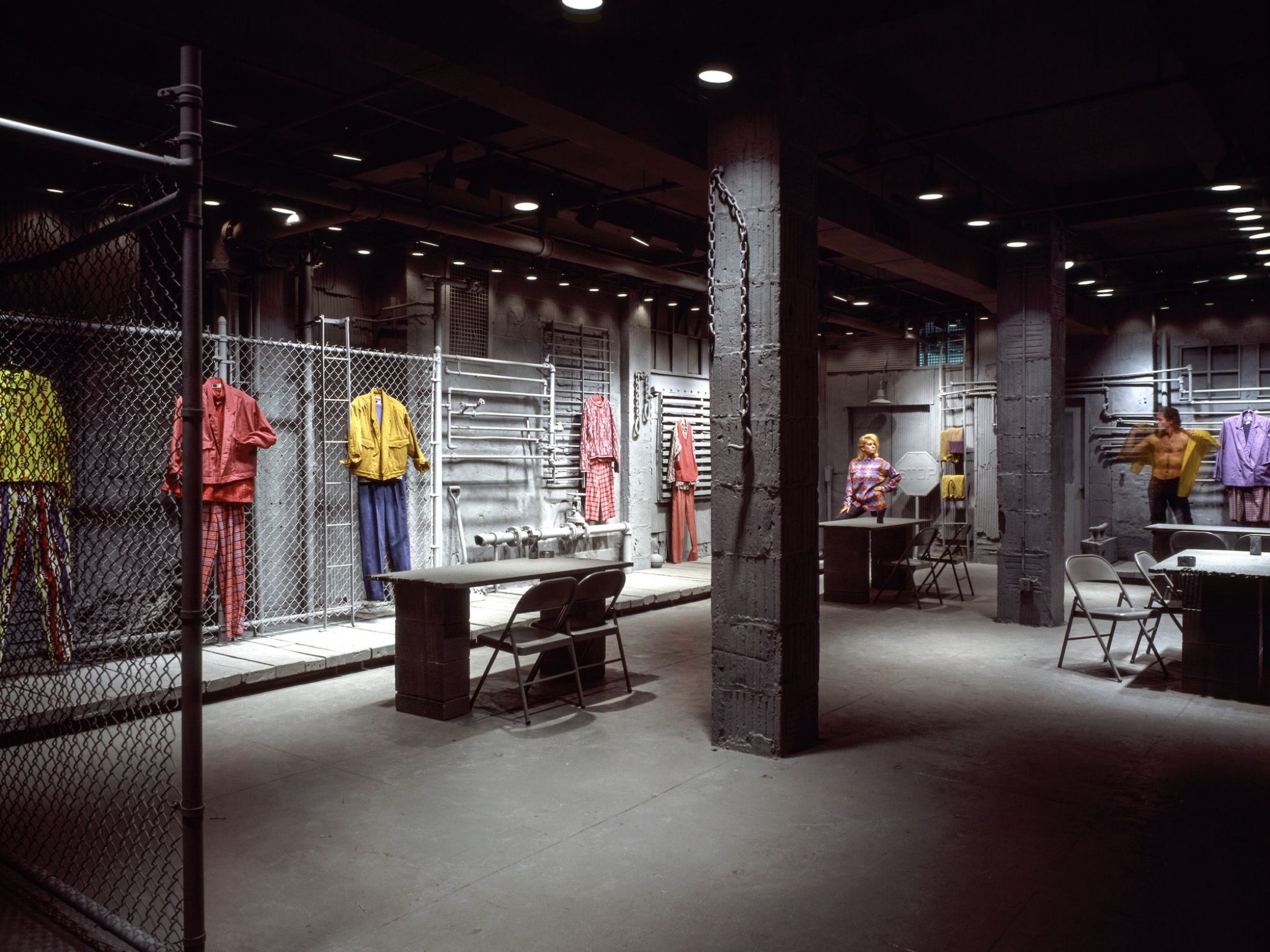
Wines has never shied away from commercial collaboration, having designed flagship stores for Denny’s and Shake Shack, as well as multiple McDonald’s locations. His recent work for brands, most notably Off-White, has exposed his contrarianism to a new generation of consumers who would never have been able to set foot in a BEST showroom. As with his early sculpture, the potential for interaction with such projects is a key factor in his decision to design for companies that might otherwise appear at odds with his critical views. To Wines, designing within what some would call “junkspace” is one way of testing the relevancy of his ideas, and disseminating them to a general public.
WINES: The idea for doing pop restaurants and things like that was to make fun of myself. Having a self-effacing quality was a very meaningful and powerful tool in the public domain in architecture. So, I took the brand’s imagery and existing iconography and tried not to change it. Denny’s, McDonald's, Shake Shack – these brands are found objects, the more you change it the more you lose.
Until recently, imagining a post-capitalist future was near impossible. Increases in political isolationism and authoritarianism have made it more feasible, but the replacement that’s been offered isn’t a sustainable techno-utopia, but chaos. The average cultural diet within that frame one of escapism that alienates us from the reality of what we are surrounded by. Part of the success of Wines’ work is its ability to illustrate this discrepancy between what we think we inhabit, and our actual environment. The city as we like to think of it, in its essential density, is a meme, something that’s no longer relevant to our decentralized, digitized lives. Greenery may not save us. But if the future is one in which decay, ruin, and abandonment shift from being default conditions to deliberate strategies for offsetting catastrophe, it will be a future that Wines and SITE will have helped provide the blueprint for.
What happened to the BEST buildings?
WINES: All of them were torn down, except the building built around a forest. And that one was sold to a church who cut down all the trees and paved over the greenery. That’s also the vulnerability of the kind of stuff I do: it’s so near a normalcy of some kind that they don’t understand why it’s not.
In a way, you’d already done the developer’s job for them, by building a half demolished building.
You know, the BEST building in Florida that looks like a jigsaw puzzle once got hit by a big hurricane. It really did a lot of destruction and cracked open the facade, but it didn’t destroy the business. I told them to just stand up the pieces of the facade and leave it that way. Nature’s Revenge.
Credits
- Text: Patrick McGraw

