RICHARD TURLEY: A Lazy Modernist in Corporate America
|ROBERT WIESENBERGER
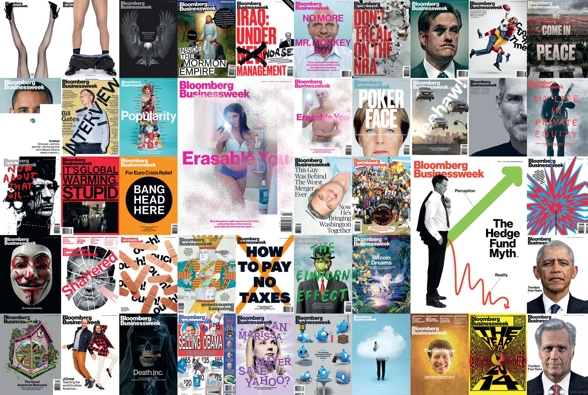
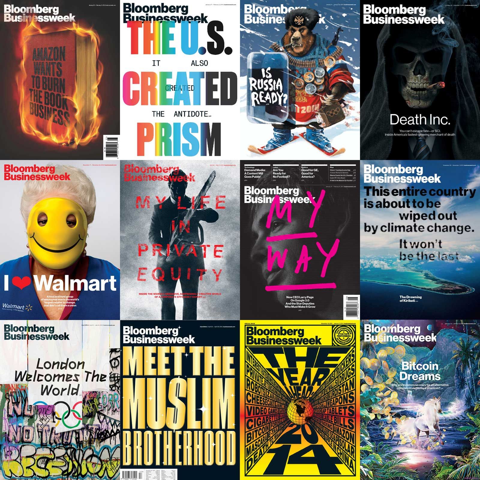
RICHARD TURLEY has created some of the most unapologetic, visually incisive magazine covers of the new millennium.
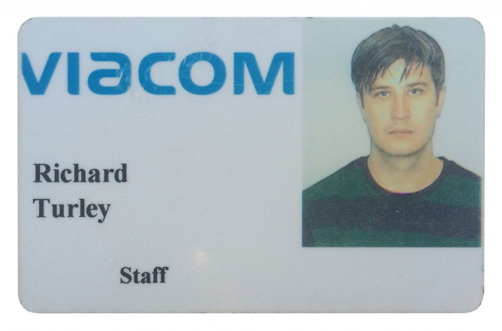
Fresh off the success of rebooting a struggling print publication for executives, he now hopes to revitalize a cable network for teens. Turley has recently become creative director for MTV News, where he will lead an always-on, cross-platform assault on the brand’s 18–24 year old demographic. When we speak, the demure young designer is navigating back-to-back meetings at the Viacom subsidiary and is serenaded by a chorus of inbox pings. He apologizes for losing his train of thought, though he’s usually making perfect sense. In his quiet way, Turley is trying to bring the anarchy that originally defined MTV to a much-changed media landscape. Moving from magazine designer to TV executive in the fast and fluid continuum of print, broadcast, and web is a task that requires a great deal of improvisation. But Turley is figuring it out as he goes along.

SHAREABLE (PRINT) MEDIA
When former Mayor Michael Bloomberg’s privately held company bought BusinessWeek in 2009, at the depths of the financial crisis, the once-indispensable title had become a dentist’s office magazine. (As one expert reasonably asked at the time, “Is any media brand with the word ‘week’ in it going to survive?”) Former music critic and TIME editor Josh Tyrangiel joined as the new editor-in-chief, and he brought on Turley immediately.
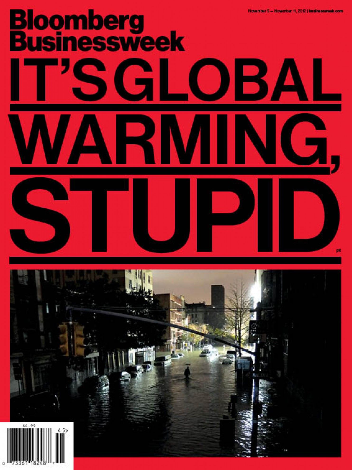
Each week from 2010–2014, Turley’s covers for Bloomberg Businessweek ranged from extremely clever to national-conversation-shaping. Working closely with editorial, his magic was to distill complex news stories into indelible images that wedded inventively art-directed photography with pithy, carefully typeset copy. After Hurricane Sandy in 2012, the magazine delivered the headline “IT’S GLOBAL WARMING STUPID” to its big-business audience with sledgehammer bluntness in massive type, black on red, topping an eerie photo of a deserted New York waterworld. For a (white) bread-and-butter business story on the merger of Continental and American Airlines earlier that year, Turley’s cover had two jumbo jets joining the mile high club. It’s almost a tender moment, and the headline croons, “Let’s Get it On.”
ROBERT WIESENBERGER: Bloomberg Businessweek ran a sidebar on the thought process behind each cover. When did covers become a thing there?
RICHARD TURLEY: We made a few good ones in the first year, and then we got some confidence. We always wanted our covers to be pretty good, but we never sat down and thought, “This is the plan, this is what we want to do.” We were given a lot of license to experiment at Bloomberg. They were supportive and it was a short chain of command – really Josh Tyrangiel and Norm Pearlstine, our president, in the first instance. Our BusinessWeek covers were sharable visual content. They weren’t necessarily designed like that, but that’s essentially what they were. At their best, the covers became the kind of thing people passed around on Thursday morning, and we put them on Twitter. There’s no fundamental difference between what I’m trying to do with MTV and what we did at BusinessWeek. Now we’re just doing it on an industrial scale.
What role did editorial play in the design process?
Josh was a fantastic partner, a real collaborator. He’s an agitator, rebellious – he wants to do interesting work. And he’s incredibly fucking smart. A lot of covers we did were his ideas and based off words he wrote. We trusted each other, could talk quite directly to one another, and we didn’t have a problem telling each other exactly what we thought.
Turley’s work at BusinessWeek recalls George Lois, the audacious American adman who consulted for Esquire magazine in the late 60s and early 70s. Lois also scraped away the encrusted copy that magazines before (and since) used to lure newsstand customers to the pages inside. In its place, he put a single, arresting photograph, or a proto-Photoshop montage. In 1965, it was a model shaving her face in anticipation of the women’s liberation movement; in 1968, it was the boxer Muhammad Ali posing as St. Sebastian, riddled with arrows and martyred for his refusal to serve in the Vietnam war. Incidentally, Lois also created a classic 1982 spot for a fledgling MTV, convincing thousands of kids to pick up the phone to their cable providers and mimic Mick Jagger, demanding, “I want my MTV!” Turley has Nicki Minaj growling the same line in a recent spot for the Video Music Awards.
But Turley is in other ways the anti-Lois. In addition to making covers, he designed the interior of Bloomberg Businessweek, which is a lesson in information design. And while Lois, a boisterous model for Mad Men (he rejects their rendition) still dispenses creative commandments (tip #82, in his recently published 10th book on creative wisdom, instructs, “Speak up, goddamit!”), Turley’s tacit mantra seems to be “just make cool shit.” It’s as unhelpful, without his considerable talent, as the design wisdom long-sought by executives from Apple’s closed-door studios.

LAZY MODERNISM
Turley’s nonchalance belies his editorial precision. He cut his teeth at The Guardian, where he got an internship after a brief stint with the now defunct Seven music magazine. He was present for Mark Porter’s historic redesign of the paper in 2005, when it slimmed down to a full-color “Berliner” format (between tabloid and broadsheet), and proved that print media could live comfortably in a digital world (at least for the moment – The Guardian now mostly lives online). Turley art-directed the paper’s daily G2 section, and stayed for almost 10 years.
When he redesigned Bloomberg Businessweek, Turley made the house font a restoration of Helvetica called Neue Haas Grotesk, originally created for The Guardian redesign by typographer Christian Schwartz, but never used. Turley had it finished in 2010, and it proved to be the glue that held the publication together. More than (just) an obsessive act of typographic originalism, Neue Haas Grotesk’s creators went back to the original metal type and 1957 notes of Helvetica’s creators to recover what was lost in its digital conversion, subtly improving the font’s legibility at all sizes.
The difference between Helvetica and Neue Haas Grotesk is pretty subtle. Would you consider yourself a type nerd?
I don’t really care about typefaces if I’m being honest. It’s not an area I know very much about. I’d struggle to tell you the difference between the two. I mean, I’m being facetious – I can tell by the leading, and so on. But there’s a certain amount of designer wank going on with the whole “back to the roots of Helvetica” thing.
A lot of your early ideas for the cover involved experimental type, but then you reverted to Helvetica, saving the wild type for the inside.
We did! Because people care far less about the insides, you can have far more fun with it, and use it as a laboratory. With the front cover, though, you want clarity. It’s got to show what your point is. It’s why we did a lot things that were just type. Often Josh came up with this great headline, and we just said, “Fuck the art ideas we have, let’s just run that.” You don’t need any more than that.
Why Helvetica?
I chose Helvetica because it felt like the wrong thing to do at the time. And because I was lazy. I am lazy. So I think in some ways I use modernism just like everyone else – lazily. Modernism is the result of design by committee, everyone trying to solve different problems, unable to agree on anything except a grudging mutual acceptance of what they hate least. It’s an autocratic ideology where content is always king, the product is always the star – a design system that gets out of the way. It’s a simple, reductive form of slippery group-think. I see modernism as being a fear of personality. Or rather personality that bends to the demands of the machine. Clean lines and an absence of mistakes. Tasteful and compliant. Easy to navigate. Fearful and elegant. Unarguably average. Confidently minimal. Honestly, I have no idea what I’m talking about.
Turley knows exactly what he’s talking about. Choosing the de facto typeface of corporate modernism for a business magazine is so wrong it’s right, so compliant it’s almost subversive.
For the inside pages of Bloomberg Businessweek, Turley used the lessons learned from Mark Porter at The Guardian to create a strong but flexible grid to organize content and typographic rules to navigate it. Clear hierarchies of information and ample white space allow the time-strapped reader to skim the page for what’s important. The data visualizations and infographics were, as one would expect from a parent company that deifies data, done brilliantly. Rather than dropping figures into layouts at the last minute, Turley’s design department worked side by side with editorial, developing material together in real time. The graphics team worked as both designers and journalists, making sure that the visuals were seamlessly interwoven with the text.
Your covers get a lot of attention, but you also redesigned the magazine as a whole. How did you approach the inside?

If you were to do a kind of equation, Bloomberg Businessweek was like New York Magazine multiplied by The Economist divided by The Guardian. That’s the kind of design language I was taught. The interior of the magazine – the spacing, the typography, the layout – owes a significant debt to Mark Porter who redesigned The Guardian, and before him, to Simon Esterson.
What was that design approach?
The idea is to create a very robust structure, so you don’t have to worry too much about the design, then putting all your energy into the illustration and the photography. You end up with something that’s a pretty blunt instrument, where most of the magazine is heavily templated, and then allow yourself these small opportunities – the cover, the features, a little bit at the end. You can then concentrate on things people actually care about, like the pictures and the ideas. The reason I used to hate American magazines so much is that they just put all their attention into stupid type in 15 different typefaces, and they’re spending all their time creating these insanely detailed, textured, multi-layered design experiences that end up forgetting the reason people buy magazines. It ends up being this mush of “design.”
You designed a business magazine that managed to be a page-turner. How?
We thought people would navigate the magazine just by flicking through it. We always wanted there to be this dual experience, of reading the headlines, reading the captions, reading some of the ornamentation on the page – that is, pull quotes, smaller pictures, etc. We’d have things at the top of the article so you didn’t even have to read it.

THIS WILL KILL THAT
Who could forget The Buggles? When MTV launched at midnight on August 1, 1981, the first music video to air was The Buggles’ auspicious hit “Video Killed the Radio Star.” Just before, spliced footage of a NASA shuttle launch and the Apollo 11 moon landing played and a voiceover announced, “Ladies and Gentleman, Rock and Roll.” An MTV flag was planted on the moon, with its block “M” and graffitied “TV,” flickering colors, patterns, and animal prints to a rousing guitar anthem. From The Real World to Teen Mom, MTV has likewise tried to reinvent itself constantly while staying recognizable. “Ladies and Gentlemen, Reality Television.”
From the relentless news cycle of a weekly magazine, Turley is entering the 24-hour, broadcast-web-and-mobile world of MTV News. His job is to create shareable visual content and the environment in which it lives. In addition to aggregating existing material from around the web – as MTV News mostly does now – it will produce more of its own short video spots. Turley’s role is not to manage a unified brand identity. Instead, he and his team are making what they want, fast, and putting an MTV logo in the bottom corner. There is not too much concern for consistency.
How are you feeling about the switch from a weekly print cycle to a constant one, on-air and online?
It’s like doing ten magazine covers a day! There’s not much of a roadmap. The idea is to take what MTV can be – that history of visual culture, of taking risks – and apply it in a digital news sense. You have to figure out how you can communicate in 15 second bursts, and how you can introduce nuance into shortform digital content that’s not just GIFs.
From its first day, MTV had this dynamic, chameleonic identity that still felt totally recognizable. Any initial thoughts on the visual directions for MTV News?
We need to bring a bit of that back. We could potentially bring a bit of anarchy back into things. Because we’re not making TV programs and dramas and things, we can mess around a bit more. Because we’re producing so much content, and because a lot of the content our audience gets is already pretty anarchic, and pretty off the wall, we can really embrace that.
So where does “TV” fit into MTV News now?
We have 20 slots a day on the MTV cable network. We’re starting to produce content that lives on TV – content that works in between programs. I think the interesting thing at the moment is to treat TV as another form of social media. It’s different, and each platform has its idiosyncrasies, but TV is still the most important part of MTV, and there’s an enormous audience there.
What about the “M” part? It’s a commonplace, a couple decades old, that there’s not enough music on Music Television …
It can feel like a noose around your neck, and I think it’s over-thought. We just had the biggest thing MTV does each year, and that’s the VMAs. If everything goes alright and the stars align, the whole world watches the VMAs at some level. But the reality is that nobody wants to watch music videos 24 hours a day on TV. If loads of people would start watching because of the music videos, then they would show music videos! But no one wants to see music videos. You can see them on YouTube, etc., and MTV Jams and MTV Hits, and in Europe there’re multiple MTV music channels. Music is a really important part of how we think of ourselves, but there’re a lot of different areas that MTV is going to be much more interested in. We should be more interested in fashion, and MTV Style should be really good. There’re a lot of interesting things MTV can take on, from civil rights to celebrity gossip.
Turley has been in New York for almost five years now, and he likes it just fine. He lives in the West Village, and walks to the MTV offices in SoHo. On the way, he passes the new Whitney Museum building, due to open next spring, and notes the graphic identity by the Dutch design studio Experimental Jetset, which also uses Neue Haas Grotesk to a very different effect. If he had grown up in the US, Turley would be part of the expansive “MTV Generation” (a term coined by a channel exec). But his parents in Bristol didn’t get Sky TV until he left home, so he only caught glimpses of things that crossed over to Channel 4 in the UK, like the occasional MTV Unplugged, or early shows like Beavis and Butthead and Daria. He remembers seeing MTV for the first time while on vacation with friends in Spain. It was the summer of Beck’s Loser.

Whatever the fate of cable TV, MTV News already commands huge attention on social media. At last count, it had 3.3 million followers on Twitter and almost 1.5 million likes on Facebook. It mostly serves entertainment news, but Turley hopes to expand the editorial reach. There are some signs that it will deliver more “pro-social” content, in the tradition of the highly successful “Choose or Lose” campaign for new voter registration in the early 90s. It has already experimented with strong interstitials on the shooting of Michael Brown, an unarmed black teenager who was killed by Missouri police. As George Lois knew when he created ads to spring Rubin “Hurricane” Carter from a wrongful jail conviction in the mid1970s, design savvy can make any message stronger.
How do you approach the “cross-platform” part of your new job?
We’re looking at ways of encouraging people to use their phone while watching TV, and encouraging being “always on.” MTV will be creating content 24/7, engaging our audience on any platform we have. The social department here is very good. I don’t think I’m breaking any confidentiality stuff by saying that social at Bloomberg Businessweek was basically an intern who put some links up on Twitter. Here they’ve got an entire department. It’s actually kind of mind-blowing just how ahead they are about fan interactions – about talking to the audience, being there, sharing experiences with them, watching episodes of Teen Wolf with them on Twitter.
What’s on your feed? What’s been inspiring you lately?
Well, I’m obsessed with Tumblr, with that quick and dirty, low-fi imageimage-image thing. And I’ve also been really into some of the downtown New York street fashion labels, like BEEN TRILL, VFiles, Telfar and so on. I love the way fashion forces itself to reinvent itself biannually, now even four times a year. It’s nice. It’s refreshing to throw everything out.
Lucky you that MTV can reinvent itself daily.
Right!
The new house font for MTV News is Druk, a heavily condensed typeface also produced by Turley’s friend Christian Schwartz’s type foundry. Druk ranges from bold to bolder in all its weights, and the letterforms vary dramatically in width. It’s now showing up in MTV motion graphics, by itself and over photos and video. It’s both urgent and ephemeral, wellsuited to spectacle, and meant to channel 1960s magazines and tabloids, especially the iconic German magazine twen, art-directed by Willi Fleckhaus. It resonates with the anarchic spirit that’s defined MTV since its founding. This “strategic anarchy” is part of MTV’s plan to succeed in a media environment defined by its own centrifugal forces. If anyone can do it, it’s Turley.
Credits
- Interview: ROBERT WIESENBERGER
