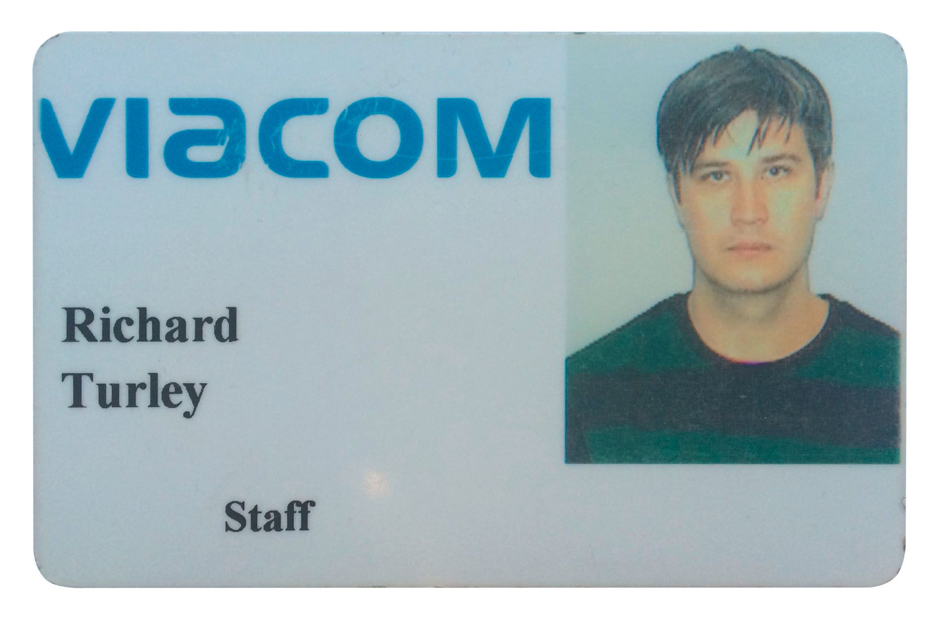
Business Made Sexy: 032c Interviews (Former) Businessweek Creative Director RICHARD TURLEY
The last time we talked to RICHARD TURLEY he was speaking as creative director of Bloomberg Businessweek. Over the past four years, his designs have taken the once-staid magazine’s image and rebranded it into one of the most talked about publications on American newsstands. We wanted to know more about his process, and how he transformed the look of one of the world’s most important business publications into one of a fanzine. Today is his last day at Businessweek before beginning a new job as MTV’s senior vice president of visual storytelling and deputy editorial director. 032c congratulates Richard on his new position, and speaks to him about design:

Bloomberg Businessweek publishes 50 issues per year. How much do you rely on instinct when designing?
RICHARD TURLEY: A lot I think. I like uncertainty.
You once said that the magazine takes a lot of ideas to sustain itself and therefore there’s more license to experiment. What do you do to achieve control in the design process?
I have no idea. Originally the idea was that you could have any idea as long as it was in helvetica. But then we got bored of helvetica. So now it’s just any idea that’s sometimes in helvetica.
How do you negotiate between excitement and “looking right”?
I’m not sure we do. I’m more interested in looking immediate.
In the history of graphic design there’s nearly always been a single voice that becomes associated with the look of an era. Neville Brody in the 80s, David Carson in the 90s. Is it still possible for a single creative vision to define an era in graphic design?
I hope so.
You chose to use helvetica for Businessweek. How do you perceive and use modernism?
I chose helvetica because it felt like the wrong thing to do at the time. And because I was lazy. I am lazy. So I think in some ways I use modernism just like everyone else – lazily. I perceive modernism now (at 3:34pm on a rainy Tuesday afternoon) to be the result of design by committee, everyone trying to solve different problems, unable to agree on anything except a grudging mutual acceptance of what they hate least. An autocratic ideology where content is always king, the product is always the star, about a design system that gets out of the way. A simple, reductive form of slippery group-think. I see modernism being a fear of personality. Or rather personality that bends to the demands of the machine. Clean lines and an absence of mistakes. Tasteful and compliant. Easy to navigate. Fearful and elegant. Unarguably average. Confidentally minimal.
Honestly I have no idea what I’m talking about.
And I’m as guilty as anyone of using a lot of those principles, so I think there’s a lot of self loathing in attacking modernism. I guess I dip in and out of anything that comes along that I find interesting. I have no allegiance to any specific idea of design or movement. I really like ideas. I’m not that bothered by which form they come in.
You’ve described what you do as “media as advertising.” Can you explain more about what this means and looks like?
Well it looks like Bloomberg Businessweek in terms of a magazine. More broadly I think it means that anyone who is trying to sell anything needs a way of talking to you, mainly so they can sell you even more things.
What’s the value of forcing yourself to work with a design you hate?
I have found it a useful way of getting out of a hole when I get stuck. As a principle we (understandably) resist creating things we hate, and there are lots of things we hate. But I think it must follow that we are limiting ourselves in some way by not at least seeing the things we hate as new ideas that are waiting to be loved. Or something. Maybe. Or maybe not.
How important is humor in graphic design?
I think pretty important. If you make someone smile then I think they let their guard down and let you in a bit more. They’re more susceptible to suggestion.
What’s your opinion on stock photography?
Love it. The world has too many photographers. We’re at ‘peak photographer’ at the moment. There is an entire idiot class of professional photographer who seem to believe they’re creating something essential every time they pick up a camera. It’s not the photographer’s fault. I blame the creative directors who commission them. There are way too many photographs in the world. Think of how many pictures have been taken all over the world in the time you’ve read this article – even this sentence. This is another sentence I’ve just typed, so that’s like a ton more. All these images multiplying and multiplying. All those shitty pictures of cats and beautiful sunsets that sit dying in the corner of your smart phone, shared with the hope of being liked by people who all have the same thousand pictures hiding on their phone. All these forgettable memories. I don’t see that’s much different from the endless stream of boring fashion pictures, boring travel pictures, boring still lifes of food that are commissioned by magazines, ad agencies, marketing firms. For every Juergen Teller there are a million Terry Richardsons. So let’s just stop. Or just use what’s there already. Or at least think about it. Sorry I’ve lost my thread. What was the question again?


