MIES VAN DER ROHE’s Collages and Minimalism’s Penchant for Chaos
But More is Not Less.
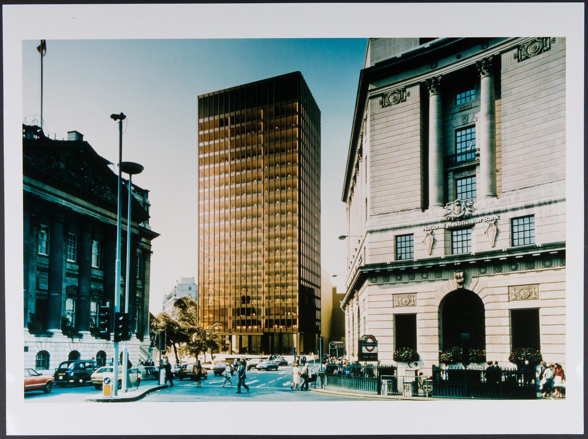
There was a time when architects were the only ones who were allowed to copy-paste. The only ones who were allowed to photoshop lived space. There was a time when no one asked architects many questions. For example, why a building designed as the Bacardi headquarters in Havana would serve just as well as the Neue Nationalgalerie in Berlin. There was a time when architects were the best trolls. Like when Mies van der Rohe erected the Seagram Building across the street from the Racquet & Tennis Club in New York, making McKim, Mead, and White’s renaissance-style building look like a stone houseplant. Or, similarly, when Philip Johnson placed a veil of beaded curtains on the ground floor interior of the Seagram Building, biting his thumb at Van der Rohe’s less-is-more ethos.

Assembled into a book for the first time, Mies van der Rohe’s collages and montages elude to this penchant for conflict. The essays in the book chew over the grandfather of the International Style’s copy-paste jobs, revealing the architect to be more of a content manager than the cold, platonic formalist that he has become in the popular imagination. In some of the collages, Van der Rohe’s gridded expanses become holding spaces for small bursts of chaos – a swirling slab of marble here, a classical nude in contrapposto there, or even Picasso’s Guernica plopped down just for fun.
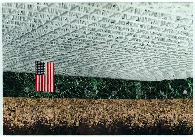
To say these compositions were intended as pragmatic tools for speculating on museum spaces would be to miss the reality that they point to: that a clean plane is often nothing more than an invitation for flux, messiness, and, most importantly, content. Take, for example, one of Van der Rohe’s most famous collages, a 1954 composition for the Chicago Convention Hall project. Like Dante’s Divine Comedy, this large and expansive room is divided into three layers: on the top, a white geometric roof, in the middle, a strip of green marble with bureaucratic emblems, and, on the bottom, a teeming rally dotted with Dwight Eisenhower campaign signs. Heaven. Purgatory. Hell. All with the American flag hanging from the center-left. Only collage can create such distinctions so immediately, and so brutally.

But perhaps the most curious of Van der Rohe’s cut-and-paste works are a series of proposals for apartment buildings, which depict drawings of living room interiors with photographs of city and country views glued onto where the windows should be. These images instantly point to the allure of the Van der Rohe design promise – the idea of a future where walls are replaced by transparent glass planes that spill into grand vistas. But there is a certain uncanniness to how a view looks when pasted onto a drawing in such a way, one that makes the outside world seem virtual. Ten years before Roland Barthes was pouring over the Citroën DS 19 – the car that turned the windshield into a mobile TV screen – Van der Rohe was thinking about how architectural surfaces can hold content. The idea that a rectilinear form can be a container for simulations is reflected in a statement Van der Rohe made about his famous Farnsworth House: “If you regard nature through the glass walls of the Farnsworth House, it is given deeper meaning than if you are standing outside. In the first case, more of nature is expressed – it becomes part of a greater whole.” This greater whole is media.


