JÜRGEN MAYER H: Germany’s Greatest Architecture Hope Since Bauhaus
|INGO NIERMANN
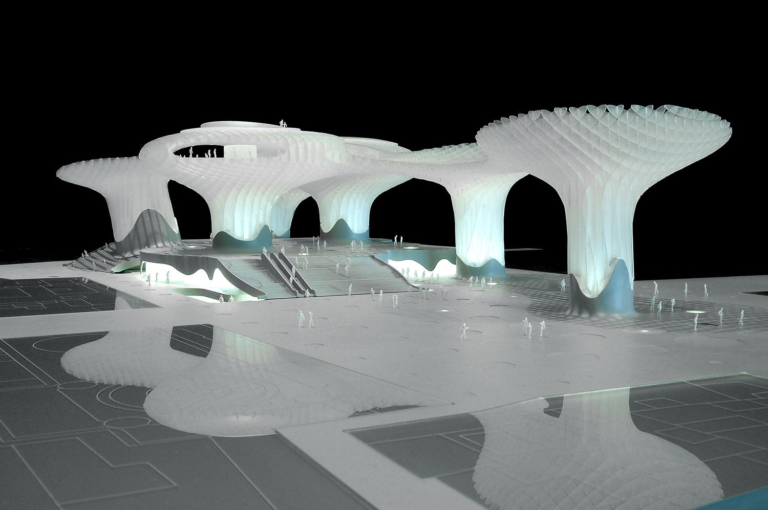
JÜRGEN MAYER H. gives us Metropol Parasol, updating an old Sevillian plaza into a 21st century public space.
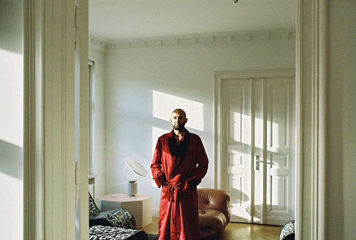
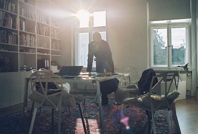
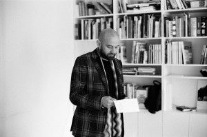
Jürgen Mayer H. is German architecture’s greatest and most charming hope since Bauhaus. The early-forties glint in his eyes is lively and the attractive blend of Swabian and American accents in his soothing voice bears witness to his Stuttgart childhood and subsequent studies in New York and Princeton. In keeping with what has become something of a cliché for modern architects, Mayer H. occupies an old-style flat in Berlin’s elegant Charlottenburg district. On the floor below is his growing office, J. Mayer H. Architects, (the dangling letter “H.” actually belongs to his middle name), which he now shares with sixteen assistants. The model workshop, along with the Styrofoam cutter, has been housed in the bathroom. Clearly, this is a compromise situation. As Mayer H. points out, the only reason for living and working in a prewar apartment is a shortage of suitable alternatives. “Ideally I’d like a penthouse with exposed concrete, planter boxes, and sliding glass doors,” he says.
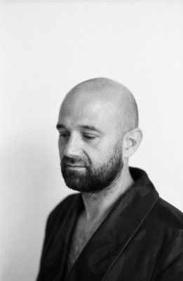
Mayer H. belongs to the first generation of German architects for whom “modern” no longer means new and avant-garde buildings, but rather something that is a given, and therefore taken for granted. But we can only guess at how grandly these architects might design, since regrettably they are not often given the chance to do so. Most family homes in Germany, regardless of whether they are environmentally friendly or not, continue to be built along the lines of 1950s frosty suburbia. Office buildings are almost always the same old gray and silver – just like cars.
The logic behind this thinking seems to be that the less spectacular the design, the greater the probability that it won’t date too fast – that the car, or house, will maintain its value for a few years, or decades. “You don’t build a house to live in forever these days,” says Mayer H. “And the more exceptional or unusual a house is, the harder it is to place on the market. A house built by Scharoun doesn’t have greater value because it’s by Scharoun. In fact, that can even turn into a handicap later, when you can’t renovate it because of historic building laws.”
So how do young architects in Germany distinguish themselves these days? Usually with temporary constructions such as trade fair booths or installations at galleries and restaurants – in other words, nothing permanent. Or, they are incredibly lucky. Then it isn’t necessary, as it was for the GRAFT firm, to pack up and move to LA to await a call from Brad Pitt, or, like Léon Wohlhage Wernik, to design a new government complex for the Libyan dictator Gaddafi. No, if you’re lucky, things simply work out – as they did for Mayer H. in Ostfildern.
In 1998, Mayer H. won a competition to build the city offices in the Stuttgart suburb of Ostfildern. A town hall, library, gallery, and music and night school classrooms were clustered together under a single roof, from which artificial rain fell. Soon, more offers followed. A villa in Ludwigsburg unfurling from the old foundations, an exhibition hall at the Danfoss Universe Science Park in Denmark that seemed to come straight out of the pages of a comic book, a chic office building in Hamburg’s Alster district, and the stacked-up layers of a courthouse in the Belgian city of Hasselt.
The Ostfildern Town Hall is angular and full of slanted perspectives. Yet with the new millennium, Jürgen Mayer H.’s designs began to arch and curve. A similar move towards fluid forms has revealed itself in the work of other architects, most notably Zaha Hadid. It’s sometimes referred to as “blob” architecture or “blobism,” but for the most part the style of our decade has not yet been assigned a name. Mayer H. has, however, a pragmatic explanation for the formal transformation. “Computerization has made it simpler to calculate and simpler to draw,” he says. “Things can be much more easily realized through the development of new materials. There are synthetic coatings, for example, that lend themselves easily to such forms. Before it was more problematic – look at the Einstein Tower.”
In other words, it would have been done long ago if it had been possible. And indeed, certain designs by Jürgen Mayer H. and other blobitects seem oddly familiar, as the forms appear to follow on seamlessly from the utopian designs of the ’60s.
Above all it’s public authorities – if they have the money, that is – who make the most grateful clients, since cities today are under just as much pressure as corporations to market themselves, competing to build ever more spectacular cultural gems. For a long time they’ve put industrial parks and shopping centers on city outskirts, thus reducing the commercial taxes at the same time. However, companies aren’t the only ones who up and leave; people do too. Increasingly cities have realized that old churches and ruins alone are not enough to attract people, and are turning to innovative architecture. The single biggest draw so far has been Frank Gehry’s Guggenheim in Bilbao, which alone has more than doubled the city’s tourist count.
“How do you approach a space that’s supposed to become the revitalized heart of a city?”
The new landmarks used by cities to transform themselves into instantly recognizable international brands tend to have shimmering, solemn façades that hold up at a distance – whether it’s glass, steel, ceramic, or titanium. You don’t need centralized marching grounds for the military or party parades anymore, and so a certain dilemma is making itself felt at the sites of these modern cultural temples: how does one liven up and give structure to such a barren and, in the evening hours, eerie expanse? A flower bucket here, a colorful, offset stripe on the ground there, as if by rule. By no means should it be too comfortable however, or else unwelcome layabouts will simply take advantage. Though free of trash, drug dealers, and dog shit, these new public squares simply turn into awkward non-places.
Leftist urban theorists mock the trend to replace park benches with anti-vagrant bucket seats, and the cobblestones in pedestrian zones that are designed to repel skaters. Not to mention new prohibitions against begging and loitering so that people can shop, consume, and work downtown with as little bother as possible. Even affluent citizens appear to avoid these cleared-up public squares, either hurrying through them or simply driving their cars into a parking garage where they can take an elevator directly to their office, apartment, or shop.
But are these inhospitable public places really the result of sinister capitalist intentions, or simply an indication of failed urban planning? Might not a public square in which people enjoy lingering also be an advantage for surrounding businesses, as well as increasing local real estate values? And if the occasional hobo or street punk is also among its patrons, why not see this as a motley enrichment?
In Sevilla, Spain, Mayer H. is building the Metropol Parasol – a monument that could revolutionize the nature of public squares as much as Frank Gehry’s Guggenheim did museum design. Gehry succeeded in creating a museum that outshines the collection inside it. Jürgen Mayer H., for one, no longer views the public square as an open space dotted with architectural elements, but rather as an autonomous, self-contained construction. His 30-meter tall, vaguely mushroom-shaped design organically integrates itself into the asymmetrical Plaza de la Encarnación, offering a layered transition from outside to inside. One level below the leafy and shady square is an indoor market, and on the level below that, a museum dedicated to the area’s Roman archaeological foundations.
As phenomenal as this building is, so disarmingly simple are Mayer H.’s architectural considerations. “How do you approach a space that’s supposed to become the revitalized heart of a city?” he asks. “The biggest asset that one can have, for three quarters of the year, is shade. So we tried out different geometric ideas, and in the end we decided on these circular elements that counter and respond to the variables of the square in a flexible way. It doesn’t seem rigid.”
Illuminated from below at night, the mushroom roof becomes an artificial sky, and it’s even possible to walk on it. The effect is spectacular, not only because of the view over the entire city, but also because you are standing on nothing but a wooden grid coated in a thin layer of polyurethane. Only the two towers up which you can climb to the roof – or take the elevator – are made of reinforced concrete. In this way Mayer H.’s design overrides the classic conflict between indoors and outdoors, between permanent and provisional.
Already for the recently completed university dining hall in Karlsruhe, Mayer H. combined highly compressed plywood with milky yellow polyurethane. This could well become his signature material, similar to Gehry’s shiny titan sheets and his patented method for affixing them. With characteristic modesty, Mayer H. emphasizes that his colleague Andre Santer was the one who developed this plastic and wood combination, and its relative affordability is probably the only reason the builders accepted it.
While in Dubai – and increasingly all over the world – beacons of originality and towering architectural icons are beginning to mount up in such numbers that their very uniqueness becomes redundant, Mayer H. is working on 21st-century cities that can actually be lived in and not just marveled at. Metropol Parasol draws advantageously on Mayer H.’s previous efforts and experience, which might at first seem like just the outlandish flight of fancy by yet another underemployed European architect. In 2001, in Vaihingen an der Enz, Mayer H. poured a huge pile of sand on the town square. The success of this simple action astonished even him: “All you have to do is create an enormous sandpit in the town square and as soon as it’s there, it’s packed.” The following year, when a second edition was requested, he refused because he felt the effects were too short-term. Meanwhile, city beaches are sprouting up all over Germany, but they only function seasonally, as closed bar areas.

One other way to generate space to relax in is with furniture. Mayer H. creates what are actually more like sculptures than recognizable chairs, objects that you can sprawl out on, in, or around. Again, the influence of ’60s designers, this time Verner Panton or Joe Colombo, is immediately recognizable. At least back then it was already possible to realize their visions of furniture in prototype form. So it’s to be expected that with the next major architectural revolution, our collective environment will become interactive, with furnishings once more taking a leading role. Mayer H. is experimenting with relatively primitive techniques, such as heat-sensitive or fluorescent colors, but the trend is clear. At some point it won’t just be other passersby, security cameras, and weight-sensitive car seats noting our every movement, but also each crosswalk, garbage bin, and wall.
We are still fearful of the new surveillance technology that allows cities and corporations to spy on and control us. But the same technology, as Mayer H.’s furniture shows us, can also encourage a playful new relationship with our environment. The feeling of security that many of us feel only within our own four walls doesn’t have to be absent from public space. That pleasingly pliable floor assures us that no dog has shit there; we can be sure that no one within a radius of 100 meters has a knife or any other dangerous object. So make yourself at home, kick back, and relax.
Metropol Parasol could well become the nucleus of a new, public easy-going casualness; a place that feels as welcoming as any lounge or park on a sunny day. Architecture that becomes its own world of nature. Such expansive claims as these existed previously only in the insular realms of art, in the “Gesamtkunstwerk,” or complete artwork, of Wagner or Schwitters. Later on, in psychedelic clubs, attempts to connect with a wider leisure-seeking public only worked with the help of drugs, and became passing fashion. Archigram wanted to make huge architectural creations – stranded UFOs – that you could walk through like a landscape. For Rem Koolhaas, the inhabitants of his Exodus project in London, the long strip of a walled city that cuts through the metropolis, are the “volunteer prisoners of architecture.” A totalitarian architect replaces repressive politics, one that not only creates spaces, but adventure and happiness too.
The work of Jürgen Mayer H. is greatly inspired by the Austrian-American architect, and furniture and set designer Friedrich Kiesler, who in the ’40s and ’50s already envisioned the house as “an organism with a highly refined nervous system.” Kiesler attempted to conceptualize this organism from the bottom up, through a rigid geometry. In his “Correalism,” circles embedded in a seemingly arbitrary amorphous form, add up to a trapezoid or a square. Metropol Parasol is unmistakably informed by Kiesler’s teachings. What reaches there into the heavens only randomly resembles mushrooms.
Endless House, Kiesler’s house of the future, attempted a pure continuation of space without corners or edges, held together in the shape of an eggshell. Nevertheless, at some point chickens have to hatch. In the end, architecture that seeks to flow has to mesh with its environment and display what remains. Jürgen Mayer H.’s Metropol Parasol represents the cracking egg.
Credits
- Text: INGO NIERMANN
- Photography: OLIVER HELBIG
- Fashion: TABASSOM CHARAF


