CY TWOMBLY 1966
|PIERRE ALEXANDRE DE LOOZ

From Vogue to nest: 032c activates the secret history of CY TWOMBLY by Horst P. Horst
EMPEROR OF THE DECORATORS
A “haunting virile cologne for the man on the prowl” titled “Royalty” once appeared in the back pages of Vogue – ideal for a man like Liberace. The unwittingly burlesque ad shared a page in Vogue’s November issue of 1966 with an article on American painter Cy Twombly. For Twombly, who is notoriously shy of media, and rarely sits for the camera or an interview, the Vogue story and its legacy offer a neglected biographical key, both real and imagined, which has haunted the artist since it first appeared.
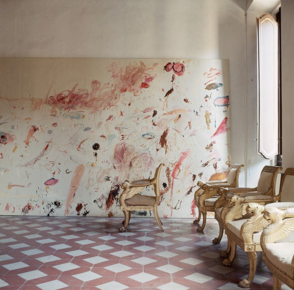
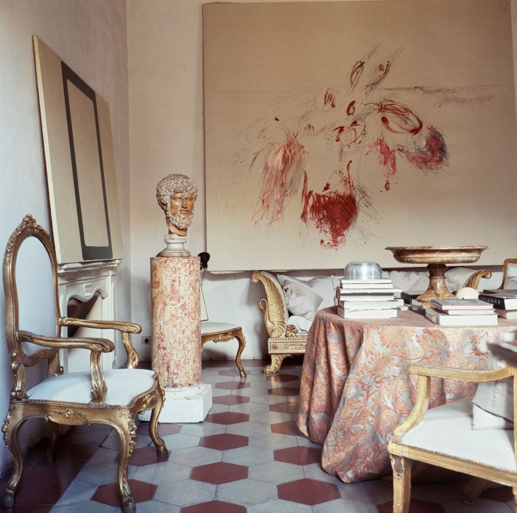
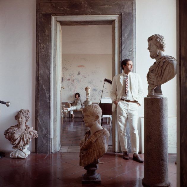
The article, “Roman Classic Surprise,” part of an on-going Vogue series on interior decoration, had striking full-page photographs of the artist’s domestic setting in Rome shot by legendary photographer Horst P. Horst. The photos in Vogue’s original editorial cast Twombly in a patrician light of old-world grandeur, and as a family man, emphasizing the artist’s young son (brandishing epaulettes and a sword) and the marital bed (dressed in fur). Vermeer-like in composition, unctuous, and mellow, Horst’s photos of Twombly in his palazzo apartment continued to make an impression through subsequent publications, most recently of which was nest, the late, cult magazine of interiors. In 2003, nest procured unpublished outtakes from the sitting. But the original, seemingly harmless article has garnered a serious allegation from historian Nicholas Cullinan, co-curator of Twombly’s 2008 Tate retrospective. Cullinan argues that “Roman Classic Surprise,” as it debuted, compromised the artist’s career. Despite Vogue’s unflappable name, despite the luminescent beauty of Horst’s images, “Roman Classic Surprise” had, in the end, stunk up Twombly’s act like cheap cologne.
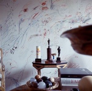
Horst’s sidekick on the story was society chronicler Valentine “Nick” Lawford, who penned the original profile. Cambridge-educated and sometime envoy of the British Foreign Office, Lawford had a nose for royalty. He would go on to publish a 1968 anthology of assignments with Horst, Vogue’s Book of Houses, Gardens, People, and author Horst’s biography, naturally studded with glamorati. Shifting the focus of the traditional interior-design column, editor-in-chief Diana Vreeland had directed Lawford and Horst to subjects with the “taste and talent and originality to create a rare ambiance in their daily lives.”
In the place of conformity, tact, and connoisseurship, Vogue under Vreeland wanted creativity in every room, console, and sash. Not surprisingly, Lawford tracked Twombly down to his most private precinct: his studio. Twombly spent entire days and nights there amongst loitering “middle-aged men of leisure” and artists who “borrow one-another’s cigarettes and painting materials and permanently unmade beds.” Taken by an atmosphere reminiscent of Jean Genet, Lawford admitted, he tacitly underscored what was louche about Twombly – Twombly whipping a canvas red with a rope, Twombly speaking softly and plaintively, Twombly out all night, all day in bed with the wife away. Naturally, these clues opened a speculative window onto the artist’s personality, and conjured a specter over his most intimate relationships, not least of which was to his work.
RUPTURE AND THE REPUTATION OF AN EX-AMERICAN ARTIST
If Jackson Pollock was eventually mobbed and unmanned by his appearance in Life magazine (it made and broke Pollock, Jerry Saltz has written), Twombly’s early cameo in Vogue may have confused his American public. From his earliest shows in New York, critics placed Twombly in reach of Pollock’s all-American, muscular “action painting,” wedding the two in a historical dialogue. As if prematurely anxious about the celebrity entanglement, Twombly left the United States in 1957 to settle in Italy, one year after Pollock’s death, breaking with the notion that America was the indisputable superpower of new art. American press, for the most part, responded by leaving the expat at the margins. Leo Castelli, who became Twombly’s New York dealer in 1958, would periodically entice his return, pleading for the importance of the American market. On occasion, Twombly complied. But by 1964, when Twombly presented Nine Discourses on Commodus, his critical reception in the U.S. had chilled, as scholars have persistently remarked. Donald Judd, for one, famously panned the show as little more than retrograde “drips and splatters”: Twombly would not succeed in art while ignoring major developments like Minimalism and Pop. As a result, Twombly’s appearance in Vogue two years later could easily have been deemed an ill-timed and presumptuous comeback for an artist who had voluntarily fallen out of fashion.
“Should the artist become a man of the world?” asked Allan Kaprow in a 1963 essay for ArtNews, which indirectly reflects on Twombly’s predicament. Artists must be responsible for their place in society, Kaprow explained, prepared to handle the consequences of promoting their work in an arts journal or a “girlie magazine.” Kaprow, an iconic artist in his own right, could analyze the art world like a historian; from studying Pollock he had moved to watching Warhol and kept pace. With some irony, Kaprow witnessed a devolution: “For Leonardo Da Vinci, the artist was an intellectual; for Baudelaire, a genius; for the 1930s (as the scene shifts to the U.S.), a worker; and for the 1950s, a beat. What a fall from grace! It is said that when a man hits bottom there is only one direction to go and that is up. In one way, this has happened, for if the artist was in hell in 1946, now he is in business.” Although artists were now making money, financial success was no way to turn back the clock or bootleg nobility, Kaprow warned: “The United States is a country of sophisticated mongrels and anyone pretending to the higfalootin’ is marked as a nostalgic or one of those ladies who drinks her Dr. Pepper with a little finger crook’d.” By broadcasting aristocratic airs for Vogue, Twombly had crossed a class line and visibly broken a sacred code: he had abandoned the proletarian role of the artist; he had forsaken his beatnik beginnings; he was even too good to be an enterprising middle-class citizen. Instead, he had claimed instantaneous pedigree, the sort enjoyed by Princess Stanislas Radziwill, Pauline de Rothschild, and Doris Duke, who all graced the “fashions in living” section before and after Twombly. To quell any doubts, Lawford reported that the artist had officially abandoned “avant-garde American discomfort,” and “married into the international, intelligent, liberal, upper-bourgeois Europe.” Thanks to Vogue, Twombly had resurfaced on the American scene as a lady with a “crook’d finger.”
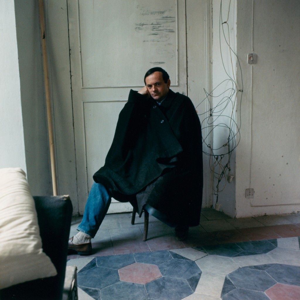
Nicholas Cullinan indicted “Roman Classic Surprise” along similar lines; but, he also suggested something worse. Twombly had not simply flared the finger of continental privilege by landing in Vogue; he let his whole hand go limp. Whereas Pollock always kept his fists in blistering evidence (think of Hans Namuth’s famous footage), Twombly appeared handless in the published portraits (they’re either pocketed or out of site). No doubt, the most insinuating of these was the title spread: Twombly slouched on a divan, leg propped, wearing white linen and a pouting smile, as a bust of Hadrian, the emperor of sugar daddies, looks on. Cullinan implies as much when he asserts that the Vogue pictures betrayed the “macho model established from Picasso to Pollock.” Simply put, Twombly had taken on a role deemed acceptable for a gay but distasteful for a serious artist; he had come out as a decorator. This was all the more disappointing given the hope that Twombly would take up Pollock’s cocksure legacy cut short.
DOORKNOBS AS ADMIRABLE AS PAINTINGS: THE ART OF THE INTERIOR
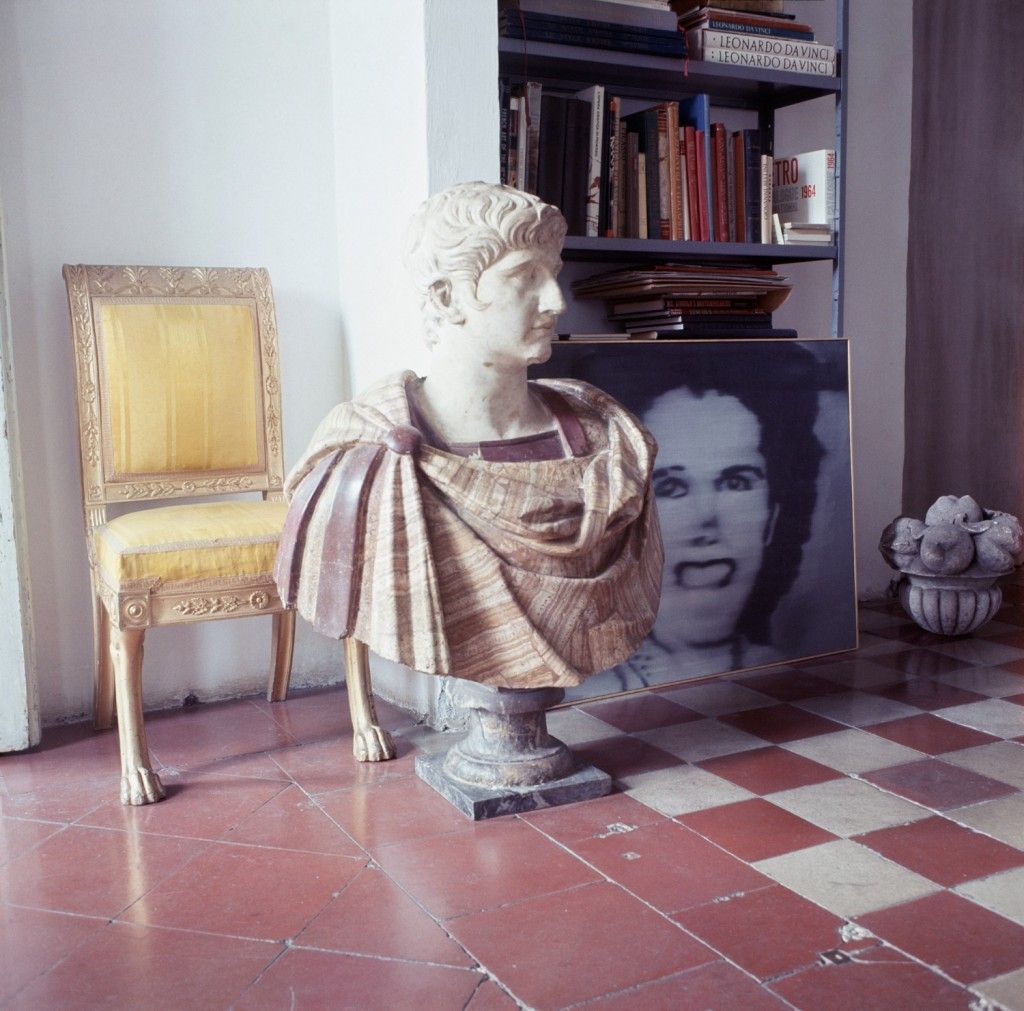
Equally distressing perhaps, Twombly made no distinction between decoration and art. He decorated with his paintings, just as he decorated with antiques, for which he seemed to have a freakish taste, such as an Empire fauteuil of swan-shaped armrests and pineapple feet. Over the years, the canvases featured in Vogue, like Triumph of Galatea (1961) and others from the period, have solicited frothy commentary. They have been called passionate and theatrical, savage and elegant, carefully rehearsed and crude as if circling around an unspoken term – in a word, camp. As Susan Sontag noted in 1964, camp is by nature hard to discuss, disturbing, complicated, and queer. Exposing camp as she did, Sontag identified it as a largely gay sensibility. Is Twombly’s work from the early 1960s really camp? In as far as it debuted for a mainstream audience in Vogue, creating an equivalency between art, fashion, and furniture, Twombly’s peculiar universe showed that, in a sense, “a door-knob could be as admirable as a painting” (to borrow from Sontag borrowing from Wilde). The artist himself was admitting to decorative art, a key aspect of camp, and to posturing as a “dandy in the age of mass culture.”
A year after the Vogue story, Twombly altered course. He presented entirely new work in New York, which critic robert Pincus-Witten applauded for maturing beyond “decorative schema.” Twombly’s newfound sobriety, like in Treatise on the Veil, arguably paid tribute to the early minimalist works of Robert Rauschenberg, and if this were true, reflected the repressive powers of the art world. An intimate friend and collaborator, who accompanied Twombly on his first Italian voyage and mentored his introduction to the avant-garde, Rauschenberg was an international success by 1968. Unlike Twombly, one might say he had quickly grasped the importance of the veil: despite being gay, he would never be reprimanded (or celebrated) for a gay sensibility. By today’s standards, however, is it possible that what could have been Twombly’s biggest embarrassment is in fact his great tour de force? By parading across the pages of fashion, by his work and life of the early 1960s, had Twombly launched a prescient and radical kind of art?
FROM HADRIAN’S WALLS TO KUBRICK’S 2001: NEST MAGAZINE NOTES THE TIMELESS
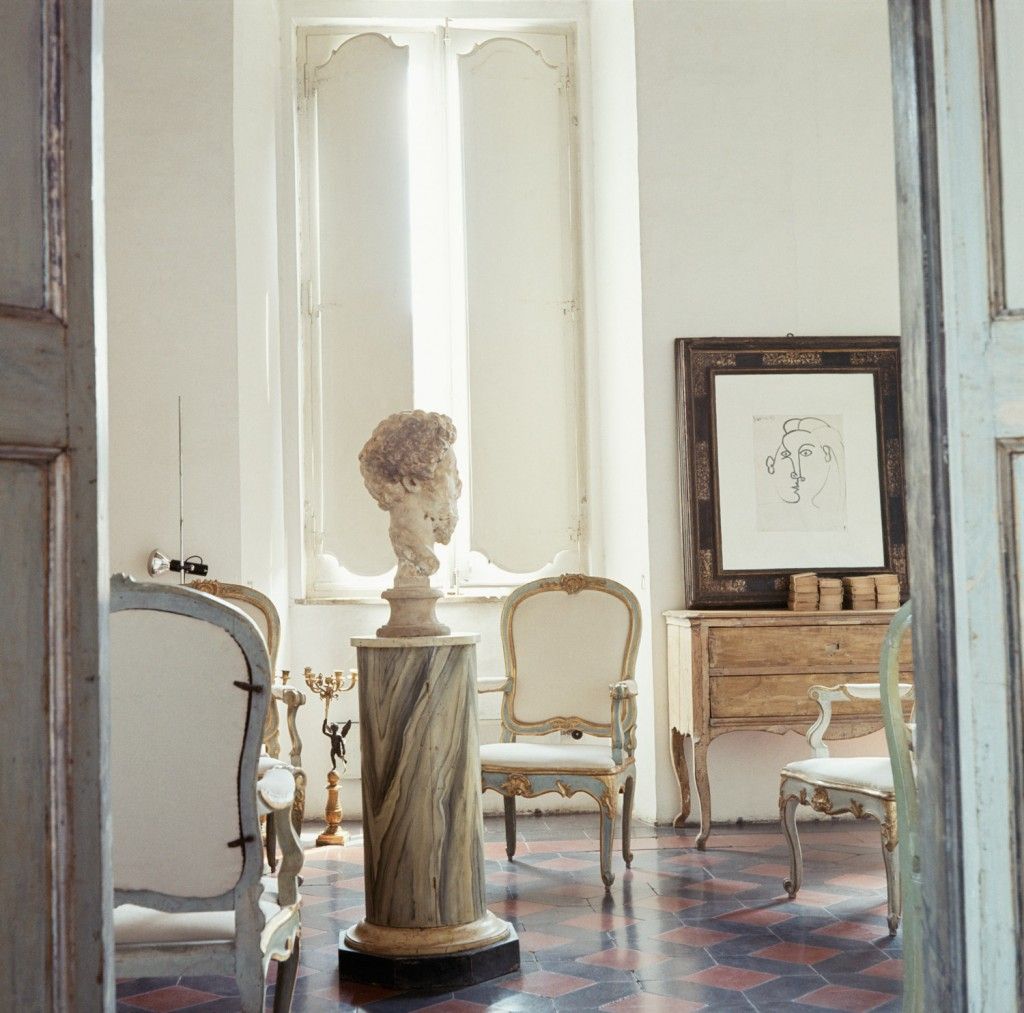
When, in 2003, nest reprinted photos from the sitting, Joseph Holtzman, mastermind and singular editor-in-chief for the magazine’s seven-year run felt it was time to celebrate Twombly’s achievement as a “great interior decorator.” “Today, it sounds like the easy-listening of decorating to our ears,” says Holtzman, but in 1966, it wasn’t.” The artist’s Roman quarters were nothing less than a breakthrough, nest proposed, “the birth of a new style of interior decoration.” Scavenging for treasures at the margins of memory and respectability, which often occurred around Holtzman’s memorable personal library, the magazine equally shared in the breakthrough. Then managing editor Paul B. Franklin, who was in charge of research, noticed the Horst-Twombly connection and brought it to Holtzman’s attention. Franklin explains: “when dealing with old film, Joseph always desired to locate what he frequently termed ‘the mother lode’ – the complete set of images from the photo shoot in question.” Indeed, Horst had shot ten times as many photographs as appeared in Vogue and until now the world had seen only a fraction. By publishing a suite of out-takes from the original shoot, nest effectively rewrote history in print.
First, Holtzman selected a series of photos that would evoke the palazzo’s architectural sequence, an enfilade of rooms, granting deep perspectives along walls of windows. Within this vast setting, Holtzman says, ponderous statuary and “wacky” antiques defined Twombly’s style. The furniture was rough and even rustic in treatment, stripped down to muslin, whitewashed, and gilded in pale metals as if responding to the palazzo’s white plastered walls. In their introduction to the story, nest remarked that the dominant chord was that of pallor. In the 1960s, the all-white interior became increasingly prevalent, a wish perhaps for the sort of weightless, diaphanous environments exemplified by the 1968 epic 2001: A Space Odyssey, directed by Stanley Kubrick. The movie was being advertised as early as 1966 in the pages of Vogue through accessories designed for the film. Twombly’s coup was to imply Kubrick’s distant future, located somewhere at the outer reach of history, within the setting of classical Rome. In the artist’s palazzo, the future and the past merge, suspended together in an eternal present. On gridded floors of syncopated tiles, terracotta, black and cream, Twombly’s motley furnishings look recently deposited, about to be moved, players on an indefinite chessboard. The game looks like it could last forever, moving no faster than airborne dust perpetually circulating. Lawford had originally remarked: “The apartment is indescribable in terms of decoration, if only because its contents are involved in a continuous process of removal and replacement.” By publishing out-takes, nest spun the game for another round, incorporating the Vogue photos in the same process of removal and replacement initiated by Twombly. Printed and reprinted, still present, the pictures themselves are nowhere in time: are they dated 1966, 2003, or 2010?
Horst. P. Horst, who looked through the camera in 1966, can be blamed for the haunting. Somewhat bored with fashion by the late 1950s, he confided, it was Vreeland who had revitalized his drive with her interest for interiors. Horst took Vreeland’s mandate of capturing “the way they live” seriously and avoided rearranging furniture, altering the lighting or styling a shoot. Though Horst once exclaimed that “you cannot photograph someone with a preconceived idea,” he aimed for something other than simple naturalness. At the age of 24, and not yet a photographer, he started his charmed ascent in the Paris of Gertrude Stein, Picasso, Coco Channel, Julien Green, Dalí, and others, who would eventually sit for his camera. None other than Le Corbusier employed Horst during his first year in Paris after receiving a written request from the German-born design student. Horst’s time was spent on an apartment for the Mexican millionaire Don Carlos de Beistegui. Published in Vogue in 1932, the apartment is considered a prototype of the surrealist interior, juxtaposing modernist white space and fanciful antiques – in this case, encrusted Empire furniture not unlike Twombly’s. Horst’s early encounter with surrealism need not explain his sensibility for the fantastic and strange, however. It is a leitmotiv running through much of his work, including his photos of Twombly. The sense of frozen time, the totemic presence of things, the rhyme of foreground and horizon, the conflation of everyday objects with the body, substituting parts and appendages, describe not only surrealist devices, but also many details in Horst’s pictures – Twombly in a black cape looks like a one-legged invention by Dalí.
HORST’S AUTOMATIC PHOTOGRAPHY AND TWOMBLY UNLOCKED
In Vogue, “Roman Classic Surprise” opened with a whimsical picture of a marble bust beneath the halo of a large umbrella, a dead-ringer for Surrealist composition. Was this Horst’s or Twombly’s doing? Historians have linked Twombly’s painterly script to Surrealism through the practice of automatic writing, but whether or not the artist and photographer shared this interest, the synergy they project seems well matched, like two sides of a coin. An avowed fan of Twombly’s work, Paul B. Franklin believes “the Horst-Twombly connection in Vogue was the meeting of two distinct, and distinctly different, but equally captivating aesthetic worlds: the young rebel yet chic painter and the impeccably elegant, if older, photographer-esthete.” And for nest, Franklin offers, the synergy was not only cultural but also personal; both men had been “romantically involved with other men – Twombly with Rauschenberg in the early 1950s, according to the research of art historian Jonathan Katz, and Horst with Lawford at the time of the shoot.” From behind the camera, Horst could completely empathize with his subject, the man in full. The resonance of this historical sitting, the license between art and fashion, painting and photography, gender and sexuality, past and present, evokes a cosmopolitan freedom untouched by the hyperbolic pressures of today’s tightly controlled marketplace. Speaking in an interview in 1982, Horst observed how the grand creative experiment immortalized by the 1930s had all but disappeared; painters, intellectuals, and fashion designers were no longer “all friends.” If nostalgia seeps from the photos, it is for the world Horst came to know in Paris, of which Twombly may have been a perfect talisman.
Horst’s service to Twombly, though relegated by critics to a white elephant, is much more. The gay, decorative, and camp have garnered widespread legitimacy in art circles today, and whether these terms accurately describe Twombly’s œuvre or not, it is impossible to neglect them. At the very least, the photos continue to pose questions that are entirely relevant to today’s post-minimalist paradigm. They show that Twombly’s practice is spatial, proto-installation. His paintings claim the rooms they inhabit. They draw a cognitive frame around the ambient space. With the early “Panorama” pieces executed in Rauschenberg’s Fulton Street studio in New York, Twombly applied large swaths of canvas directly to the wall; it was the wall he then indiscriminately covered in scribbles, the canvas an incidental surface to be later cut away and detached as the work. The paintings in this way are fragments of rooms Twombly has passed through, which is all the more evident when his paintings are considered together with his photographs. Often supplementary records of the paintings in their native space, in the case of the Fulton Street canvases, they are the principal record. Twombly’s photos from the last decade continue this practice, and some strongly echo those by Horst, as if Twombly has picked up the camera, pondering what the photographer had seen, mimicking his gestures, replaying the shoot, composing the pictures all over again.
But by far the greatest compliment to Horst’s images may be an essay entitled “The Wisdom of Art,” written by french literary theorist roland Barthes for Twombly’s 1979 retrospective at the Whitney Museum of American Art. It is still considered one of the most illuminating writings on Twombly. Describing Twombly’s airy composition, Barthes commented that it “allows one to breathe better.” It surrenders openly to the viewer’s imagination. “Basically, Twombly’s paintings are big mediterranean rooms, hot and luminous, with their elements looking lost and which the mind wants to populate,” Barthes rhapsodized. In the context of his essay, this simple image, and its evocation of life and practice, unlocks Twombly’s magic.
And if this image is not entirely indebted to Horst, it takes on a riveting palpability thanks to his photos. Needless to say, Barthes was a cosmopolitan thinker, fascinated by the press and by fashion; he knew better than most how to penetrate a story like “Roman Classic Surprise,” and not get hung-up on the Emperor’s new clothes.
Credits
- Text: PIERRE ALEXANDRE DE LOOZ

