Archive Editions, Inspired by the BAUHAUS
|Irina Baconsky
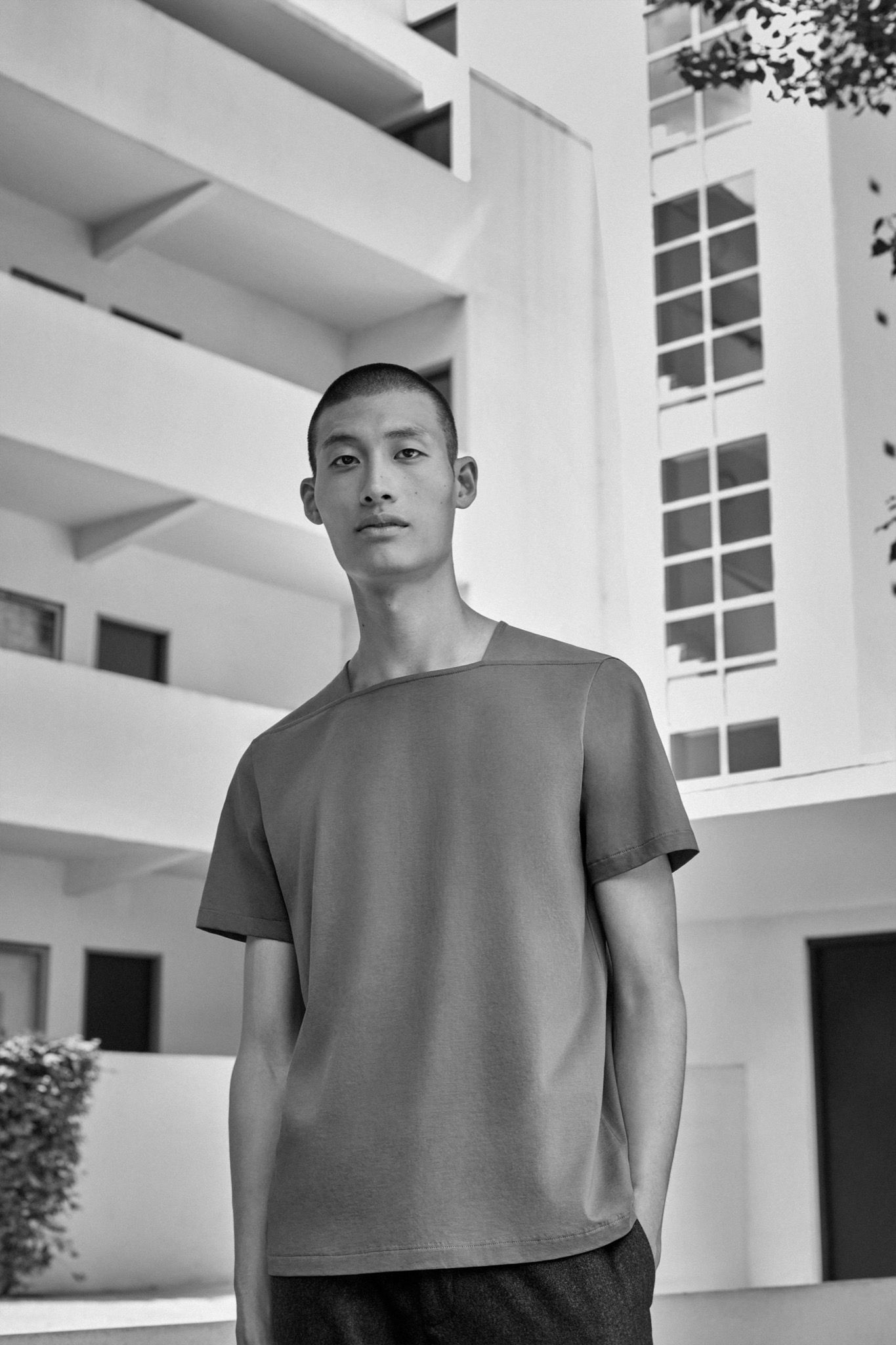
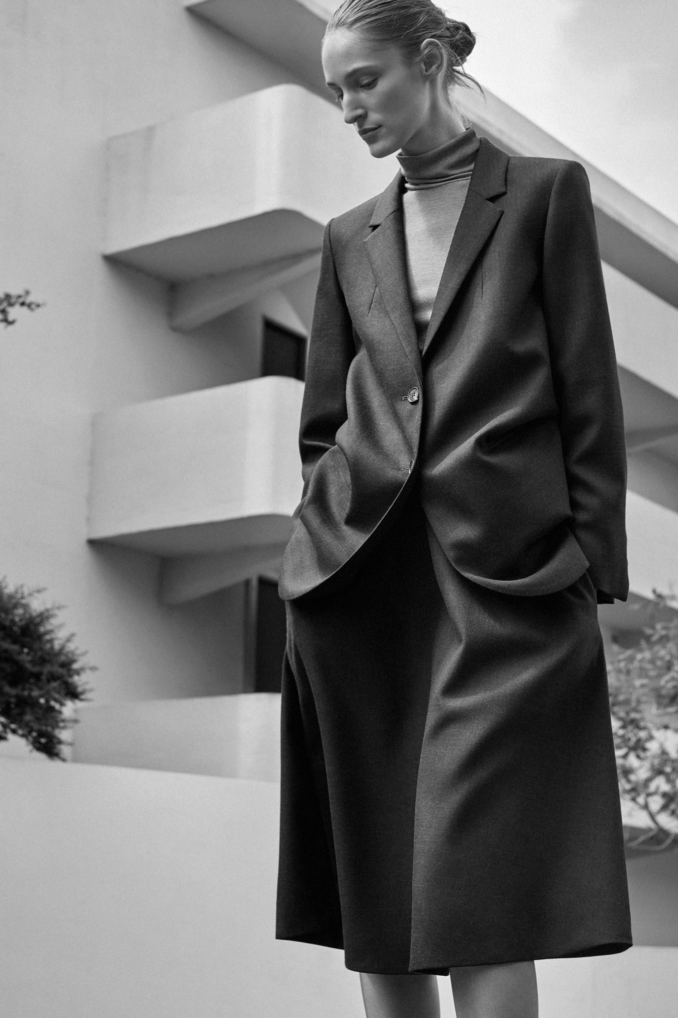
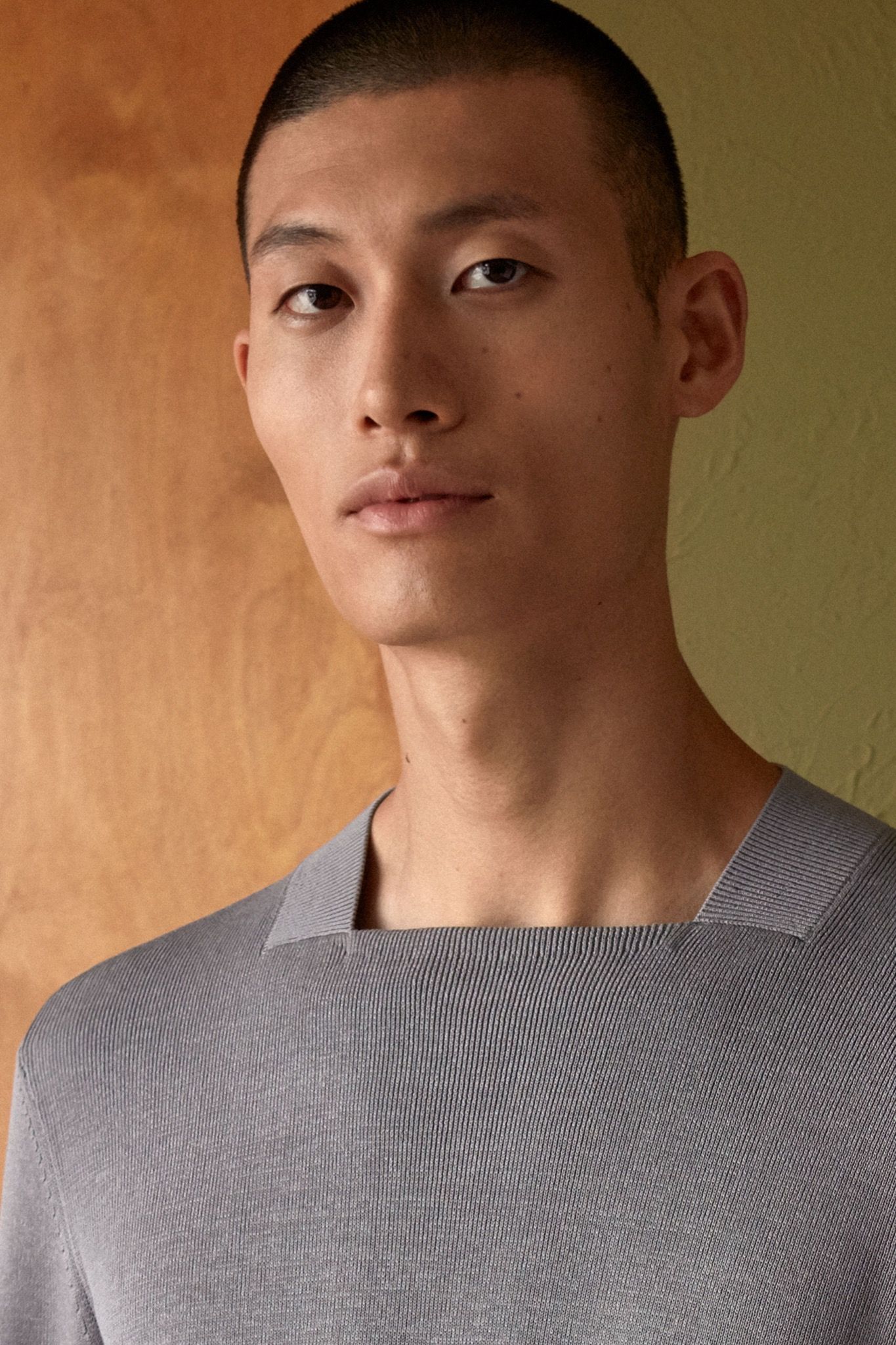
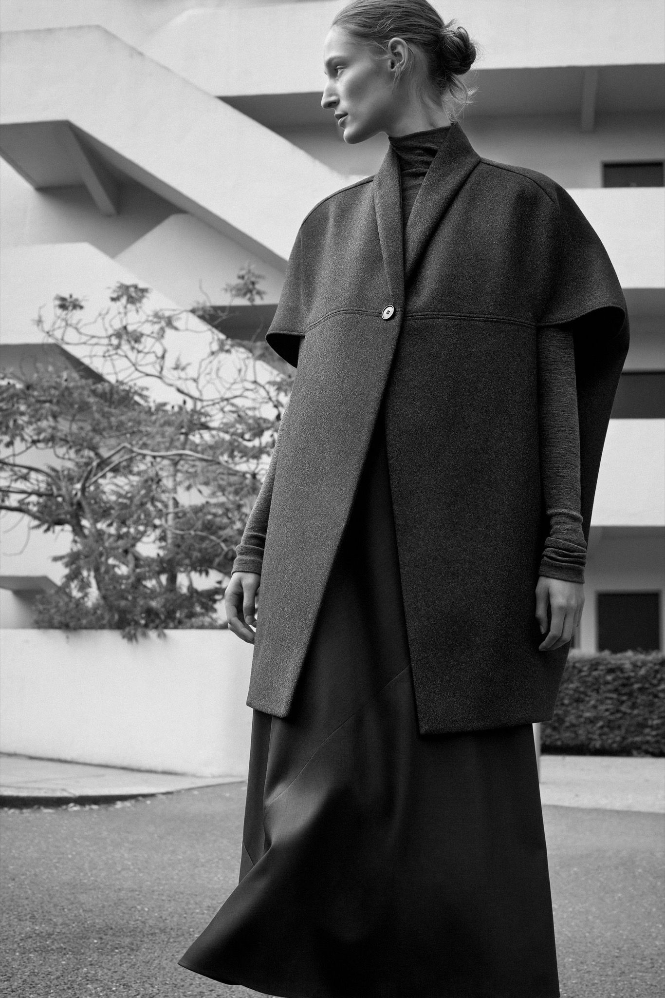
The Bauhaus school turned 100 this year, inspiring exhibitions and conferences all over the world, honoring, reexamining, and sometimes exhuming the influential design institution – and particularly here in Berlin, where Original Bauhaus: The Centenary Exhibition opened at the Berlinische Galerie last week. Joining the anniversary celebrations with a wearable homage is the London-based clothing label COS, whose new capsule collection, Archive Editions, inspired by Bauhaus, launches this autumn.
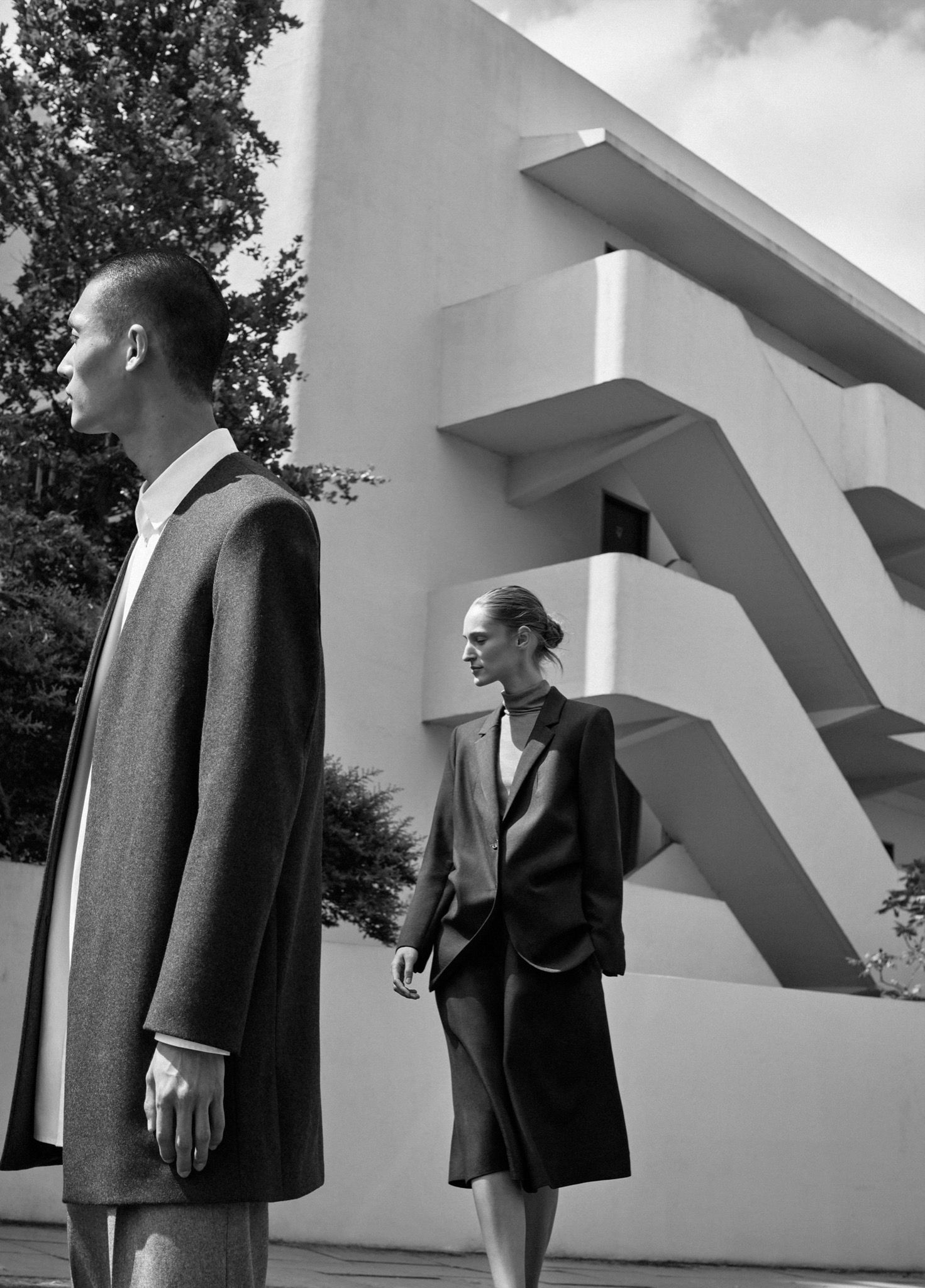
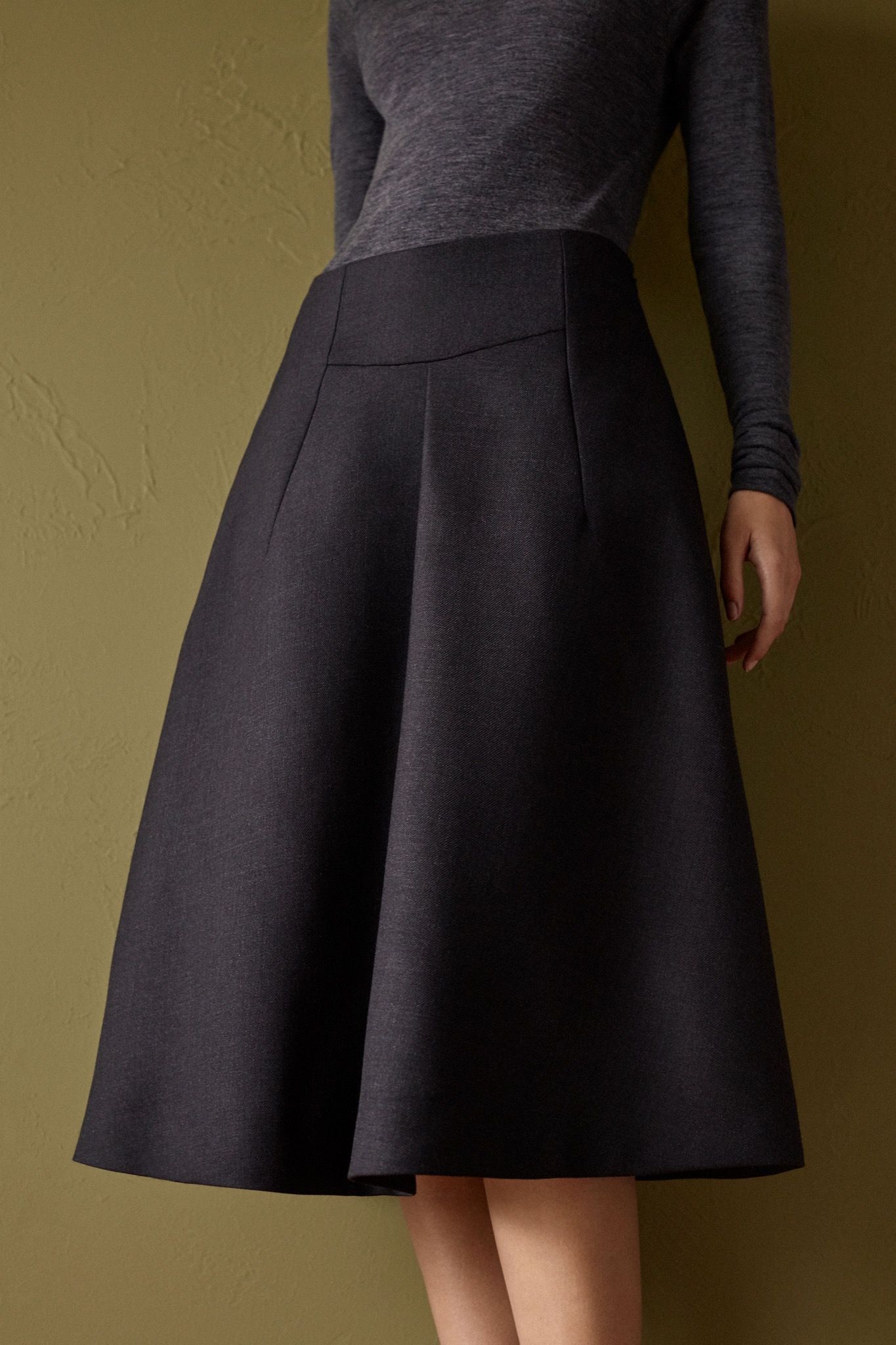
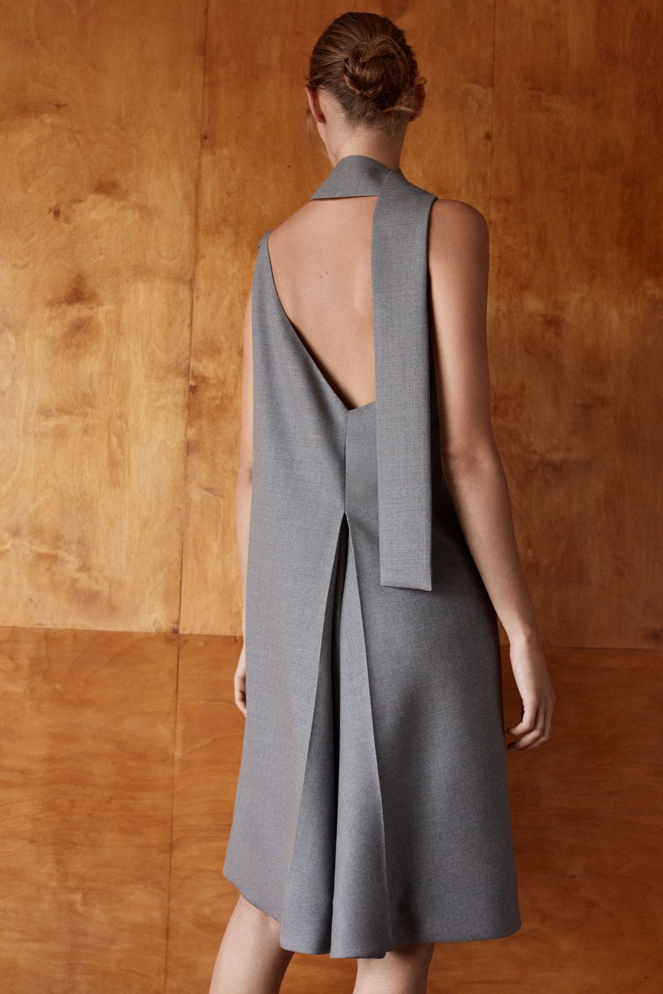
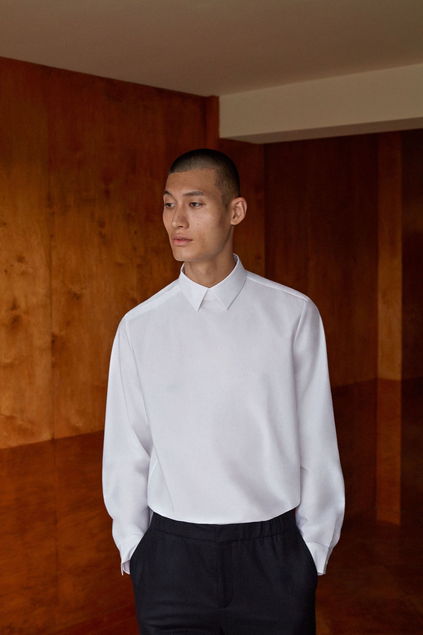
COS is known for its architectural, modernist aesthetic, so a link with the Bauhaus seems intuitive, even on the rack. The brand’s minimalist cuts, efficient materials, thoughtful textures, and concrete-modern color palette point to an ethos of functionality that does not compromise design – or forget the importance of play, which was central to the Bauhaus. COS has a history of collaborating with artists, architects, and designers on special projects, and this first installment of the Archive Editions series seeks to bring all creative disciplines together, informed by the idea of the German Gesamtkunstwerk (“total work of art”) as it was exemplified in the practices of the Bauhaus.
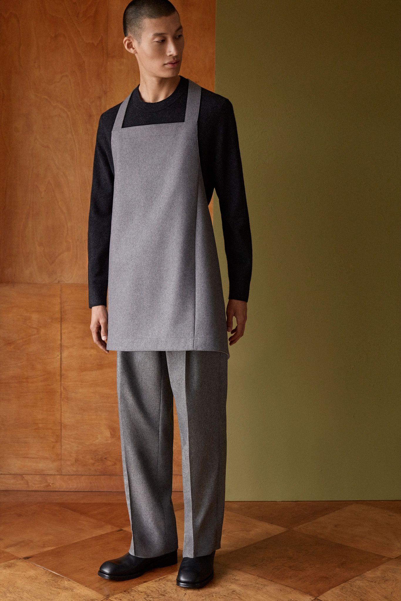
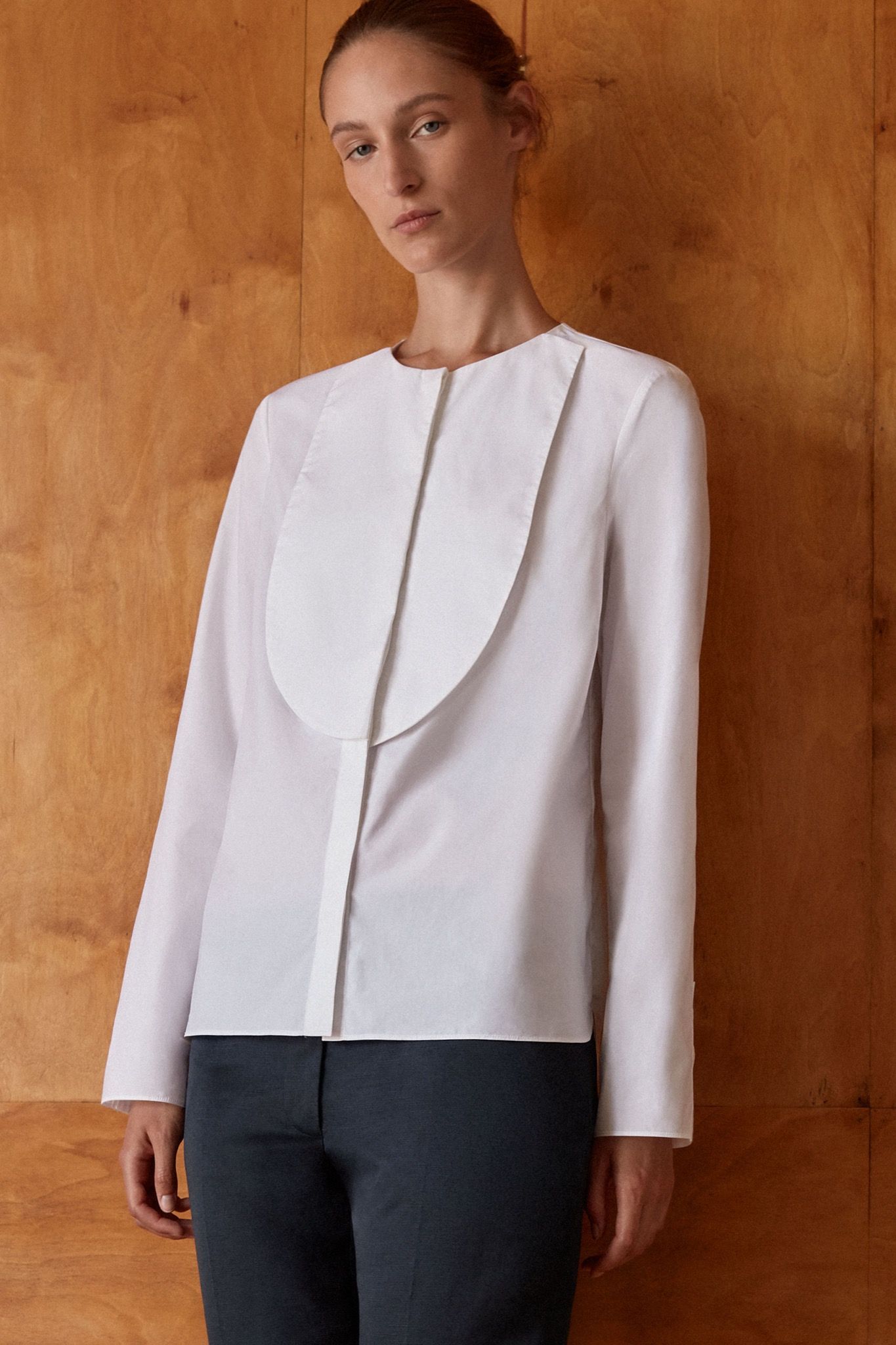
To create the collection, which consists of six pieces each of menswear and womenswear, and one accessory, COS turned toward its own history, surveying the brand archives all the way back to its founding in 2007. “The Bauhaus has been with us since the beginning,” explains COS head of menswear design Christophe Copin of the definitive pieces (and philosophy) of the last 12 years. We spoke to him on the eve of the capsule’s announcement, covering Marcel Breuer, expansive functionality, and how to keep timelessness cutting-edge.
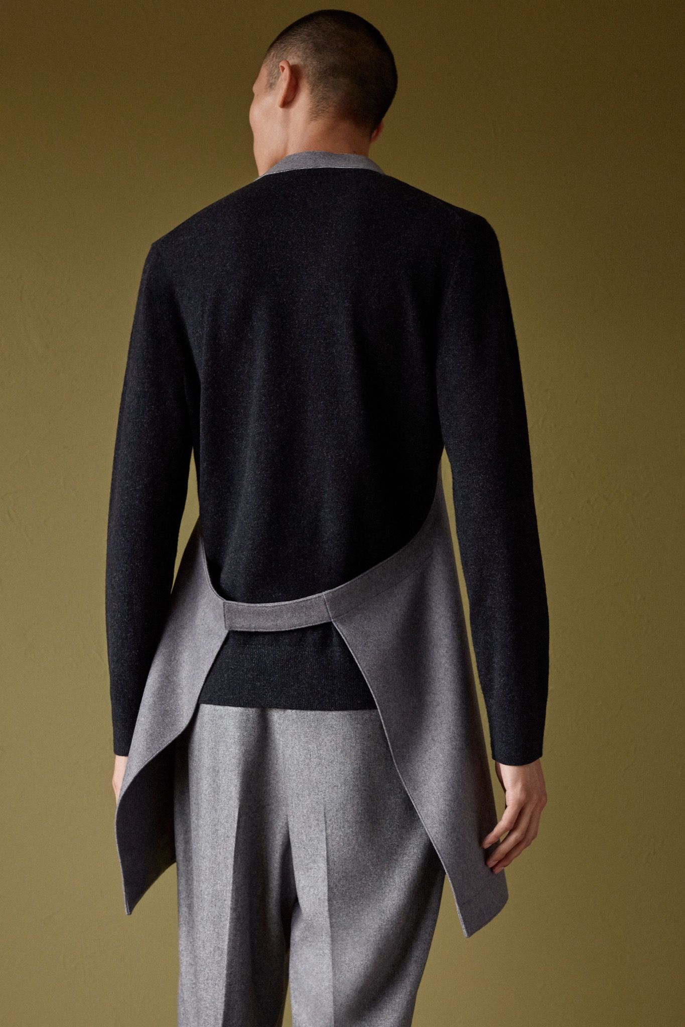
COS has always been informed by the Bauhaus legacy in an aesthetic sense; how did you navigate the brand archives to come up with this collection?
Design and architecture have always been essential points of reference for us, including artists from the Bauhaus movement. So it was obvious that we wanted to celebrate the centenary, but we didn’t want a capsule collection to refer to the movement too literally. We didn’t want Bauhaus-inspired graphics or anything like that.
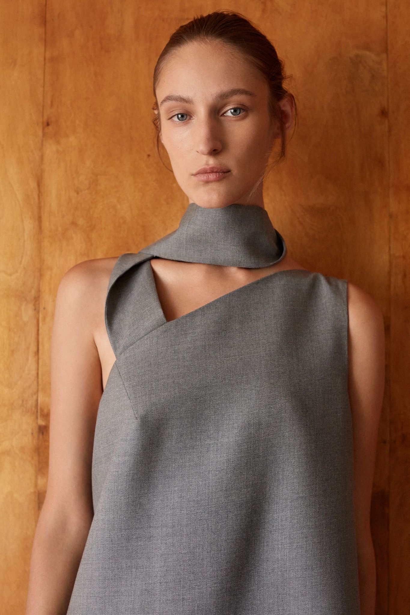
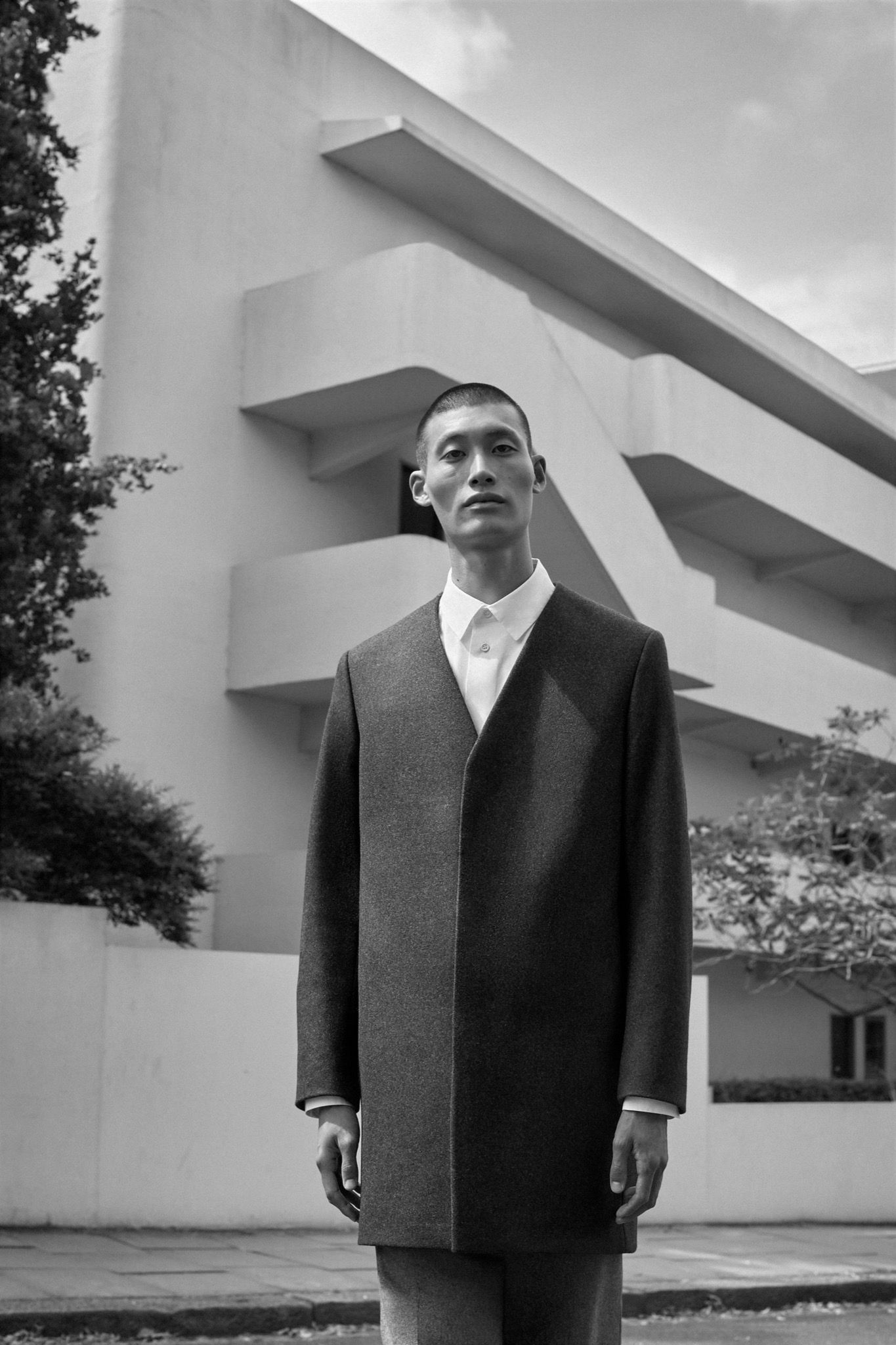
The archive selection required a lot of edits but it was quite organic in the end, because we wanted something very consistent between menswear and womenswear. We also found it interesting to work on the idea of the geometry that the Bauhaus is so known for, so all the pieces have some kind of geometric reference. The colors, of course, were very important. We decided to keep only the shade of grey and white of the Dessau building, so it was a very obvious choice for us. The way we worked was by bringing back the old pattern, making the first toile, and refitting it, because we wanted to make adjustments for the silhouette of today.
Would you say that with this capsule collection, COS is looking to amplify or spotlight the architectural dimension of clothing?
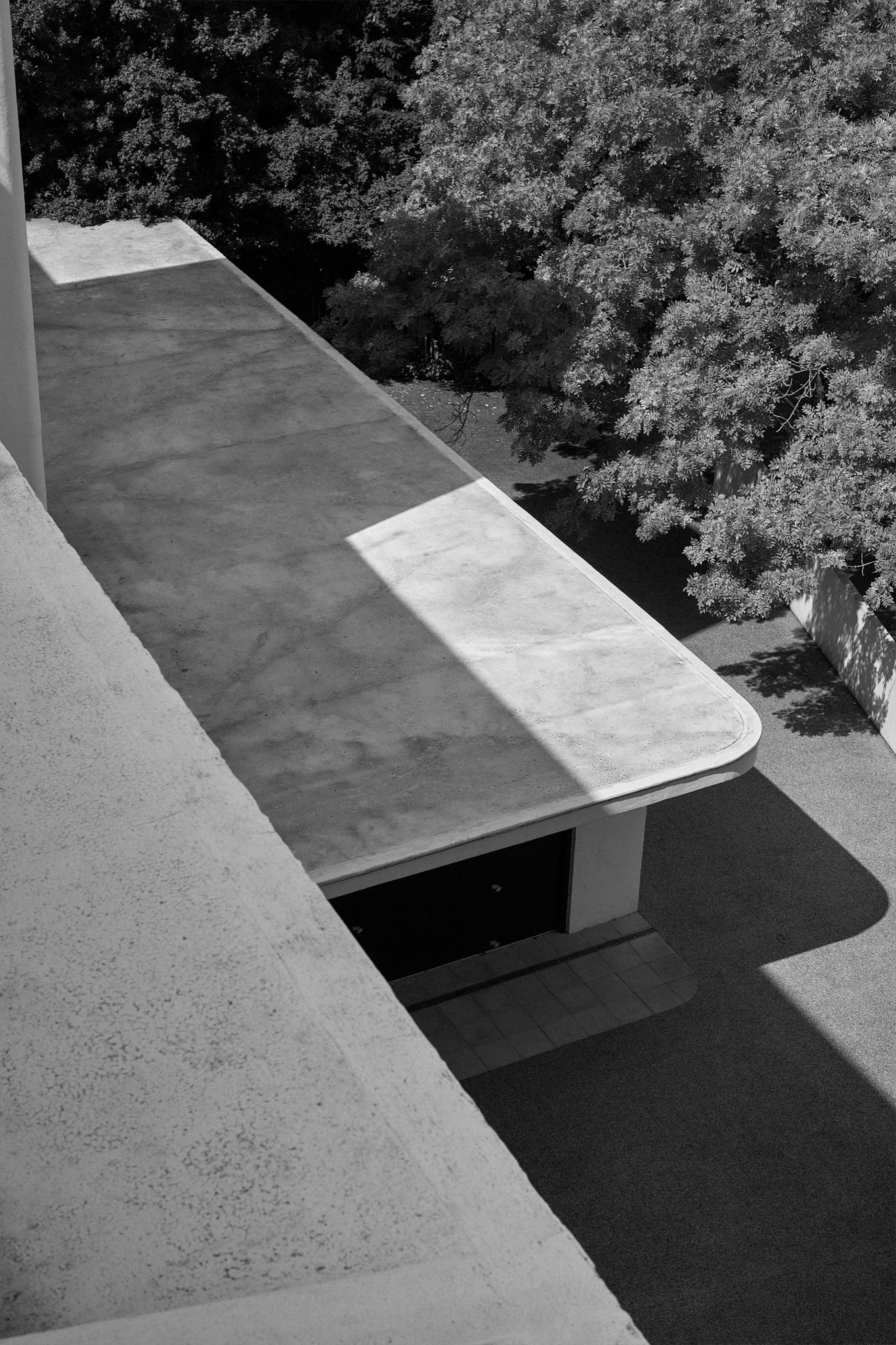
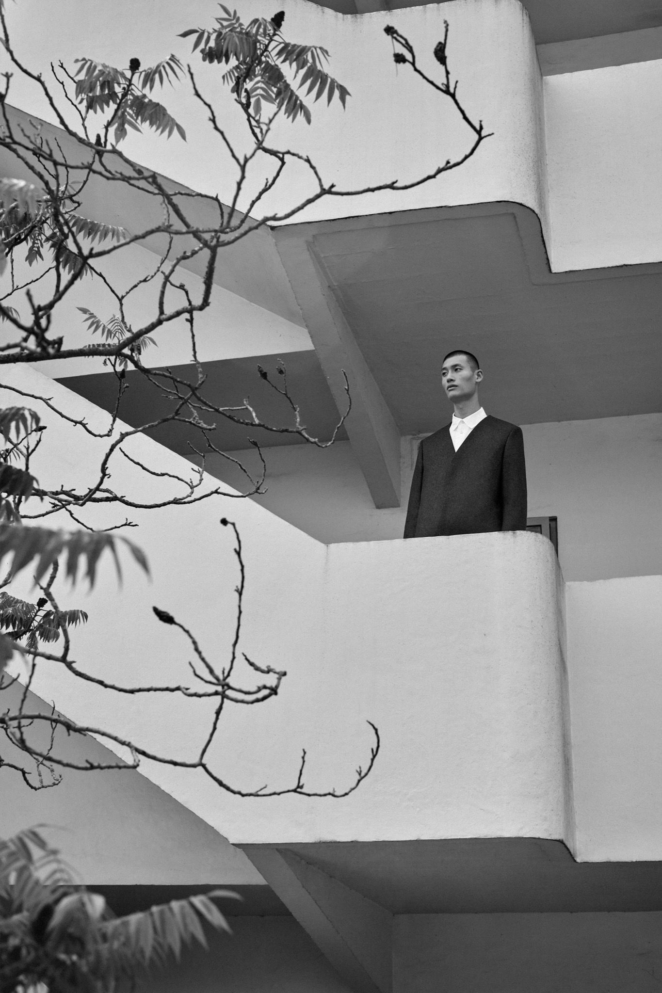
It can seem counterintuitive to draw inspiration from architecture, which is quite rigid: it doesn’t move, and clothes should accommodate movement. But this is not exactly true. If you look at buildings like the Bauhaus building in Dessau, it’s not something that looks static. Even when it’s a static piece per se, there is a movement that underlies it, there is movement – with the use of glass, the different balconies, there is something happening graphically and that makes you feel the movement. If you look at the triangular UNESCO building built by Marcel Breuer, you feel the tension, the lightness of the piece, even if it’s all in concrete. So this is really what guided us – along with the proportion and the balance of everything, which also hints at the work we’re doing when we create a piece inspired by a building.
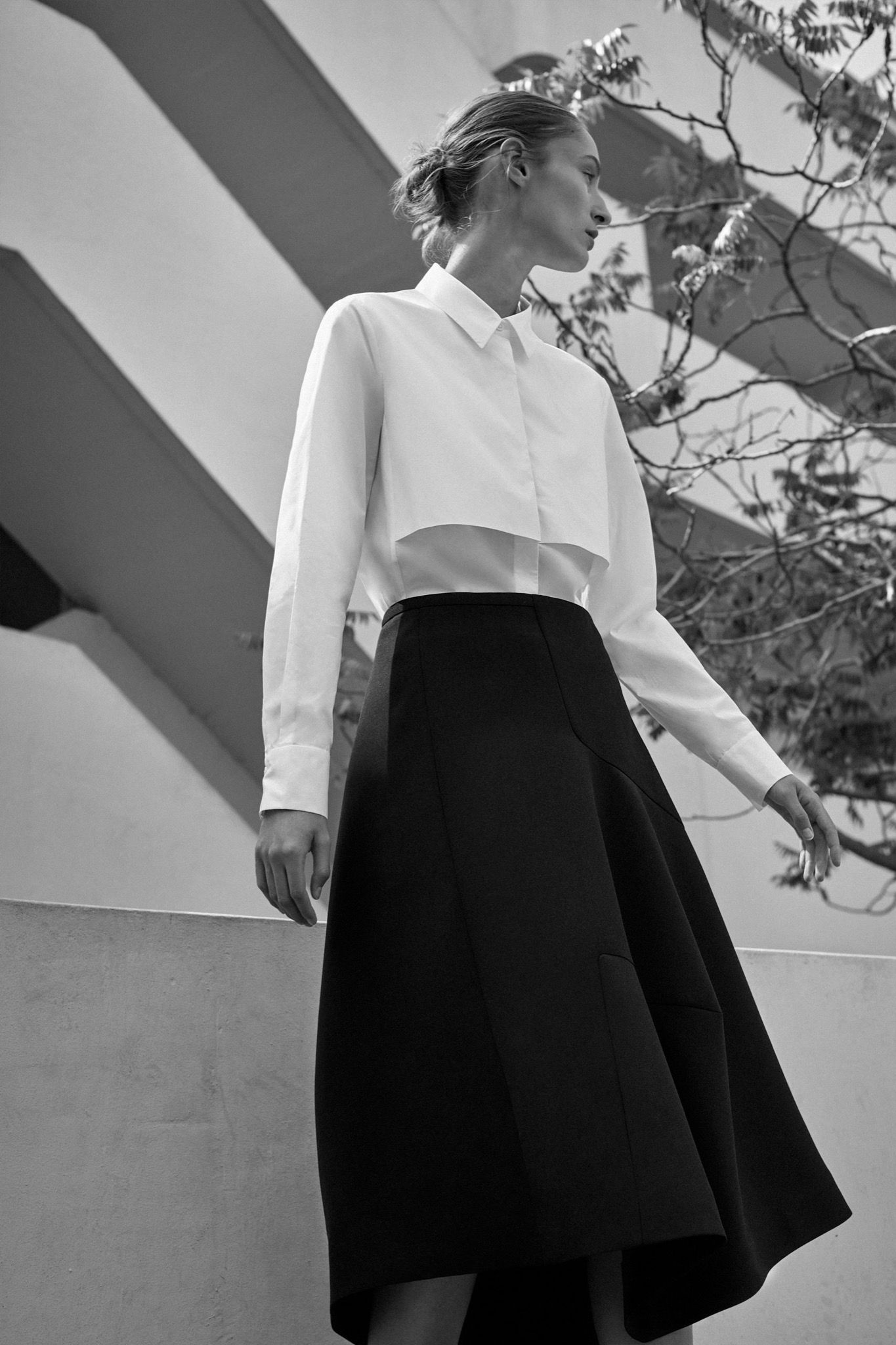
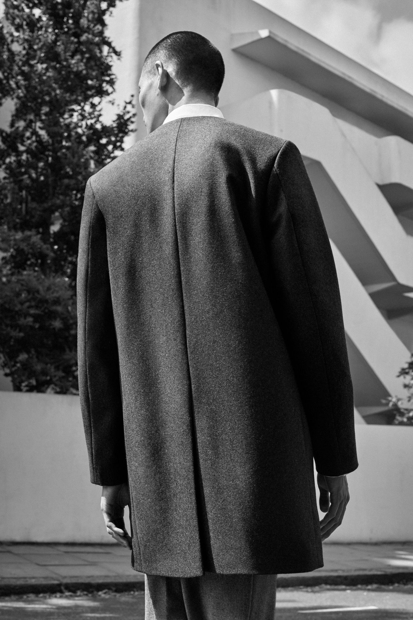
Both clothes and buildings have a functional purpose at the end of the day, but they also don’t have to be limited to that. What do you think of the idea that the Bauhaus reinvented functionality as something avant-garde, perhaps emerging from unorthodox practices?
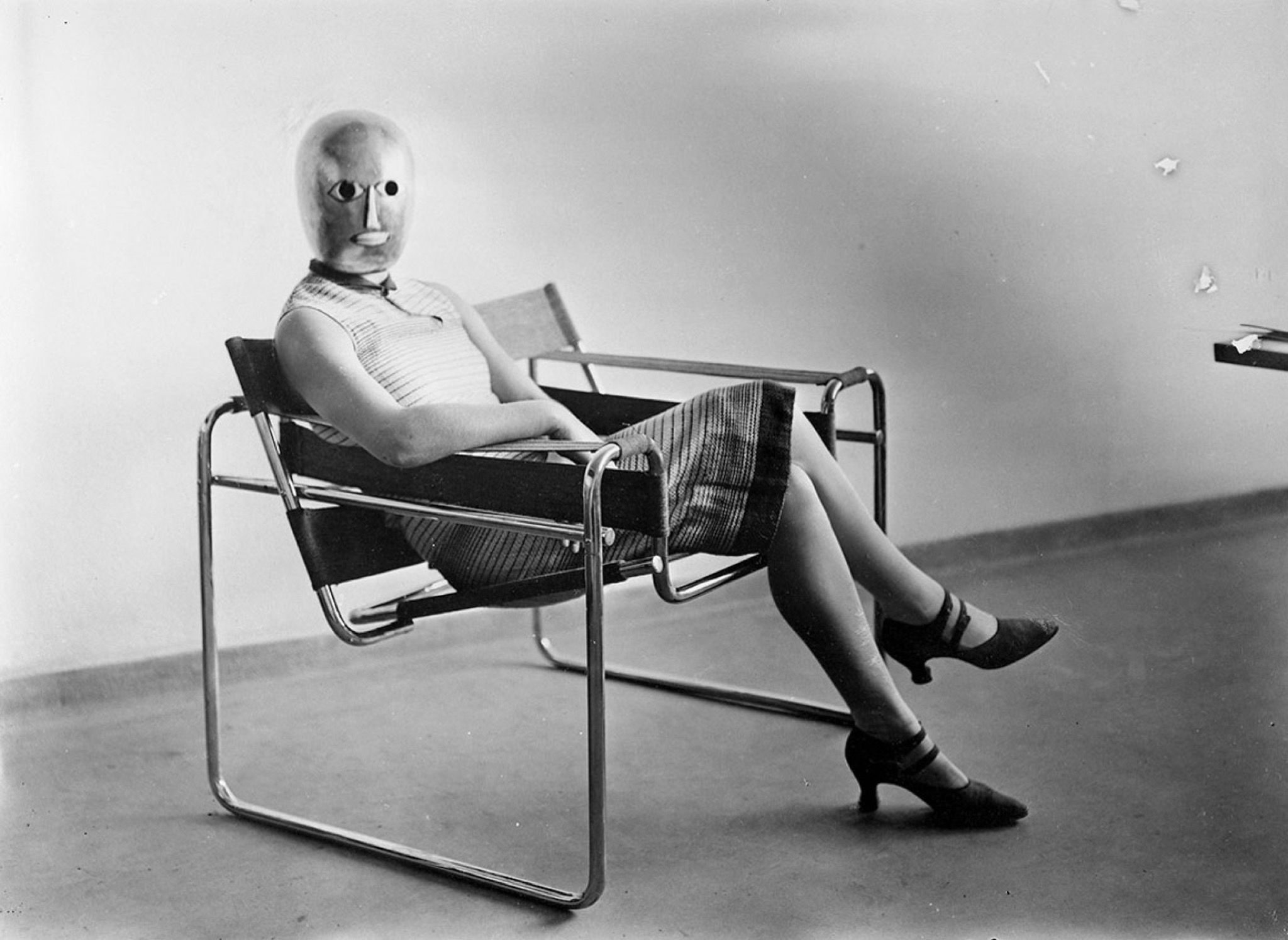
That was an interesting common point between COS and the Bauhaus. It’s essential to work on the function of a piece, but also on its longevity and ability to survive the passing of time. I mean, if you take the Bauhaus’ buildings or objects, they’re 100 years old but they look incredibly modern. The Vassily chair, for instance, is an artwork in terms of design, but it’s also incredibly comfortable. What’s interesting is to start with the function and then move to the form, working with the atelier in-house, and the pattern-makers. It’s real teamwork, definitely.
This way of working very collaboratively, with the art and design being at the same level as the craftsmanship, was also a trademark of the Bauhaus.
Yes. We always talk about the Bauhaus as a movement, which it is, but originally it was a school, and a school is made to teach, to share ideas, to nurture new talent. What’s interesting here is the teamwork, the collaboration, the sharing of initiatives, and crucially, the challenging of ideas: the Bauhaus itself contained a lot of very strong opinions, often clashing with each other. Ultimately, they asked themselves how they could work together to make something happen. This process is truly amazing. It’s the other thing I find incredibly modern for the Bauhaus.
Diving into the archive itself seems like a daunting task. How was the research process?
It’s a lot of reading, looking at old photo documents, but as a creative team we always look at one thing and project something else. We never want to take something literally – it’s too easy. So that’s the way we question everything: by taking in as much information as we can, then finding our own take on the Bauhaus, our own way of expressing its message. When you look at a COS piece, it’s not essential that the people know what it’s inspired by. Of course, it’s made pretty clear on the tag, and the tag is there. But at the end of the day, it’s meant to be taken off.
Credits
- Interview: Irina Baconsky
