Surprisingly slick art direction from the chaotic world of hardcore punk
|Tyler Watamanuk
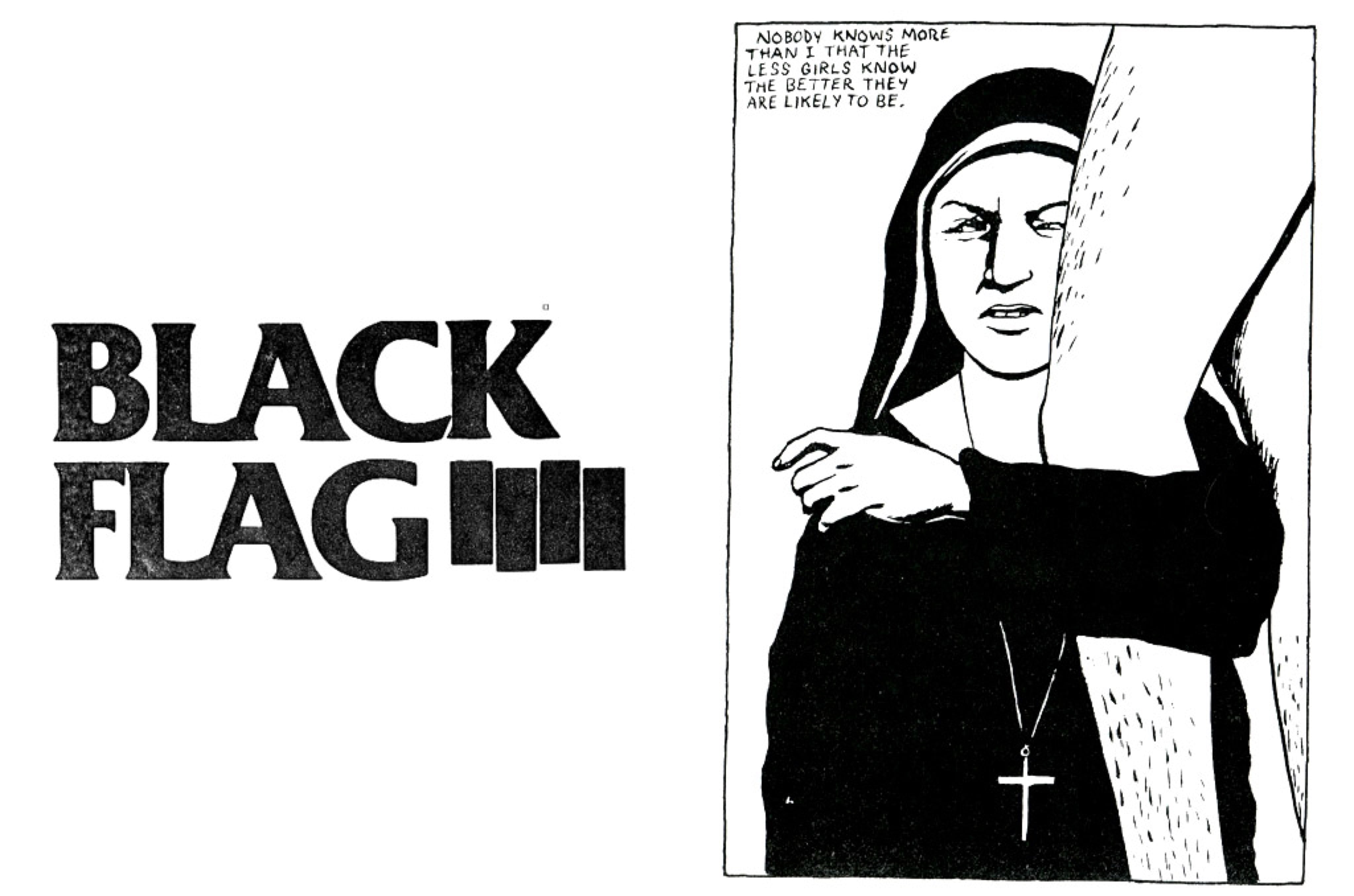
If the Black Flag logo is seared into our psyches as the epitome of punk rock visual identities, it is perhaps to the art and design crowd that we owe its continued visibility. The graphic is easily recognized and reproduced, and as elegant as it is defiant – which is perhaps why it is as resonant to admirers of Muriel Cooper’s iconic MIT Press logo as it is to the nonconforming young music fan hungry for iconoclasm and rawness. Beyond art school and those off-kilter black bars, though, a new world of punk rock graphic design emerged over the years, and its output has yet to be canonized. Here’s a brief look, in time for festival season.
“It feels good to say what I want. It feels good to knock things down. It feels good to see the disgust in their eyes,” screams Black Flag front-man Henry Rollins on the second track of Damaged (1981). Clocking in at just 34 seconds long, the song is a chaotic assembly of distorted power-chords and urgent, breathless vocals. Everything about it symbolizes punk’s unwillingness to compromise, apparent both in the lyrics’s rejection of cultural norms and in the roughness of their delivery.
When the first wave of hardcore punk spread across North America in the early 1980s, it was an angry-yet-inspired movement of testosterone-heavy music and perilous mosh pits, D.I.Y formations and crappy tour vans, local scenes and regionalized sounds. As the music evolved it became slightly more accessible with late 80s’ “youth crew,” then more metallic in the 1990s, and more melodic with the post-hardcore sound of the aughts. The unpolished mentality of early hardcore remained, though. The subgenres and subcultures that it helped birth built their music and public image on blocks of fury in the hopes of changing the world (or at least their hometowns) with brash songs and brasher attitudes. A lack of varnish was a sign of purism, and purism is punk.
Deliberate art direction may seem out of scope for a scene known for crude songwriting and in-your-face lyrics, but the most impactful bands of the hardcore spectrum have often been those who opt for a considered design direction to accompany their impulsive music. Shot by punk photographer Ed Colver, the cover of Damaged features Rollins’s bloodied hand breaking a mirror – an image whose composition and graphics took it out of the pit and, years later, onto the pages of art and design journals. Black Flag’s iconography was created by artist Raymond Pettibon, brother of the band’s guitarist Greg Ginn, and remains indisputably iconic. Pettibon’s illustrations, packed full of crass subject matter and bone-dry wit, appeared alongside the logo on the band’s albums, merchandise, and flyers. At once bristling, romantic, and mysterious, their “flag” of four black bars would help shape the aesthetic that would dominate the scene for years to come.
Perhaps best known as the architect of the Sex Pistols’ graphic identity, English artist Jamie Reid began to approach graphic design with a lo-fi lens in the 1970s. Ignoring existing rules of composition, and remixing how a designer could use shape, color, and form, Reid captured the chaotic energy of early punk with a deafening cut-and-paste aesthetic that defined the birth of the genre. In the decades that followed, artists such as Pettibon, Jeff Nelson, Derek Hess, Alan Forbes, and Linas Garsys would all lend their skills to bands. A live act might project an aura of discord, but a glance at the band’s album artwork might reveal a curated look and feel. And in a world that rewards a “no fucks given” attitude, a punk band having a glossy art direction is pretty damn punk.
Taking the effort to craft a strong visual identity is worth it: if a band can create an aesthetic that resonates, fans will hang banners on their walls, get iconography tattooed on their bodies, and wear the graphic T-shirt until it disintegrates. The space where punk rock and high design meet is what builds a deep, layered connection with audiences — ultimately, it’s where a lasting legacy will live. Below is a sampling of contemporary hardcore bands that have taken a page out of Black Flag’s book, and in doing so are reaping the benefits of a striking visual image.
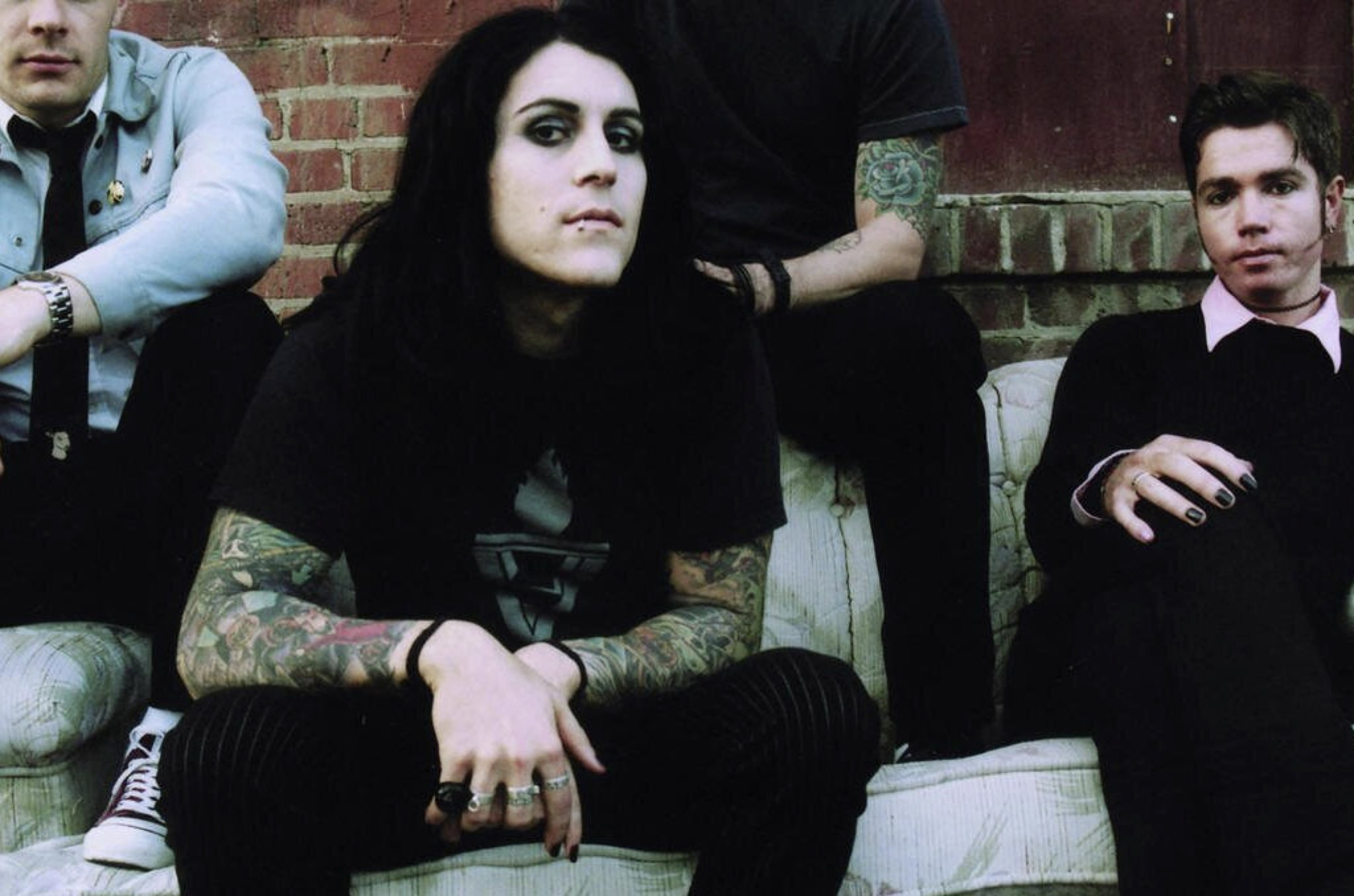
AFI: Davey Havok’s Manicured Goth-Punk Image
In the 2000 music video for “The Days of the Phoenix” from AFI’s breakout album The Art of Drowning, front-man Davey Havok jumps and gyrates while wearing a black latex top and pants. He’s a sexed-up Glenn Danzig and a more confident Robert Smith. At a time when popular punk music was mostly masculine or goofy, Havok rarely strayed from a uniform of skin-tight clothes, eyeshadow, nail polish, and lipstick. He oozed a new type of male sexuality that felt personally authentic yet meticulously crafted.
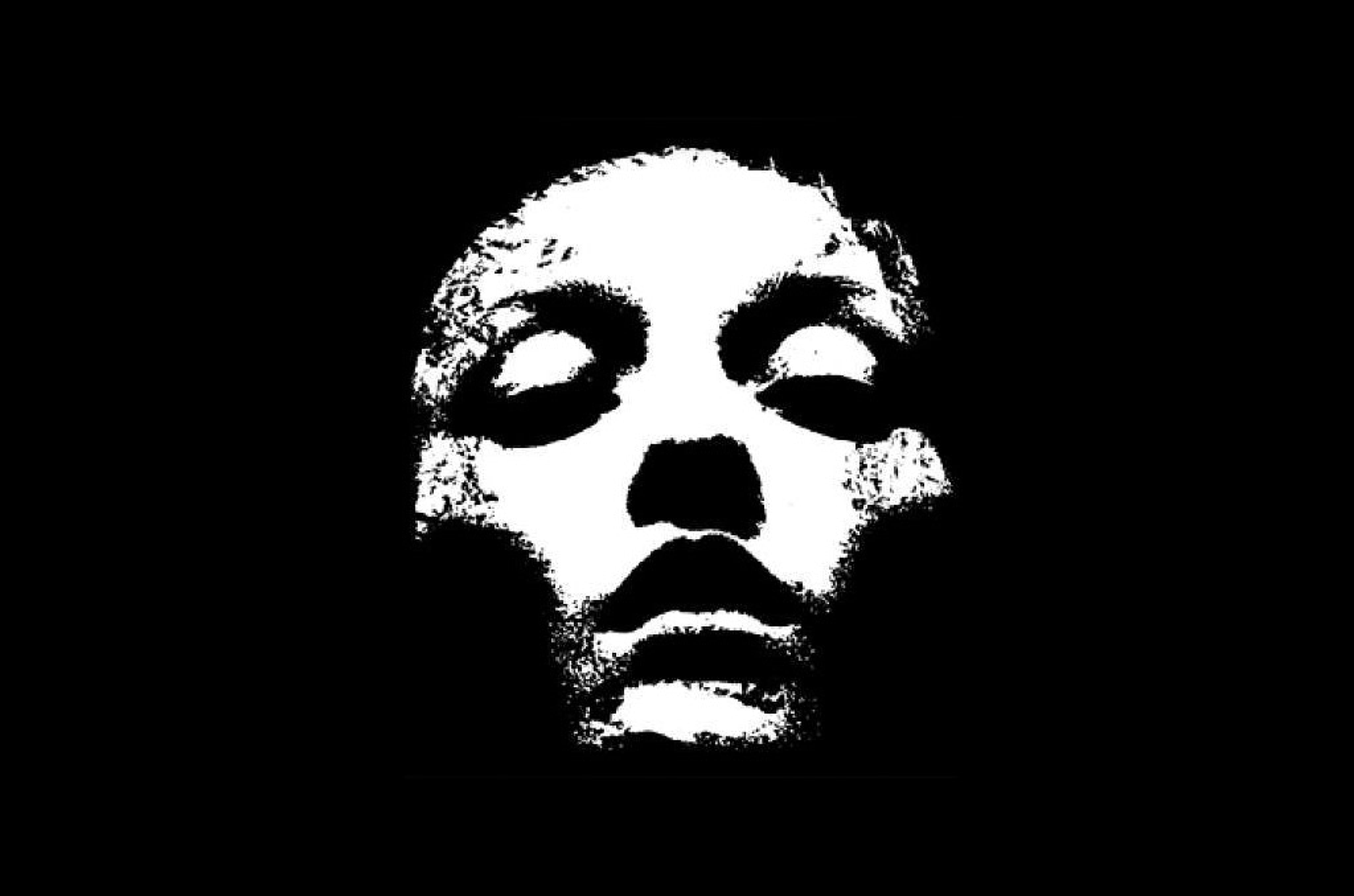
Converge: Jacob Bannon and His Vision of Experimental Metal
Jacob Bannon is known first as one-fourth of the genre-blurring Massachusetts hardcore-metal band Converge, and second as a visual artist. At nine albums in, the beloved band continues to shape-shift the purpose and function of imagery in metal and hardcore punk, and Bannon’s artwork has been the face of it all. While Converge’s music may morph from record to record, Bannon’s own style—collage-like and full of high-contrast shapes, sharp silhouettes, and layered textures—has never wavered.
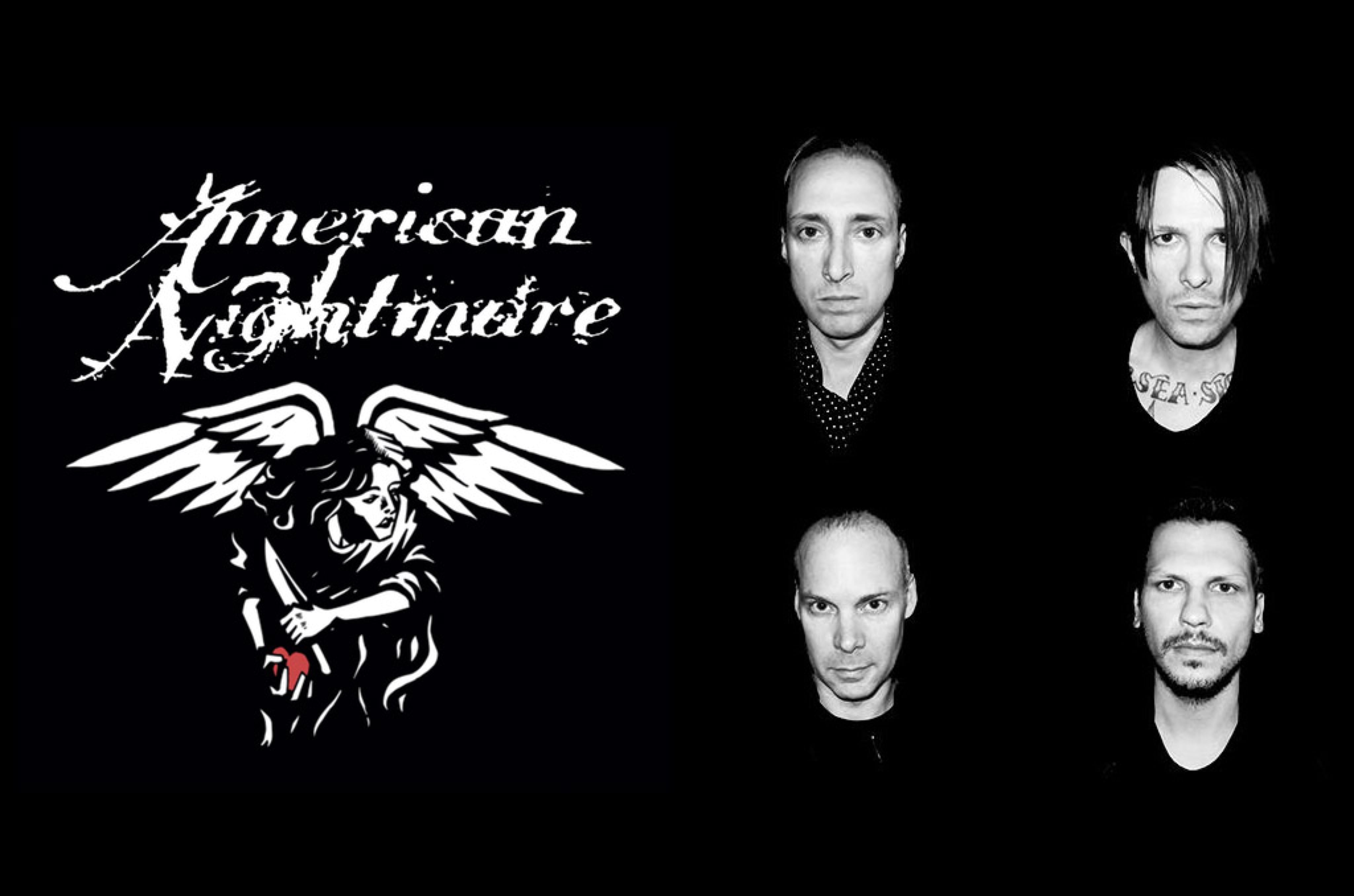
American Nightmare: Emotional New-Age Boston Hardcore
Originally active in the late 1990s and early 2000s, the trailblazers of contemporary Boston hardcore emerged out of an ultra-aggressive scene, but always flew their own banner. American Nightmare matched the energy and menace of their peers, but the band’s creative center was more akin to that of The Smiths. Their imagery played directly into that emotional tone: stripped-down, black-and-white graphics with no shortage of allusion to heartbreak and vulnerability.
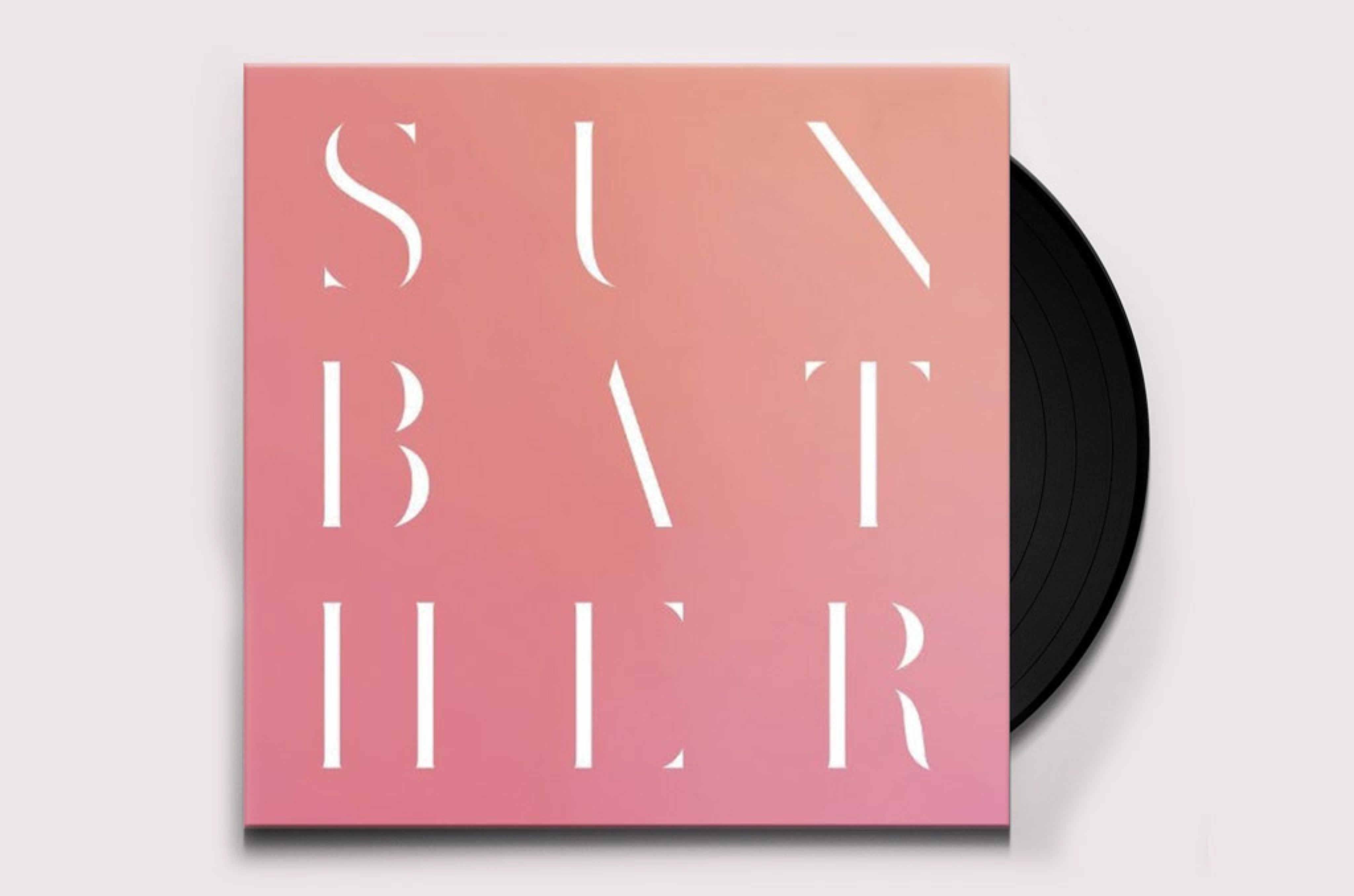
Deafheaven: Black Metal Coated in Pastel Pink
As a genre, black metal is better known for corpse paint and gothic imagery than pastel gradients and hyper-designed sans-serif fonts. Deafheaven built a rabid fanbase by mixing intense black metal and fuzzy post-rock, and clearly had no qualms about stepping outside the confines of what a metal band’s image usually looks like. They even released an artisanal blanket featuring their signature pink-hued artwork, and offered up their go-to font for purchase, too.
Code Orange: Graphically and Tactically Dark
At the 2018 Grammy Awards, where Code Orange was nominated for “Best Metal Performance,” the Philadelphia band posed on the red carpet in outfits that included trench coats, a ski-mask, and even a high-end cross-body bag by the emerging designer label Alyx. Despite coming up in the gritty hardcore scene, Code Orange radiates an image that is as meticulous and precise as their military clothing, carefully edited music videos, and the slick visuals that often feature their “Tiger Head” logo print.
Turnstile: An “Anything Goes” Sense of Sound and Color
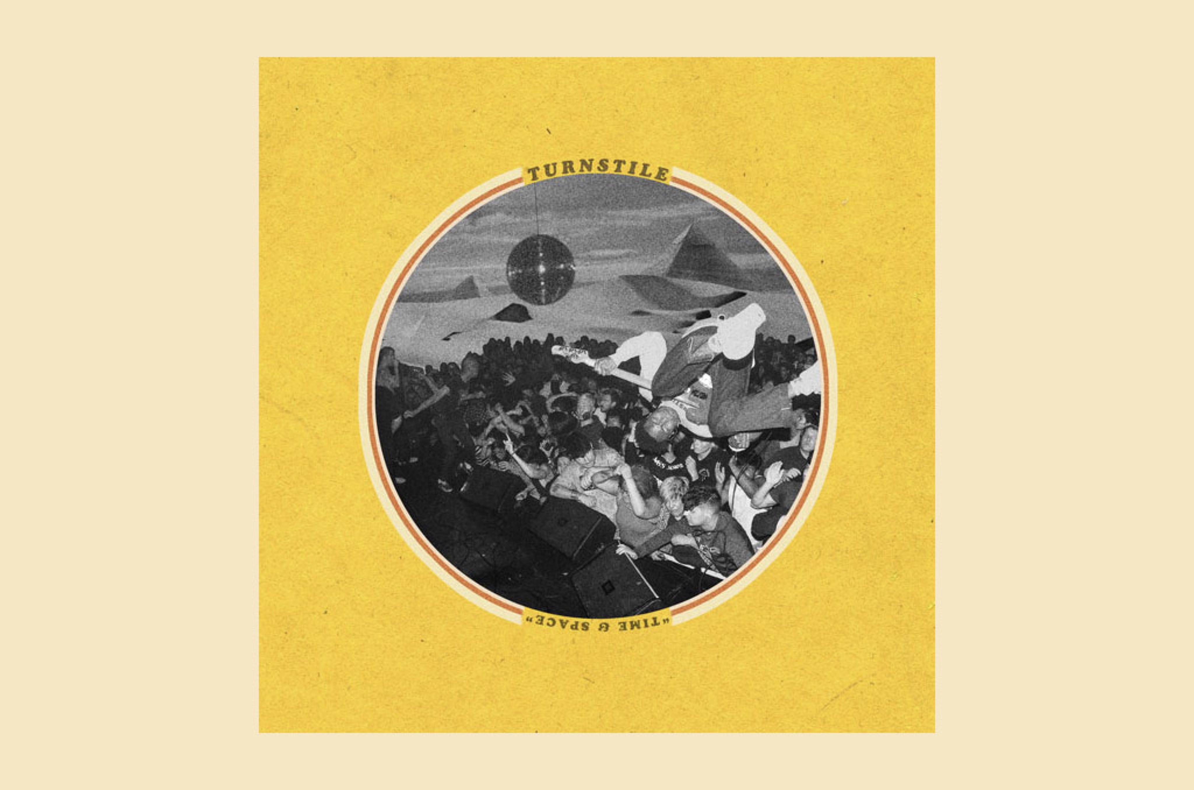
Turnstile, one of the breakout stars of contemporary hardcore’s thriving scene, has always subverted genre stereotypes and had a hell of a good time in doing so. Their latest record, Time & Space, features punchy power chords, grabby sing-a-longs, and electronic samplings from mega-producer Diplo. The album’s cover features an electric yellow background, a disco ball inlaid with an action shot from a live show, and retro-inspired typography – a look as eclectic as their music, and deliberately so.
Credits
- Text: Tyler Watamanuk
