OMA AMO w/for PRADA
|Jack Self
Every year, Prada holds four runway shows in a windowless concrete hall at its headquarters in Milan. This industrial space has become the blank canvas for the world-famous Dutch architects OMA to produce a dazzling array of immersive runway shows. These sets are more than just the centerpiece of the longstanding collaboration between two global powerhouses. They are a testing ground for new formulations in the relationship between culture and commerce. For 032c’s Winter Issue 2016, Jack Self traveled to Rotterdam and Milan to speak with OMA founder Rem Koolhaas, his partner Ippolito Pestellini Laparelli, and project architects Giacomo Ardesio and Giulio Margheri.
No one likes being pressured to buy. It is tacky. We want to take control – to be recognized as discerning, to feel special when we make a purchase. We like luxury because it is not desperate. It does not need our money. It is not selling us a thing. It is offering us a lifestyle. The timing, the setting, and not just the objects, are vital to how we craft and project our idealized self-image into the world. Appearance always trumps reality.
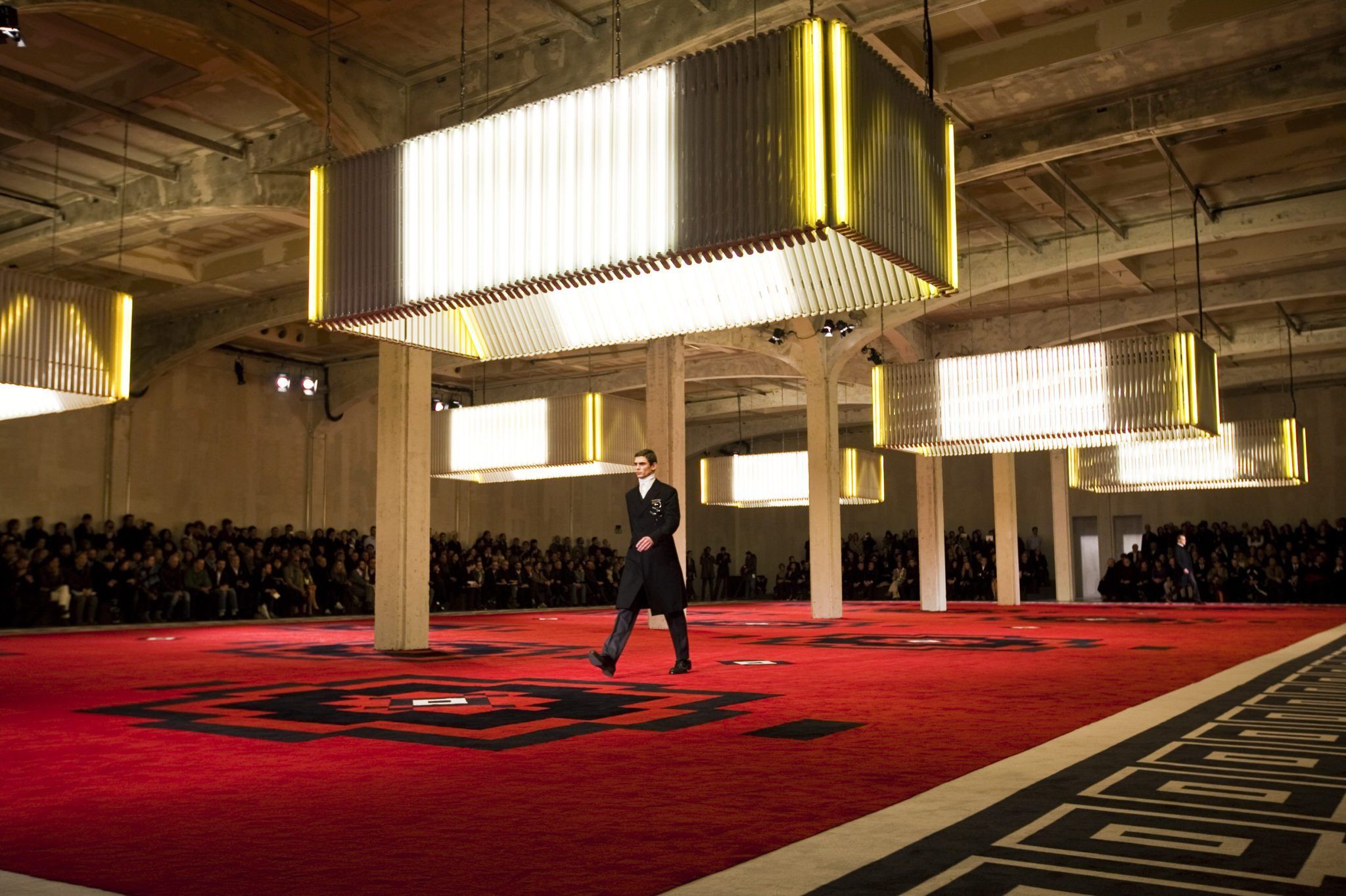
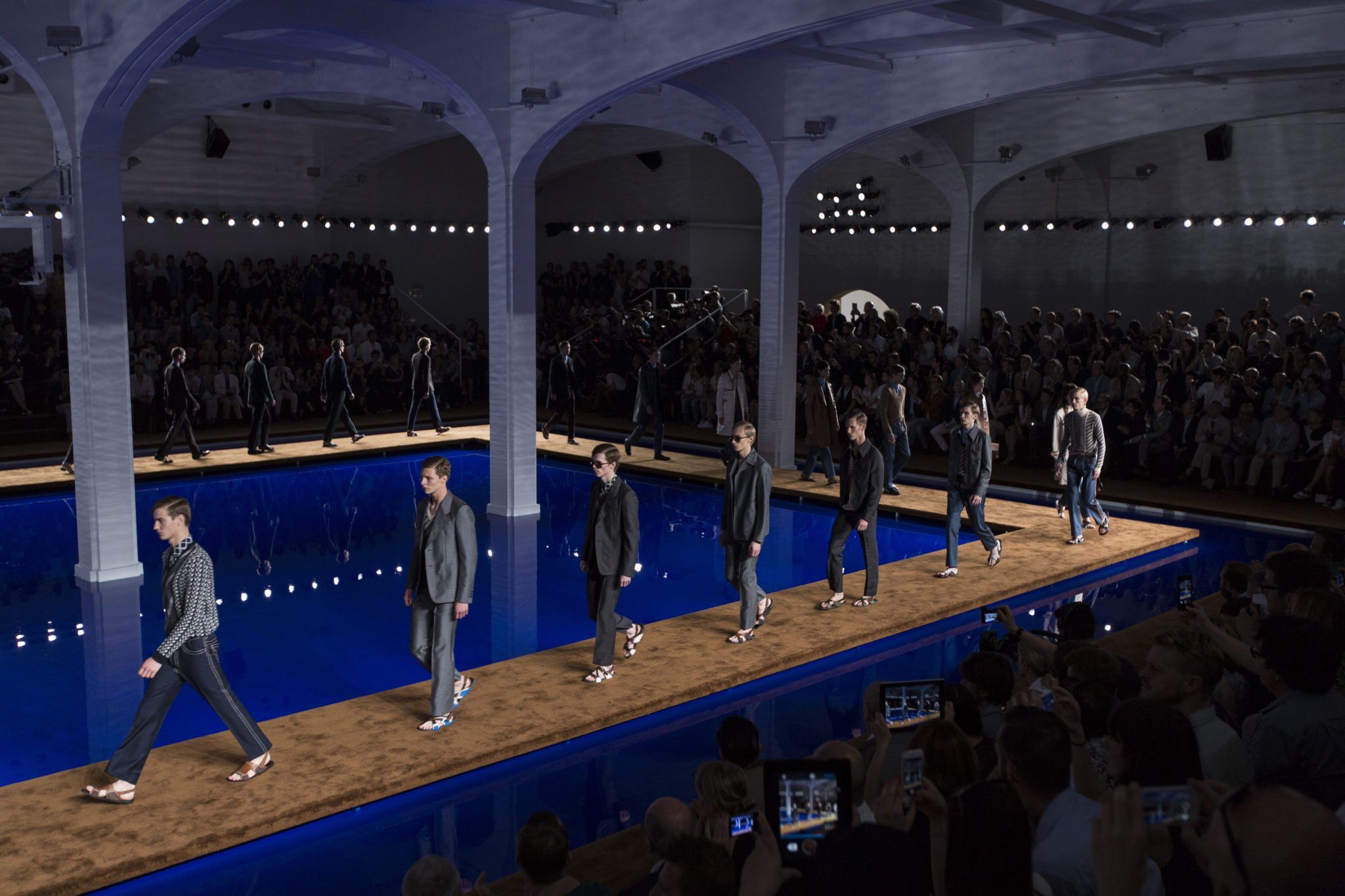
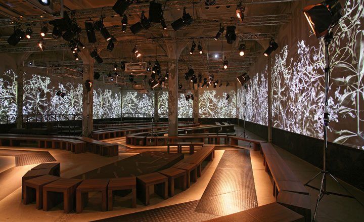
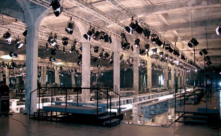
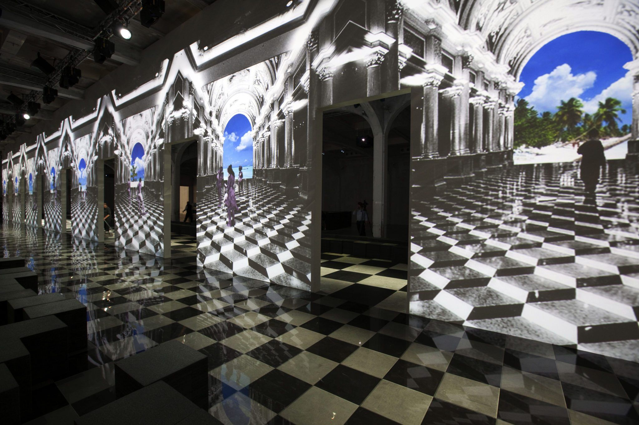
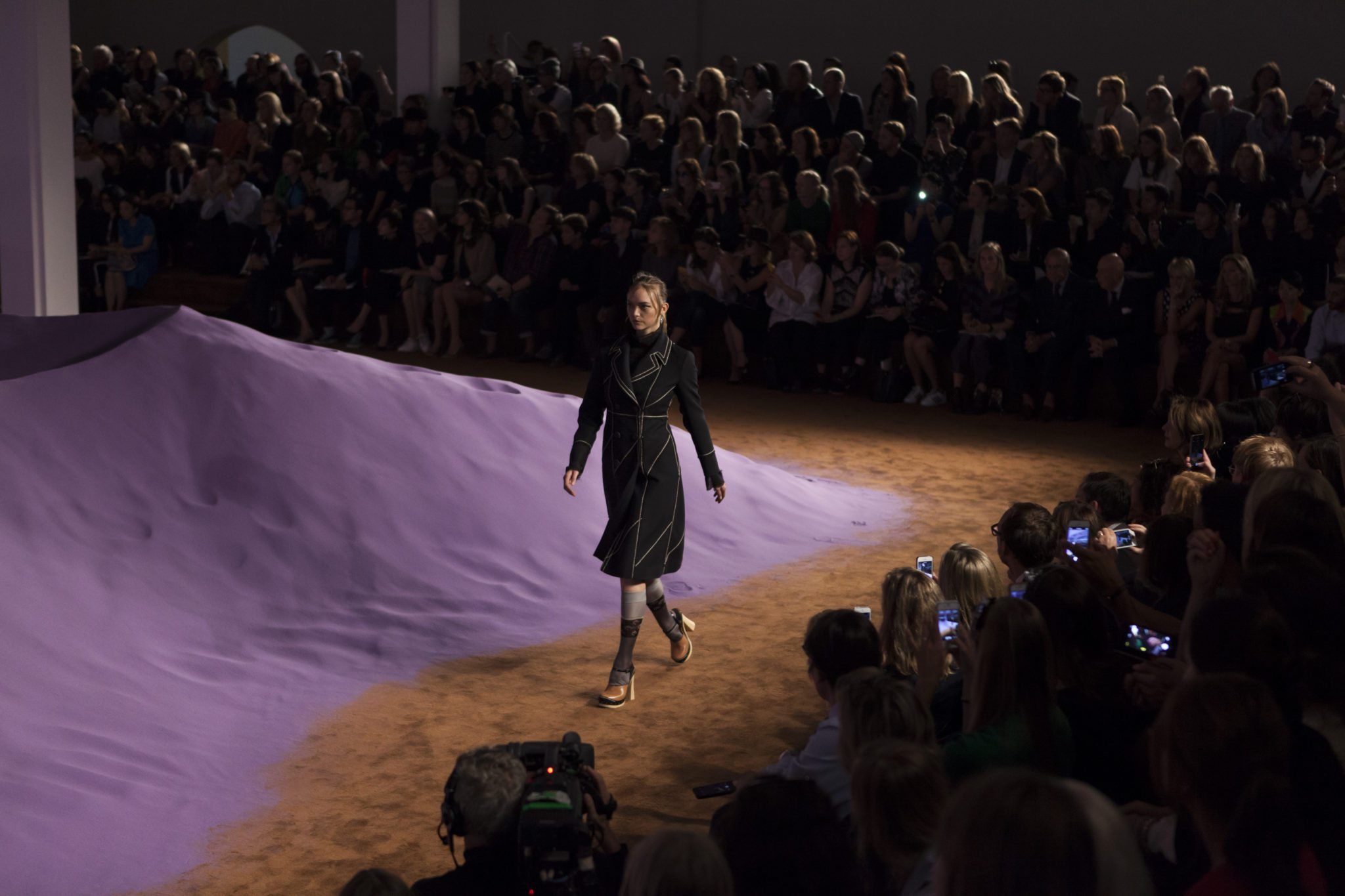
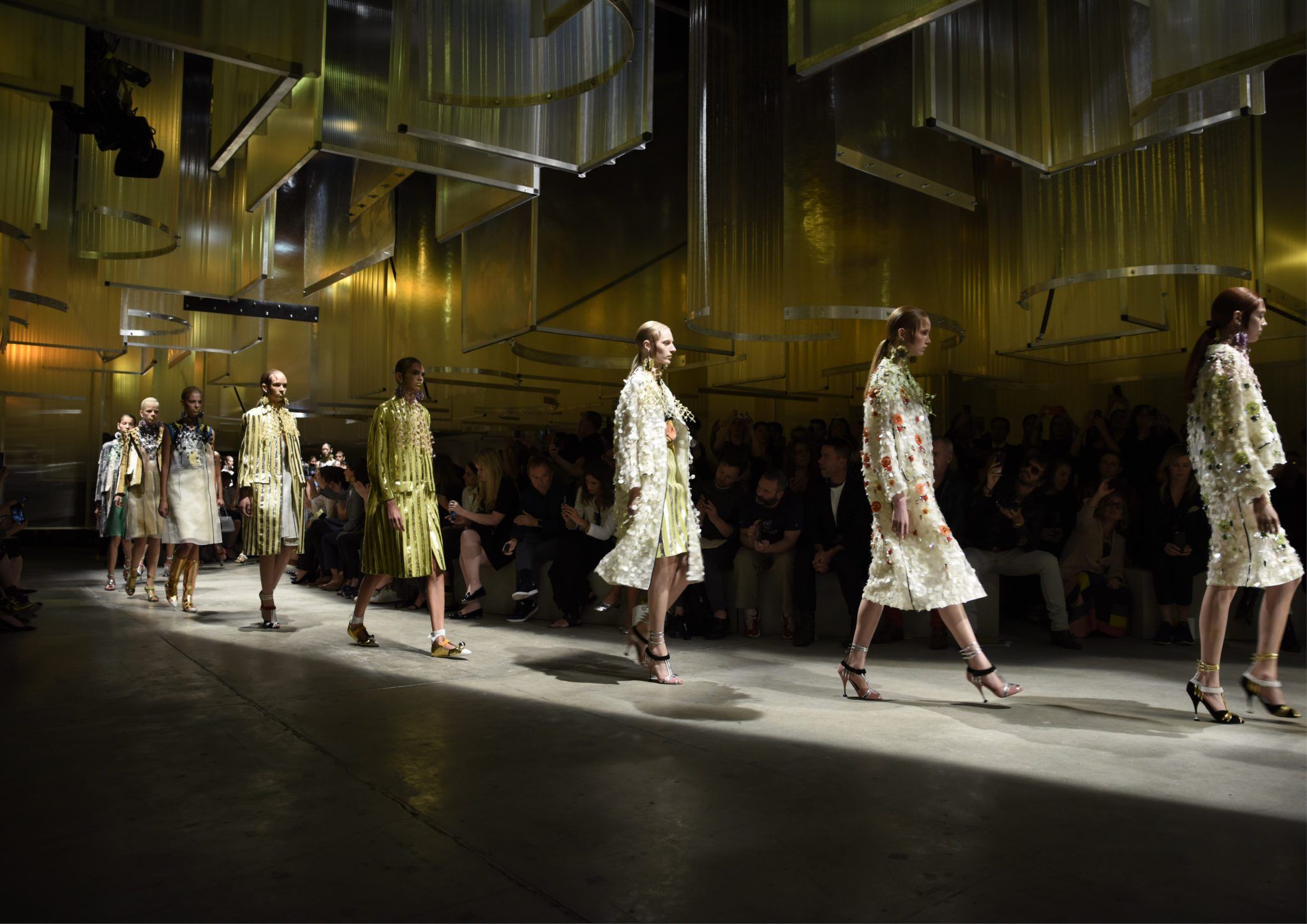
Through the years, the Dutch architects OMA have turned Prada’s concrete hall on Via Antonio Fogazzaro into a luxurious Soviet palace and a moody boxing ring – the latter a commentary on the violence of the global financial crisis. It has appeared as an archipelago with models adrift at sea, or as a full-scale modernist villa complete with custom-designed furniture in which models assumed scenes of domestic bliss. It has been a grass field populated by a grid of blue cubes, geometrically forgoing the snobbery of the front row. There even was a set designed to eliminate the audience altogether, where viewers were forced to spy on the runway through long slits in walls, situating an entire industry as voyeuristic peeping-toms. Unusually for the world of fashion, it is the architects who determine the direction for these sets, which are then coordinated and approved by Prada. The spatial design fixes whether it will be a show for 405 or 660 people – whether there will be an opulent entrance replete with drinks and canapés, or just an austere antechamber. With such a repetitive seasonal program – basically an 11-minute show of people walking around in new clothes – you would expect even the architects of OMA to eventually exhaust themselves. But through a relentless pursuit of contemporary culture, as well as continuing efforts to challenge the format of the fashion show itself, the project remains relevant and fresh. The collections and space work together to produce something more than the sum of its parts. It is a Gesamtkunstwerk that explores historical references, plays on material and symbolism, and endlessly innovates the worlds of fashion and architecture.
In the past year, Prada’s two runway shows centered on the theme of persecution. It first emerged in the AW-16/17 presentation during January’s Milan Fashion Week, when the brand presented a set design based on the infamous Auto-da-fé – so-called “acts of faith” perform-ed by the Catholic Inquisition in which apostates were put to a fiery death. Apparently, the original proposal of OMA was intended as a critique of social media and its unforgiving judgment of fashion through digital images. However, the connection between the theatrical torment of the show and the real torment of the Prada group did not escape its viewers. Shortly after the presentation, it was revealed that profits had fallen to their lowest levels in five years. Revenue continued to tank over the summer, and by September, it was down more than 15 percent. Everyone was looking for a sign of faith.
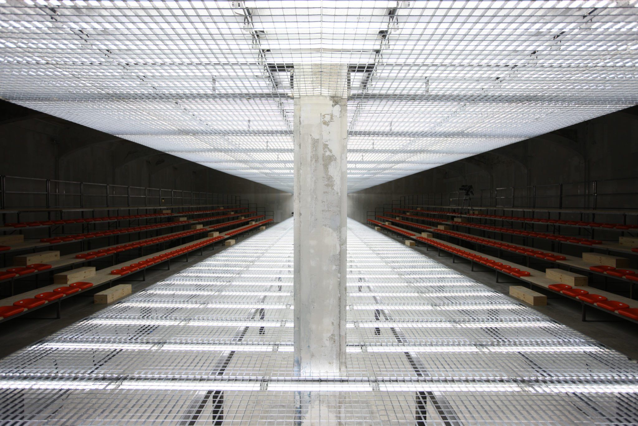
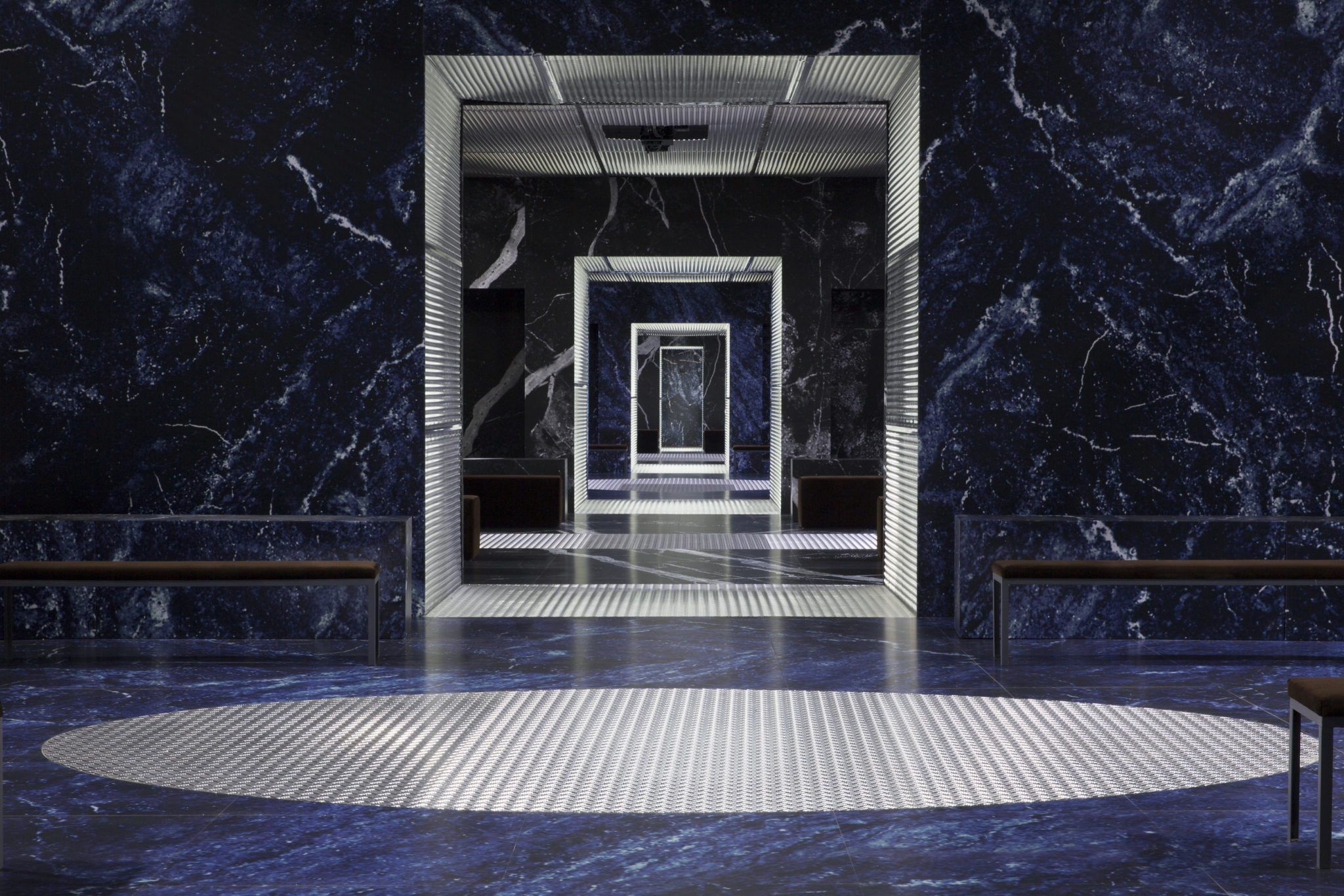
Miuccia Prada’s arrival at the Milan headquarters for the SS-17 show this September certainly gave me cause for hope. I was standing in the back courtyard when, without notice, the main gate’s tall doors were prized open and a midnight-blue Audi hatchback rolled into view. Not without some dramatic deliberation, the car parted a silent crowd that had spontaneously gathered out of thin air. Cigarettes were extinguished. Ties tightened. One woman nervously straightened her skirt. Mrs. Prada sat in the front seat with her hands folded over her lap, eyes fixed straight ahead, neither turning to look at her press team nor her chauffeur. She was an entire order of magnitude more elegant than anyone I had ever seen. Inside, it became clear that the show would continue the theme of oppression and punishment. For two decades now, OMA has been negotiating a careful line between offering Prada what it thinks it needs and simultaneously telling it what it really wants. The sets always reflect the state of Prada’s psyche at the moment of the show, but also speak to political and economic events, or the direction of popular culture and the zeitgeist beyond the world of fashion. With its steel mesh runway, harsh neon lighting, and frigid air, the show recalled a corporate dystopia. Suspended screens played excerpts from a monochrome David O. Russell film showing women trapped in a fugue state of déjà vu. Short loops ran backward and forward, forcing the protagonists to dress and undress, answering their phones only to hang up immediately, running up to then fall down escalators, waking up only to pass out as they desperately try to navigate an inescapable airport interior. The repetitive vignettes vied for attention with the clothes, creating a discord underlined by a soundtrack of shrieking violins. The runway collection was a kind of “greatest hits” mash-up. There were Prada’s signature black tanks and wrap skirts from the early 1990s, the faux-frumpy pencil skirts and cardigans that came after, plaid bombers and car coats from the mid 2000s, and the Chinese silk pajama suits we have come to see more of again recently. There was something for everyone – a reminder that there is little indication that the clothes per se are to blame for Prada’s slump. The underlying cause appears to be a concerted effort to resist the rise of e-commerce. Prada has a long track record of being first in technology. After all, they were responsible for the first-ever touchscreen smartphone in 2006, a branded LG device that leapfrogged Apple’s iPhone by a whole year. Yet according to analysts at BNP Paribas, less than two percent of Prada’s total sales are made online. For a company that has been at the forefront of mainstream fashion for the last few decades, this is unquestionably retrograde.
Yet, Prada’s concentration on traditional cultural credibility – through foundations, original exhibitions and artworks, as well as an ambitious architectural program – has set them apart from other fashion brands. It seems as though Prada uses this straddling of fashion and culture at large as a way to outflank social trends. It is true that their long-term collaboration with Dutch architect Rem Koolhaas and his firm OMA remains one of Europe’s most successful and enduring large-scale cultural projects. At a time when digital media has spawned a lazy reincarnation of postmodernism, OMA’s catwalks continue to present a rare and powerful proposition for how we should live today. Of all the major fashion houses, Prada remains the most active in other spheres of cultural production – which in no small part is attributable to their early adoption of art as a form of capital exchange. They realized long before anyone else that commissioning original artworks or hosting exhibitions did not ipso facto constitute contemporary relevance. However, if those works could be incorporated, appropriated, or become instrumental to the production of fashion, they could operate as a refined form of public relations. It is hardly unique, but Prada does it best.
Prada’s architectural think has benefitted them. Its work with OMA is in-se-parable from the field of architecture, which – for all its criticism and critique – is an irredeemably optimistic profession. The role of the architect is not only to respond to changes in social attitudes and the popular use of space, an architect must also make a positive proposal for directing that change. OMA’s stra-tegy for the brand began with store design and has expanded rapidly into diverse arenas: everything from outposts of the Prada Foundation to multi-purpose rolling exhibition structures. OMA translates Prada’s clothes into a built aesthetic.
The exchange goes two ways, and one could say that OMA has learned more from Prada than the other way around. Understanding how space operates when it is purely composed for the making of images, or how it must function in intensely performative ways, has influenced several OMA projects. The Prada design methodology has leaked into their Venetian mall Fondaco dei Tedeschi as well as the Repossi store in the Place Vendôme, among others. Remarkably, the dedicated Prada team within OMA is tiny, consisting primarily of partner Ippolito Pestellini Laparelli, along with project architects Giacomo Ardesio and Giulio Margheri. When I visit OMA’s bustling multi-floor office in Rotterdam on the eve of the SS-17 show, I learn that the Prada team has its own mezzanine. With its low ceiling and commanding view over the other employees, it re-sembles a cave. Moodboards clutter the walls, while scraps of fabric are incon-gruously pinned under stone and mesh swatches. Like dancing when you are by yourself, you get the impression the Prada team is isolated in order to ensure their freedom from convention.
After visiting the team at work, I flew down to Milan to meet them on set. In the wings of the most recent show, I interviewed project architects Giulio Margheri and Giacomo Ardesio during the final photography tests. The moodboards and combinations of sample materials in the Rotterdam office were striking, if only because they are not at all common to the world of architecture. I began by asking them how this unique design methodology functioned.
GIULIO MARGHERI: We mostly start with our own references, our own research, which doesn’t always overlap with Prada’s. The two approaches certainly meet at a general cultural level, but not in the detail. Sometimes we study certain kinds of spaces for the show, and from this a fashion story emerges. Sometimes though, the collection and space don’t overlap directly at all. There are many ways we look to challenge the hierarchy of the industry, the relationship of the viewer to the clothing, as well as the mood of the architectural scheme.
JACK SELF: Does the way in which the space is presented as an image ever drive its design?
GIACOMO ARDESIO: In fashion, it is not unusual for a space to be completely composed around specific ambitions of the image. And unlike in a normal architectural project, we can also play with a certain kind of humor. For example, in the so-called “democratic” show produced with blue foam cubes, the effect was to frustrate the world of fashion by destroying the idea of a front row.
What is the value of working on such a specific kind of project for the office more broadly?
MARGHERI: There is a lot of room for us to conduct material and spatial research through the fashion shows. So we have built up a lot of knowledge that gets put to one side and is later recycled. Other teams at OMA will come and dig out elements of the work to incorporate into unrelated projects. Prada works like a gym for architecture, as a place to test our limits and build up new abilities. We produce a wide variety of outputs, but we can’t always follow it up to the highest level. After all, we are only really working on facades. It falls to our colleagues to develop our starting points into more complete systems for application in buildings.
As we speak, Ardesio is tightening a handrail bolt that has come loose. We discuss last January’s show, which was inspired by a 1683 painting housed in Madrid’s Museo del Prado. It depicts one of the last and most extreme Auto-da-fé held by the Spanish Inquisition. The architects were attracted to it for its strong sense of multi-layered space: a closed wooden piazza with tiers of audience rising all around – from clergy and nobles to the ogling general public. Their all-consuming concentration rests on a single event. Mrs. Prada loved the reference, comparing the ruthless religious spectacle to the unforgiving eye of the fashion critic – armed not with a torch, but an iPhone flash. The final product was a square with remarkably urban qualities and elegant classical proportions.
ARDESIO: When we work on a fashion show, we design as if it were real architecture. The biggest difference is that cul-tural references and images take pre—ce–dence over program, which is unique to this kind of work. In real buildings, program always leads architecture. While for a set design, the program is effectively always the same – a runway – which allows for more experimentation.
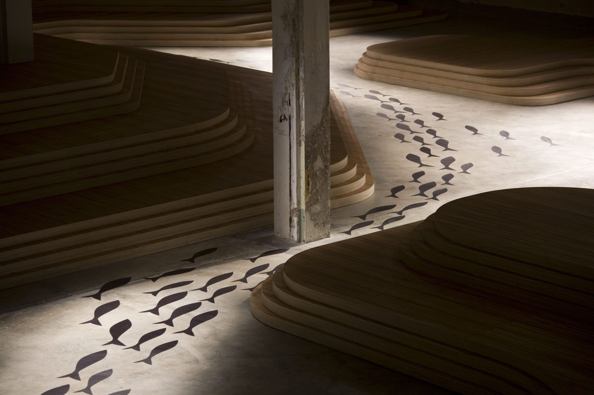
In early modernist architecture, exhibition interiors such as Mies van der Rohe’s Barcelona Pavilion were a vital field for testing new types of space. The general model was to adapt industrial building techniques to propose new quotidian spaces. At this time, industrial construction was the dominant form of production in society. Today, our economies are driven by financial services and creative production. In this context, OMA’s work with Prada serves as a petri dish for proposing a new corporate aesthetic. The runways are therefore the locus of research and development into new materials and relationships between bodies in space.
Earlier that day, I met with Rem Koolhaas at the Prada Foundation. I found him with his back against a wall, his face bathed in a yellow glow. It was less poetic than it sounds. The Prada Foundation is literally leafed in gold, and its facade reflects a luxurious light. At an adjacent table, a group of young visitors were posting pictures of the Wes Anderson-designed café to their Instagram accounts. Nearby, a Spanish architecture student was discreetly trying to work Rem into the background of his selfie. I asked Rem how he first came to be involved with Mrs. Prada more than 15 years ago.
REM KOOLHAAS: Miuccia came to our office almost unannounced and said, “I am bored with all our stores.” I told her, since we had never done a store before, that we needed to convince ourselves we could do it. I asked her to give us three months to investigate the field, and we produced a book with a number of pro-po-sitions. The central message of the book was to articulate ideas about the meaning of luxury. We argued that in a world where everything is shopping – and shopping is everything – luxury is quite simply not-shopping. Luxury is about an absence of pressure to consume, an absence of pressure to sell. Luxury is really defined as an absence of pushing. It is the opposite of force-feeding geese.
When sharks stop swimming, they die. Brands that do not push – indeed, who do not squeeze until the market is absolutely saturated with their product – end up sidelined. Paradoxically, the relaxed attitude that makes a brand appear more luxurious, can also make it go bankrupt.
Isn’t luxury as an absence of pushing fundamentally incompatible with modern capitalism?
KOOLHAAS: It depends on what you understand by the creation of value. Museums are popular not because of their content, but because of their lack of content. You go, you look, you leave. There are no consumer decisions and no pressures to buy anything.
You’ve described redefining luxury as an exclusivity that is not elitist – luxury as simply whatever no one else is doing.
KOOLHAAS: At the time we started collaborating, everything in the world of art and fashion was polished. Everything was smooth, so we felt that Prada must be rough. We put an emphasis on concepts like waste. In real estate terms, the ultimate luxury is wasted space, for example. Or we wanted to capture people’s attention, not as a distraction to sell products, but in order to create a space for focus and clarity. These are not strictly commercial propositions, but they have become luxurious because they were not part of the mainstream. The ambition was to collapse the distinction between cultural and commercial activities. I would use the word “hybrid” to describe this kind of environment that is neither one nor the other.
A common strategy deployed in the creation of a “look” is to place ordinary or banal objects into unfamiliar, arresting, and contradictory contexts, thereby altering their meaning. A look is not necessarily connected to its price: Prada can make plastic sheeting worth just a few dollars look “expensive.” Similarly, a cut-crystal sequined ball gown worth tens of thousands of dollars can still look “cheap.” In the late 80s, Prada pioneered cycling cheap materials into mainstream luxury items – most famously through the transformation of common black nylon into an “expensive” bag. By juxtapo-sing the glossy fabric against dimpled leather, its meaning was destabilized, creating a space where Prada alone could dictate value. When Mrs. Prada describes fashion as “instant language,” she is pointing to the power of context and timing to generate new cultural and commercial values. Koolhaas’s tone of voice is somehow simultaneously anxious and unwavering. A black Mercedes pulled up near the Prada Foundation, and he suddenly stood up to announce, “Now we will drive.”
How important is architecture for contextualizing luxury?
KOOLHAAS: I really regret the naked and open pursuit of luxury. I find it an appalling sign that the word “luxury” has become completely acceptable, that it is mentioned as an unambiguously desirable condition. I cannot live with that equation happily. But Prada is not about luxury in the common sense.
Prada’s particular approach destabilizes material value and meaning. This was a core subject of our discussion when I met the partner in charge of OMA’s collaboration with Prada, Ippolito Pestellini Laparelli. Architects take a notoriously long time to train, and most do not peak until their late 50s. But with a string of large-scale projects to his name at just 36 years of age, “Ippo” is a prodigy. He speaks carefully, choosing his words with serious precision, only to lighten the mood with good humor or a poetic turn of phrase the next minute. Laparelli join-ed OMA in 2007 and began working on their projects for Prada almost immediately. He began to take responsibility for set design, catwalks, and a host of other research and exhibition projects, and in 2010 became director for the entire collaboration.
What do you think OMA has learned from Prada?
IPPOLITO PESTELLINI LAPARELLI: Prada is a really good example of a combi-nation of elegance and tackiness. We have moved in directions that were really unexpected for OMA, in terms of materials or lighting, and so on. We have begun to actually give value to things not because of their aesthetic value, but because of what they represent symbolically. Now, you’re looking at a particular material, but as soon as you charge it with a new meaning, it becomes something completely different. You could say the same thing about the gold leaf used at the Prada Foundation. It looks extremely luxurious, but if you take its cost per square meter, it’s a lot less than any kind of marble or stone, even most paints. The beautiful thing about Prada, and fashion in general, is that we learn to move through the symbolic meaning of materials in a very agile way.
A fashion show is not the same as permanent architecture. For one, achieving an effect during a short performance requires far greater precision.
LAPARELLI: It’s almost like designing a piece of a theatrical world in the sense that the show itself is contextualized by the set and vice versa. The whole event is further defined by music and light, so you have to express a single concept through many media. I do think that working with fashion has more blatantly brought to our attention the issue of time in architecture. When you design a fashion set, you have to design through space and time simultaneously, as two integral components of a larger spatial experience. Movement informs space. I think this is actually something embedded in many old OMA projects, but it has a renewed relevance in the context of fashion.
One of the most remarkable qualities of OMA is that it does not have a trademark architectural aesthetic. Unlike other so-called “starchitects” – such as Peter Zumthor or Frank Gehry – OMA has continually evolved stylistically throughout its history. It does, however, have a trademark methodology, which produces a consistent attitude towards design and space. In a sense, its brand is based on concepts and ideals. It sits at an interesting junction. The partners of OMA are considered architects’ architects. They are among the foremost intellectuals in the discipline. But they are also masters of public relations and mass-communication, bridging architecture with other cultural fields of production. Like Prada, OMA has had to constantly strike a balance between the pressures of always producing something new, while remaining consistently “on brand.”
LAPARELLI: The main link between our two companies is a shared belief in the process of research, analysis, and conceptual thinking. We don’t work like that with any other company, because we have never been asked to design a specific product. With Prada, we are constantly trying to clarify a concept or an idea together, and then turn that into a project.
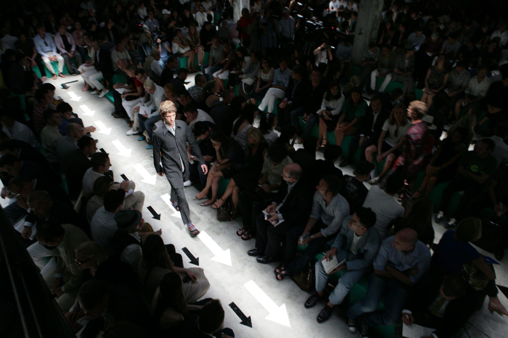
Central to Laparelli’s design approach is a concept of “staging” – something be-t-ween the “look” of fashion and the “context” of architecture. It presents luxury as a total vision for life, a wholly desig-ned and contained environment. You could describe context as the integration of form into space – not of making it invisible, but creating a powerful relationship between a new and existing environment. It is about a permanent and durable harmony. The look, by contrast, is concerned with temporary associations conjured up by overlapping readings and misreadings. OMA’s fashion show sets have to work at both levels. For example, the look of a boxing ring – its allusions to sensationalized violence and brutality – is not the same as its context – the size and shape of its platform, its height, and relationship to the audience. Together, they form the distinct and unusual design methodology Laparelli calls “staging.”
What do you mean by this term “staging”?
LAPARELLI: Staging encompasses many definitions: the staging of values in the context of an exhibition, for example, the staging of a performance in the most traditional sense, the staging of relationships between people, clothes, spaces, or products. I have the same approach across all these fields. It’s just an issue of scale and speed that differentiates the projects. In the case of the catwalk shows, this concept for staging has to precede the design of the clothes, so it takes on a special quality – almost a clarity because it can start from many possibilities.
You must be one of the most fashion-conscious architects in the world. Have you always been drawn to the field?
LAPARELLI: I’m not a fashionista at all. I am only really interested in fashion as a process. It requires military organization. It requires an enormous amount of creative production in a really short time. I think architects can learn a lot from the process of fashion. It is brutal and creative and intelligent in the way it grasps what the world is able to offer. But we are not into trends. Not me, not my team, not the people that work on the fashion shows in general. Of course, we observe tendencies and new pheno-mena that are really important, but not necessarily related to fashion. The collection always starts from some sort of observation. When we start designing the stage set, we are trying to figure out what kind of an idea of a man or woman we want to deliver. Not the way they would dress – but what kind of man or woman represents the current moment.
Could you give me an example?
LAPARELLI: For example, in 2009, immediately after the economic crisis hit, many fashion companies decided not to organize shows at all. We designed a show that was almost a cage, imagined as an enclosed retreat. It was a very rigorous space of metal, dark surfaces, absolutely anti-decorative, austere, and the fashion was extremely severe. The whole idea was to deliver a fashion appropriate for people who make quick decisions and aren’t concerned with ceremony. It was one of the simplest sets we have designed, but in terms of its relationship to the fashion and the global condition, it was really quite fitting. That’s the premise of every show – we start from what kind of character we can represent. Since I’ve been working on stage sets, there have been several phases of design. In the beginning, we were only interested in changing the geometry of the catwalk: from linear to a spiral to a labyrinth to an X. It was a purely platonic geometric investigation of shapes. Then there was a second phase, in which we were really pushing the limits of the fashion business. For example, the “Field” [SS-11] was questioning the way fashion shows are organized, which is all based on exclusivity. More important people are in the first row, and people who are less important in the back. By providing a field, we created a sort of democratic organization, where everyone had the same hierarchy. The third phase is what I tend to call the “blatantly theatrical” – because it’s where we began to be much closer to the domain of theater. We designed props, projections that would work in windows on the background, even furniture design. This is the phase in which we designed a huge carpet with models marching on top, inspired by the Soviet interior. The current phase is more immersive, in which the audience is surrounded by a stroboscopic environment. The collaboration between Prada and OMA evolved through a number of current topics, which I think is even more interesting than looking at a single show. When you take many shows together, you understand both the process of OMA and the role that architecture can play in the world of fashion.
In 1999, OMA created the internal mirror organization AMO, which was charged specifically with original research and publications. This was around the time that Mrs. Prada first came to the office.
KOOLHAAS: The main incentive to create an entity like AMO is that there is something horribly pessimistic about the architectural profession. You are always ready, but somehow somebody else has to ask you to do something first. Only then does it trigger your intelligence. AMO is a device that enables us to enter fields where we have not been invited.
Do you think architecture is becoming more fashionable?
LAPARETTI: I think it is. And I think it has to do with changes in media more than anything else. Architecture is more accessible, simply because it’s more consumable through media. It used to be that architecture was only visible in architectural magazines. Now, architectural imagery has escaped the discipline altogether. In a way, that’s a positive thing, as architectural imagery has now entered a domain that makes it more understandable. At the same time, projects are becoming extremely simplified.
We are also increasingly surrounded by moving images of architecture. Is this influential for you, or do you still refer to the mainstays of architectural inspiration: sculpture and painting?
LAPARELLI: I do find much greater in-spiration in something like cinema than in other forms of art. I feel more in tune with cinema as a language. It is of course a language made of multiple languages at the same time, but it is also a language in and of itself. It is closer to architecture, in that it proves how space can perform all at once. It depicts space beyond just its aesthetic or plastic qua-lities, purely because of the relationship that cinema is able to initiate between people and things. That can only happen when you think about space through a script, as a sequence of scenes.
When I asked Koolhaas in the car about whether he thought architecture was becoming trendier, he reflected before answering.
KOOLHAAS: I think “trendy” is quite a denigrating term today. There are very few people who would admit to following trends or taking them seriously. But at the same time, we live in an incredibly fast-moving and chaotic civilization, so I don’t see trends so much as constant, but rather as morphing alternations between different urgencies and different mini-ideologies. Whether you want to or not, for me, it’s very intellectually important to take trends seriously and find a res-ponse to them.
Historically, the world of architecture has taken its main references from the world of art. Certainly that was the case when the collaboration between Prada and OMA began 16 years ago. Back then, the world of art was neither as predictable nor as safe as it is today. It was an era of pop star artists who defined mainstream culture. Since then, art has become something of a diminished field, allowing fashion – and now architecture – to occupy more of the public imagination. This unlikely and longstanding collaboration between an Italian fashion brand and Dutch super-architects has now produced a third entity that is larger than the sum of either party. In the process, they have redefined cultural production for the 21st century.
Credits
- Interview: Jack Self