“NEST.” Or, How PROZAC Spawned the Greatest Interiors Magazine, Ever.
Nest magazine, the cultishly acclaimed interiors quarterly, published its last issue in the fall of 2004. After seven years, 26 issues, and more than 4000 pages, for Joseph Holtzman, Nest’s founder and art director, the process of making what design writer Steven Heller has called “the most unusual, remarkable, uncompromised consumer magazine I have ever seen,” had become routine. When Nest’s first issues plunged its readers into 16th century castles, historic igloos, Barbie houses, jail cells, a child’s bedroom, the homes of the Asmat people in Irian Jaya, and the riverside Manhattan apartment of just deceased architect Paul Rudolph, they emerged with the world around them scrambled, a Picasso of its former self, re-scripted in nonlinear narratives.
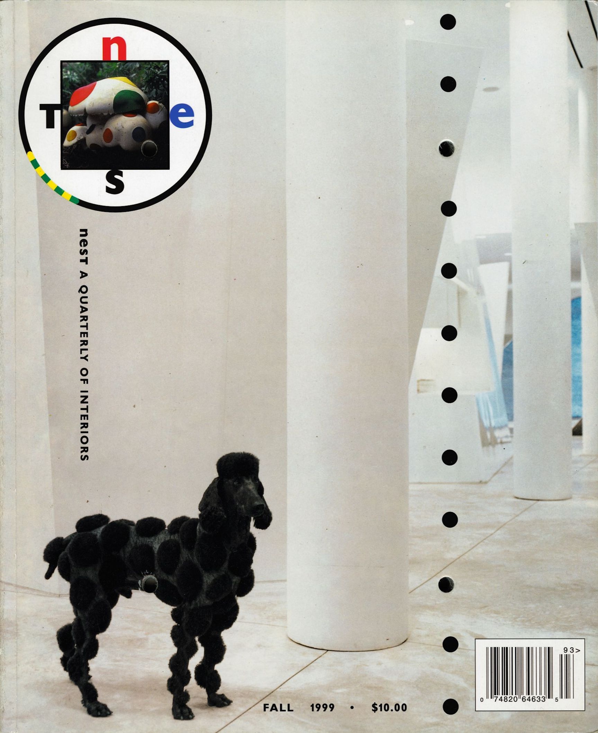
In 1998, the New York Times called Nest “a virtual jackdaw’s nest of design movements, motifs, and ideas.” Each issue had its own quirk. No. 9 featured a couple on the cover with scratch-off clothes. No. 10 came in a zipped plastic bag. A cross-shaped hole was burned through No. 11. No. 13 came tied with a black ribbon. In No. 17, many of the articles, including the subscription notice, were interpreted in musical notation. Several issues had wavy or oblique die-cut edges, freeing the printed object and its layout from publishing’s orthogonal regime. (The magazine was not advertiser friendly. Holtzman even kept the coveted back cover for himself.) The only thing constant was the magazine’s yellow spine – today a telling hallmark of a truly magazine-philic bookshelf. There is no formula for eccentricity. And though new readers of the magazine continue to marvel at the impossible variety in and on its pages, by No. 26, and after two National Magazine Awards, it had all become second nature to Holtzman.
Seeing the magazine’s complete run as a single project reveals commitments greater than each issue’s encyclopedic obsession with interiors. Private space is the private self manifested, and in this way, Nest was both a study on and a celebration of the thoughtful, rash, beautiful, and at times reckless ways we determine our lived environment. Perhaps reading a magazine about other people’s spaces allows us to see our own lives in relief. To what degree do we present our homes as ourselves? To what degree are they costumes? As in 032c Issue #21, Nest No. 2 features mid-century Turin architect Carlo Mollino’s home and secret boudoir. Mollino’s decadent photos of naked women photographed in his home, found after his passing, were superimposed onto photos of the same spot in the house sans nude. No. 9 from summer 2000 sought to plumb “the question of decency,” the heart of how we see ourselves and how we intend others to see us. It featured a story about a community of cross-dressers in a small town in New Jersey. Michael Hurst and Robert Swope wrote that they found a collection of albums from the mid-1950s to mid-1960s in a flea market with images of men who gathered in a house they called Casa Susanna to dress and socialize as women. Glamour shots were found among the photos, suggesting Susanna and her friends performed in drag shows, but Nest published only the private images from inside the home. “The girls sweep the front porch, cook, knit, play scrabble, bathe in the nearby lake, and, of course, dress. And how they dress! It was no longer for the glamour of the stage, but for each other, as normal women would dress, albeit with their own sense of style. There is an evident pleasure of living here, a liberation, a simplification of the conflicts inherent in a double life.”
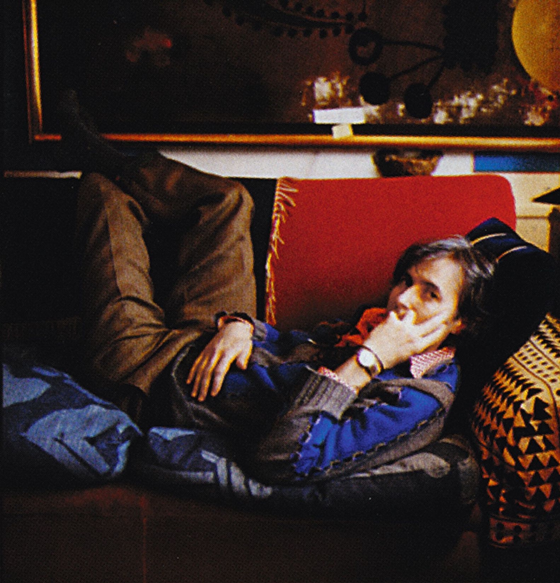
In the editorial to the first issue, Holtzman asked, “What is human?” But the question that persists when leafing through the issues is really, “Who am I?” In fact, the easiest way to read Nest is to see it as an aggregate of episodes from Holtzman’s lived and mental world in print form. His friends and neighbors become contributors, his extended captions gloss each photograph as if he is muttering in our ears, and he appears now and then in Hitchcock-like cameos, peering from behind furniture here, standing in a hallway there. Without any training in graphic design – or much formal training in anything, for that matter – Holtzman designed every issue. Patterns clash with other patterns, uninhibited by convention. His singular claim to aesthetics attracted contributions from Rem Koolhaas, Patti Smith, Nan Goldin, Matt Groening, Stephen Sondheim, John Waters, Chuck Palahniuk, Catherine Opie, Lydia Davis, as well as 032c alum, Todd Eberle. Novelist Matthew Stadler was Nest’s literary editor, giving the magazine polish and depth, but Holtzman will tell you that the voice of the magazine is really musicologist and translator Carl Skoggard, his partner for the past 35 years.
Carson Chan: Tell me about Derry Moore.
Joseph Holtzman: Paige Rense was running Architectural Digest in its heyday (1975-2010), and I learned about decorating through the captions of her magazine. Derry was one of her photographers, and he could just shoot the air in the room. I didn’t know at the time, but Derry had the clout to get her images of England’s most well-appointed homes. He was aristocracy. And he’s lovely. We never talk about his nobility except vaguely now and then. I’ve spent a lot of time with him. In fact, he’s the one that encouraged me to start Nest. Derry had such beautiful photo books of these incredible English interiors, and I wanted to update them. I asked him to shoot the home of Aiden Shaw, a porn star who was briefly on my masthead. Aiden was a pretty interesting figure in the late-90s. He was one of the top gay porn stars, an AIDS activist, as well as a novelist. Derry was intrigued by my choice of subject and he told me that I should start my own magazine, and I did. I was 39 years old. In reality, I didn’t even get out of bed until I was 39 years old. In the end, Derry was my only business partner. His archive became my archive. I had access to all of it, except the things that Architectural Digest owned. He’s a gentle, modest man. I’m close to his children now. He’s twenty 20 years older than me, and he was basically my father figure. He was unfailingly encouraging.
Besides Derry, what else sparked you into action?
Prozac. Before Prozac, I was afraid and I did nothing. I watched soap operas all day. It was dreadful.
Federally approved in the United States in the late 80s, Prozac calmed the feverish, raw nerves of the 80s and gave the 90s a convivial peacefulness, an easy assuredness against panic. (Of course, the rise of Starbucks at the same time sharpened it up with a caffeinated edge.) The truck bomb detonated in the North Tower of the World Trade Center in 1993 was brushed off as the work of a single radical. “Nothing to see here.” Instead, we watched the household shenanigans of The Simpsons and Seinfeld. As South Africa dismantled apartheid, as the Iron Curtain collapsed, we read the heartfelt strains of Dave Eggers, and steeped in the magic realities of Harry Potter. Something new, uncertain, and very magical was afoot for publishing. The digital revolution that erupted in the middle of the decade gave everyone with an Internet connection the ability to broadcast and publish. Without much exaggeration, Nest represents a final claim to the singular potential of the American print periodical.
Holtzman, born in 1957 in Baltimore, came from a wealthy luggage-making family that gave him the freedom to brood over his own curiosity. Similarly, making money was never a real concern for Nest. The magazine was run out of an apartment next to his own in Manhattan’s Upper East Side. Production costs per issue hovered around $6 a copy, and with a newsstand price of just under $10 in 1997, Holtzman would cover the rest of the cost. At one point, he sold a Matisse bronze to finance the magazine. Holtzman told journalist Fred Bernstein in 2004 that he sunk somewhere between $4 to $6 million of his own money into the magazine.
A nest is not really an interior. It’s a home. The word implies a household.
Nest was not actually my choice of name. In the beginning, I was afraid to admit it was my own project, and would always describe it as a committee production. I had a different name for it. Nest gave me a little sense of shame, like I had a bad last name. I wanted to call it A Shelter Magazine. A shelter magazine is the category of magazines that deals with decorating. I loved decorating magazines.
It’s interesting that you came from a family of luggage makers. Your grandfather founded Baltimore Luggage in the early 20th century. Luggage is an object that epitomizes mobility, the non-homely, the transient.
I like that. It’s true, but you can also say that my dad was an engineer, and he made objects, like objects one would have around the house. My mother was a bit strange retrospectively, but she had brilliant taste. As a housewife in Baltimore, she put Rothkos on our walls. As a kid, she’d bring me with her to hang out at the studios of George Nakashima and Paul Evan. She had a gifted eye. I guess I felt beneath her as a painter, so I went into decorative arts and became interested in antiques.
I heard that one reason why Nest was graphically so eccentric was to counter Wallpaper’s minimalism. Wallpaper started in 1996 and Nest in 1997.
That is true. At the time, I was interested in minimalism. I saw all that fashion on the horizon, and I thought they did and did it all right. It scared me to death when they came out. In any case, I stopped looking at magazines after I started my own. I memorized rooms. I couldn’t remember faces. If a character in a film walked out the screen, I wouldn’t recognize him. I could remember the clothes. I have a photographic memory for patterns, rooms, and spaces. In No. 8, we did a story where we took out all the people from famous paintings, because that’s how I saw paintings. I was really into decorative arts. Often, I liked looking at the frames even more than the paintings. When I closed the magazine, I went to look at paintings every day.
It is impossible to say whether Nest was a product of its cultural context, or whether it emerged outside its time. Martha Steward Living – the Stepford-Wivesian quarterly of domestic arts founded in 1990 that became a monthly a few years later as its namesake became a celebrity – and Architectural Digest were the market foundations on which Nest and Wallpaper* tested their ideas. If Wallpaper’s minimalism is seen as a response to the detail-driven fastidiousness of its predecessors, then Nest counters with an expressive penchant for the arbitrary. In any case, it beat out both Martha Steward Living and W for the National Magazine Award for Design in 2001.
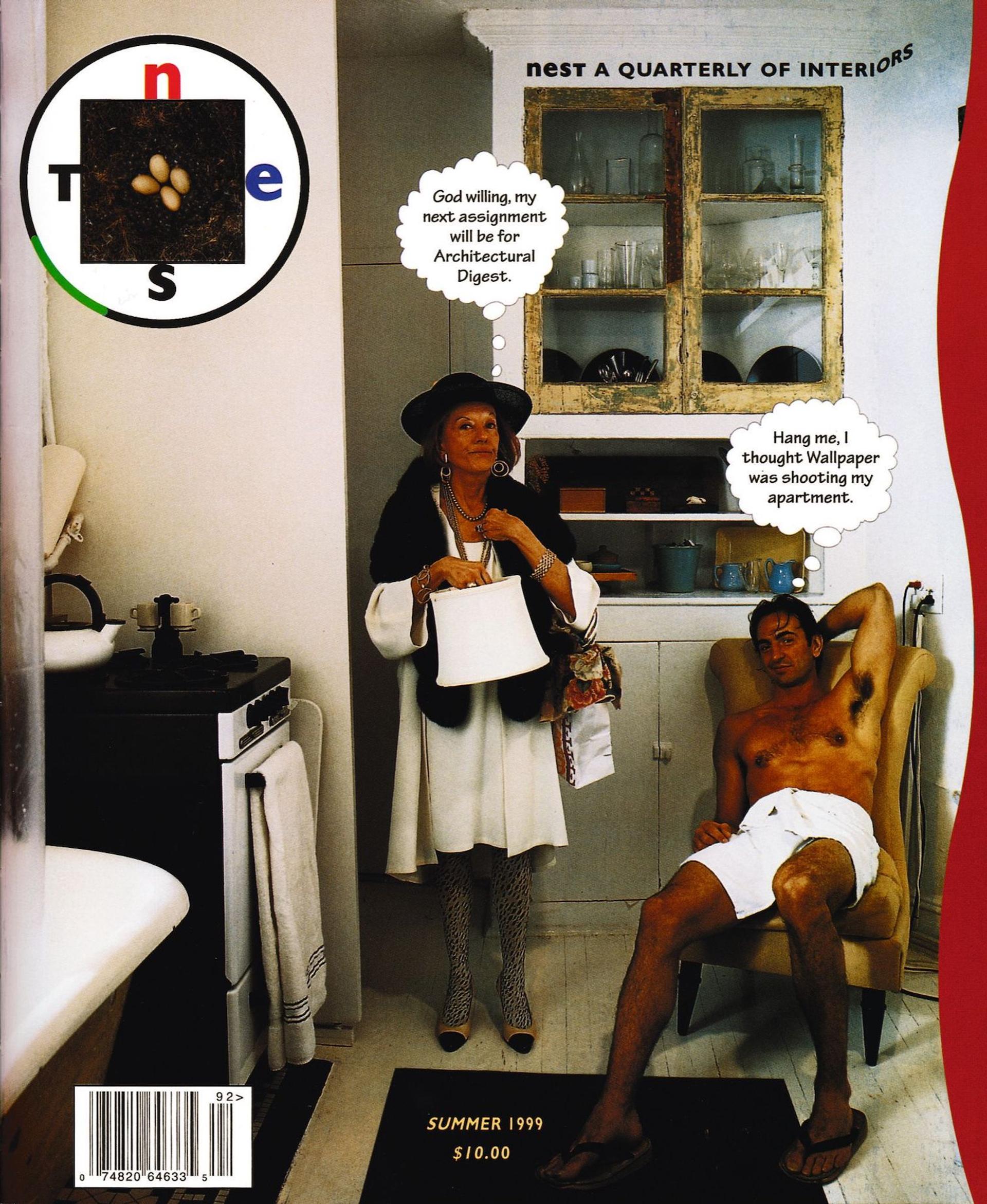
The cover of Nest No. 5 from the summer of 1999 shows a jeweled society woman standing in a bathroom next to a seated young man in a towel. She looks miffed, and he wears a haughty grin, leaning back in his chair with one leg extended. Thought bubbles ascend from their heads. She’s thinking: “God willing my next assignment will be for Architectural Digest.” He’s thinking: “Hang me, I thought Wallpaper was shooting my apartment.” She’s wearing a fur shawl, fully accessorized, while he exudes sex, clad in next to nothing. On the cover is another bubble on the top left: Nest’s circular logo. Reflecting on this “rude encounter,” Skoggard wrote that, “This mischief recalled those distant days of heedless play with the chemistry set, when anything might happen, and did.” How Nest saw itself amongst these other publications is not entirely clear, but it recognized itself as an active agent in the conversation. For Rem Koolhaas, Nest had “manifesto-like ambitions” to volley at its peers. Writing in 1999, Koolhaas says that, “in an age where each magazine seems designed more to capture future investors than current readers, Nest represents an aggressive, deliberate throwback to content, modulated with perfectly honed, contemporary pitch.”
You started Nest in 1997. Searching for information then was not as easy as Googling for it now, yet you yielded such diversity in your research. What was your process?
Well, we spent months and months finding those Richard Harrington photos of the igloo interiors from the late 1940s. That was a triumph. Actual interior photos of igloos from back then are almost non-existent. Research was just a matter of sniffing around. But I don’t know how I do it. I don’t leave my house, but every time I do something happens. I asked the landlord for another apartment. Put four large Ikea tables inside, and started making phone calls. I did what I had to do to rope people into the project. I may have said once to someone that Susan Sontag was writing for me. When I had my baby to sell, I could do the tap dance. I hate parties, but Todd Oldham taught me a trick. You say hello to the host, but don’t say goodbye.
You had an Absolut ad in your first issue: “Absolut Coupland” made by the Canadian writer. How did you manage that?
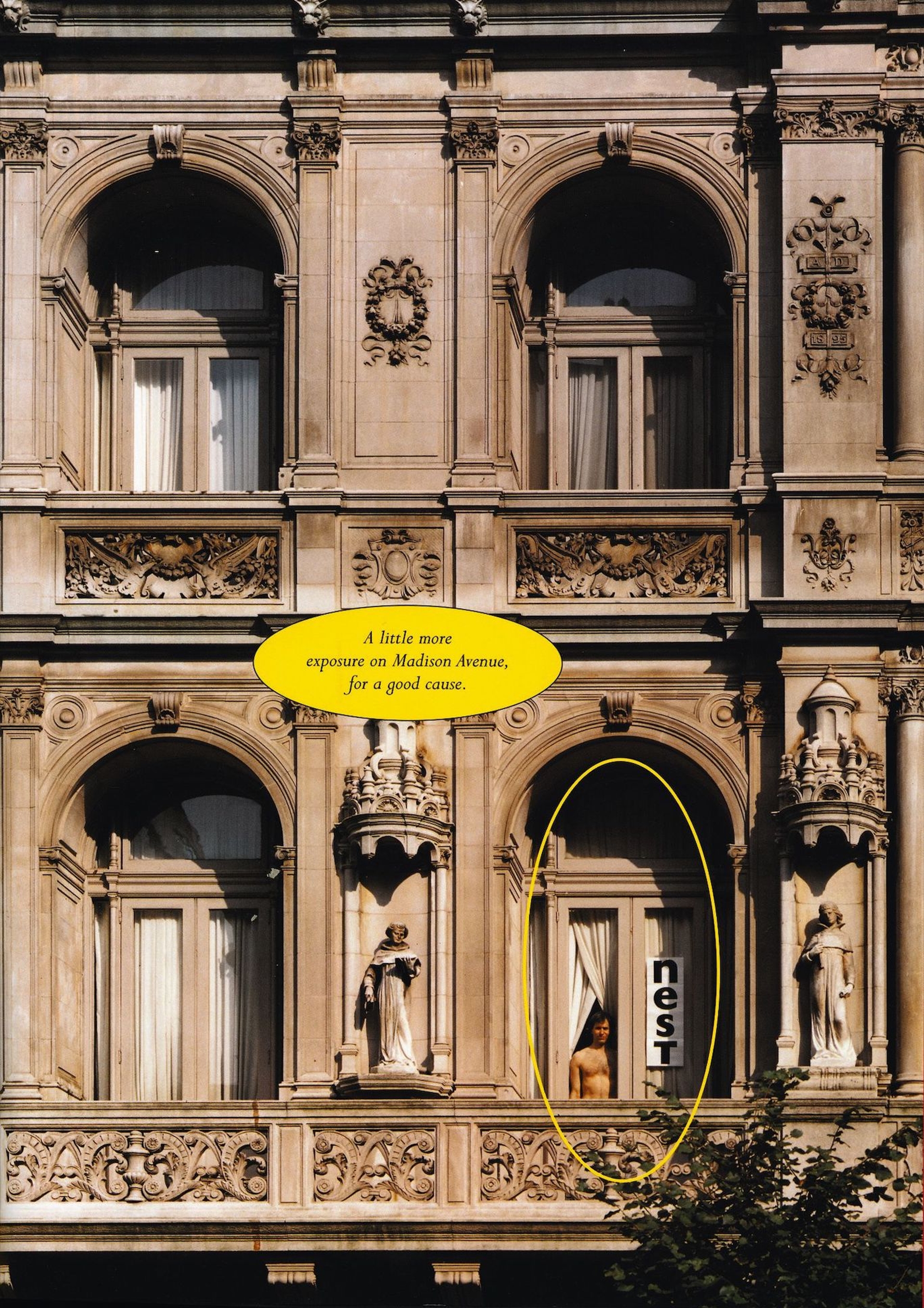
I made all the ad calls myself. I was the best ad seller in the team. I guess I was just resourceful. I had scouts telling me about things they hear all the time. Starting the magazine, my father was proud of me for the first time ever. He measured success by counting the ad pages in the magazine. But he didn’t talk to me after the scratch-off issue. He thought that male frontal nudity would drive them away. He thought I just killed my business.
Going through all 26 issues of Nest, it’s very apparent that the magazine was a vehicle for you to structure your idiosyncratic worldview. The pages show a frenetic, nonlinear imagination that needed to be structured.
After every issue, I would tear up my apartment and redecorate. We did a scallop issue because I started scalloping my walls. The magazine became an extension of my mindset. I was always totally involved – there was no separation between my life and the magazine. I wanted the magazine to be well designed, and to present the editorial material well. These requirements pulled me back from being fanciful for fanciful’s sake.
You’ve said that you don’t read, but it’s hard to believe as the prose is so beautiful. It was such a great idea to give Matthew Stadler full reign of the magazine’s text.
I met Matthew through the English novelist Alan Hollinghurst, someone I admire greatly. I met Matthew, who had written two novels already, we hit it off, I made him Literary Editor, and in the end he was involved in every issue. We worked so well together. I think I only pulled rank once in the seven years.
What’s the relationship between the words, the design, and the images?
The text is basically just grey stuff.
So the words are there to fulfill a design?
Basically, the texts just need to be the right length and readable. Tom Beckham, who I worked with on the design, is a great typographer. Sometimes, we bring in a typographer. We’d often design the pages before the words came in, and I would argue with Matthew regarding cuts. I was cutting pieces for design, whereas he was editing them for content. More often than not, the design would yield to the text if it needed to be longer.
That Holtzman does not see Nest trading on words does not mean it retreated from the discourse of ideas. Unearthing archival images of painter Cy Twombly’s place in Rome, Nest inspired us at 032c to take another look in kind. 032c Issue 19 (Summer 2010) reprinted Horst P. Horst’s photographs of Twombly’s Roman residence, which appeared in Nest No. 21 in the summer of 2003, themselves outtakes from a shoot for Diana Vreeland’s Vogue, which commissioned the German photographer in 1966. Vreeland sent Horst (a.k.a. Horst Paul Albert Bohrmann) to Rome to capture the painter in situ for their “Fashion of Living” section. In publishing the outtakes, Nest opens room for resituating the modernist great. Where Vreeland’s selection of images showed a pensive arriviste – leaning against a granite doorframe in his linen suite, his eyes trained out the window, captive amongst Roman busts and his own canvases – Holtzman shows the same image, but adds also a shot of the backs of several paintings stacked against the wall. Vreeland’s Twombly is a man of cultivation. Holtzman shows his hidden calculations.
Yeah, I remember being not quite sure about the images of Twombly’s apartment. They showed a calculated sophistication: much of the furniture was stripped down to the muslin. I felt that they showed him to be more high fashion, than a real connoisseur. The writer had a completely different take on the story, but that’s often the case. I get to tell my story in the captions.
Artist and writer commissions seemed important for Nest. You commissioned artist Nayland Blake to clad a room entirely of gingerbread. You commissioned figures like Muriel Sparks for a text on temporary lodgings in the third issue. In the same issue, I thought it was pretty ballsy to commission artist Rosemarie Trockel to design wallpaper that you would put on the cover.
I hated it. I was told that I should really try to work with Rosemarie. I was researching flocking at the time, so I invited her to create a flocked cover. I told her she could use any color of flocking, any color paper, and I was furious when she returned with a beige on beige design! My mood turned that whole issue fecal. The colors were charcoal and shiny brown. I commissioned another artist to make wallpaper: Paul Noble. He drew all these turds. That collaboration went really well.
You’ve protested against artists taking the place of designers. In the last issue of Nest, you wrote on top of a Cooper Hewitt Museum ad for an exhibition of artist-made design objects, condemning it.
I was on the acquisitions committee for Cooper Hewitt. They were going to start collecting artist-made designs. They don’t have a clue! I thought Cooper Hewitt had sold out.
In Nest, neuroses, senescence, and death often mixed freely with fantasy and fiction. Extravagant interiors of homes of dead rich people are one thing, but No. 14, from the terrible autumn of 2001 – the issue where Lydia Davis discovers the Proust left behind in his room – contains a story about Corumbene, a geriatric home inland from Hobart in Tasmania. A third of its residents are afflicted with dementia. Rife with metaphor, the facilities are designed to simulate the outside world. Like a street, the bedrooms run along a double-loaded corridor. Their entrances are made to look little houses, complete with clapboard siding and pitched roofs. Letters are delivered as post. The nurse’s station is called the “Pharmacy.” Decorating the interior world is also a form of care, the making of a better world. “The architecture of Corumbene recognizes, intuitively, the eloquence of fragments. Everywhere odd details snag the eye: a bus seat in a hallway, an old-fashioned yellow enamel bathtub, a handrail cut from the branch of a gum, the bark still clinging to it. They bear an intense familiar aura and function not so much as replicas of home but, more powerfully, as metaphors of homeliness itself. Here an outhouse stands for a whole landscape and its associations, a bath for domesticity, the ever-present bird song for lost pets. There is, in addition, a sense that – although it is all these things – a home is more than bricks and private memories, or even a raft of textures and sounds, or a quality of light.”
There were stories about the fictional interiors of I Love Lucy, Flintstones, and Futurama.
I’ve never watched The Simpsons or Futurama. Matt Groening contacted us. He made a flipbook animation on a corner of the magazine. Bender, the robot from Futurama, did somersaults. I don’t like to watch movies, my eyes move too slowly for the camera, but I love half-hour sitcoms. Recently, I’ve been working on a sitcom idea, but that’s another story.
I was always happy to see the fictional spaces of TV shows represented in Nest. It’s a nice thought that Lucy’s living room, or the Flintstone’s living room, spaces where many of us spend so much time, could also be given the pride of place in a magazine that takes the interior seriously. Another thing I think Nest does really well, perhaps anticipating Internet culture, is the flattening of social hierarchies. You profile everything from mud huts in Colombia to European castles.
I like the idea of making interiors into an ethnographic story. They are always domestic stories. I wanted to give castles and Fifth Avenue apartments the ethnographic treatment. Everybody is a decorator, and in the end, I’m fascinated by the rooms they make for themselves.
Why are you fascinated by rooms?
A good room is like a good poem. It has harmony, balance, and tone – is probably what is lacking most today. One of my favorite rooms was the Adam and Eve room we made for No. 9. It defined what a room is for me. It’s based on certain principles of horizontality, how it meets a perpendicular. The perpendicular surface is for me the most important invention, even before the wheel. It establishes space. Punctured, it allows for light.
And what does space mean?
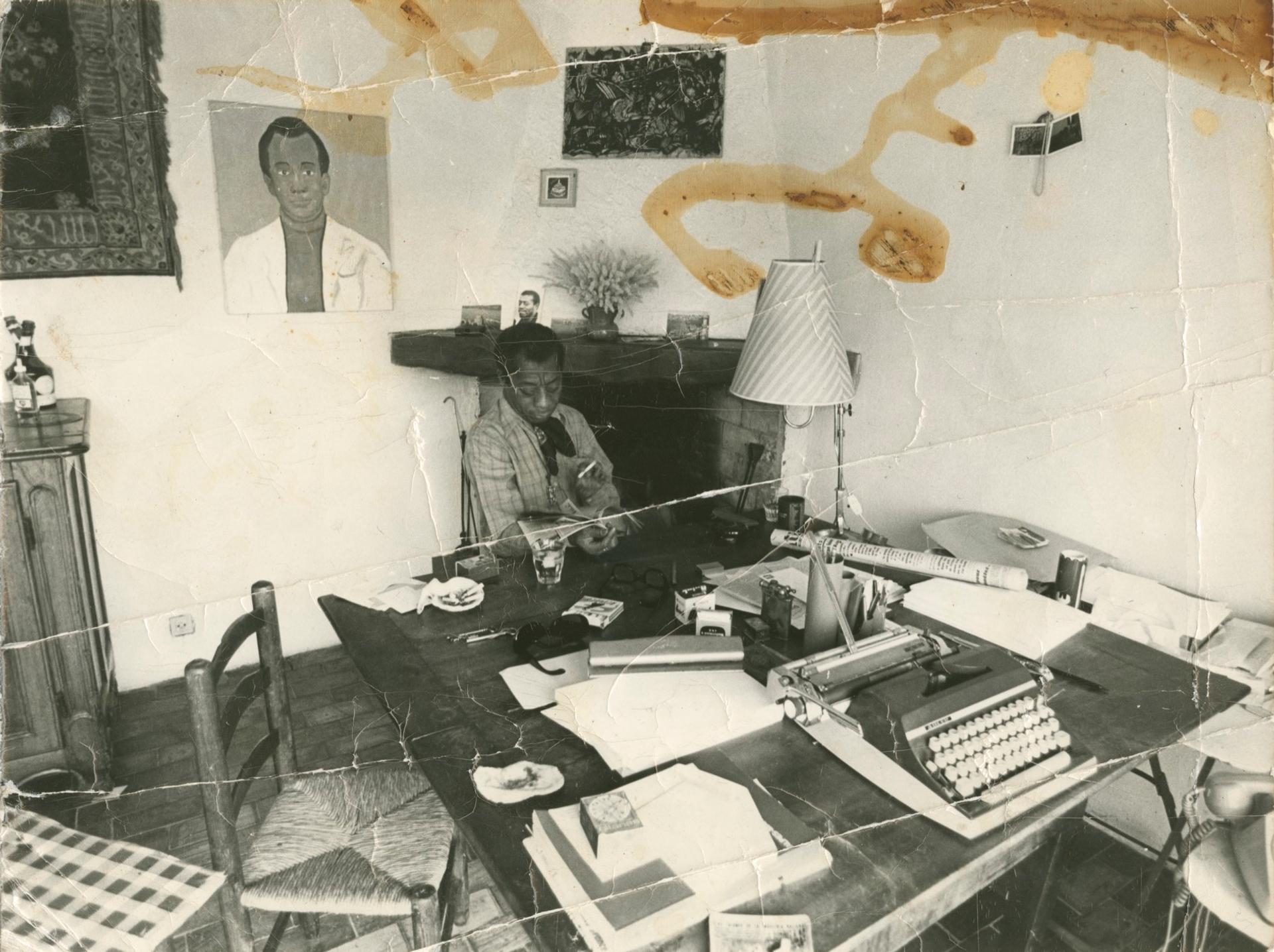
Space is security. I’m agoraphobic. I feel best in a room. Traveling, staying in hotels, can be tricky. It needs to be right. A great room hits you in the chest like a great chord. I did one issue from a mental hospital I had checked myself into. I was supposed to give a talk to the editors of Condé Nast in France. My Prozac was collapsing at the same time, and I was so terrified that I checked myself in. They thought I would be a threat to myself, so I was under lock-up. We used to hide the words “Kill Condé Nast” in the magazine, printing it either in code or backwards. In the end, they wanted to buy Nest! I wrote the editorial for No. 21 in lock-up from my room in the New York Presbyterian Hospital’s psychiatric ward. It was a very well-proportioned room.
I’m surprised you said the Adam and Eve room from No. 9 is your favorite room. There’s no furniture in it. Just two naked people and plants.
That was one of the times where I gave complete creative license to someone who I think is interesting, but whom I didn’t necessarily like their design. Ken Smith, the landscape architect, designed it. He called it Hotel Eden. I wanted him to create artificial beauty. The models were just found on the street.
The word “interior” was used in the 16th century to connote not only the indoors, but also the mental, spiritual self. If we still see our rooms as the outward expression of our interior selves, and if our rooms are themselves the interiors of our houses, we start to contextualize ourselves, the inhabitants in a more integrated way. We produce our rooms as much as they produce us.
I’ve always seen the interior designer and the architect as necessary opposites, as yin and yang. I think I’ve just recently discovered why I’m such a privacy freak. I had staph pneumonia, a debilitating illness as a one-year-old. At the time, in the 1950s, the way to treat it was just to isolate the child. I didn’t see my mother, and the doctors would do transfusions through my head. Perhaps my fear of human beings coming into my space at any time is why I retreated into rooms.
In profiling of so many different homes and shelters, would you say that Nest’s editorial mode was one of discovery of different places, or an escape to different places?
Perhaps neither. Fundamentally, it was about showing respect for the ways people decorate their spaces. Even if the taste is off, and sometimes we reached far to find stories, it was about respecting that someone decorated their space. I was really proud of the story about an adult man that lived like a baby (No. 10). The furniture was scaled up, and he was dressed in diapers. With that story, I hit it right. Some other times I came up short, and other times I went a bit too far. In this sense, going to these different interior conditions is always about discovery. I would never escape to someone else’s vision. In fact, the whole business was run from inside my home, and all the meetings took place there. When people see me inside my space, they would understand me. I see the world from within my space. I guess I’m a voyeur. I have a telescope.
Of course, the interior is ultimately defined and bounded by its exterior, and in the last issue of Nest, the outside world beckons our attention. We see the free-form floor plan and chintzy luxury of Saudi arms dealer Adnan Khashoggi’s private plane – an interior unbounded by place. The same issue featured drawings of the Tuileries by photographer Henri Cartier-Bresson, made from his fifth floor apartment window on Rue de Rivoli in Paris. Looking out of the room takes on the same force of meaning as looking forward.
What’s your favorite way to experience a room?
Lying down. The way we ignore the ceiling is still one of my pet peeves. One of my favorite editorials brought up this question. Are we decorators, or are we ostriches? Perhaps part of it comes from TV. We see the sets of TV shows like I Love Lucy frontally, and the ceiling is removed. Now we just paint all ceilings white. We hide our ducts, we recess our lights there. It used to be the primary surface of expression. Ceilings used to be masterpieces. They used to be celebrated.
Right, how rooms are represented in media probably changes the way we design them. It’s the difference between experiencing a space, and seeing that space as a photograph.
Images are important for interior design. If it’s a good photograph, you can really learn a room. Particularly if you work with photographers like Derry Moore, who only shoots with natural light, a lot of the character in a space can come through.
But isn’t the danger then that people will make rooms that look good in photographs rather than rooms that provide a good experience?
Photographs can instruct us. Just as some people can read floor plans and some can’t, if you have the capacity to read photographs, they can be very powerful tools for reading rooms. Seeing Derry’s photos of the Rothschild interior, I can hear my footsteps on those floors. Similarly, I can see a whole room from handling paint swatches. In any case, rooms change so quickly. They never last. They are only really captured in pictures. Edith Wharton knows rooms and she can capture them in her writing.
How do you determine your space?
It’s craftsmanship. Everybody is a decorator, but it’s about knowing one’s craft intimately. How does light reflect off of different surfaces? It’s also about knowing that one is making choices in one’s space. Some people make their beds, some people don’t. I don’t, but I’m very conscious of that.
Is there a wrong way to decorate? I heard that you don’t like found objects.
That’s not true. I don’t mind found objects. I don’t like when found objects are used as artwork. Choosing an object is just good taste. That’s not art for me.
What’s the difference between someone who has good taste in decoration, and someone who has intimate knowledge about decorating?
Seeing the work of someone with knowledge is like seeing a painting. One sees references here and there. A surface treatment or a textile pattern can evoke all sorts of ideas. Some people see ideas, and some people just see colors. I think there is a decorator gene. In a way, I don’t really believe in the idea of professional decorators. People should be their own decorators.
So you think through painting, and you can think through images. Do you ever decorate as if it were an image?
Never. In fact, I don’t connect painting with image. I would think I have failed if my paintings conveyed through image. Painters have it very hard now that people are used to seeing images back-lit on their computer screens. I love surfaces. I love the craft.
Holtzman and his partner Carl Skoggard now spend most of their time in their wooded home in upstate New York. A converted butchery – they left the meat hooks, ceiling transport rails, and blood drain in place as form, not function – the compound is decorated in quintessential Holtzmanian fashion. Paul Noble’s intricate wallpaper decorates a guest room. Rosemarie Trockel’s line the back stairs. Smaller framed drawings are hung directly on larger ones. All the ceilings are painted in various geometric motifs. Holtzman spends his days painting and pouring over art books in his upstairs studio. (An exhibition of his oil-on-marble paintings just closed at the Hammer Museum in LA. Holtzman painted vertical yellow stripes in the gallery, as if segmenting the space with Nest spines.) Skoggard translates German texts from atop a separate little house. (His translations of Walter Benjamin’s sonnets were published last year.)
One reason why I stopped the magazine is because I thought I was getting repetitive. I knew how everything worked. I was also getting obsessive. I could see when layouts were off by even a 16th of an inch. I had thought about starting a radio call-in show where people can get decorating advice.
You’d have no visuals.
That’s the idea.
How did you intend to communicate spatial ideas with just sound?
It’s all the same problems. Decorating is about relationships, harmony, and peace. Perhaps that will be my next decorating challenge.
In his praise for Nest from 1999, Koolhaas appeared to have also called for its end. “You want many more Nests, but not Nest forever. It is a corrective, a temporary breach, an opening … If Nest is a manifesto, it is hoped that it will end, suddenly, like the Surrealists’ reviews. Then it can assume its future status as legend.”